2024
JOIN FUN
Entrant Company
Hunan Subject Creative Design Co., Ltd
Category
Corporate Identity - Brand Identity
Client's Name
Country / Region
China
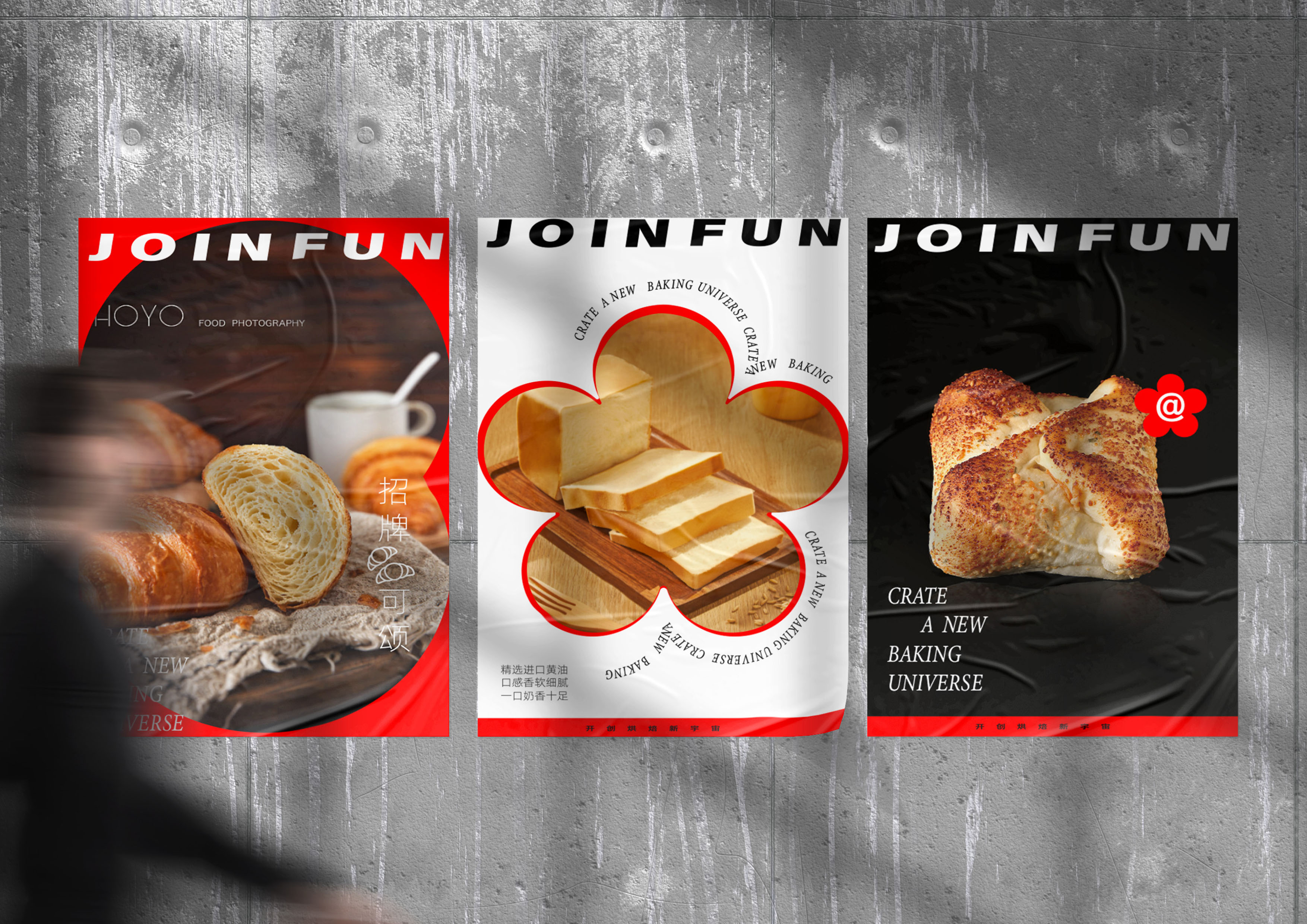
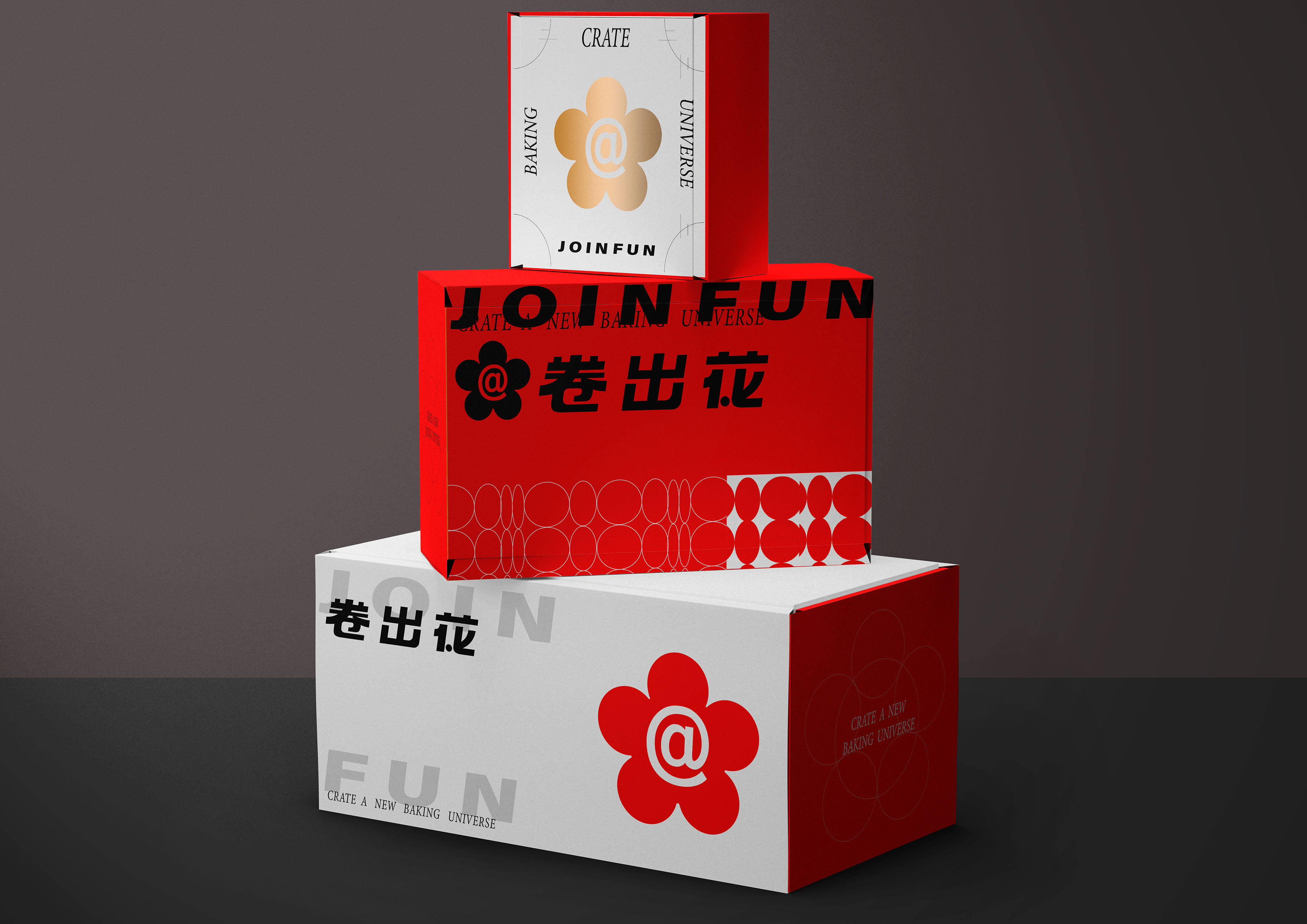
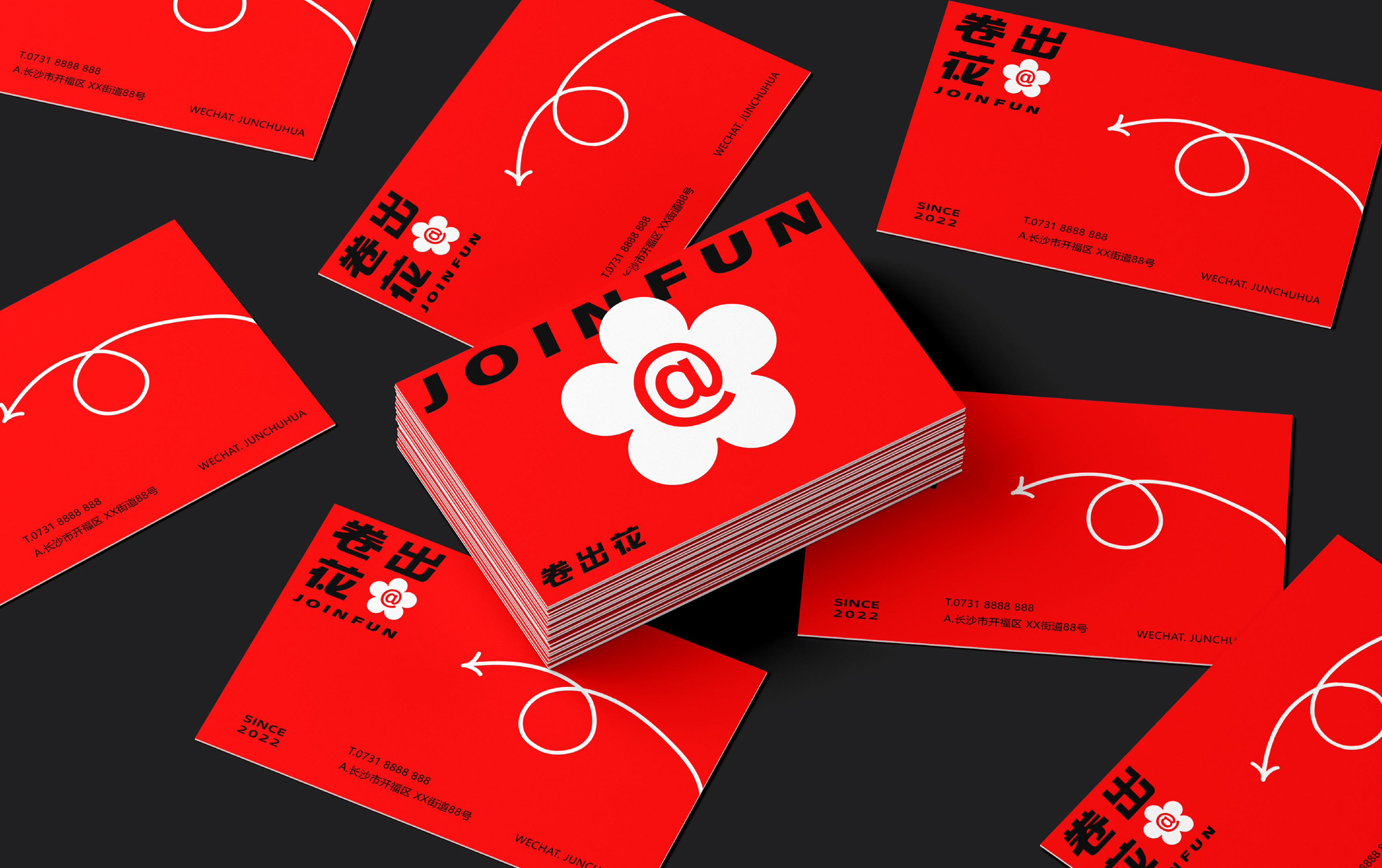
The VI design of this brand is based on three concepts: "roll out nice things", "roll away from restrictions", and "roll into your heart". The design team used the "@" symbol to represent the concept of "roll" and combined it with a little red flower to create the brand's super sign. The "@" symbol visually resembles a cross-section of a cake roll, which aligns with the brand's product characteristics. Additionally, it is a sign commonly used in social media and online communication platforms to refer to or tag a certain user, which creates a stronger emotional connection between the brand and the user. This technique is frequently used in brand design as it can fully strengthen the visual memory of the super sign and its communicative nature.
To continue the brand's VI style, the shop space was designed symbolically using simple and competent visual language. The design team enlarged the super sign at the front door and emphasised it repeatedly on the interior products and walls. This not only enhances the brand's recognition and topicality but also maintains the consistency of the overall style.


Credits
Entrant Company
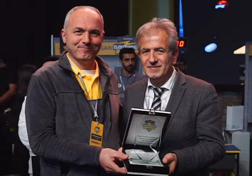
Escapist
Category
Event - Tournament
Country / Region
Turkey
Entrant Company
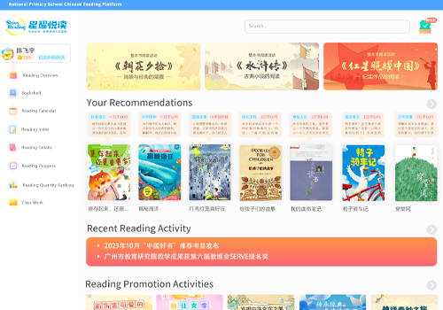
Guangzhou Shiny Reading Education Technology Co., Ltd.
Category
Website - Training / Knowledge-Base
Country / Region
China
Entrant Company
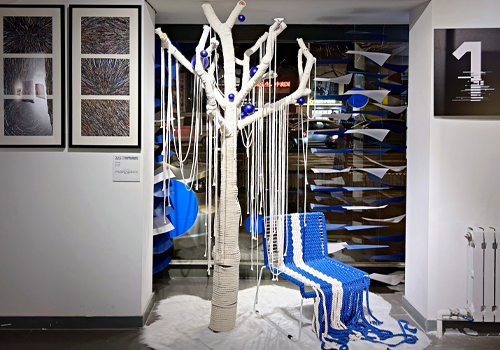
Luxun Academy of Fine Arts
Category
Integrated Marketing - Event Marketing
Country / Region
China

Entrant Company
Exemplifi
Category
Website - Government
Country / Region
United States