
2024
SK International School Wuxi Brand Design
Entrant
Sichuan Dandelion Architectural Design Co., Ltd.
Category
Branded Content - Age-Group Marketing - Youth
Client's Name
Sichuan Dandelion Architectural Design Co., Ltd.
Country / Region
China
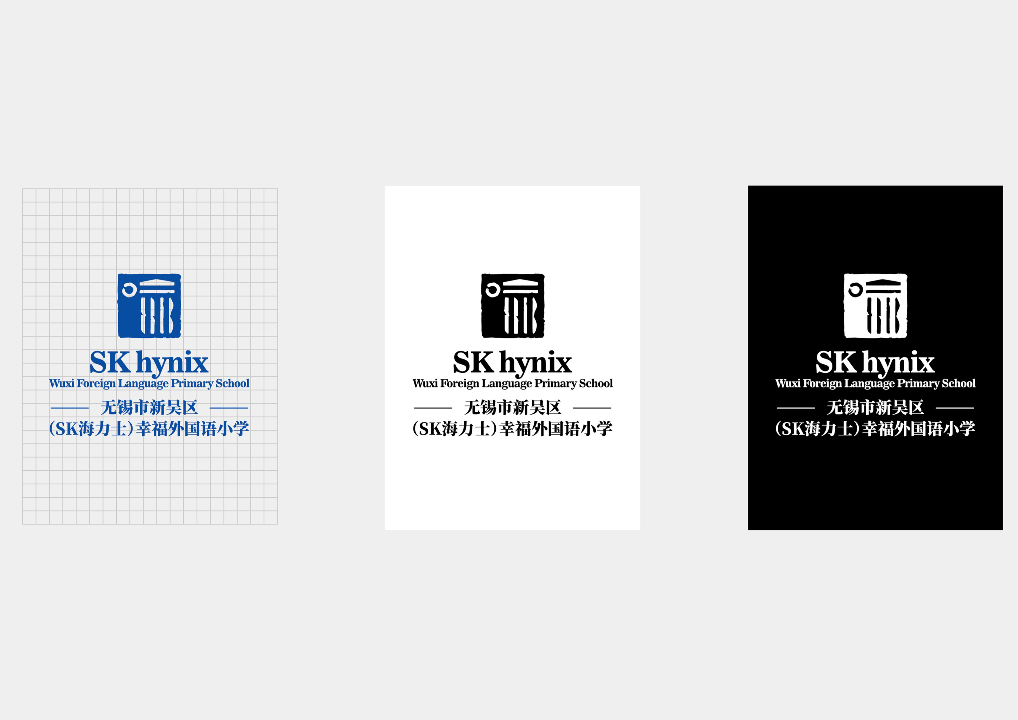
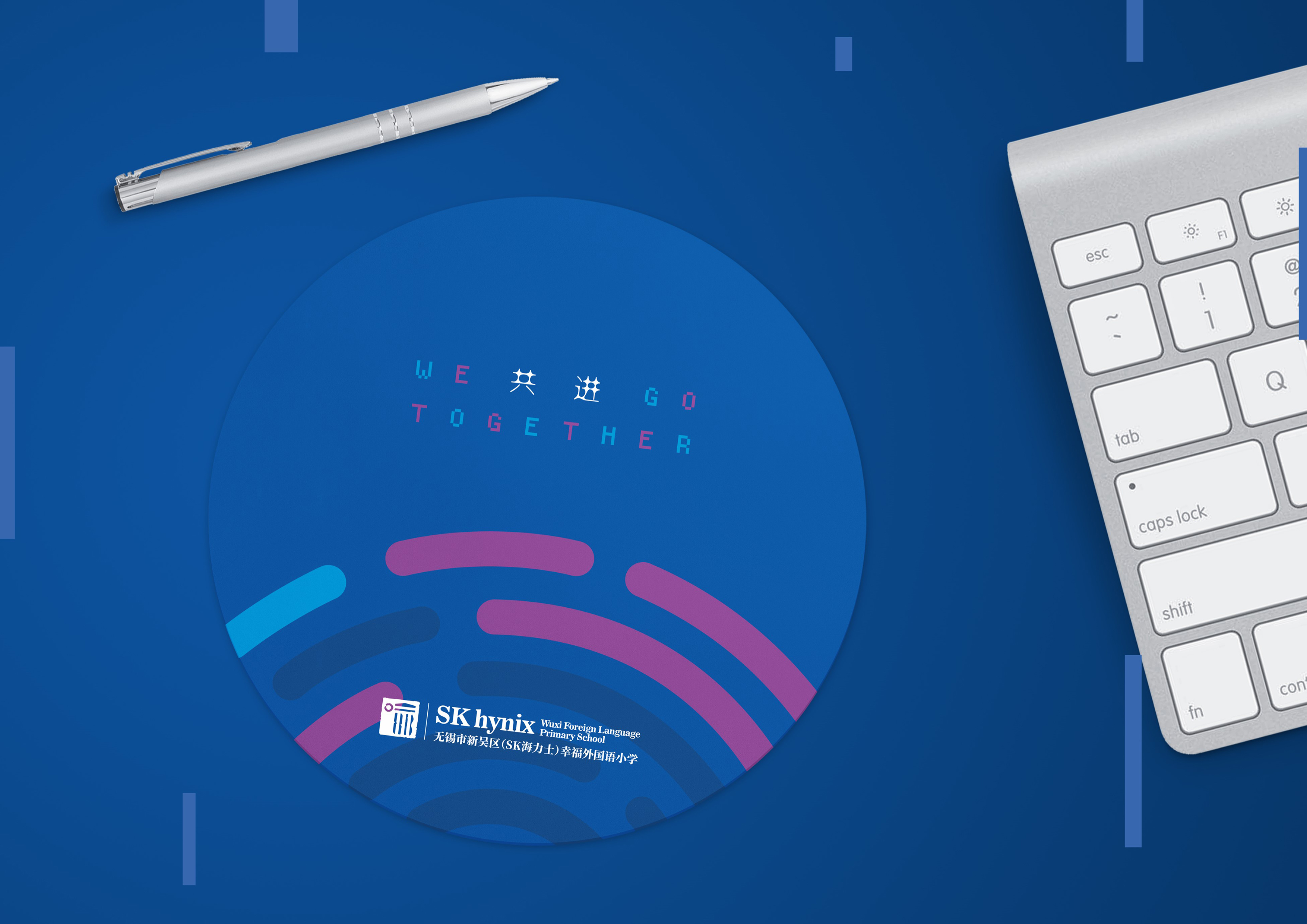
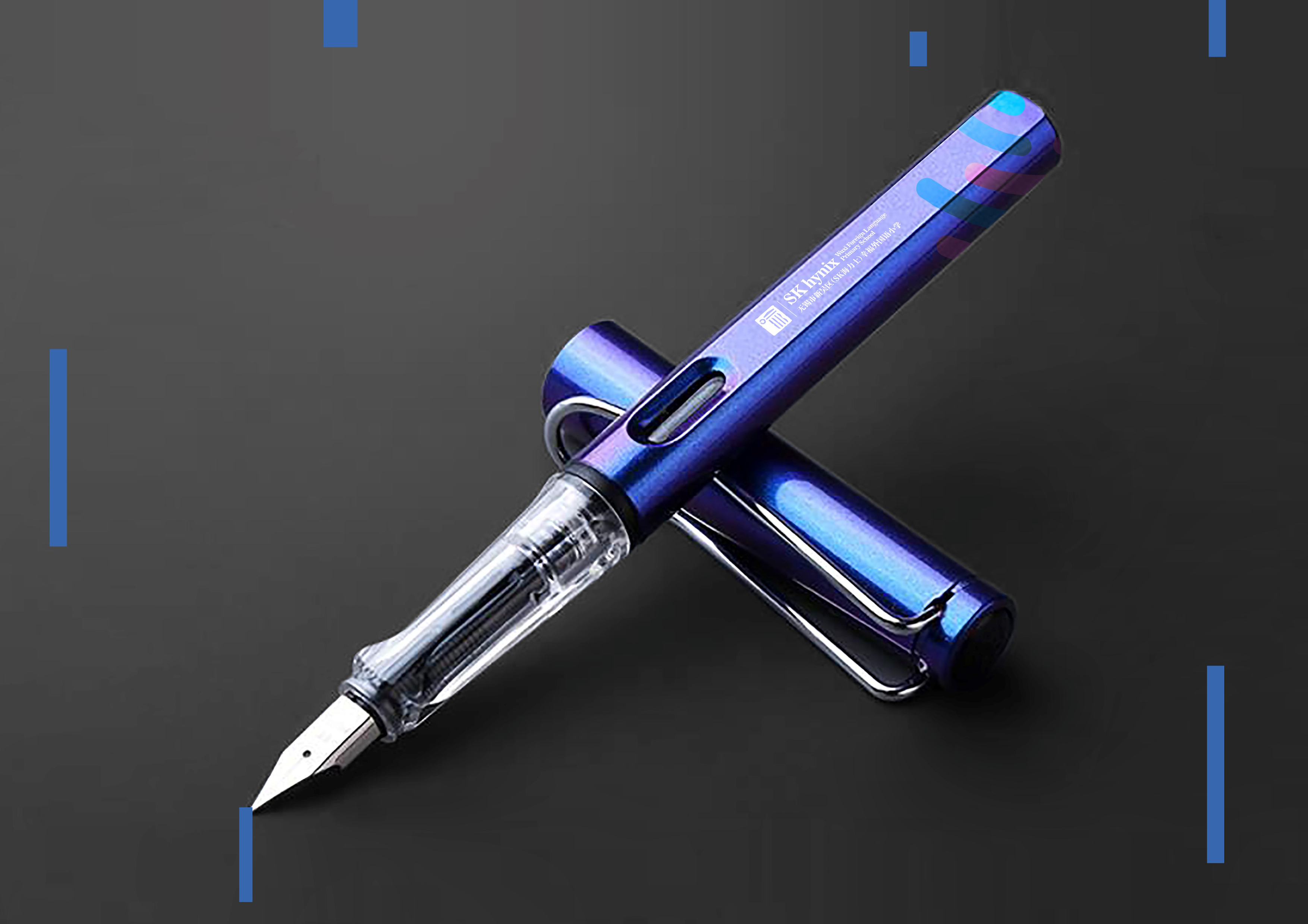
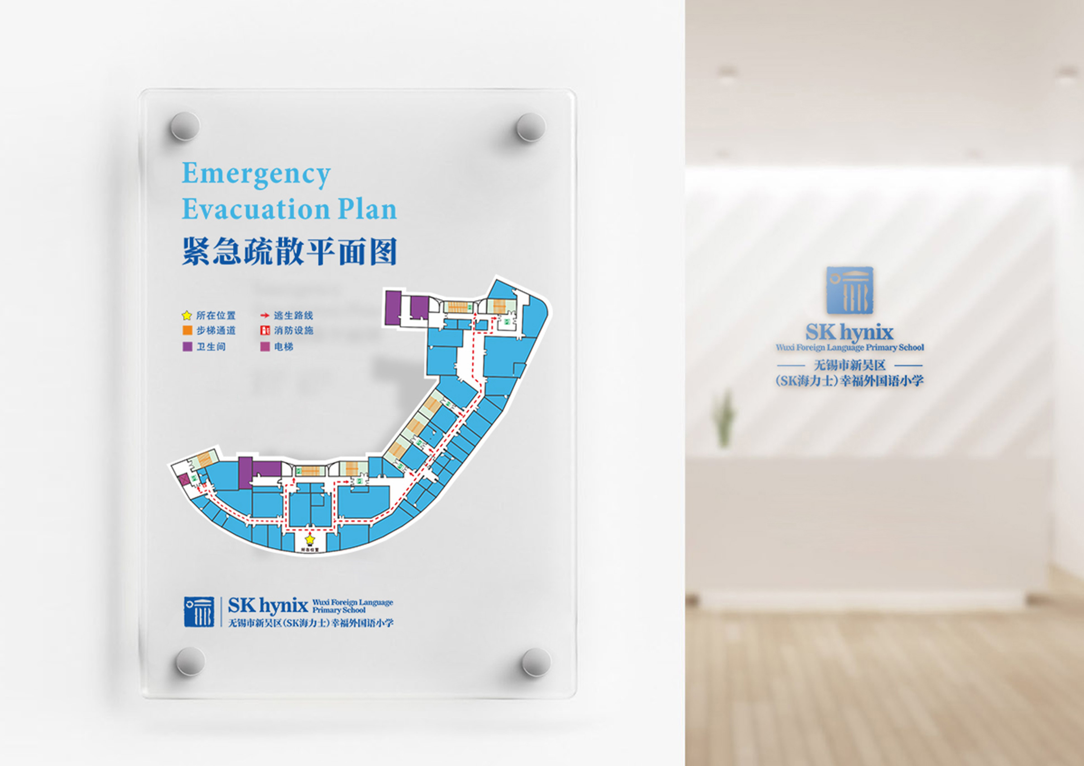
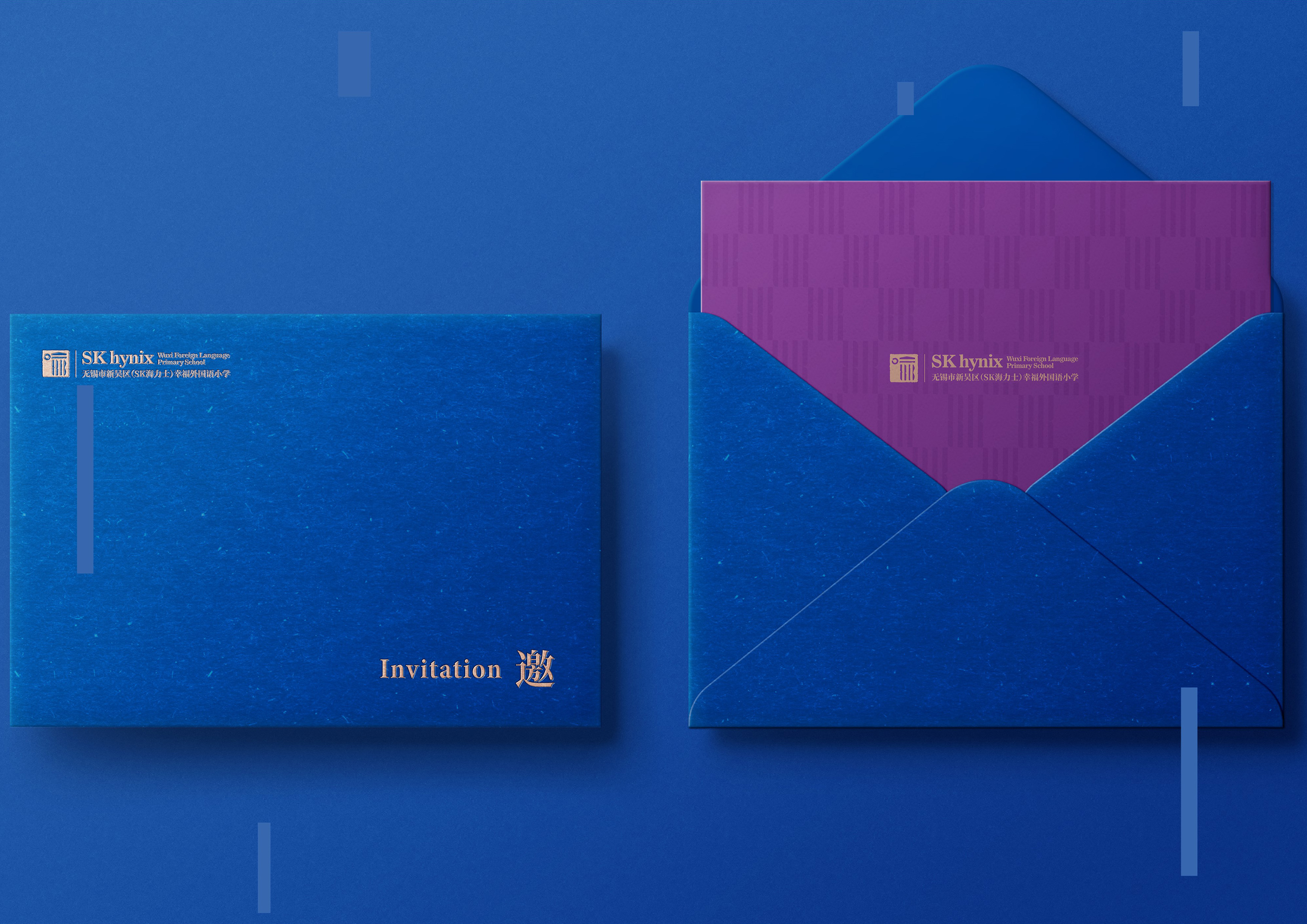
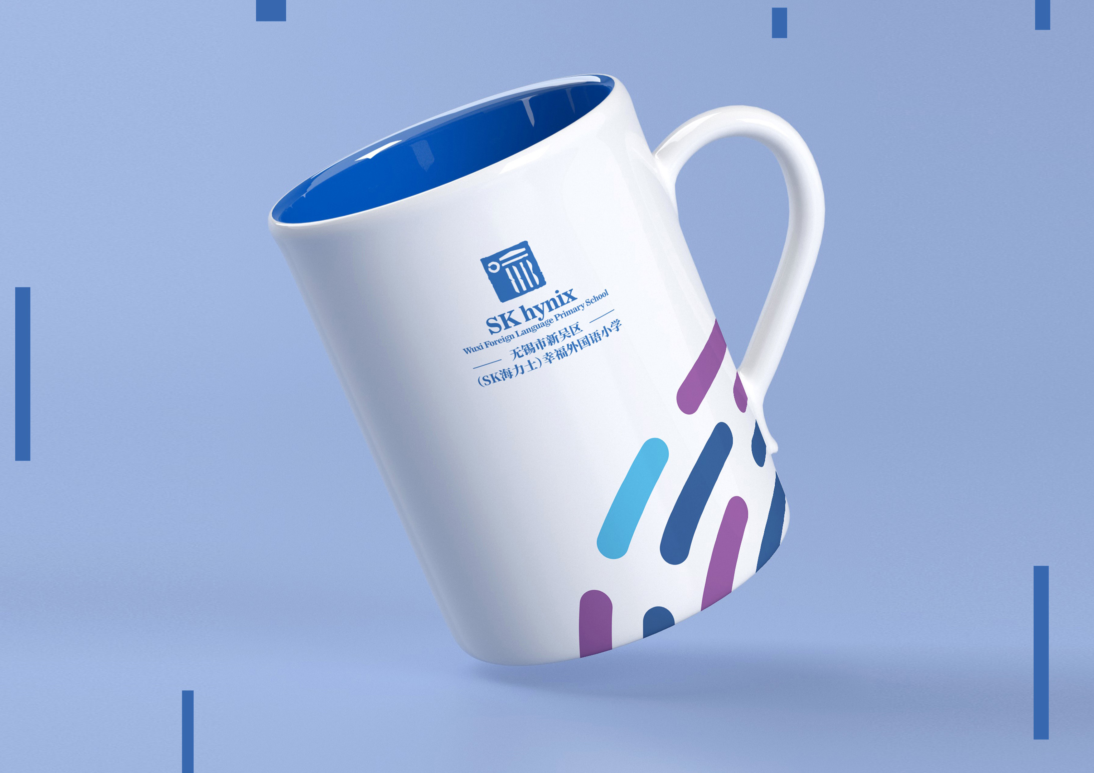
The VI design of the SK Campus is based on its cultural positioning, which aims to convey the concept of teaching students in accordance with their aptitude. The school intends to provide children with a future-oriented education, so it has chosen "Future Blue" as the representative colour of SK School's education. The selected colour symbolises the school's respect for serendipity in the education process, and students with different personalities can be guided towards the right future. This is consistent with the profound meaning of the word "Yu"(enlightenment) in the school's cultural positioning.
The logo design incorporates the character "Yu" as the primary theme, symbolising "enlightenment". The unsealed side of the character "Kou"(a square) represents the openness and diversity of the flat world. On the other hand, the character "Yu" resembles a school building, highlighting the unique atmosphere and spiritual connotation of the Boyu Academy. Furthermore, the character "SK" is integrated into the logo in the form of a book, supporting the school's architectural structure and signifying a ladder to climb the peak of knowledge. The elements of calligraphy and seals are also employed to signify China's self-confidence. To make the vision and heritage tangible, the design team created a set of auxiliary graphics and auxiliary colours in "future blue". This gives the school's cultural brand more space for extension and use scenarios.


Entrant
DeVito/Verdi
Category
Corporate Identity - Brand Identity
Country / Region
United States
Entrant
Beijing Clouds' Digital Art
Category
Video - Art & Design
Country / Region
China
Entrant
Grundfos (China) Investment Co., Ltd.
Category
Mobile App - Professional Services
Country / Region
China

Entrant
AARP
Category
Marketing & Promotional - Specialty Item
Country / Region
United States