
2024
Smiley O
Entrant
Jingchuang Media Group (Wuhan) Co., Ltd., Wang Xiaoji
Category
Corporate Identity - Brand Identity
Client's Name
Wang Xiaoji
Country / Region
China
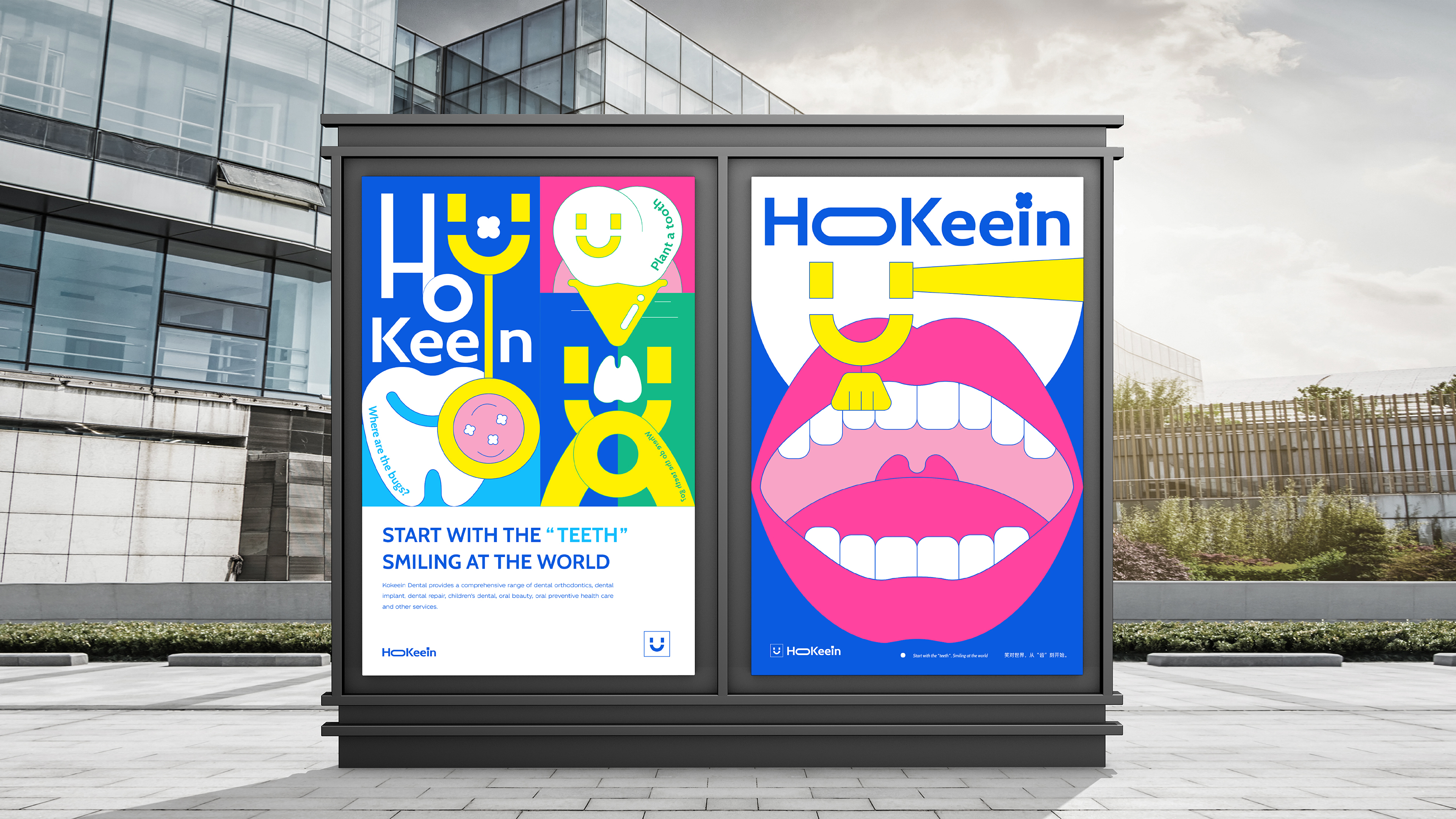
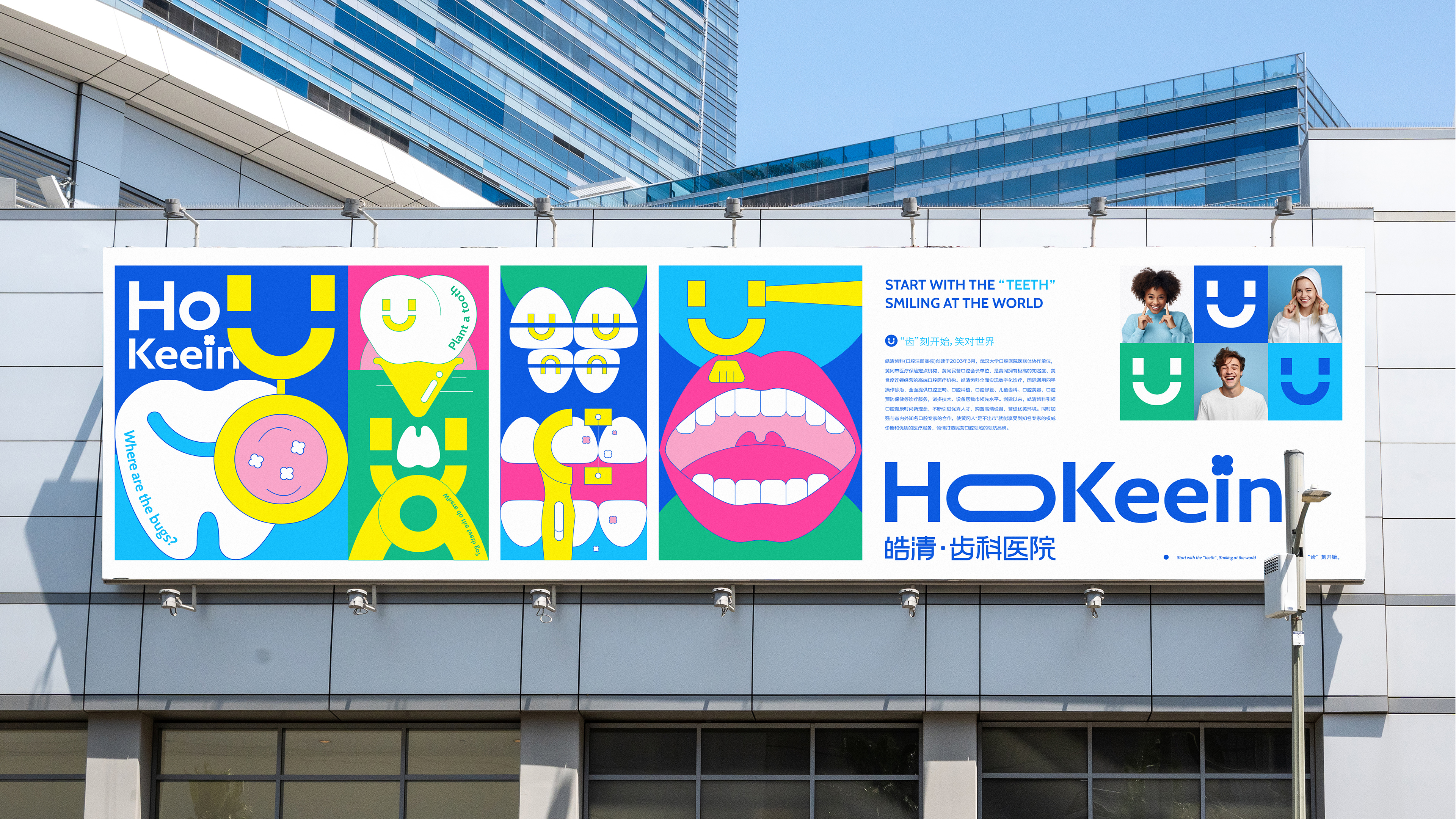
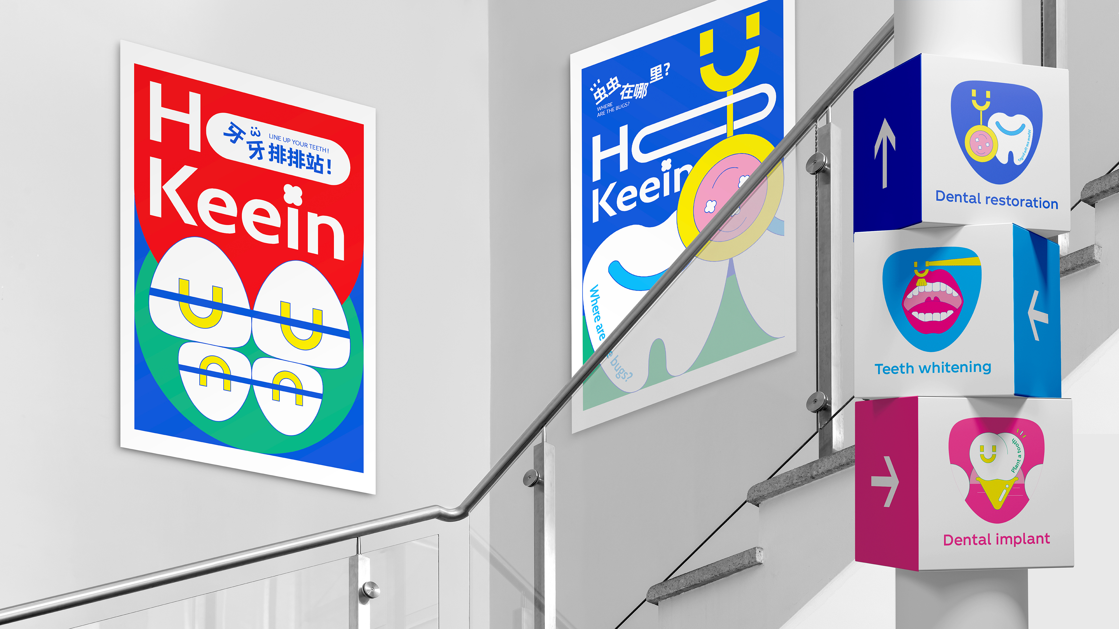
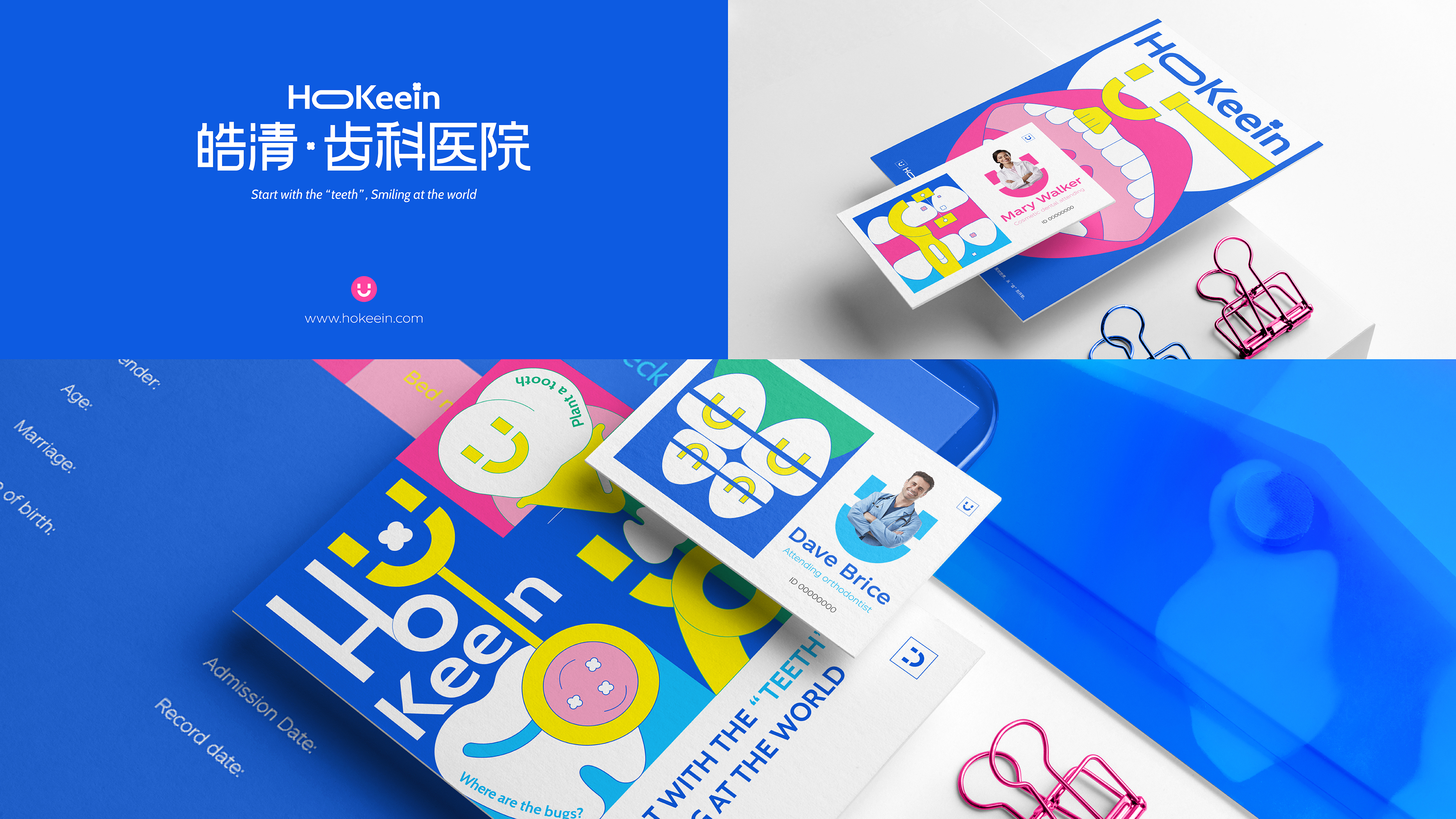
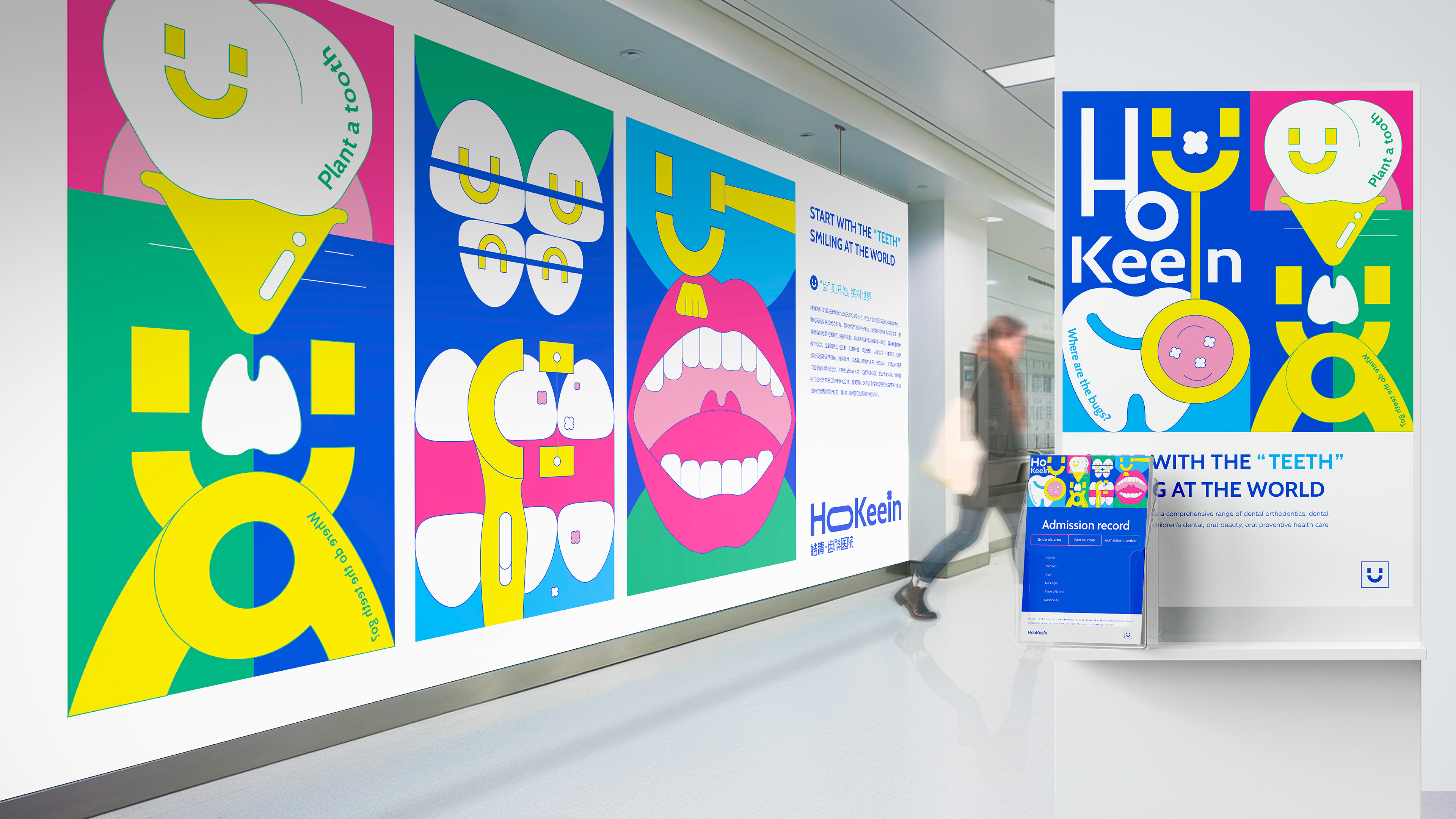
This is a visual identity work designed exclusively for Wuhan Hokeein Dental Hospital. It introduces a delightful design that captivates the public. It seamlessly integrates the smiling face element extracted from the hospital’s English logo with dental medical instruments, creating a consistent theme throughout. Delicate illustrations coupled with charming simple texts are used to showcase various dental processes in a lighthearted and enjoyable manner, aimed at dispelling children and young people’s fears of dental hospitals and infusing some relaxed vibes into the otherwise clinical and intimidating medical setting.
The work boasts a clean and stylish appearance with bold yellow, blue, and red colors that are visually impressive. The combination of medical instruments and smiley face graphics creates an attractive visual focal point. The dental instruments in the illustrations are depicted to show their characteristics and functions in a more realistic and intuitive way. The use of a flat illustration style adds a sense of fashion and fun, catering to the aesthetic preferences of kids and young people.
This artwork serves the purpose of conveying dental care processes to the public and promoting Hokeein Dental Hospital’s professional, warm, and stylish dental services. The illustrations vividly depict a series of dental processes such as teeth cleaning, orthodontic treatment, teath repair, etc., helping children and young people gain a new understanding of dental clinics and dispelling their fears.
The most distinctive part of this work is the application of the unique smiley face which is extracted from the letter O in Hokeein. As the dental care process unfolds, this smiling face element evolves accordingly, featuring toothbrushes, dental mirrors, braces, tooth grinders, extraction forceps, dental fillers, and more. It fosters a more approachable perception of dental instruments by alleviating their chilling and dull appearances.
This VI work elevates the brand image of Hokeein Dental Hospital, making it more recognizable and popular to the mass. It contributes to enhancing public perception for dental care processes. The cute and lively design also conveys Hokeein’s humanistic care for patients and its service philosophy, thus contributing to the development of a harmonious doctor-patient relationship.


Credits

Entrant
SFC Group
Category
Advertising - Advertising Campaign
Country / Region
United States
Entrant
Gravity Global
Category
Advertising - Advertising Campaign
Country / Region
United Kingdom

Entrant
Beijing Wangjianxi Culture & Technology Co., Ltd.
Category
Event - Art Event
Country / Region
China

Entrant
Inertia Studios Ltd
Category
Video - Animation
Country / Region
United Kingdom