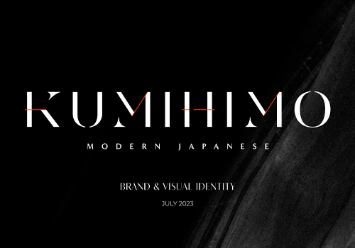
2024
Komolife; Fine Selected Minimal Fashion Accessories
Entrant Company
Freelance
Category
Corporate Identity - Corporate Identity Redesign
Client's Name
Komolife
Country / Region
United States
Komolife Group, an active player in Iran's dynamic fashion market, has been at the forefront of introducing, distributing, and promoting an array of youthful and innovative brands since its establishment in 2013. Yet, underpinning the uniqueness of each brand is a common thread: Komolife's foundational philosophy of cultivating a "minimal, young, urban, and avant-garde space where design takes center stage."
As Komolife continued its journey, constantly evolving and expanding its horizons, it became increasingly apparent that a fresh visual identity was needed to mirror the brand's ever-evolving youthful spirit. The call for a more contemporary, modern, and dynamic identity grew stronger, one that seamlessly harmonized with the essence of the brand. This pivotal task was entrusted to me as the designer responsible for reshaping Komolife's visual identity.
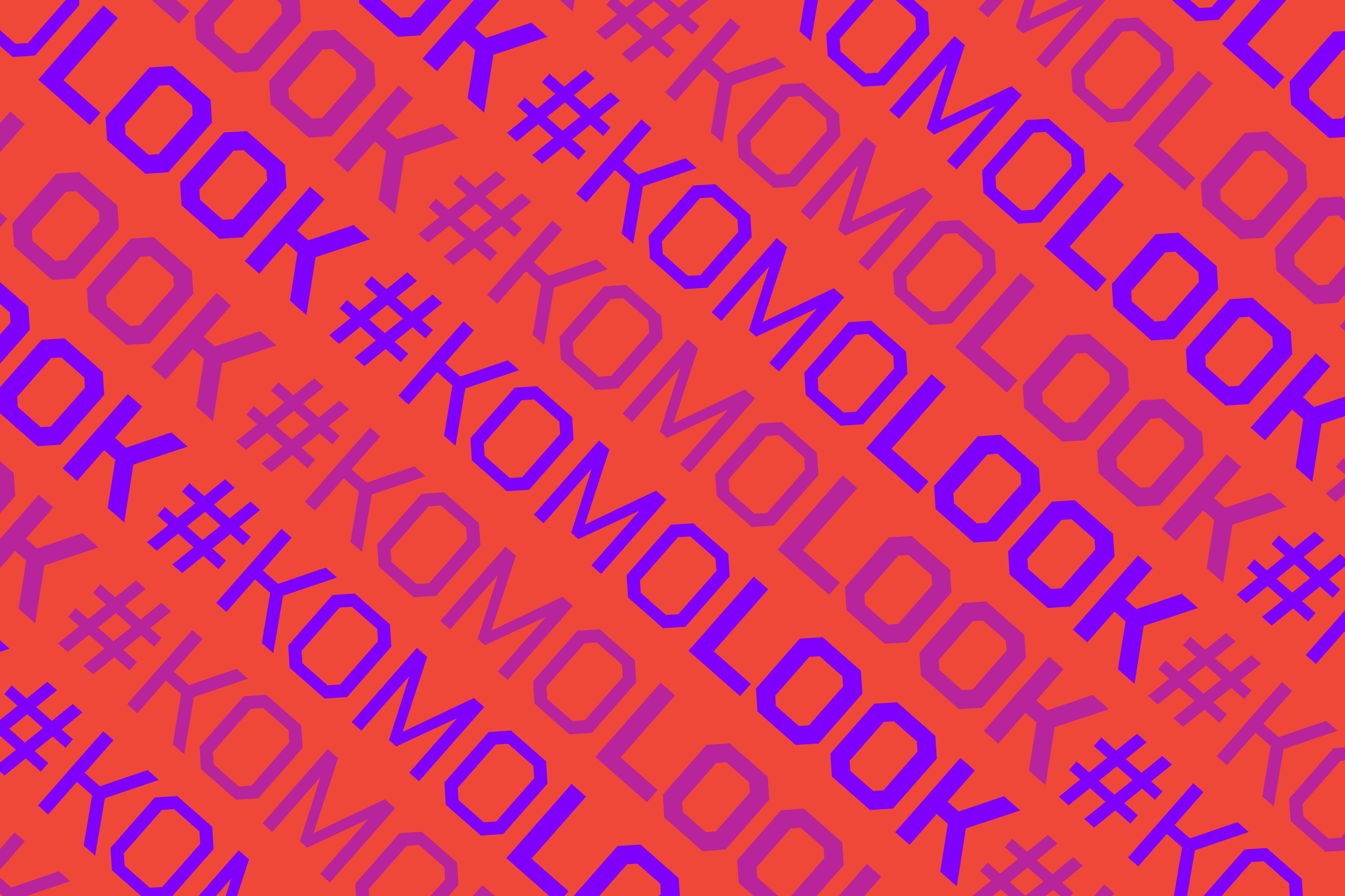
Our mission was clear: to craft an identity that seamlessly adapted to both digital and physical touch points, spanning websites, social media, physical stores, packaging, and more. In our quest for a unifying concept, we coined "Komolook," a clever hashtag encompassing elements of fashion, style, and aesthetics, perfectly aligned with Komolife's expertise, which prominently includes eyewear.
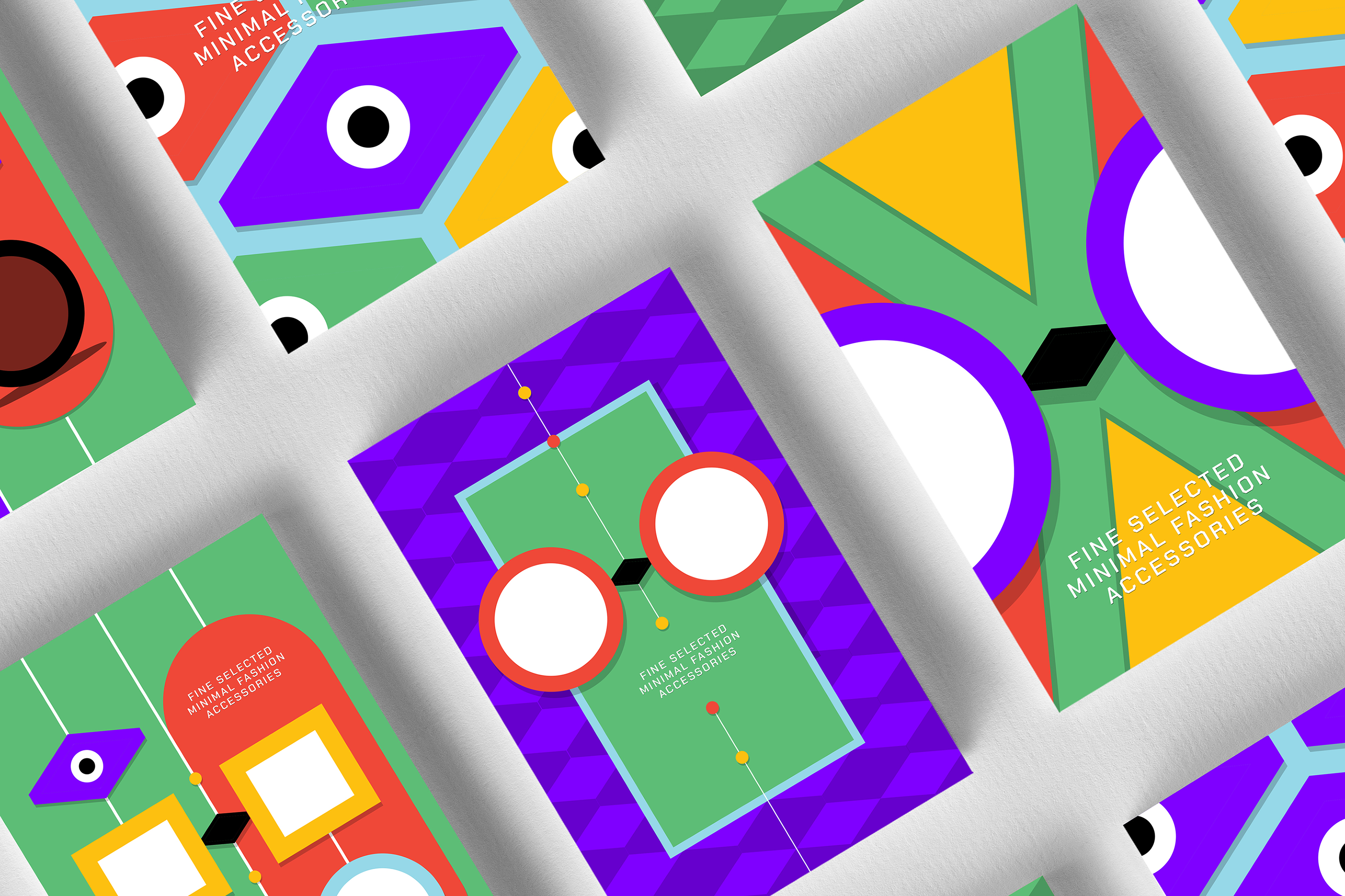
Inspired by this concept, we meticulously constructed a grid of intricately interwoven rhombus-shaped units. From this grid, a plethora of shapes and icons emerged, with one central figure being a playful, dynamic eye that gazes, blinks, and surveys its surroundings. This eye evolved into one of the primary icons, frequently employed in diverse, dynamic patterns. Furthermore, this diamond-shaped eye purposefully transformed into clock arrows, symbolizing Komolife's emphasis on watches.
The heart of this project beats in illustration, where we transformed eyewear and watches into purely abstract yet distinctive shape, generating unique patterns and spaces for various occasions, from Nowrouz to Valentine's Day and beyond. The adaptable grid enabled us to derive countless patterns and illustrations, offering endless creative possibilities.
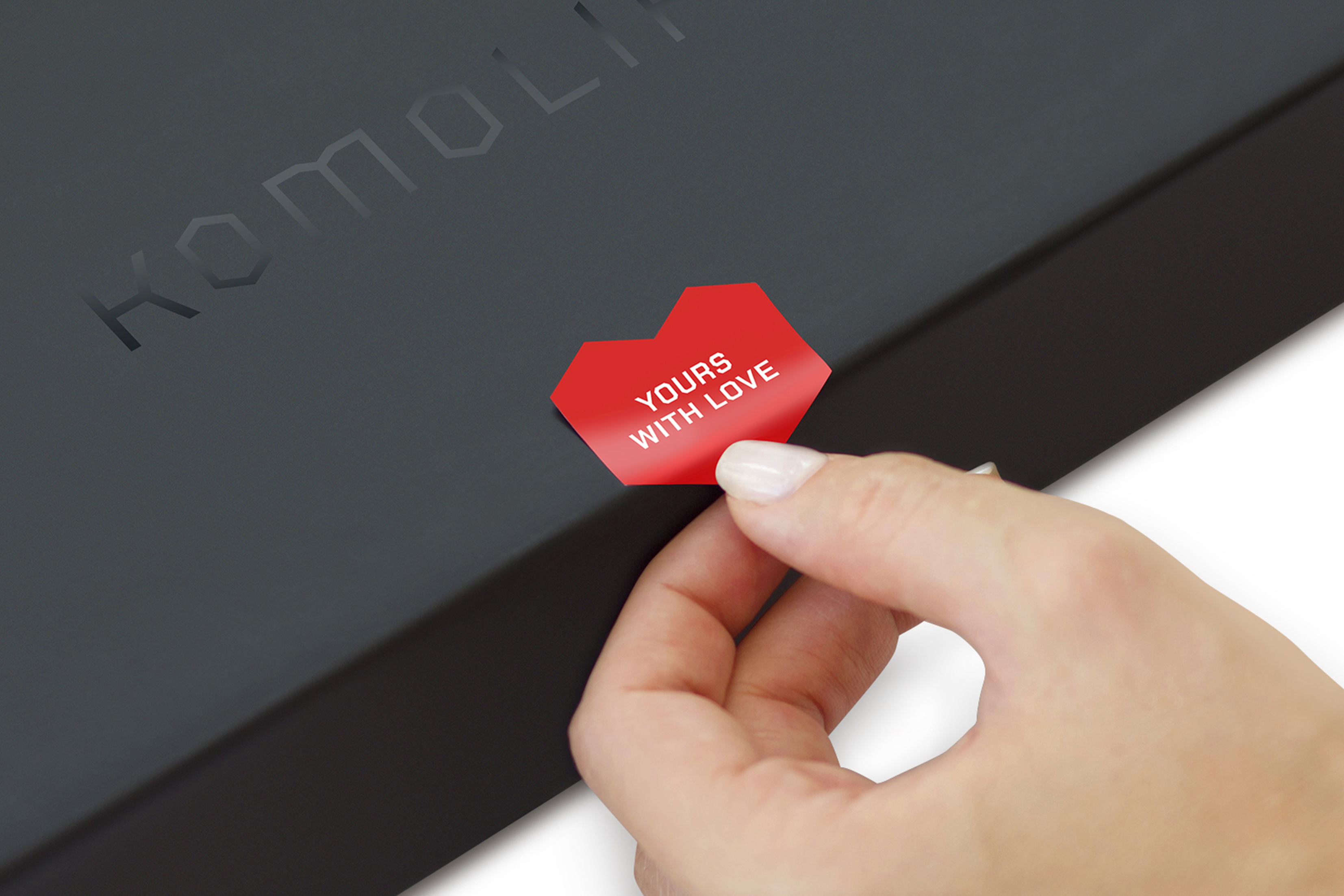
To unveil the refreshed Komolife identity, we harnessed the power of graphic motion, crafting dynamic visuals that effectively encapsulate the brand's new spirit. These graphics, strategically deployed on Instagram and the website, breathe life into the brand, delivering an exciting narrative of Komolife's evolution.


Credits
Entrant Company
greymatters
Category
Corporate Identity - Brand Identity
Country / Region
Vietnam

Entrant Company
22Squared
Category
Social Media - Retail & E-Commerce
Country / Region
United States
Entrant Company
IDEOLOGIST LLC
Category
Experiential & Immersive - Public Art Installation (NEW)
Country / Region
Russia
Entrant Company
BALDUCI FILM - Film Production Company
Category
Video - Tourism
Country / Region
Croatia (Hrvatska)