2024
Audacity Health Agency Brand Identity
Entrant Company
Audacity Health
Category
Corporate Identity - Brand Identity
Client's Name
Audacity Health
Country / Region
United States
At Audacity Health, we know innovation never stops. And neither do we. Our integrated brand strategy and activation solutions help our science, health, and wellness clients thrive, so they can transform human health. Even our design mark reflects the “full circle” nature of our agency’s purpose.
A core component of the Audacity brand is the “dot” element, pulled from our logo. It represents data, because we use data-driven insights to fuel strategy and creative. These dots are the fundamental building blocks of our brand, like cells in the human body, and just like cells they grow, combine and iterate to create new shapes and expressions.
Audacity builds powerful brands by keeping the human element at the core in everything we create. That human core, inspired by the cells that make up every part of our body, has been expanded into colorful branding elements and woven throughout all Audacity Health brand materials. They are especially brought to life on our website, where they pull the viewer forward throughout the digital experience, and animated purpose video, where they combine and rearrange to tell the Audacity Health story.


Credits
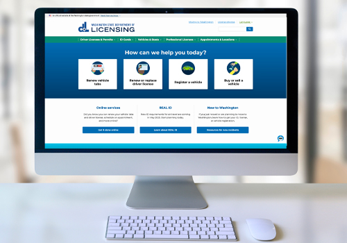
Entrant Company
Anthro-Tech
Category
Website - Government
Country / Region
United States
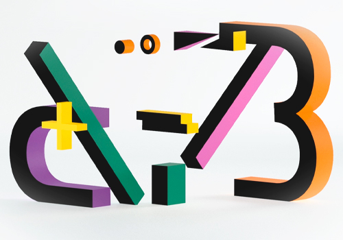
Entrant Company
Content Creatures Ltd
Category
Video - Business to Business
Country / Region
United Kingdom
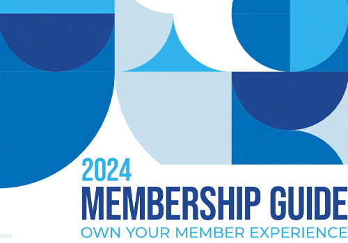
Entrant Company
National Association of REALTORS®
Category
Publication - Publication / Other___
Country / Region
United States
Entrant Company
Octavo Designs
Category
Corporate Identity - Brand Identity
Country / Region
United States