2024
SHANHE
Entrant Company
Hongyou Design
Category
Corporate Identity - Brand Identity
Client's Name
SHANHE
Country / Region
Taiwan
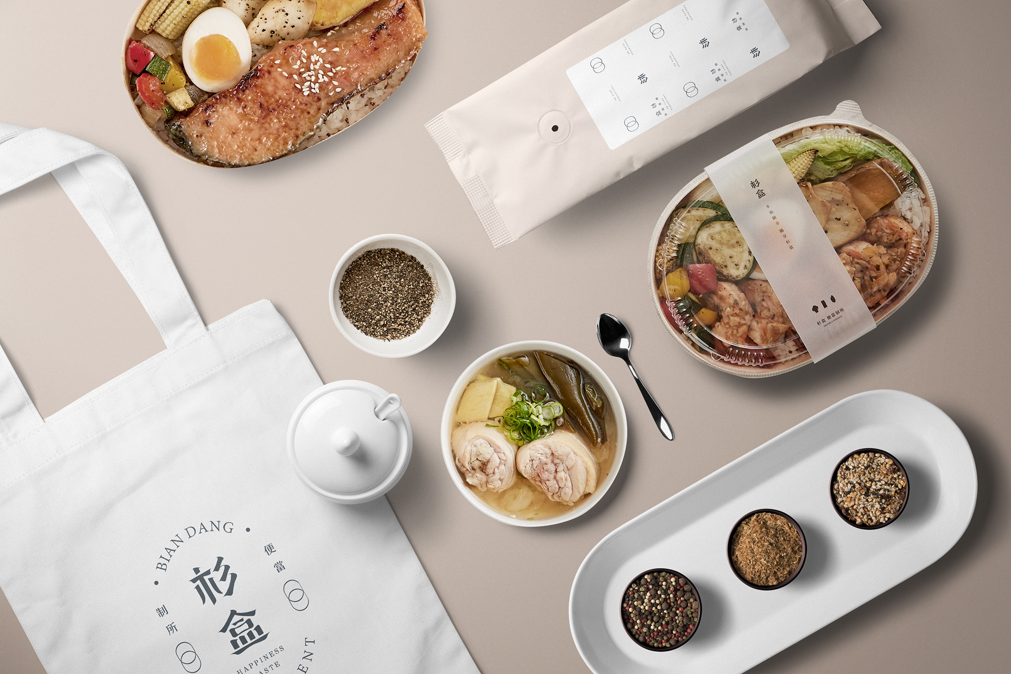
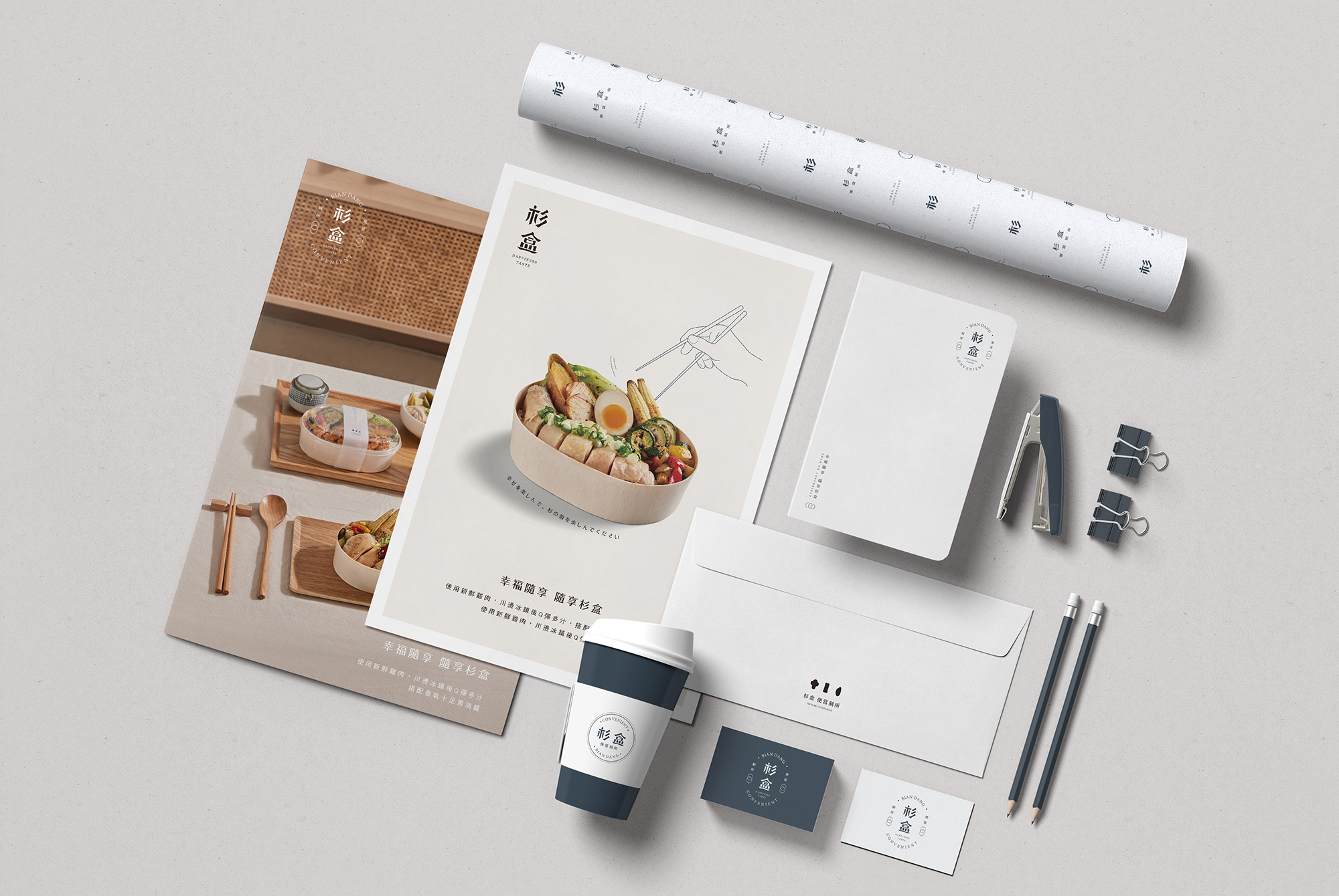
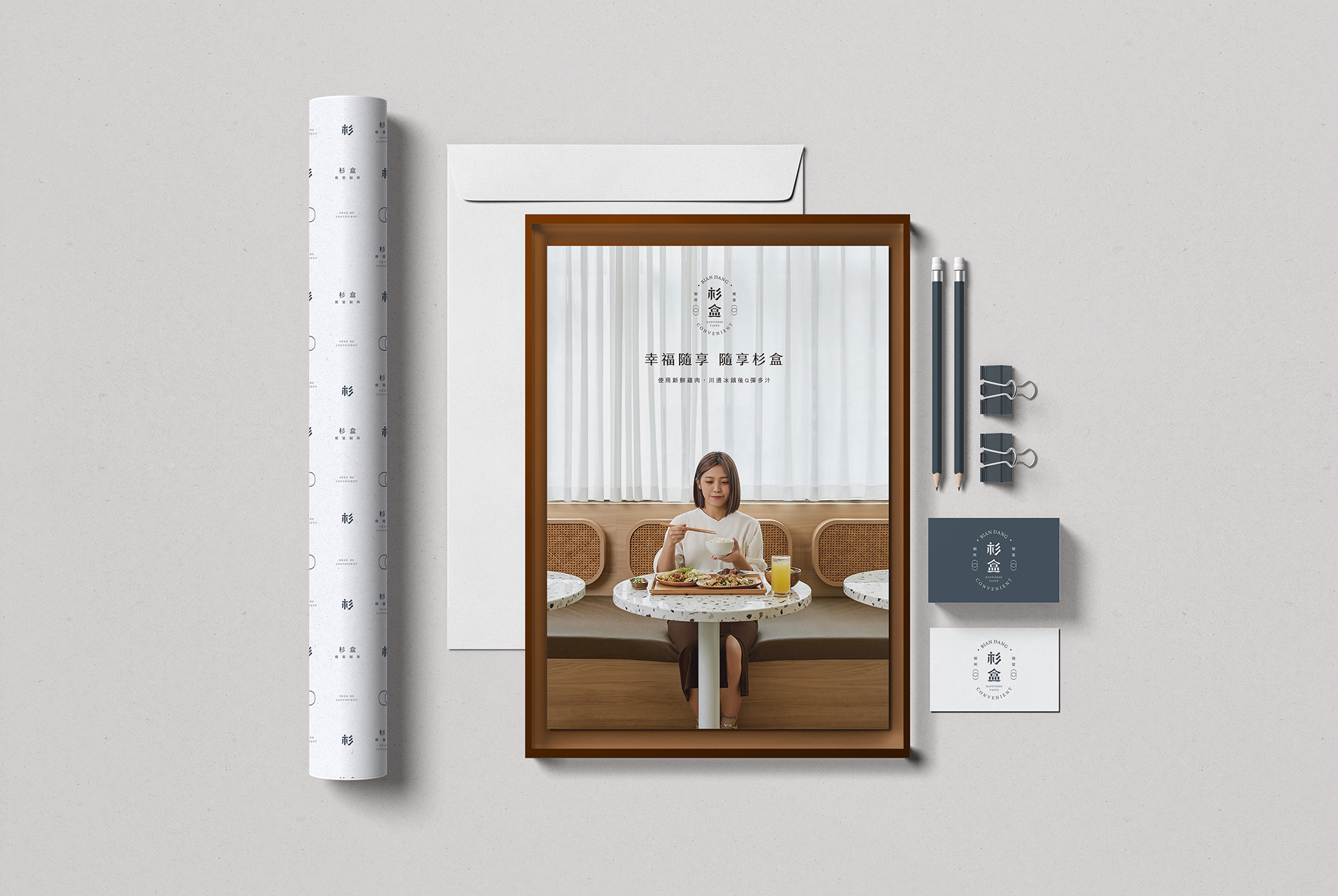
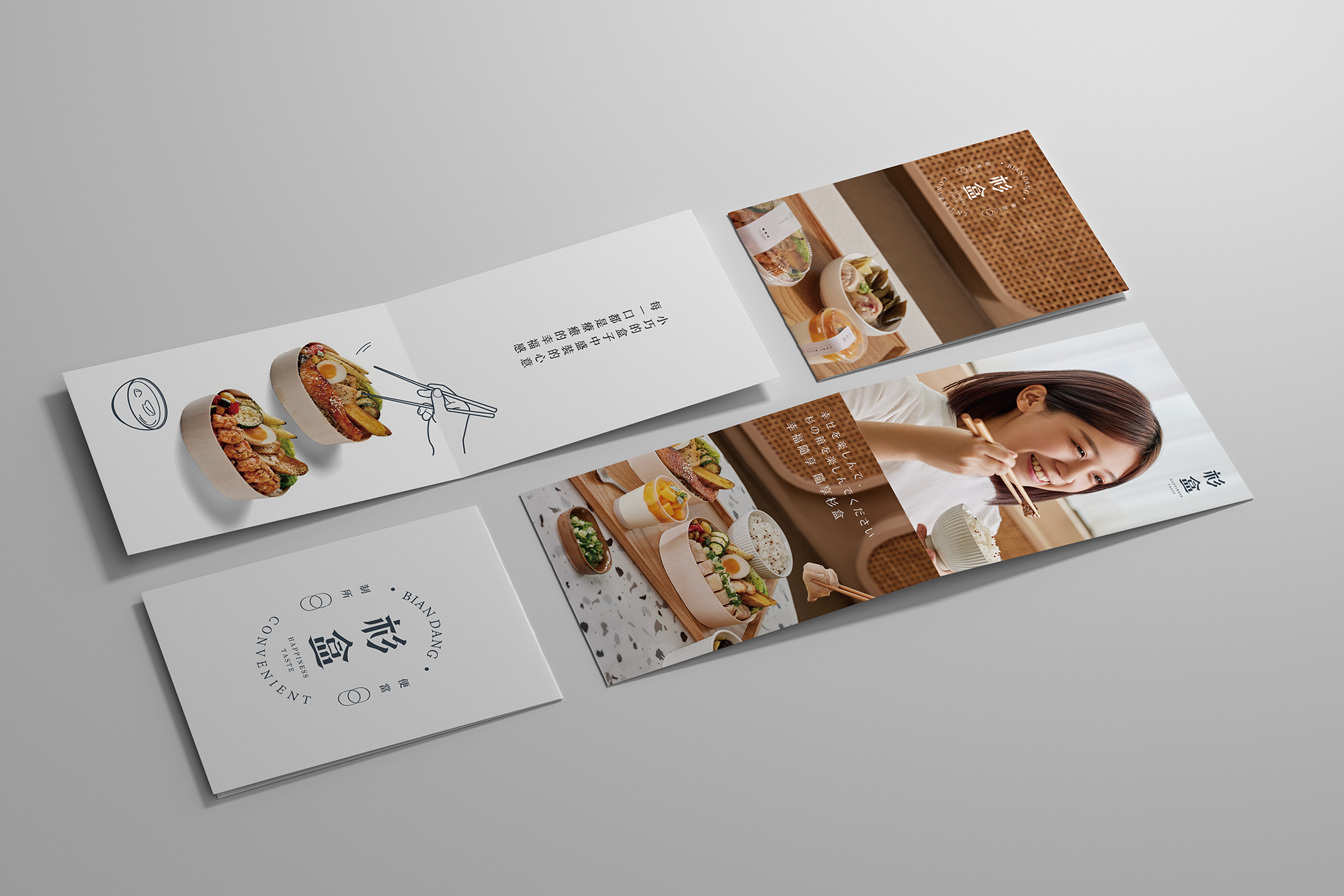
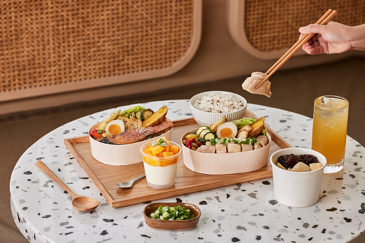
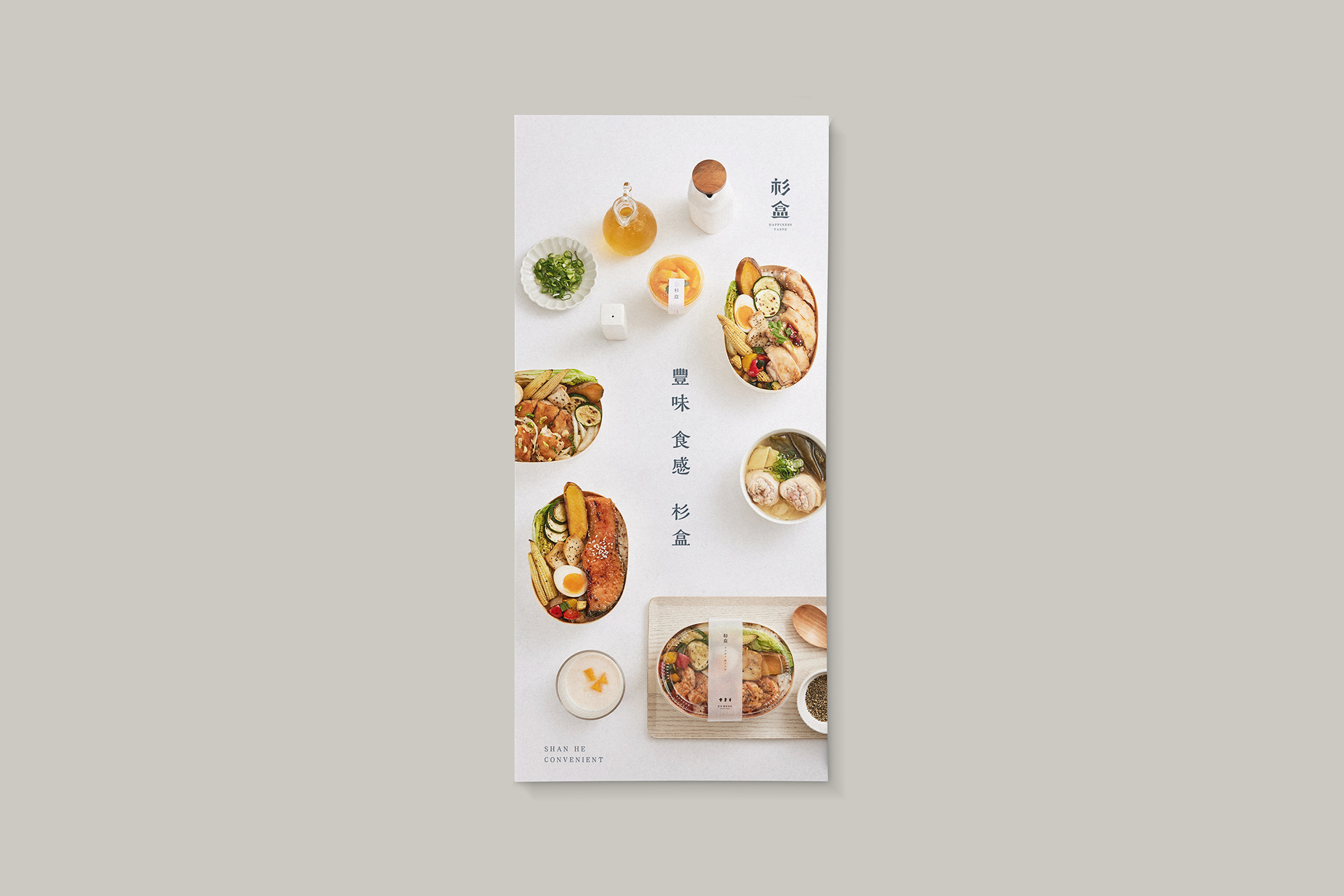
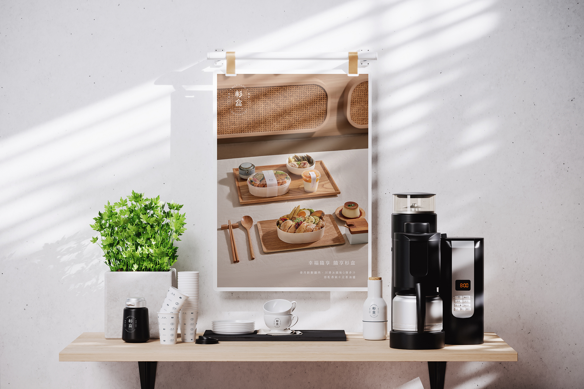
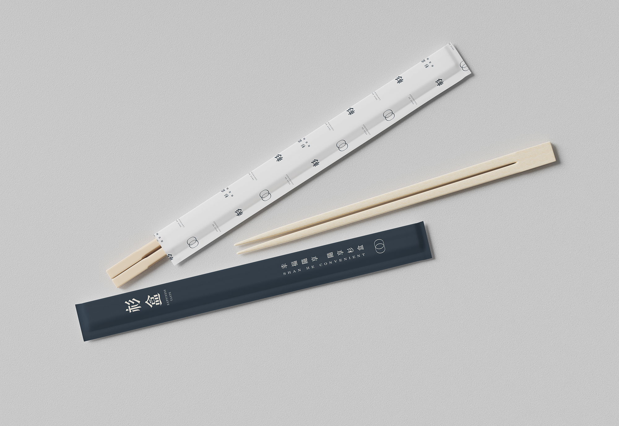
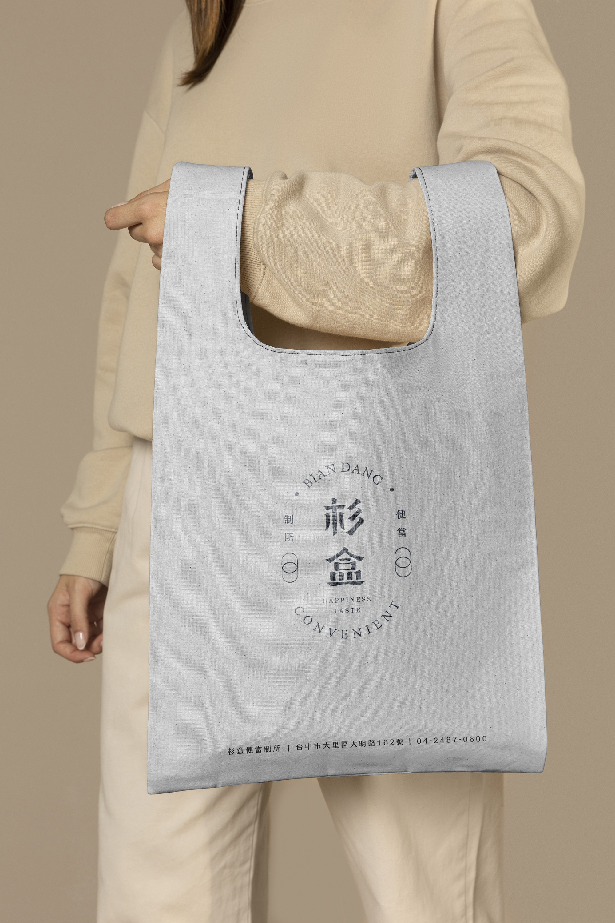
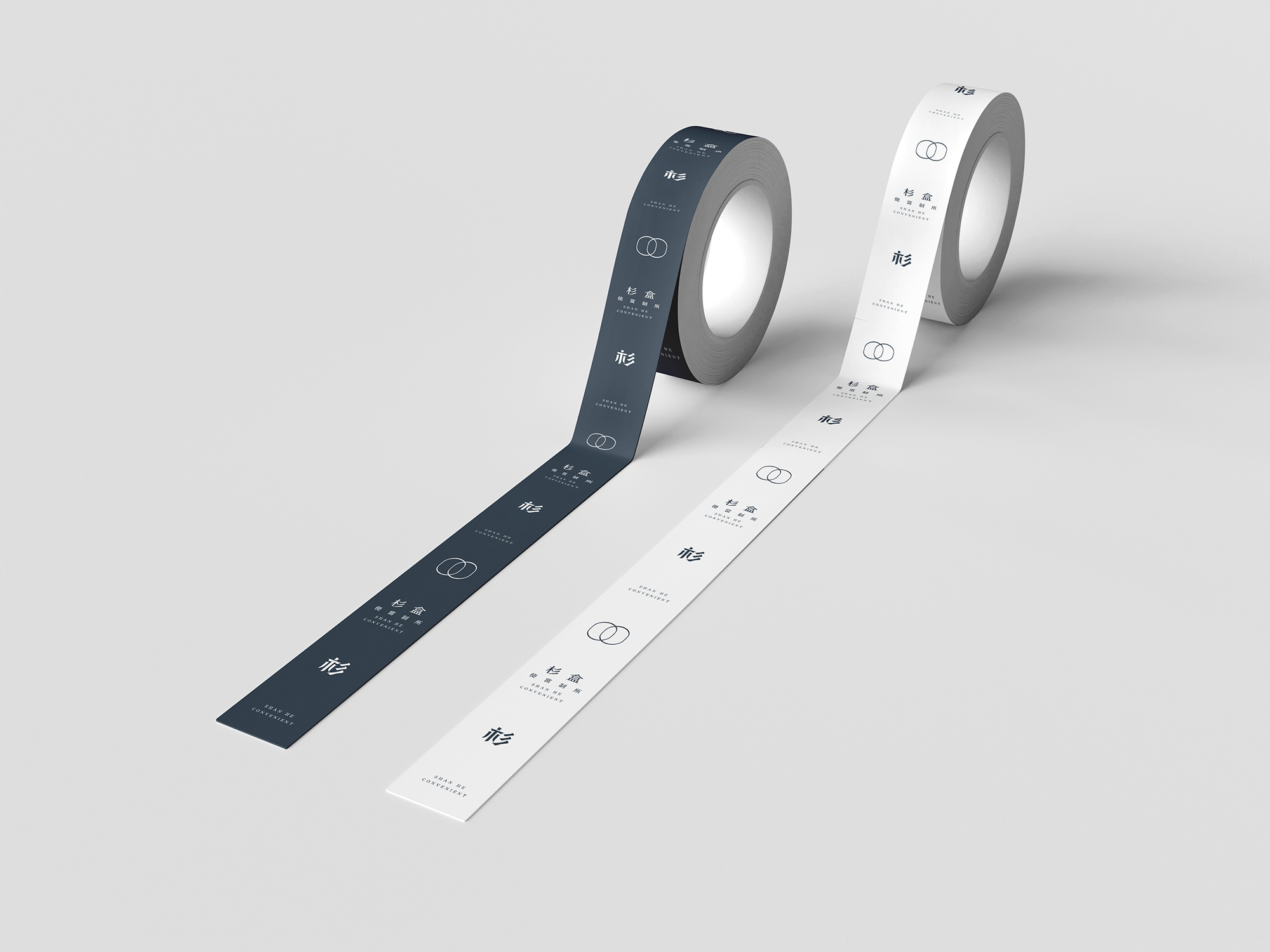
This visual identity serves as the cornerstone of SHANHE, a distinguished bento restaurant brand. The design intricately weaves together natural elements and minimalist aesthetics, embodying the brand's philosophy of "simplicity enriched with meticulous details." Employing minimal lines and judicious white space, the brand logo exudes a sense of understated elegance, strength, and lasting recognition. The logo's color palette, which includes warm Morandi blue and earthy hues reminiscent of cedar wood, not only evokes a feeling of warmth and contentment but also underscores the brand's unique position within the bustling pace of modern life.
The visual design concept of "SHANHE" is centered around the fusion of modern simplicity and artisanal texture, serving as a testament to the brand's unwavering commitment to meticulousness and excellence. The logo draws its primary inspiration from the organic form of cedar wood, the traditional silhouette of a lunch box, and the contours of a food tray, all of which are intended to resonate with the brand's identity at its core, encapsulating its ethos of vibrancy, steadfastness, and enduring quality. To achieve this, the distinctive shape of cedar was artfully transformed into a bespoke font, while the abstracted representation of a traditional lunch box was adopted as a brand icon and logo frame. Additionally, the color palette is derived from natural, understated neutrals, meticulously selected to not only reinforce the brand's wholesome image but also to forge a deeper emotional connection between consumers and the brand's offerings through thoughtful design interventions.
The visual identity of the lunchbox packaging can also be extended to encompass a range of other items such as web platforms, physical signage, menus, business cards, cup holders, and shopping bags. The brand places a strong emphasis on environmental protection and utilizes sustainable materials throughout its operations. For instance, the lunchbox packaging is crafted from biodegradable materials such as eco-friendly pulp and bamboo fiber, and the printing process involves the use of vegetable-based inks, leading to a significant reduction in carbon footprint and harmful chemical emissions.
Credits
Entrant Company
Lingou Li
Category
Corporate Identity - Brand Identity
Country / Region
United States

Entrant Company
SFC Group
Category
Advertising - Advertising Campaign
Country / Region
United States
Entrant Company
Promo TV Globo
Category
Video - Video Remixes / Mashups
Country / Region
Brazil
Entrant Company
Symmetry LLC
Category
Experiential & Immersive - Exhibition Experience
Country / Region
United States