
2024
WANPENG
Entrant
Guangdong YINGSIPAI Brand Planning Co., Ltd.
Category
Corporate Identity - Logos
Client's Name
Gaosheng Future Brand Advisory (Shantou) Co., Ltd.
Country / Region
China
Gallery






About The Entry
The Wanpeng Incubation Base, located in the Tianhe District of Guangzhou, is independently developed and operated by Guangzhou Wanpeng Incubator Investment Management Co., Ltd. It serves as a comprehensive technology enterprise incubator that integrates functions of "entrepreneurial nursery—incubation—acceleration." The base is dedicated to providing comprehensive support for startups, covering all stages from the germination of ideas to the maturity of enterprises, helping them thrive in a competitive market.
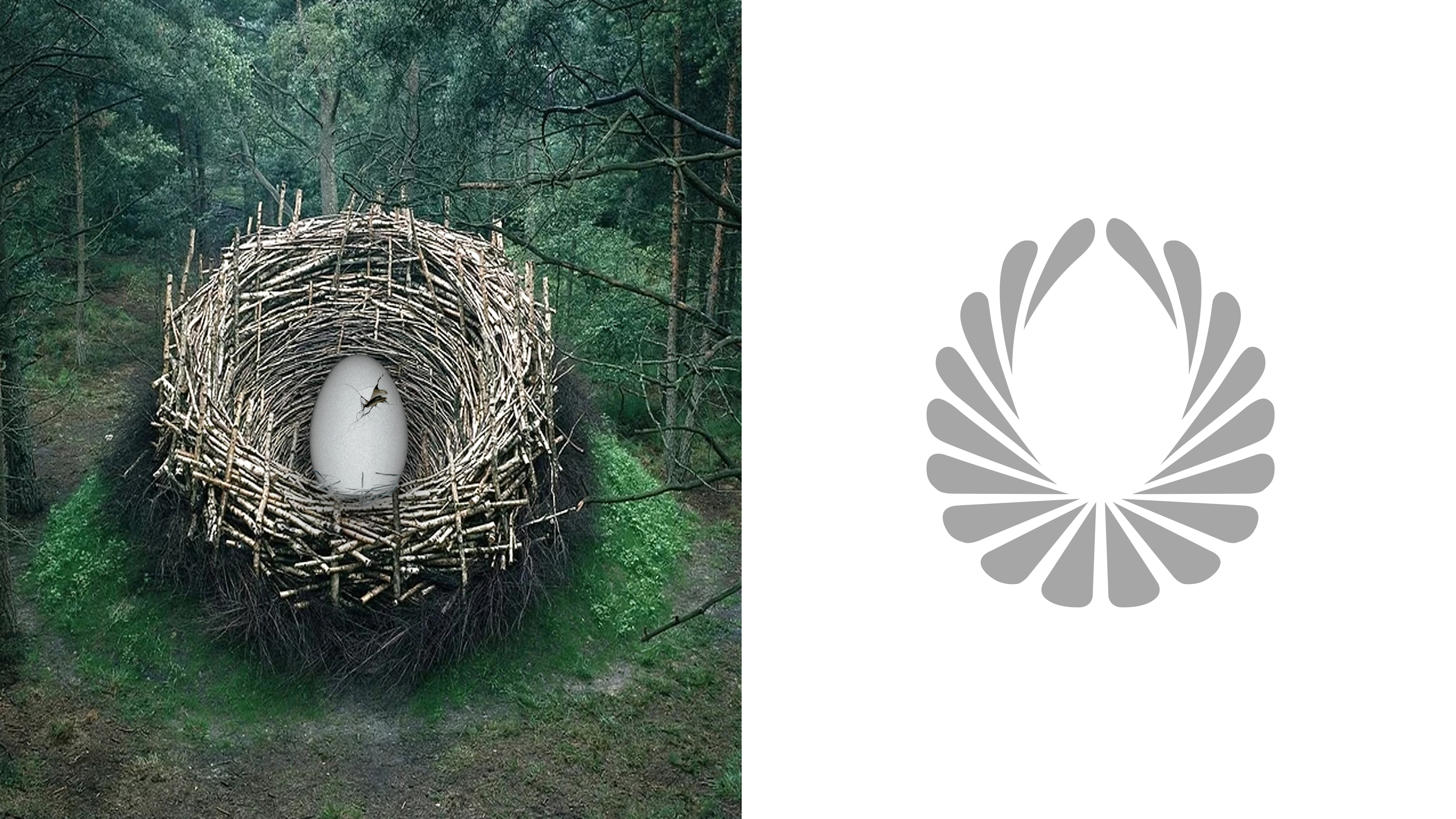
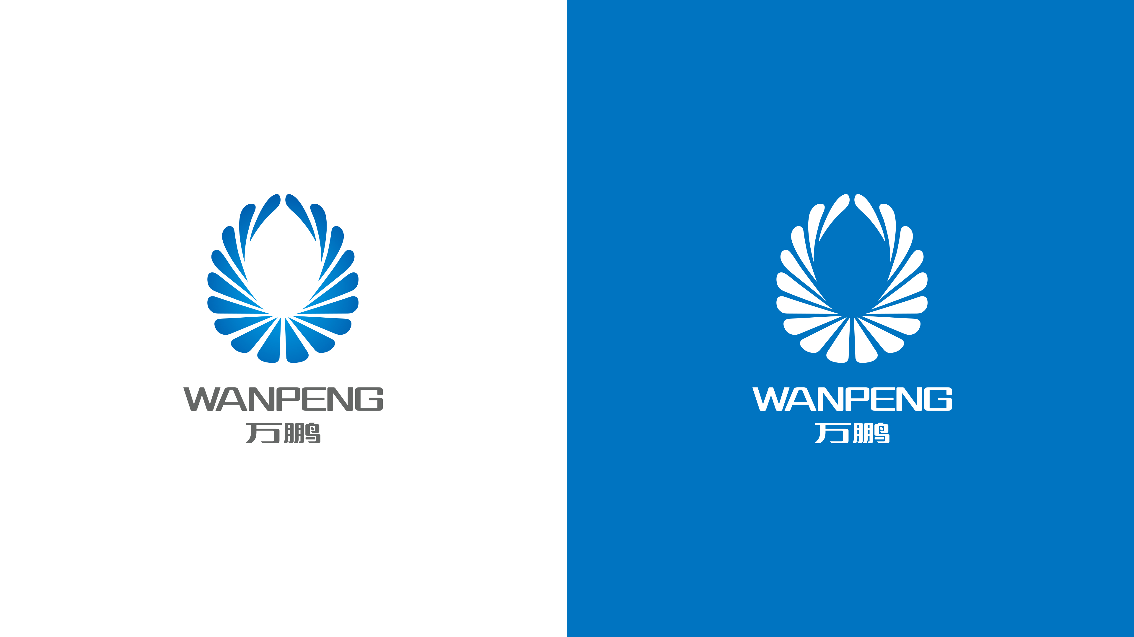
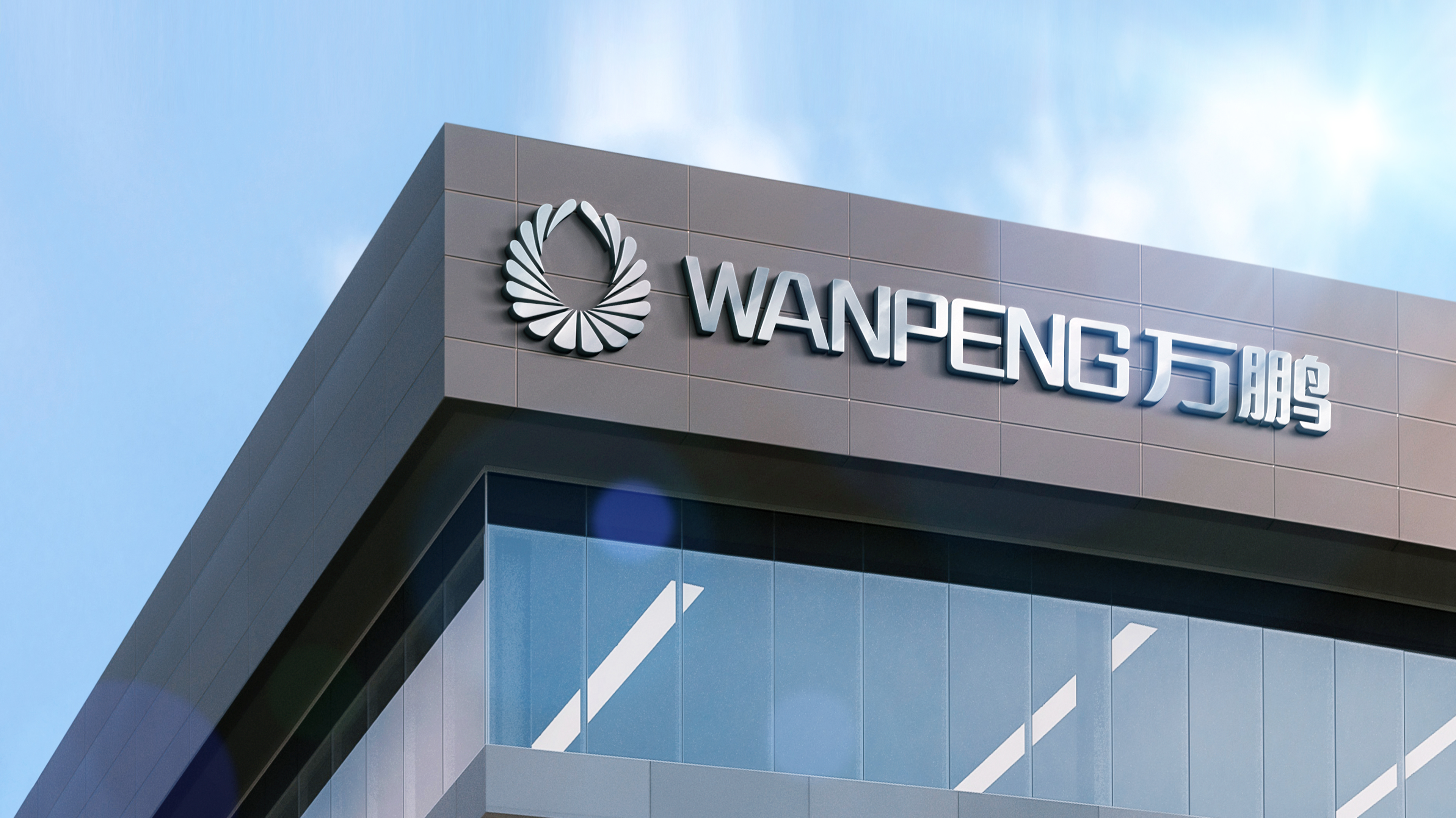
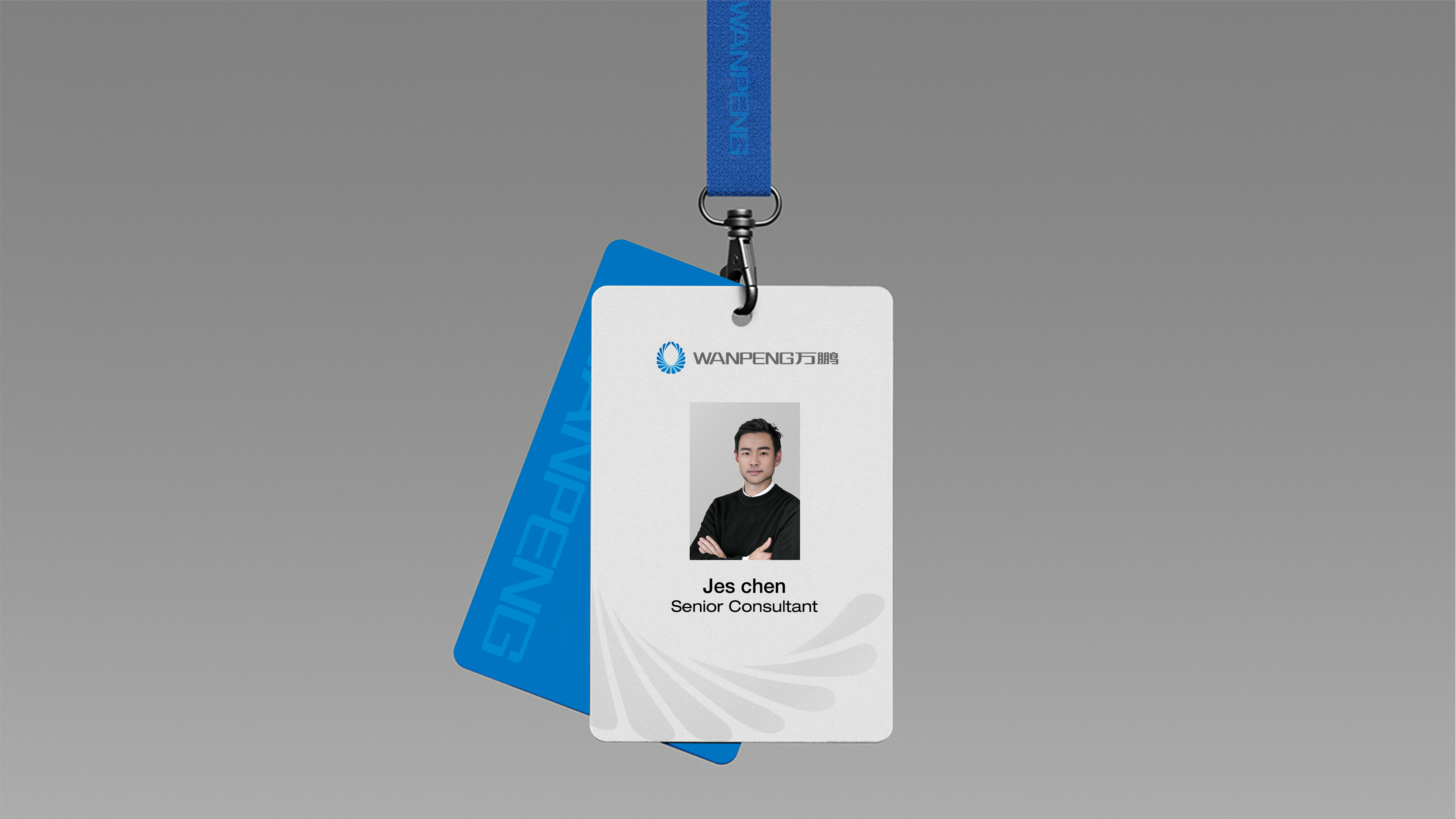
The brand logo design of Wanpeng is distinctive, featuring the visual elements of "the incubating egg" and "the transformed wings," combined with the bilingual "Wanpeng" logo, which carries profound meaning. The name "Wanpeng" is derived from "a thousand miles of soaring," symbolizing broad development prospects and limitless possibilities. The logo uses blue as its primary color, reflecting Wanpeng's professionalism in the technology industry while also conveying a sense of stability and trust.
"The incubating egg" symbolizes the nurturing and inclusive corporate culture for startups, representing our value and support for every innovative idea. "The outspread wings" signify the dreams that incubated enterprises can achieve, reaching new heights and showcasing bright development prospects. The overall logo design is high-minded, with a simple and symmetrical style that highlights the brand's premium image while demonstrating Wanpeng's firm support for technological innovation and enterprise growth.
This logo is not only a manifestation of visual art but also a symbol of Wanpeng Incubation Base's commitment and belief in creating an ideal incubation environment for entrepreneurs. Through professional services and support, Wanpeng Incubation Base is gradually becoming an important force in promoting regional technological innovation and development.
Credits
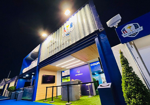
Entrant
George P. Johnson Experience Marketing
Category
Experiential & Immersive - Sponsorship Experience
Country / Region
United States
Entrant
SSBC GmbH - Brand Naming Agency
Category
Corporate Identity - Corporate Identity / Other___
Country / Region
Germany

Entrant
gloria@energyhill.com
Category
Corporate Identity - Corporate Identity / Other___
Country / Region
United States

Entrant
Splendid Communications Ltd
Category
Experiential & Immersive - Experiential & Immersive / Other___
Country / Region
United Kingdom