2025
Smoothly Ingredient Icons
Entrant Company
Freelance
Category
Marketing & Promotional - Icon
Client's Name
Country / Region
United States
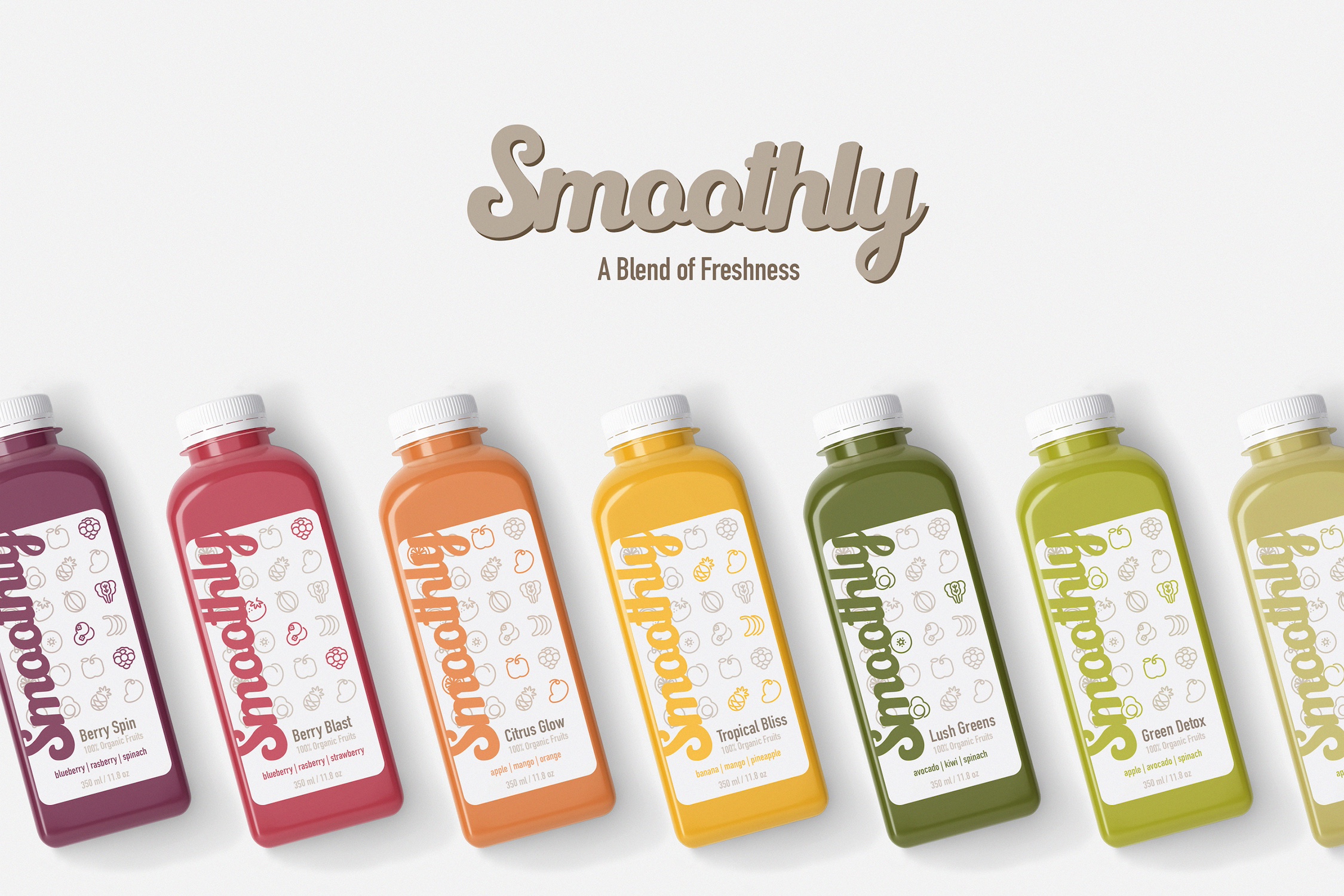
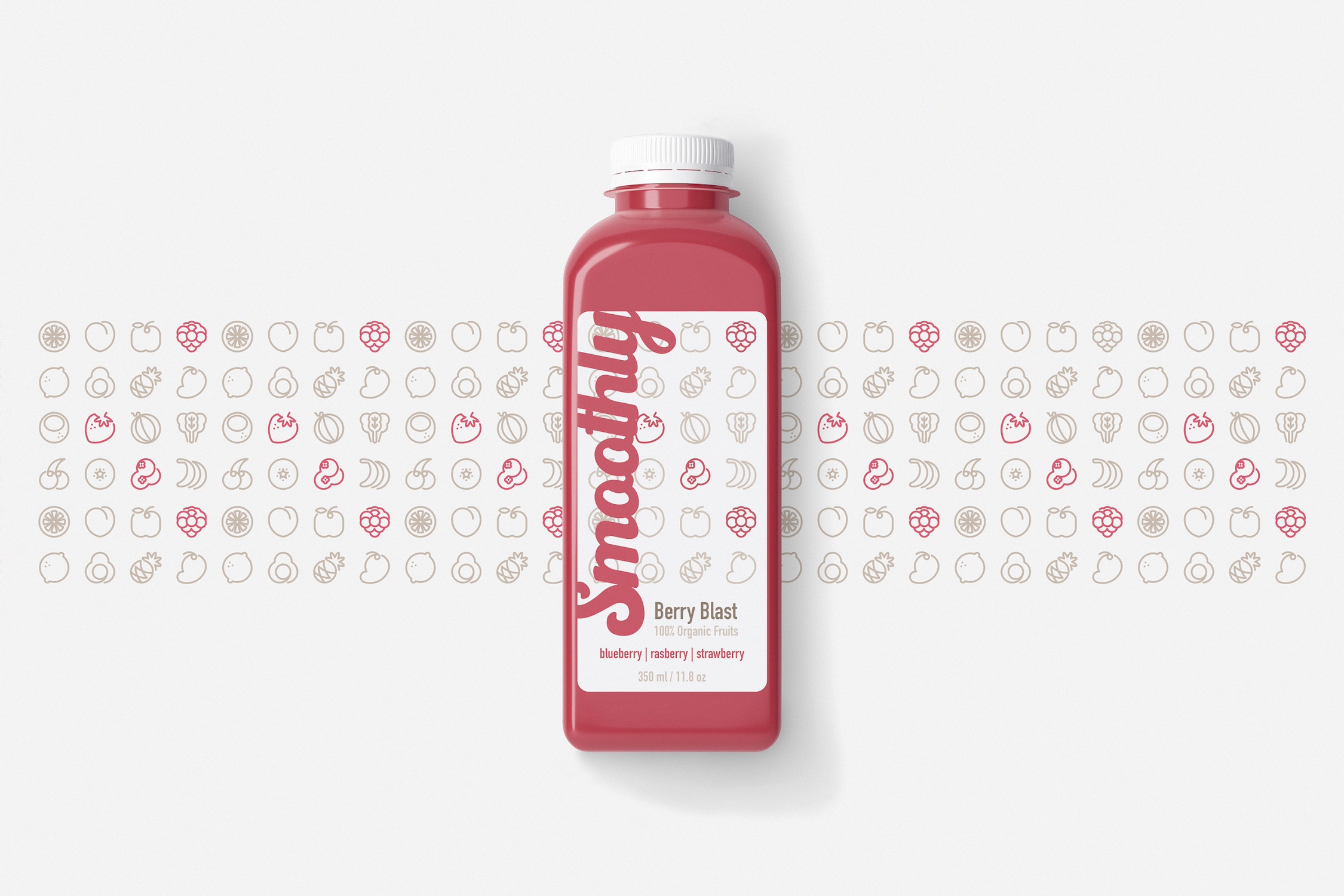
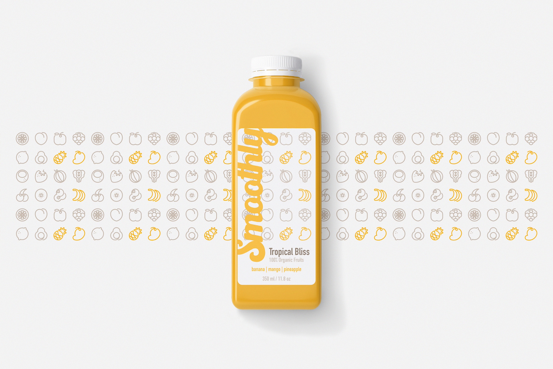
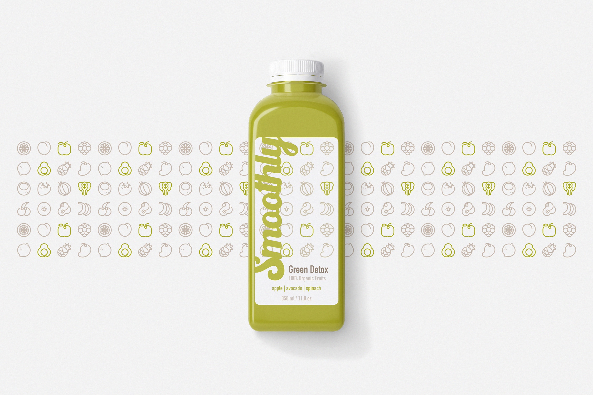
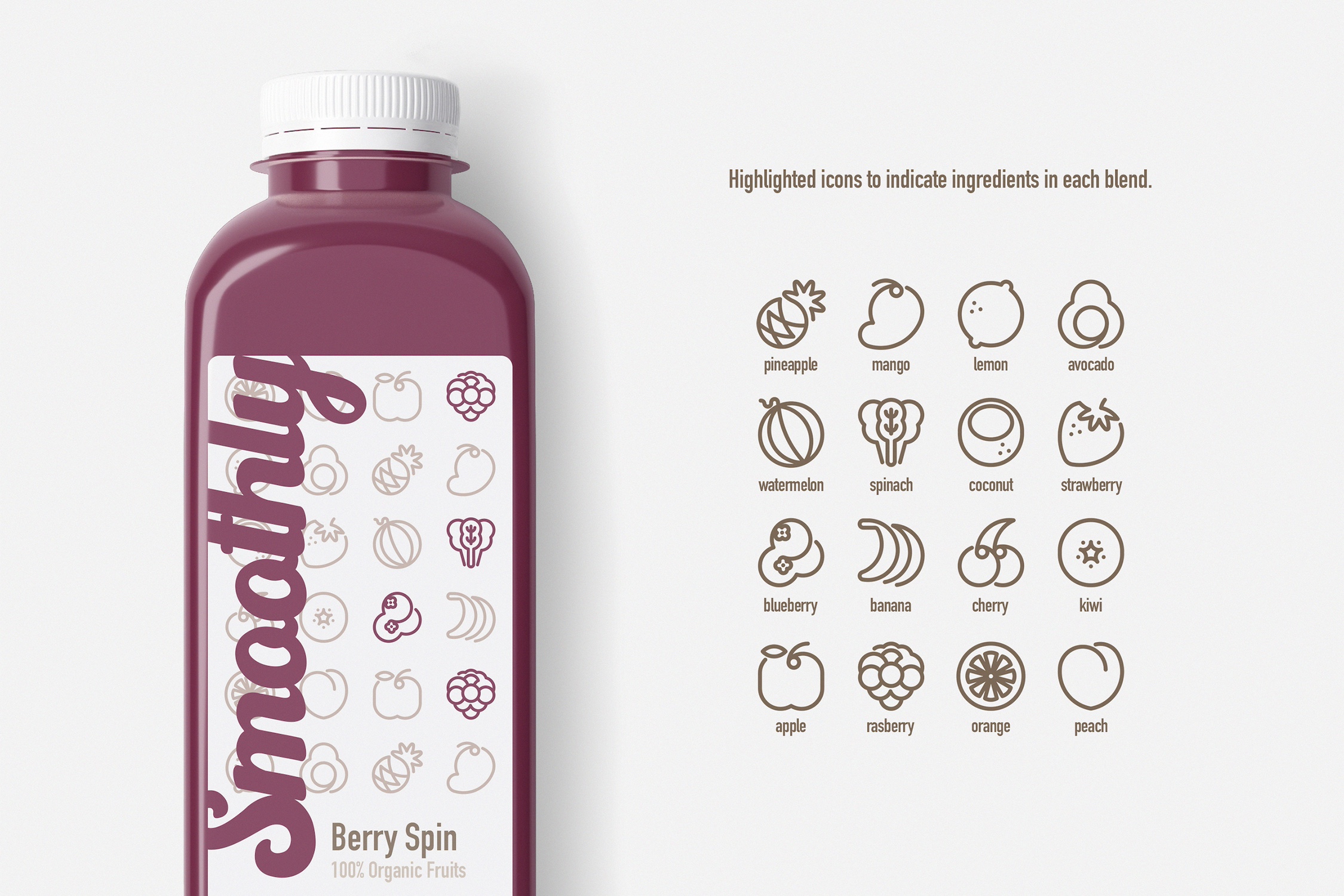
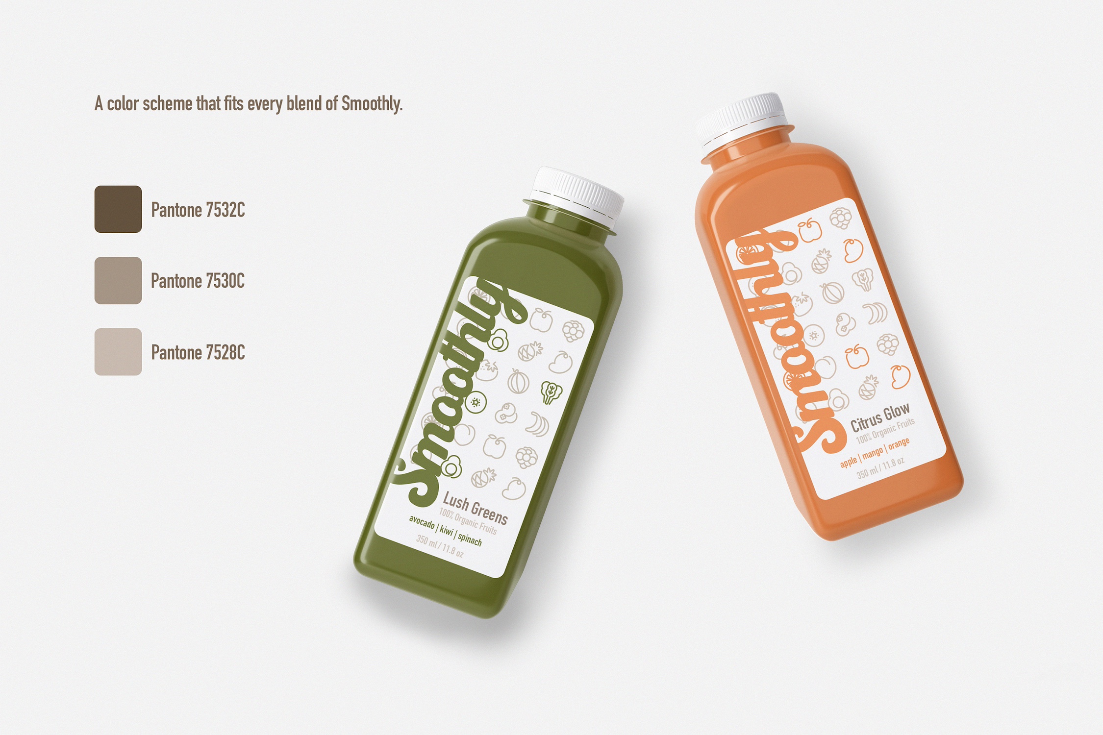
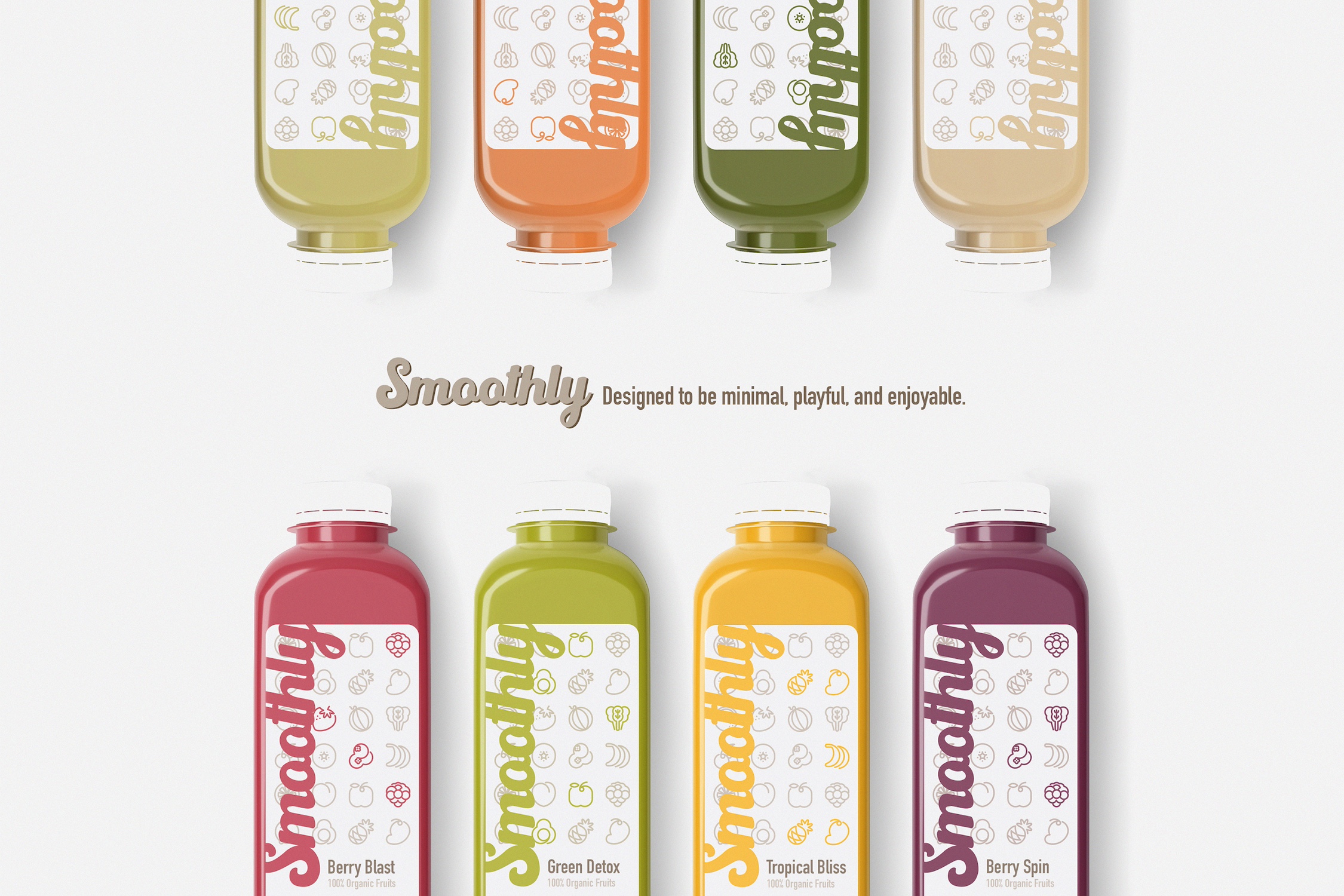
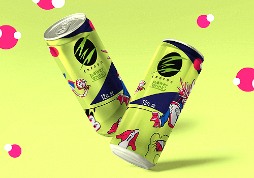
Smoothly is an organic smoothie brand identity designed by multidisciplinary designer Stacey Chen. The branding embraces natural freshness and premium quality through bright, minimalist packaging that accentuates each smoothie’s vibrant, natural hue. Thoughtfully designed fruit icons highlight key ingredients, providing visual clarity and reinforcing the purity of each blend. The Smoothly logo, with its warm, flowing typeface, reflects the brand’s smooth, natural character and commitment to simplicity. This cohesive design invites consumers into a wholesome, health-conscious experience.
Credits
Entrant Company
MIKEADV CORP
Category
Branded Content - Food & Beverage
Country / Region
United States

Entrant Company
University of Southern California
Category
Student Submission - Student Experiential Design (NEW)
Country / Region
United States
Entrant Company
Alpha Creative (M) Sdn. Bhd.
Category
Publication - Annual Report
Country / Region
Malaysia
Entrant Company
Sharon and Guy
Category
Marketing & Promotional - Poster (Single)
Country / Region
United States