2025
Organic Energy Drink brand identity & Logo Design
Entrant
MIKEADV CORP
Category
Branded Content - Food & Beverage
Client's Name
ENERGO
Country / Region
United States
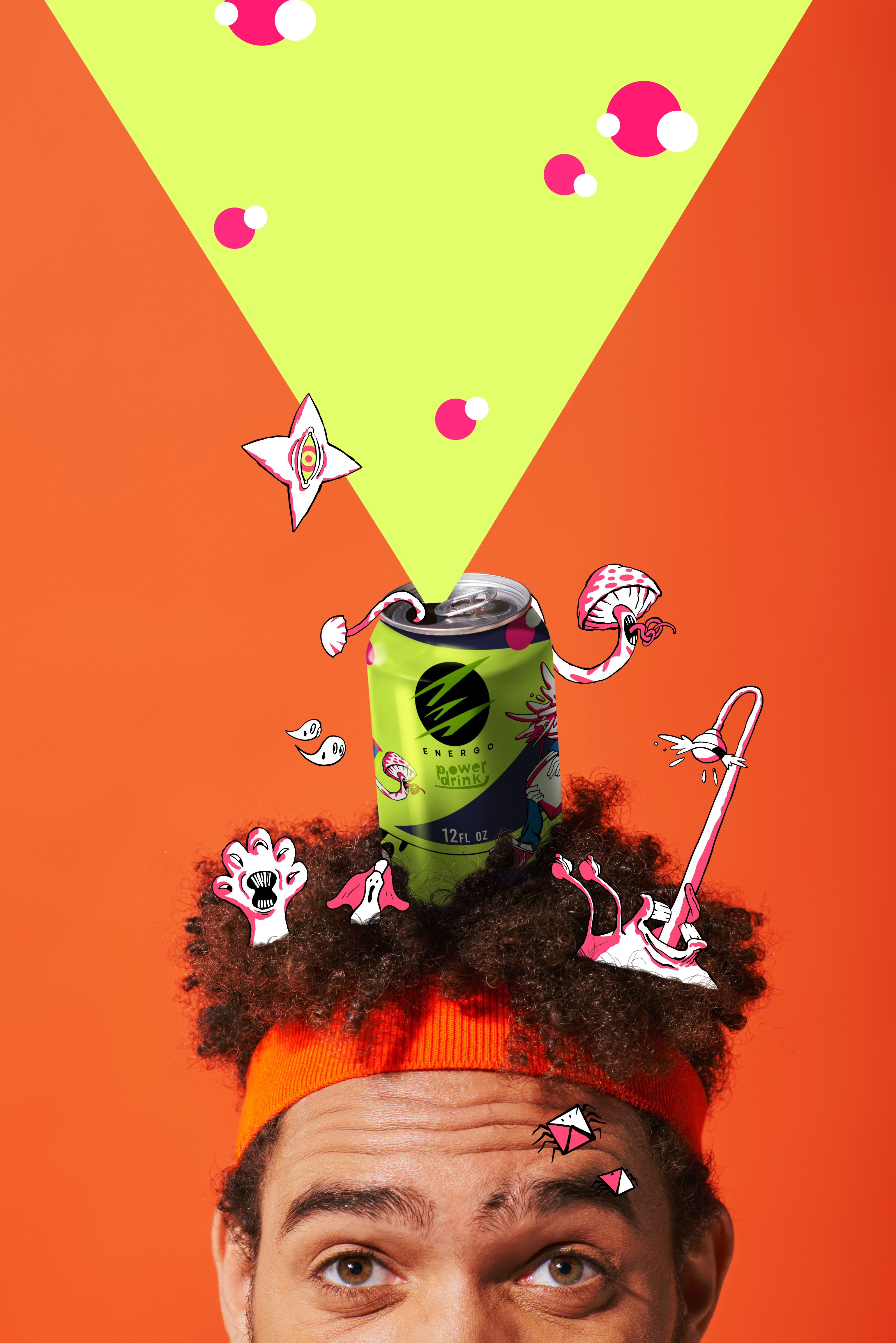
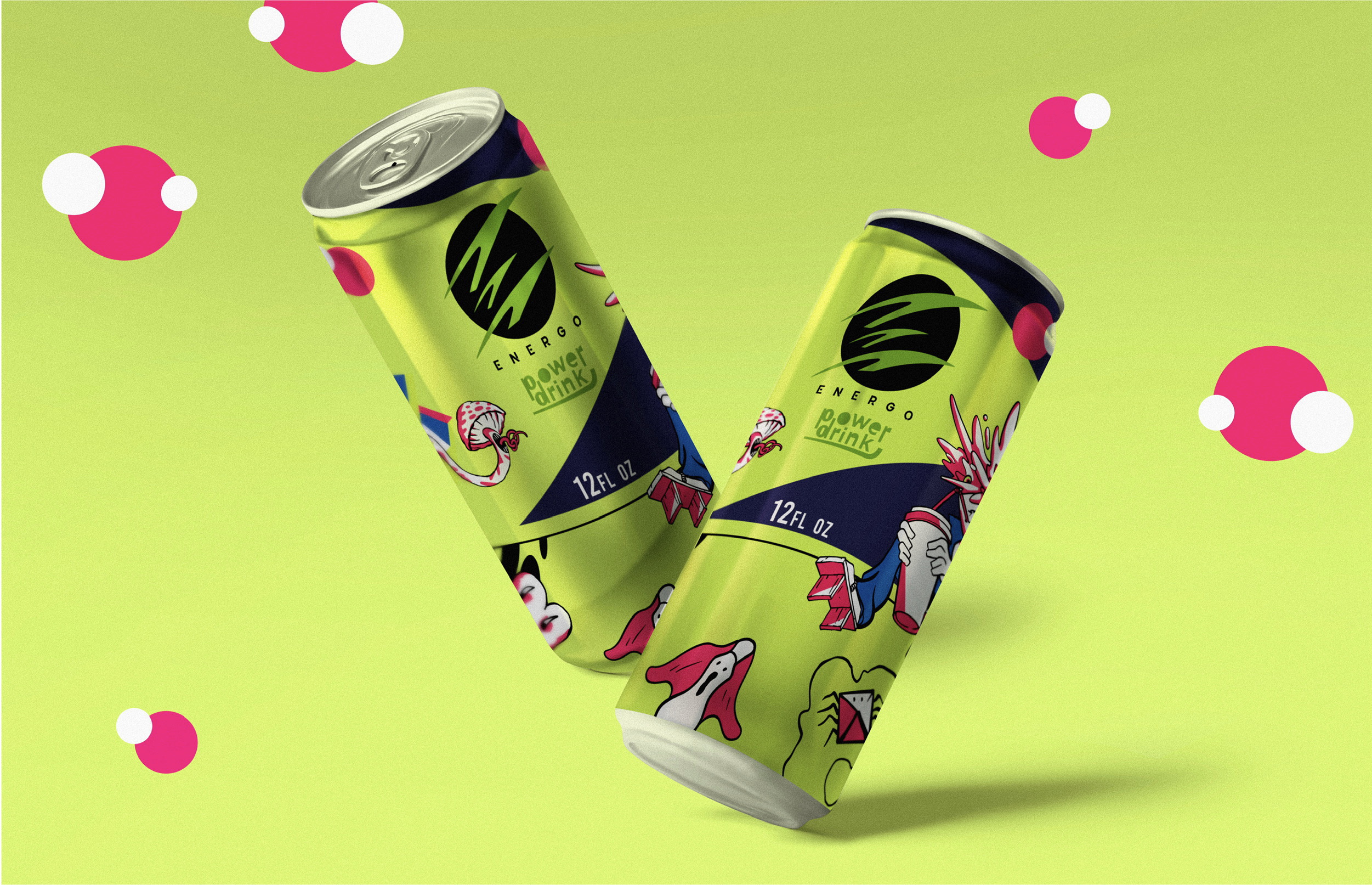
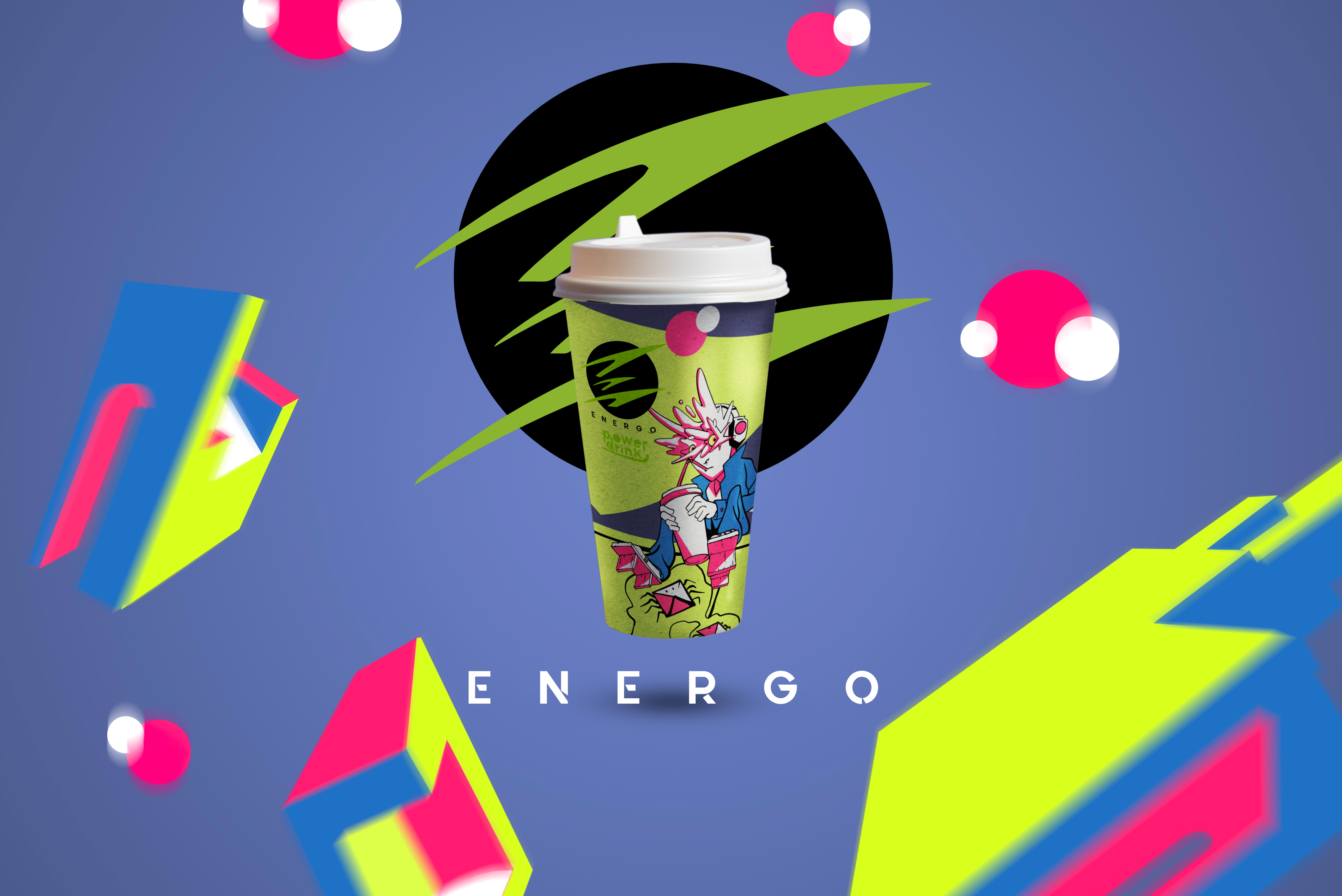
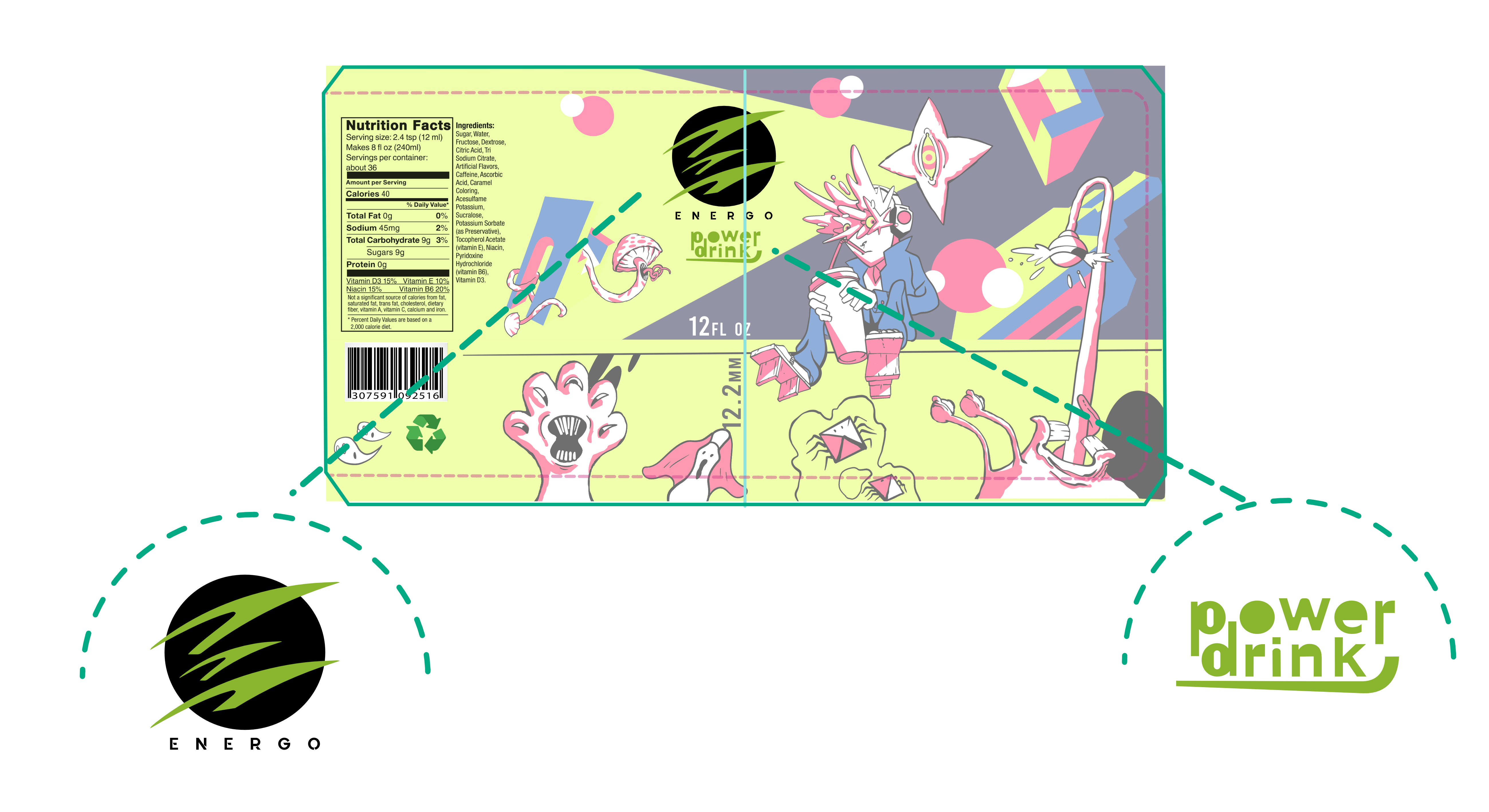
The ENERGO mark is a kinetic E that captures charge, motion, and flow in a single stroke system. Three ascending blades form the letter while suggesting a surge cutting through water. The shape feels fast, clean, and controlled. It reads instantly at shelf and on screen.
Why the E works
Immediate legibility. The silhouette reads as an E at a glance, even at icon size.
Built for motion. Angled terminals and forward bias create natural movement for animation and sports content.
Energy and purity in one form. The blades reference lightning and fluid streams, which ties the brand to clean power and hydration.
Ownable geometry. Repeating angles and spacing establish a proprietary rhythm that can extend into patterns, UI dividers, and packaging accents.
Craft and system
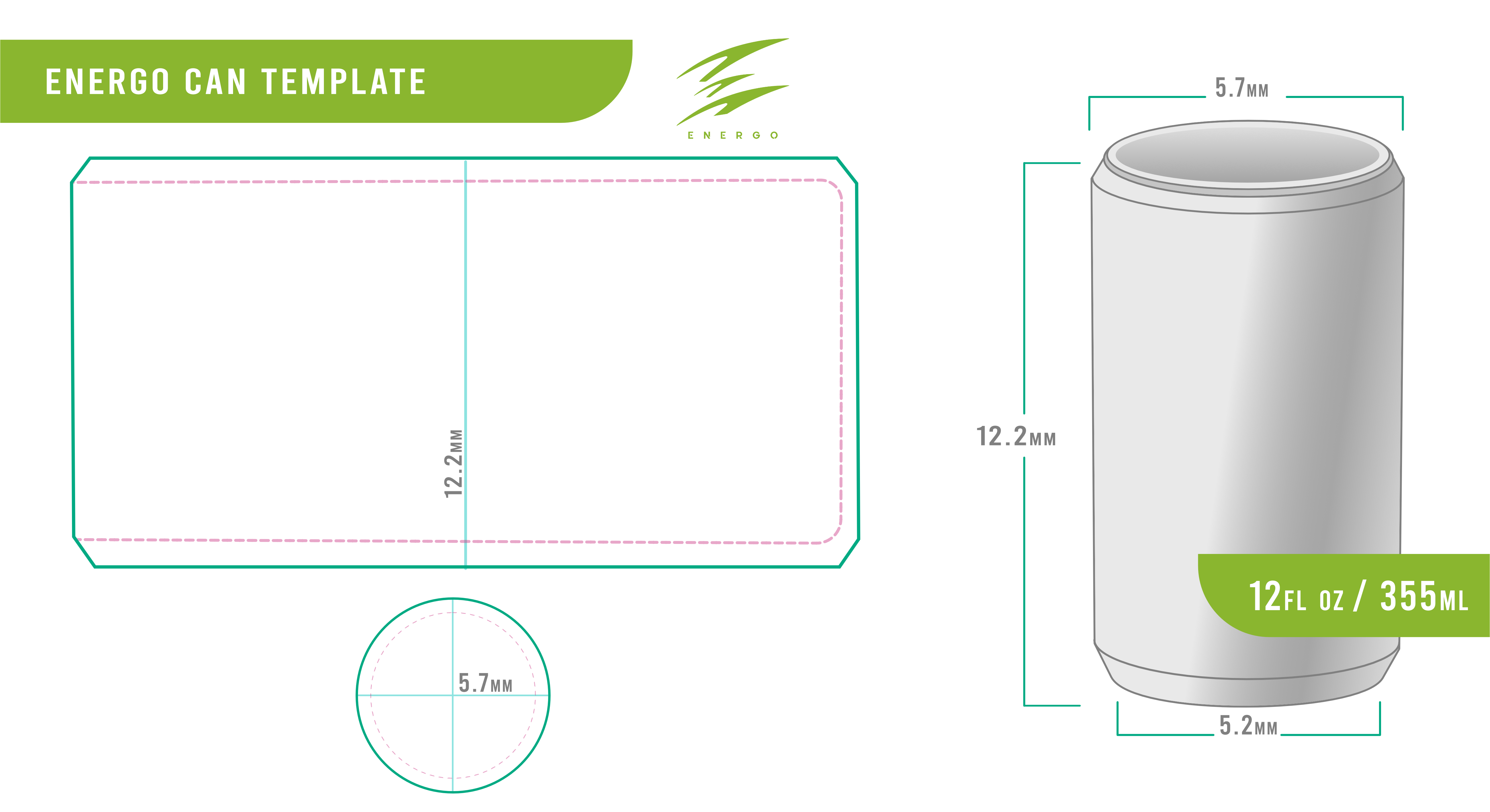
The pictogram sits on a simple geometric grid for precision and repeatability. Strokes taper to maintain clarity in small sizes and to avoid ink gain in print. The form holds in solid, outline, and single-color applications. It embroiders cleanly, foils with crisp edges, and embosses with depth on can bodies and carriers. A stencil cut variant supports laser marking and screen printing where fine counters may fill.
Scalability
From favicon to freeway banner, the mark keeps its voice. On cans, the E locks left or right to create movement around the panel. In digital, the three-blade rhythm becomes a loading pulse and a swipe cue. In motion, the blades separate and rejoin to signal recharge moments between scenes.
Meaning at a glance
E for ENERGO. E for energy. E for efficient. The triple-blade structure says power, purity, and performance with no extra words.
Our role
We at MIKEADV designed the E, engineered the grid, and built the visual system that grows from it. The guidelines detail spacing, angle rules, animation cues, and finish options for packaging and retail.
Philosophy. Build the brand. Build the business.
A strong pictogram is a multiplier. The E creates instant recognition, accelerates merchandising, and shortens the path from first look to first purchase. Clean, confident, and ready to move.
Credits

Entrant
Tom, Dick & Harry Creative
Category
Advertising - Magazine Ad (Single)
Country / Region
United States

Entrant
Yuan Ze University
Category
Student Submission - Student Conceptual Design
Country / Region
Taiwan

Entrant
Heritage Commission
Category
Event - Cultural
Country / Region
Saudi Arabia

Entrant
AARP Brand Creative Services
Category
Marketing & Promotional - Brochure
Country / Region
United States