
2025
Greentown Jinlu Real Estate Project Poster Visual Design
Entrant Company
Beijing Parallel Advertising Co.. LTD
Category
Typography - Poster
Client's Name
Country / Region
China
This series of posters combines modern art with traditional culture. The creative process involves meticulous hand-drawing as well as iterative experimentation with design software for element refinement, layering, and color schemes. These efforts enrich the visual impact, while the fusion of cold and warm tones exemplifies a remarkable originality and spirit of innovation.
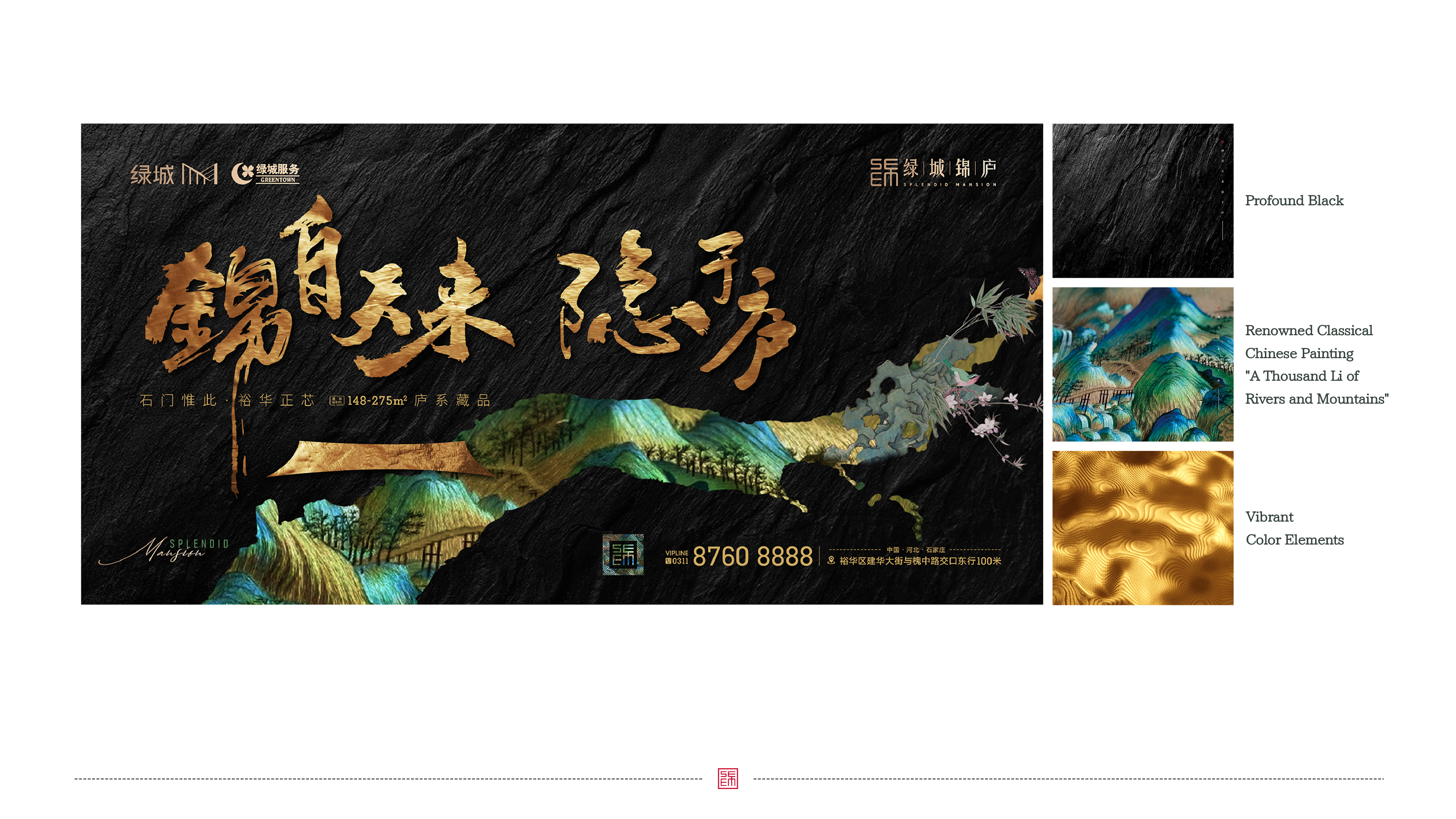
Dominated by the profound black, the primary poster features the renowned classical Chinese painting "A Thousand Li of Rivers and Mountains" as its background, blending with the essence of traditional culture. The strategic placement of vibrant color elements against profound black creates a notable visual contrast, significantly amplifying the sense of three-dimensionality. The design incorporates irregular strokes that echo the landscape features of the painting, alongside the seamless integration of structured eave patterns. This strikes a harmonious balance between vigor and grace, resulting in a visually rich and well-defined layered composition.
Regarding typographical layout, the poster combines modern fonts with striking calligraphic styles known for their powerful visual appeal. Based on a design methodology that emphasizes "rhythm and variation", the typography achieves a dynamic equilibrium to effectively mitigate visual exhaustion.
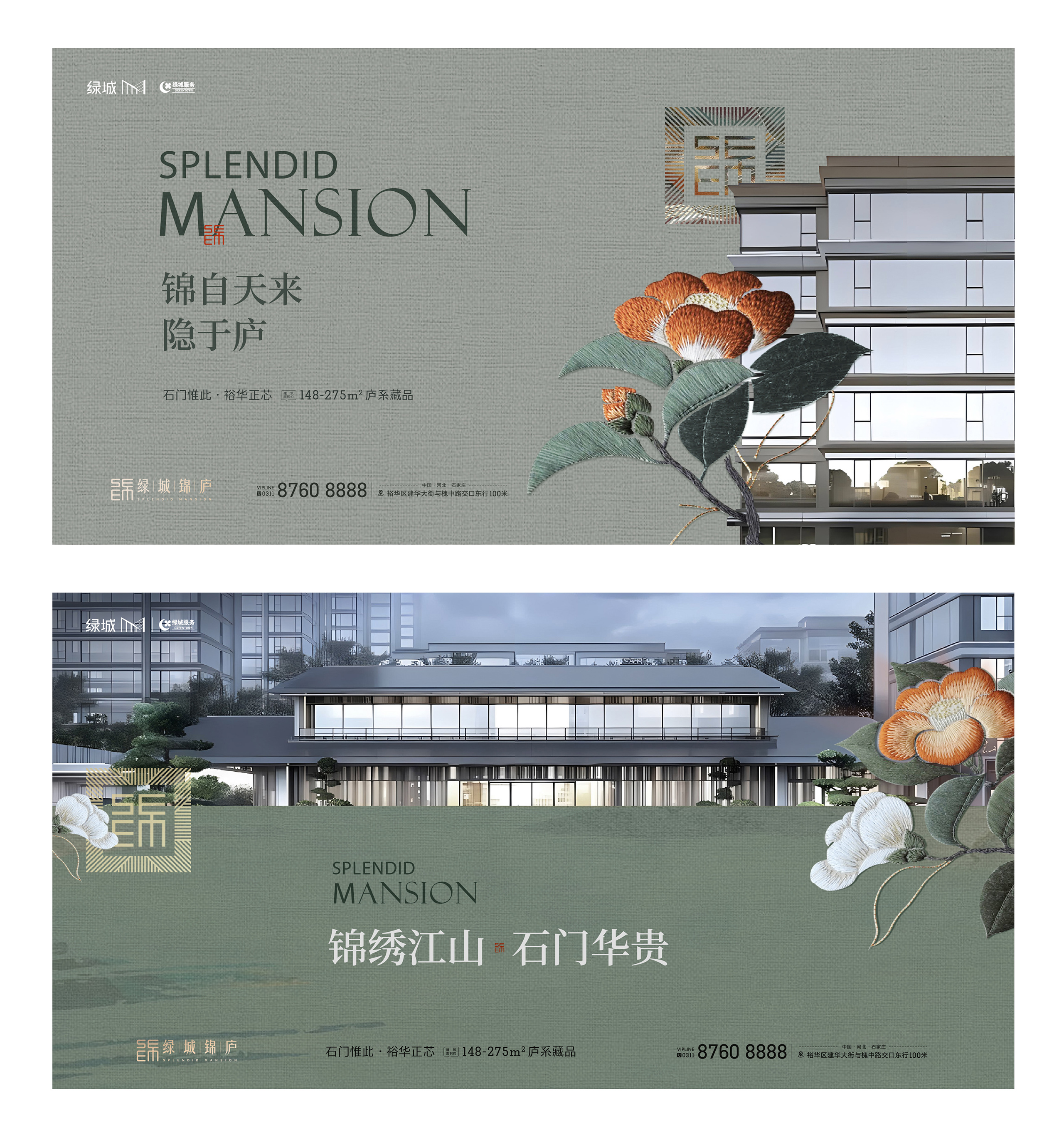
The project poster masterfully integrates the project facade with brocade details, employing a subtle fabric texture in the background to imbue the visual with a tactile dimension. Amidst the muted tones, vibrant embroidery motifs emerge with striking prominence, evoking "a single red flower in the midst of thick foliage." This contrast enriches the image's depth and amplifies its visual impact.
The posters for offline events maintain the visual identity from the primary poster while introducing innovative elements. Traditional Chinese brocade patterns and dynamic typography craft a perfect union of modern art and Chinese culture.
The design of promotional materials builds upon the visual narrative, enhancing the image's intricacy and depth through the incorporation of brocade textures, embroidery details, project facades, and creative derivatives inspired by the Chinese character "Jin". This ensures that the series is more a medium for cultural preservation and the conveyance of brand values than a captivating visual display.


Credits

Entrant Company
Fang Nan
Category
Mobile App - New Category
Country / Region
United States

Entrant Company
None
Category
Typography - Personal Work / Unpublished
Country / Region
Taiwan
Entrant Company
Freelance
Category
Video - Animation
Country / Region
United States
Entrant Company
Hibou Studio
Category
Corporate Identity - Brand Identity
Country / Region
United Kingdom