2025
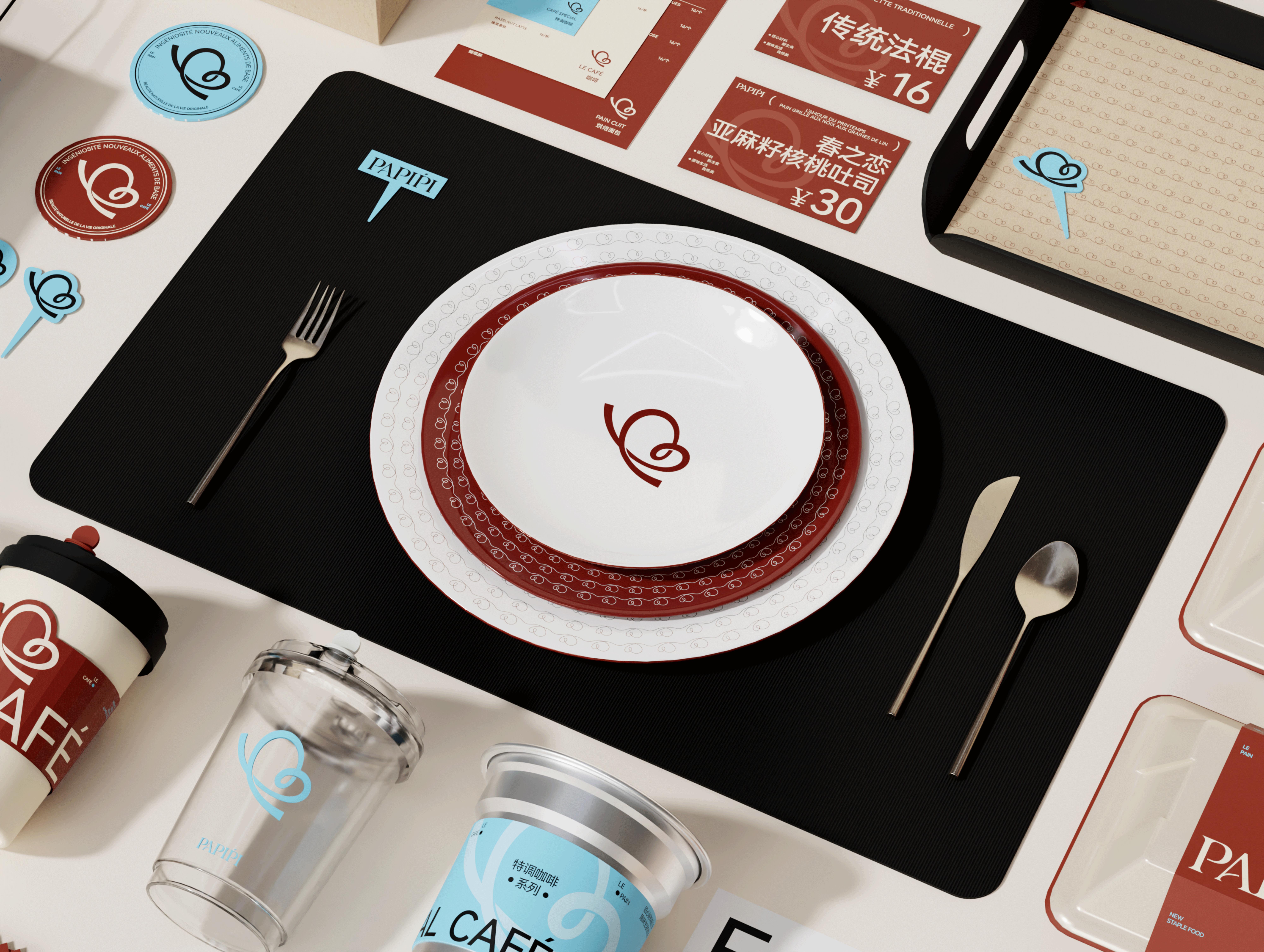
PAPIPI bakery brand design
Entrant Company
MonaSu(Nagongzi)
Category
Corporate Identity - Brand Identity
Client's Name
Changzhou You see home technology Co., LTD
Country / Region
China
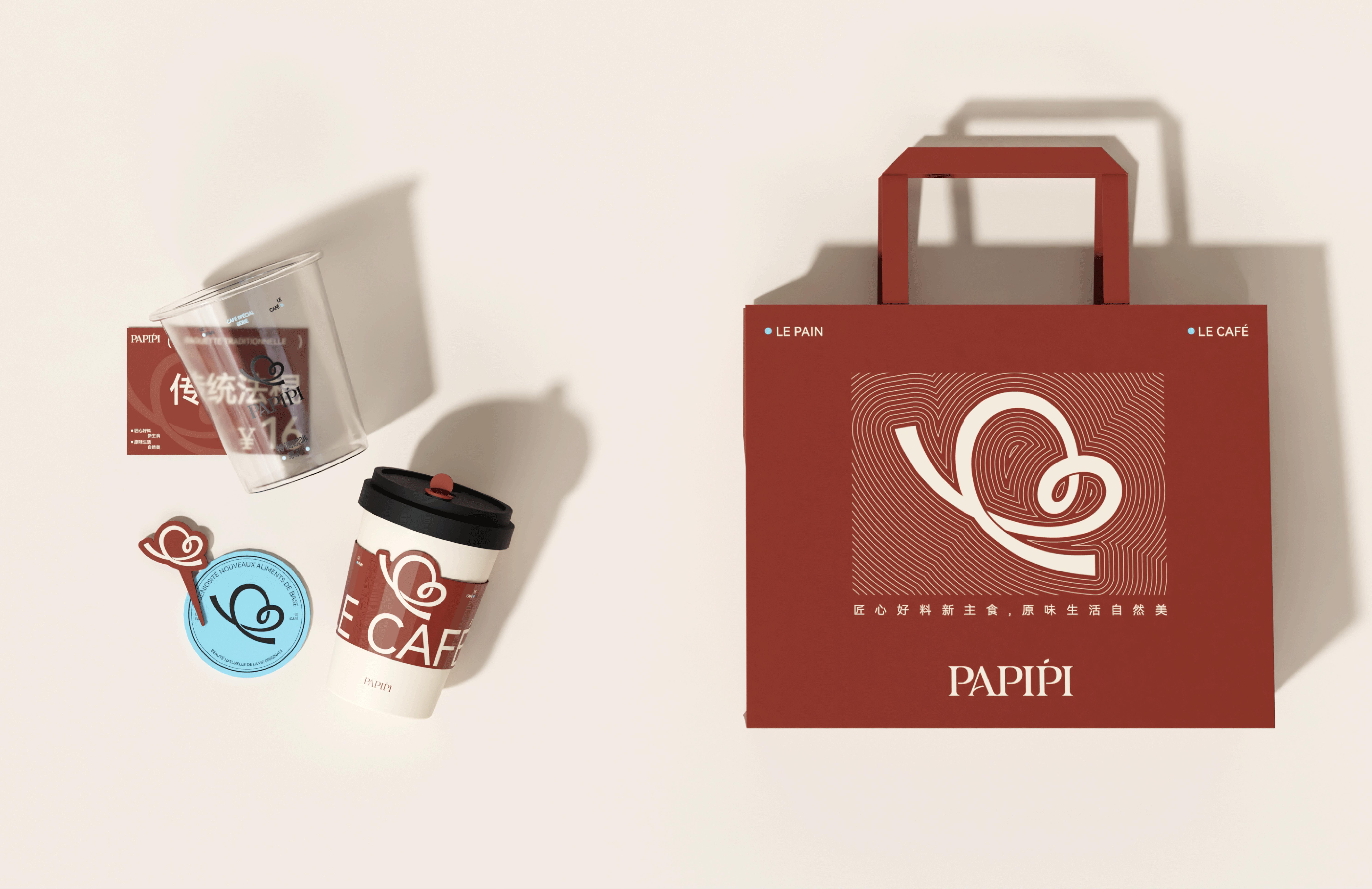
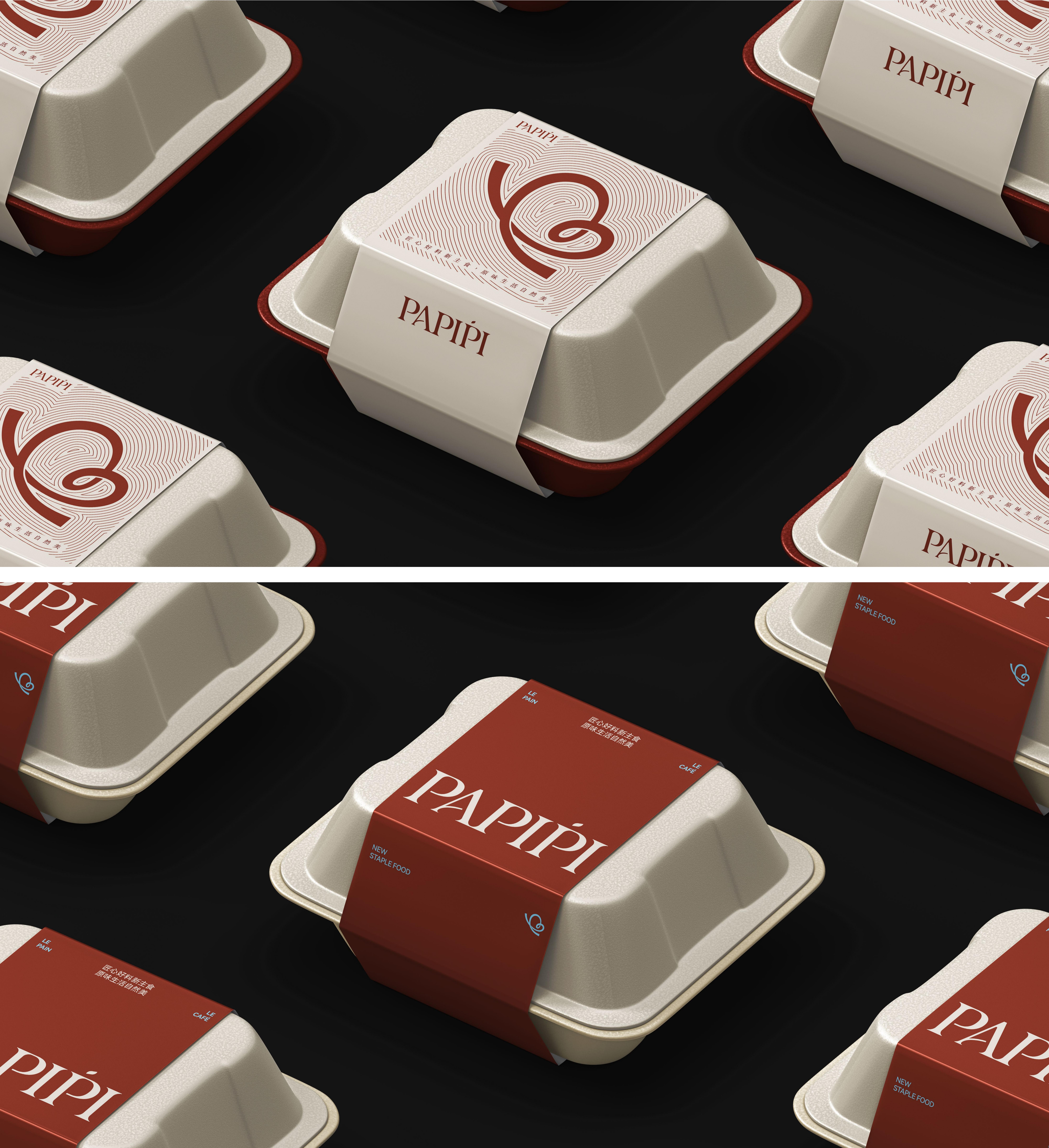
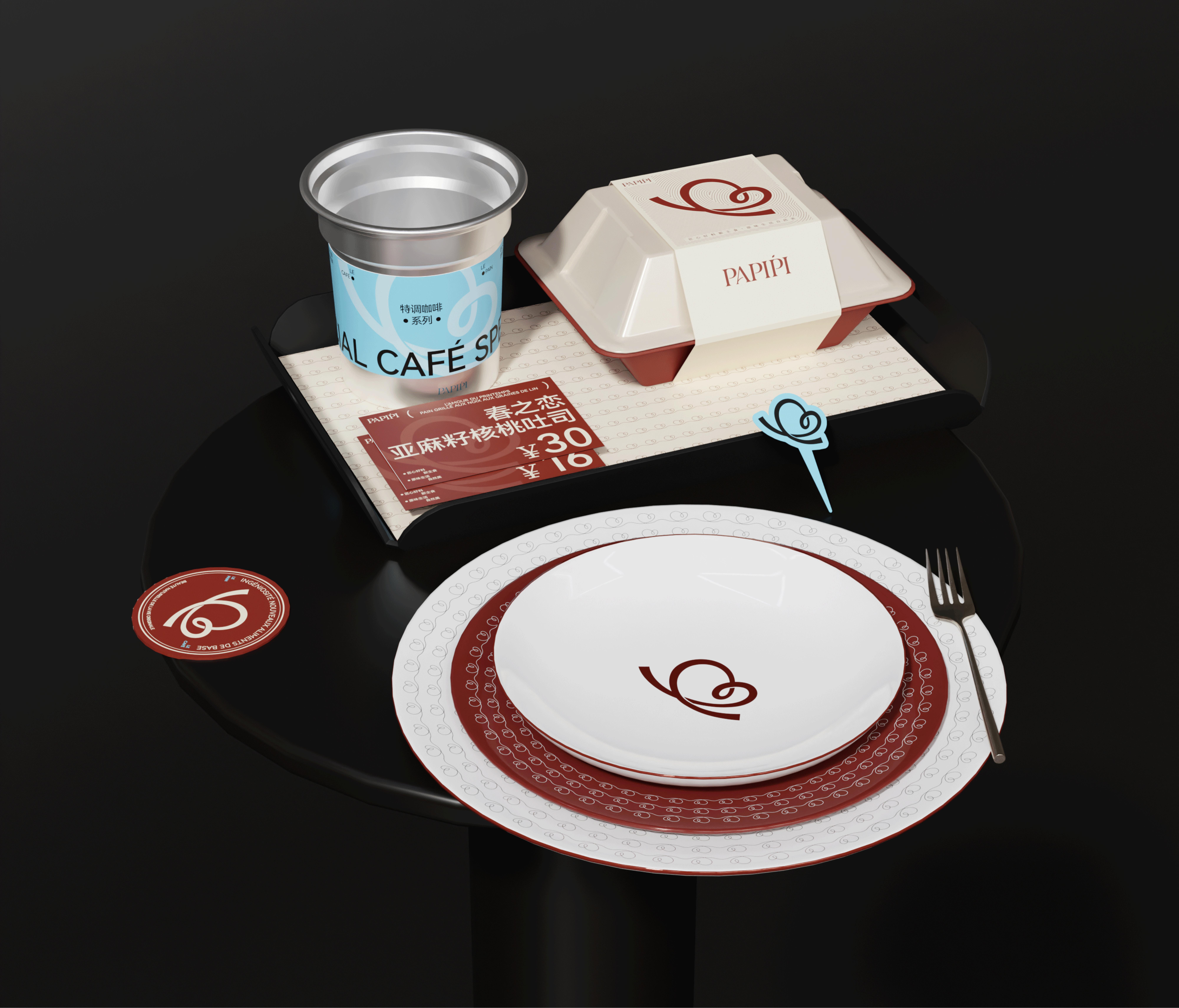
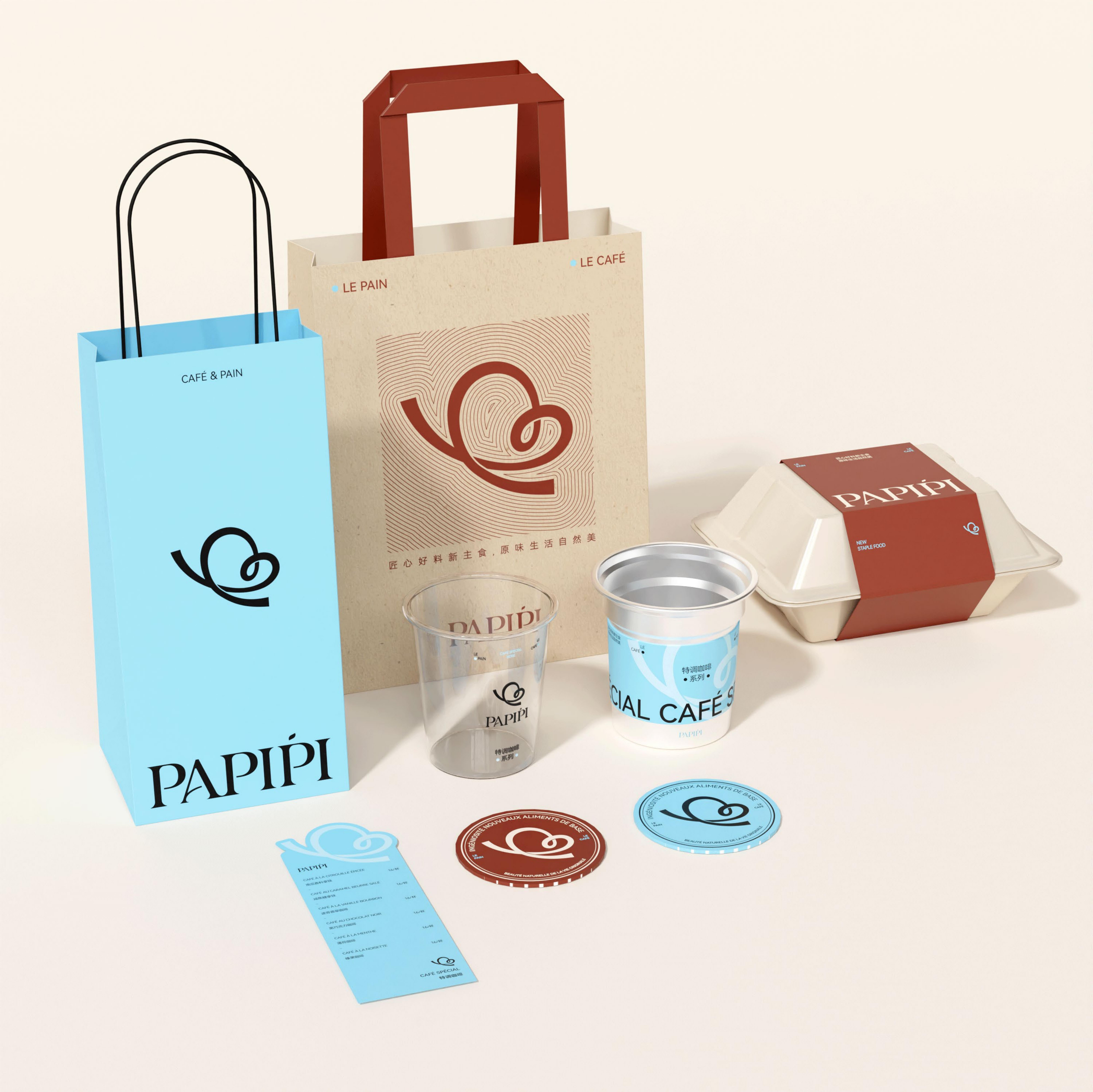
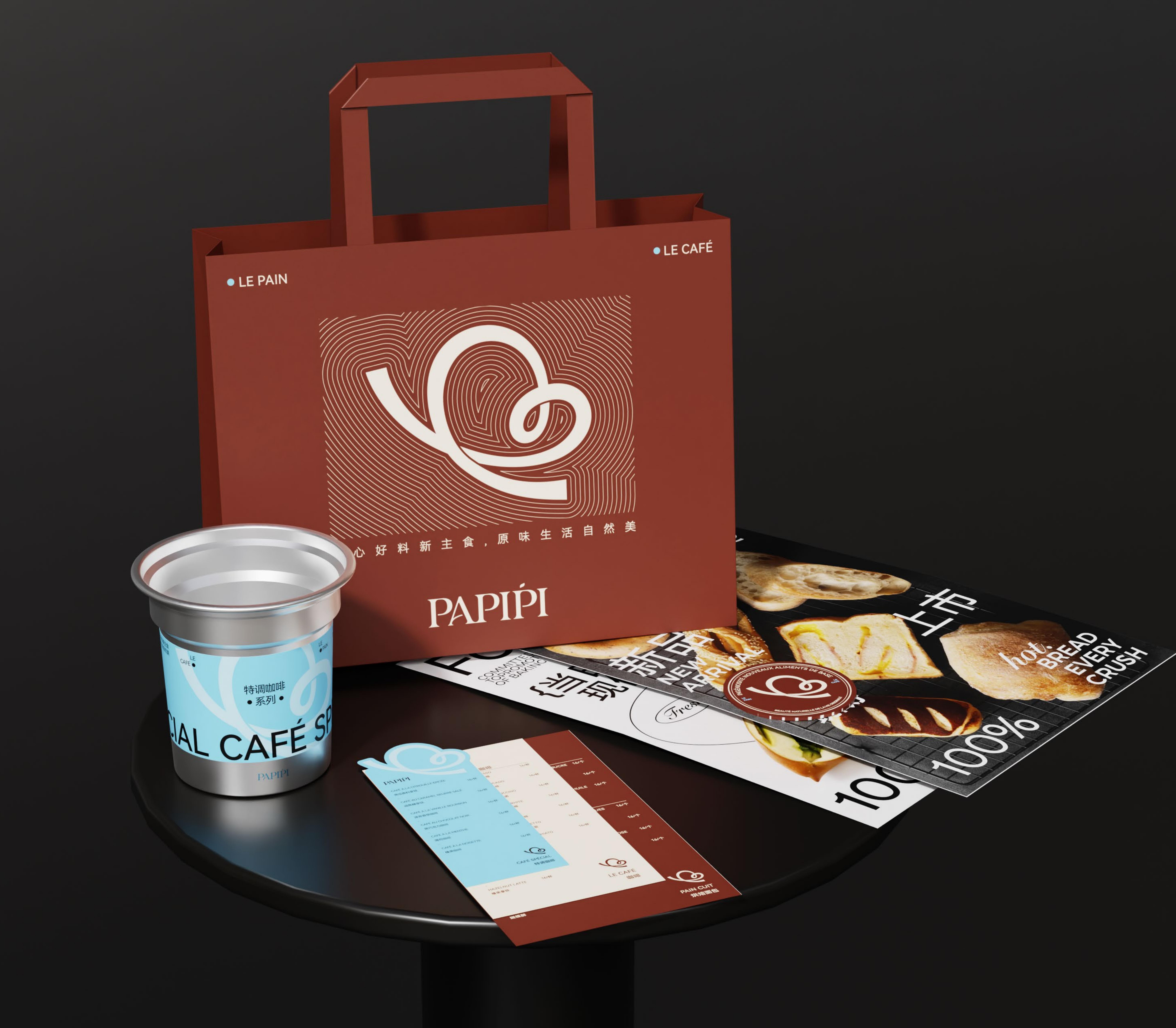
The PAPIPI bakery brand design has meticulously developed a comprehensive and cohesive visual identity system that encompasses the logo, colour palette, graphics, and text labels. This design ethos effectively conveys a sense of rhythm and aesthetic appeal through precise geometric forms, artfully merging modernity with French elegance. This approach articulates the brand's fundamental values and distinctive concepts, offering consumers a unique bakery experience imbued with emotional resonance and cultural significance.
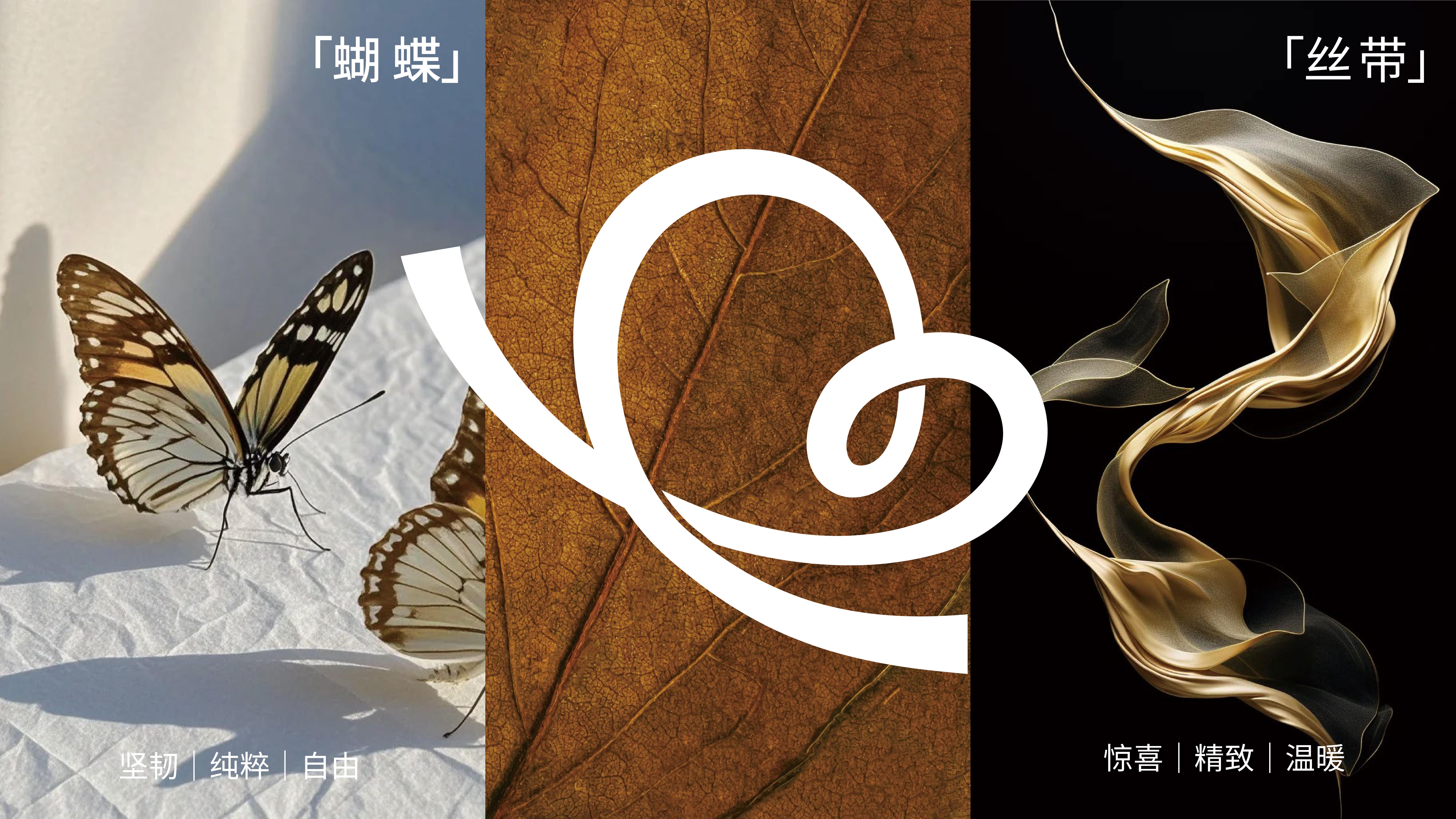
In its brand naming strategy, PAPIPI draws from the French words "Papillon" (butterfly) and "épi" (ears of wheat). This nomenclature not only encapsulates the brand's French baking heritage but also invokes images of nature and harvest, aligning with the brand's commitment to promoting a natural, healthy, and sophisticated lifestyle.
A notable feature of the PAPIPI brand visual identity system is the design of the super symbol. Centred on the butterfly motif, the design employs romantic French lines to abstractly represent the bakery product known as "Butterfly Crisp." This design choice effectively links artistry with health advocacy, showcasing the brand's natural grace and French character while underscoring its creative ingenuity.
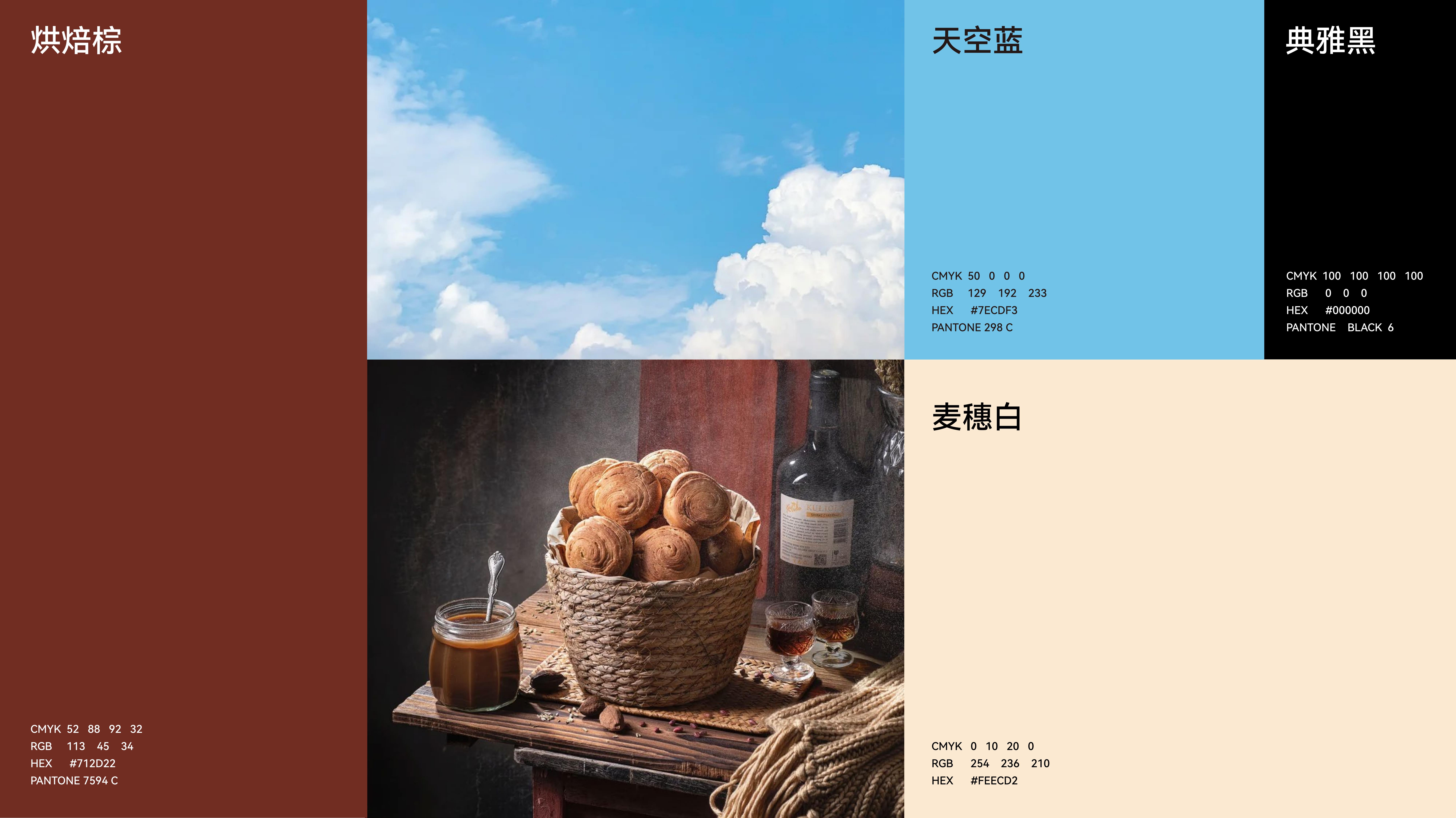
The colour palette of the PAPIPI bakery brand incorporates the themes of "healthy, natural, and modern" as its core principles. The baking brown conveys warmth and artisanal craftsmanship, while wheat white symbolizes purity and a connection to nature. Sky blue signifies freshness and a commitment to a healthy lifestyle, and elegant black provides a sense of sophistication and high-end quality. The overall colour scheme is rich and three-dimensional, aligning seamlessly with the brand's focus on staple food offerings and delivering a dual sensory pleasure of both visual and gustatory enjoyment.


Entrant Company
Tzai-Di Leisure Management Consultant Co., Ltd.
Category
Video - Travel
Country / Region
Taiwan


Entrant Company
Synergy Group
Category
Video - Animation
Country / Region
Australia


Entrant Company
PPK
Category
Social Media - Ad Campaign
Country / Region
United States


Entrant Company
Gravity Global
Category
Video - Food & Beverage
Country / Region
United Kingdom
