2025
8 lnns Plus Hotel Brand Visual ldentity Design
Entrant Company
Shanghai Sinostar Art Design Co, Ltd.
Category
Corporate Identity - Brand Identity
Client's Name
Dongguan Bafang Express Hotel Co., Ltd.
Country / Region
China
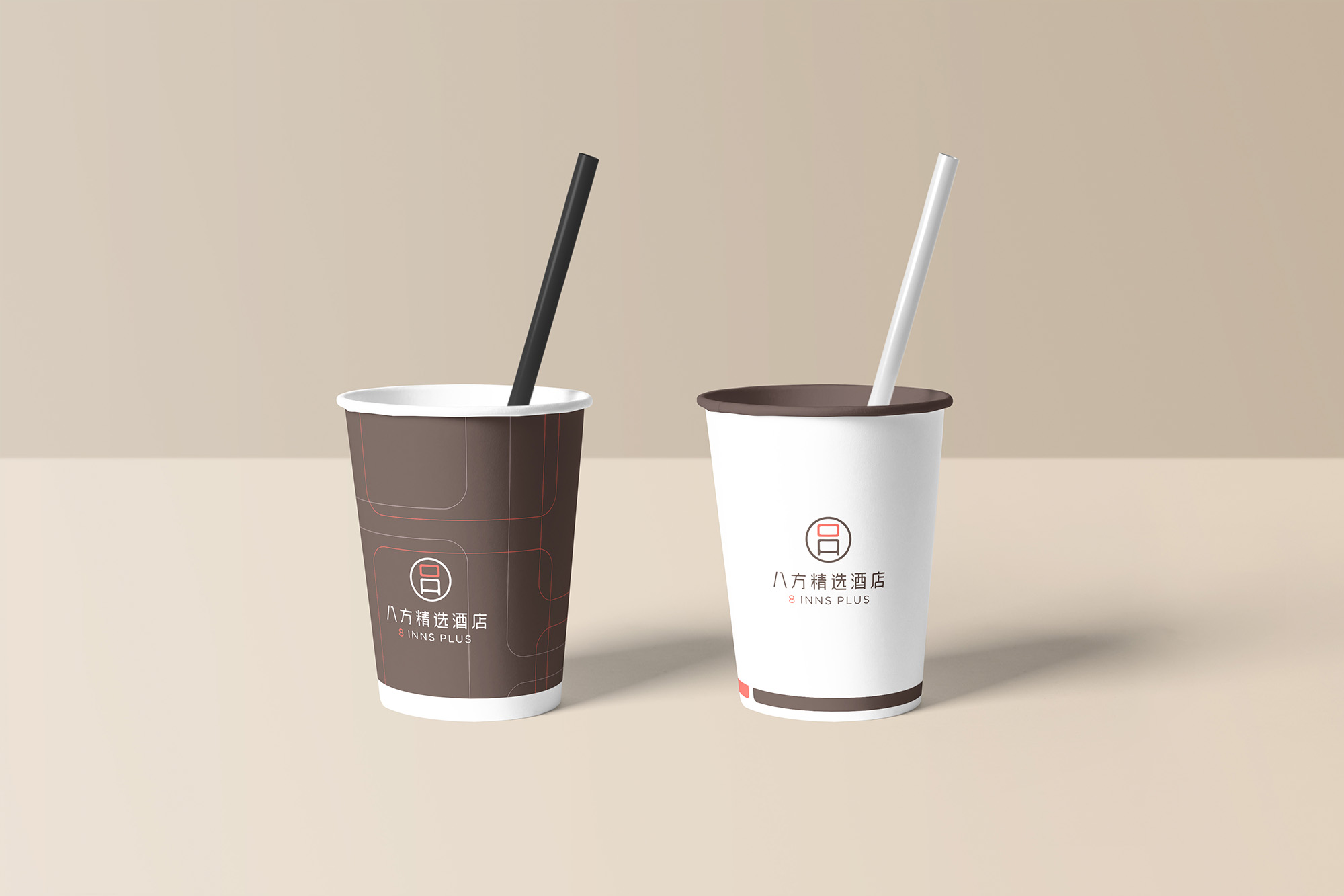
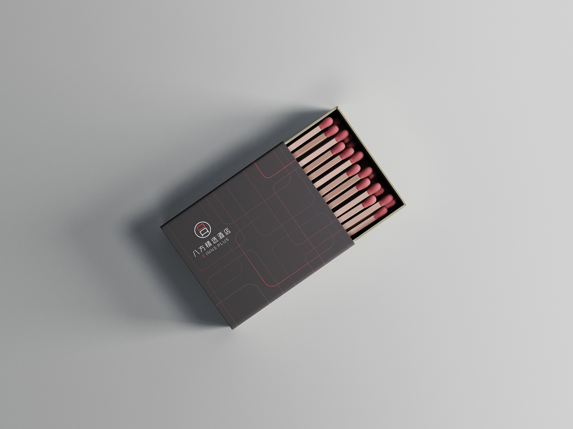
The logo is evolved from the number“8", which also resembles a window. The window signifies the opening and starting of a new space, and at the same time implies the meaning of tolerance and absorption, The logo is coloured in orange and dark brown, with orange representing energy and passion, symbolising 8 Inns Plus Hotels' brand values of genuine service and unique guest experiences. The colour sepia represents confidence and wisdom, symbolising 8 Inns Plus Hotels' brand values of going beyond quality and innovation.


Credits
Entrant Company
Xiangqi Liu, Bilan Liu, Bowen Wei
Category
Mobile App - Health & Wellness
Country / Region
United States

Entrant Company
The LOOMIS Agency
Category
Advertising - Advertising Campaign
Country / Region
United States

Entrant Company
Hsinchu City Government
Category
Event - Cultural
Country / Region
Taiwan

Entrant Company
Yunlin County Government
Category
Event - Celebration
Country / Region
Taiwan