2025
Memento-Art Companion Program
Entrant Company
WU,YI-EN、CHIEN,WAN-YU、SHIH,SHIANG-CHI
Category
Student Submission - Student Logo Design
Client's Name
NKUST Department of Cultural and Creative Industries
Country / Region
Taiwan
The Memento Art Companion Program is an intergenerational initiative that welcomes participants from all backgrounds, regardless of age or identity, to join and learn together. It is an event where participants can share their life stories and be guided to express their individual experiences through interactive art, combined with AI-generated software to create unique, personal works of art.
The word "Memento" comes from Latin, meaning "to remember" or "memory." In English, it refers to a souvenir or keepsake, and it is often used to describe objects or symbols that help people remember something. In cultural and cinematic works, it can also suggest a reflection on memory, echoing the concept of awakening memories that this project aims to inspire.
The Art Companion Program represents our activity's mission, which is to accompany people through art interaction. Regardless of who they are, participants can use this program to awaken memories, evoke emotions, and relieve stress.
We hope that by introducing the Art Companion Program, students can be guided to express their emotions and thoughts through interaction, providing them with a proper outlet for emotional expression. Through interactive art, the program helps students release negative emotions, easing their anxiety and helplessness about the future and present.
For this purpose, we have also designed a set of specialized card tools, which include: cards, a baseboard, and a questionnaire. We designed six different types of cards, all based on a square foundation, and each category has a unique card design created with different colors.
The cards are divided into five categories: Self and Interests, Places, Everyday Items, Stress, and Emotions. The corresponding colors are transparent, yellow, green, blue, gray, and red. The standard font design uses geometric block transformations, incorporating the card's shape and the colors representing different categories. The strokes of the font are varied in size and thickness, creating a lively, playful, and interesting feel.
Credits


Entrant Company
Miami Ad School New York
Category
Student Submission - Student Product Design
Country / Region
United States


Entrant Company
Seafoam Marketing
Category
Website - Website Redesign
Country / Region
United States
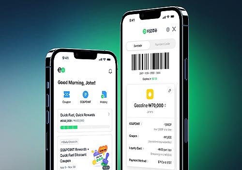

Entrant Company
GS Caltex, Favorite Medium, and GS ITM
Category
Mobile App - Lifestyle
Country / Region
South Korea

Entrant Company
JLL
Category
Marketing & Promotional - Brochure
Country / Region
United States


