2025
Meet in Arcadia Brand image design
Entrant Company
dawnbrand Design
Category
Corporate Identity - Logos
Client's Name
YouChange Entrepreneurs Rural Development Foundation
Country / Region
China
In 2017, Youcheng Entrepreneurs Poverty Alleviation Foundation targeted Longtang Village in Leishan County, Guizhou Province. At that time, there was a lack of rural industries, limited villagers' incomes, brain drain, and a widespread phenomenon of hollow villages and left-behind children. The "Meet in Arcadia" project is a comprehensive rural development project with rural tourism as the main industry, aiming to explore a model of rural revitalization that focuses on preserving the traditional village culture and lifestyle, supporting the development of the collective economy, and stimulating the intrinsic motivation of the villagers.
Idea
Meet in Arcadia, as a charity program, derives its logo from the Chinese character for "beauty". Using a minimalist and abstract approach, the logo shows a picture of a beautiful countryside with terraced rice paddies. Above the terraced fields, the abstract Miao village houses are skillfully blended with the strokes of the character "Mei", and the last stroke is transformed into a roof. This not only highlights the characteristics of the local countryside, but also conveys the concept of "beauty", making the visual language simple, memorable and easy to associate. Starting from "beauty", it helps to revitalize the beautiful countryside.
Form
1. Utilize the power of design to promote rural revitalization and development.
2. Enhance the brand image and arouse people's concern and desire for the countryside.
3. The theme of the design is "beauty", simple, easy to remember and easy to associate.
Function
"Meet in Arcadia" brand design performance: First, the brand image is integrated with rural characteristics, and the logo incorporates rural elements to convey the theme intuitively; second, the communication effectively conveys the connotation of rural culture. In order to build a unique brand association, it is simple to use, and the logo is easy to recognize and the language is easy to understand. Service approach: First, guide the tourism experience through brand design, unified image to provide clear guidance; second, use the brand implication to establish a connection with the user, so that the user resonates.


Credits
Entrant Company
Gravity Global
Category
Branded Content - Products & Services
Country / Region
United Kingdom

Entrant Company
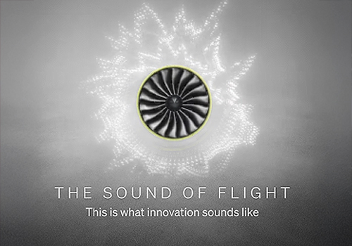
Vox Creative
Category
Video - Documentary
Country / Region
United States
Entrant Company
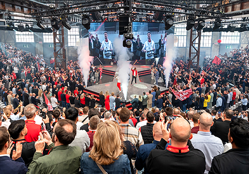
insglück Gesellschaft für Markeninszenierung mbH
Category
Event - Corporate
Country / Region
Germany
Entrant Company
Yuxin Pan
Category
Branded Content - Lifestyle
Country / Region
United States