
2025
Iron Shark
Entrant
Yang Weizhi
Category
Branded Content - Sports
Client's Name
Country / Region
China
Gallery
About The Entry
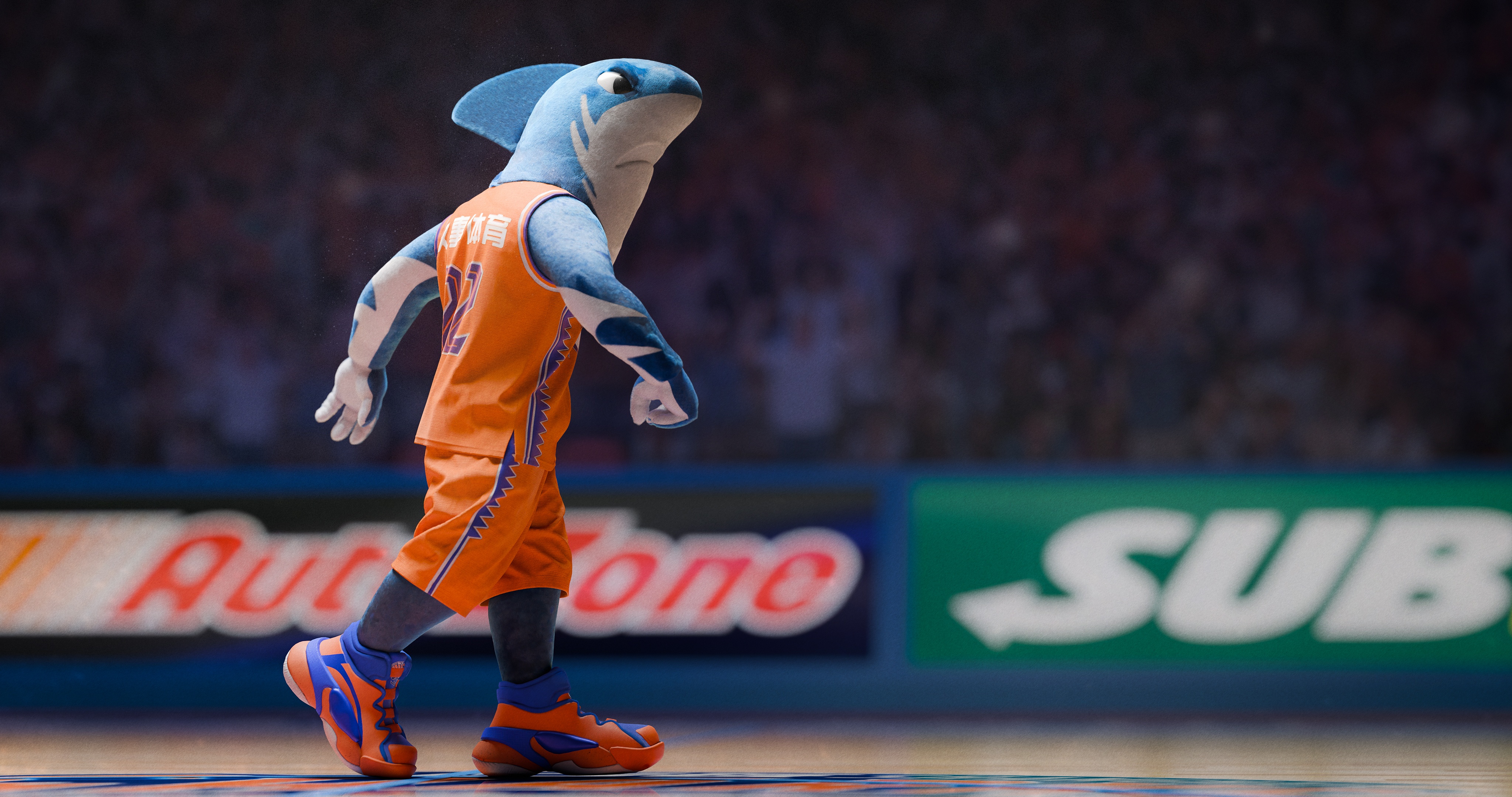
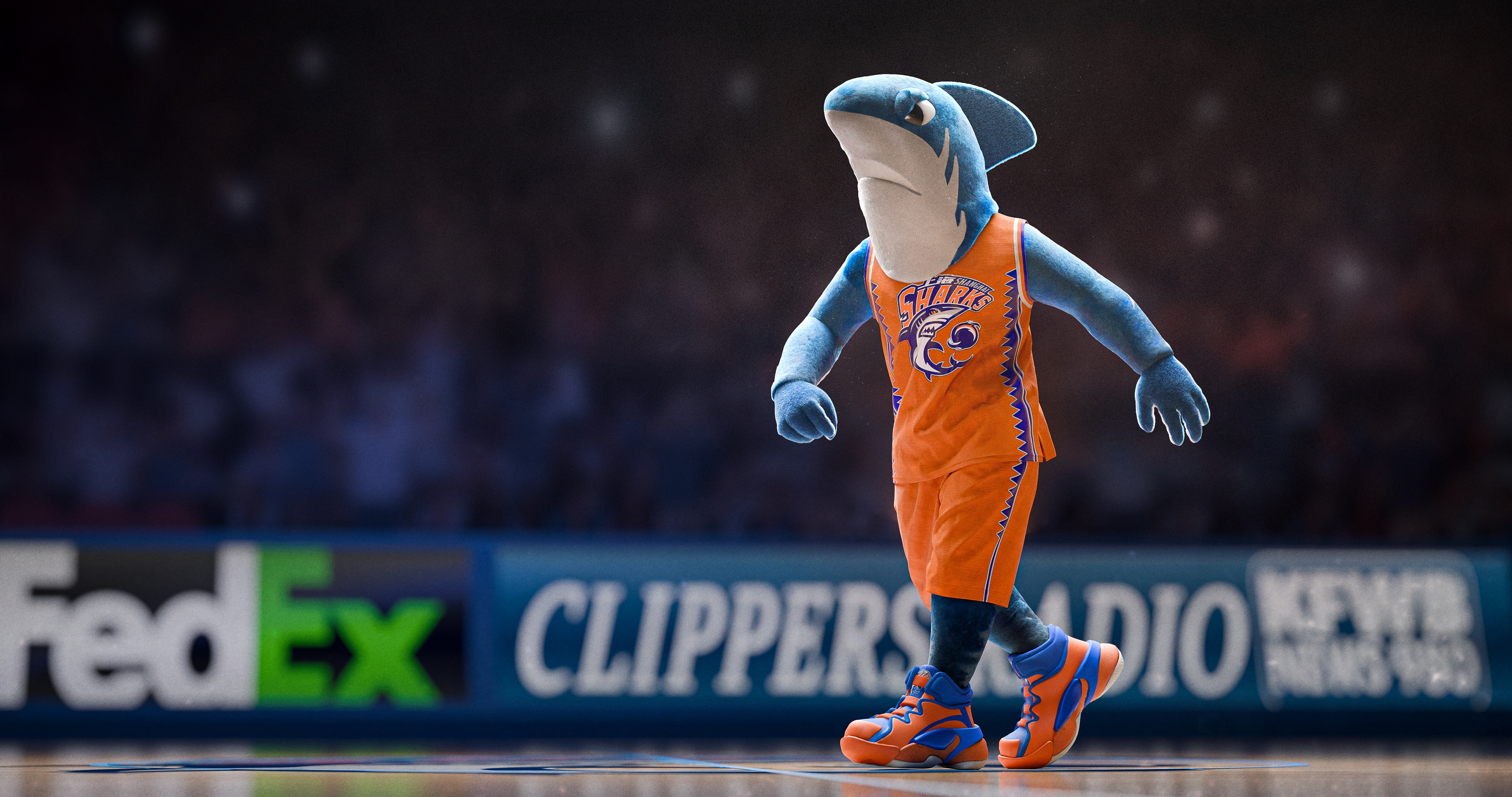
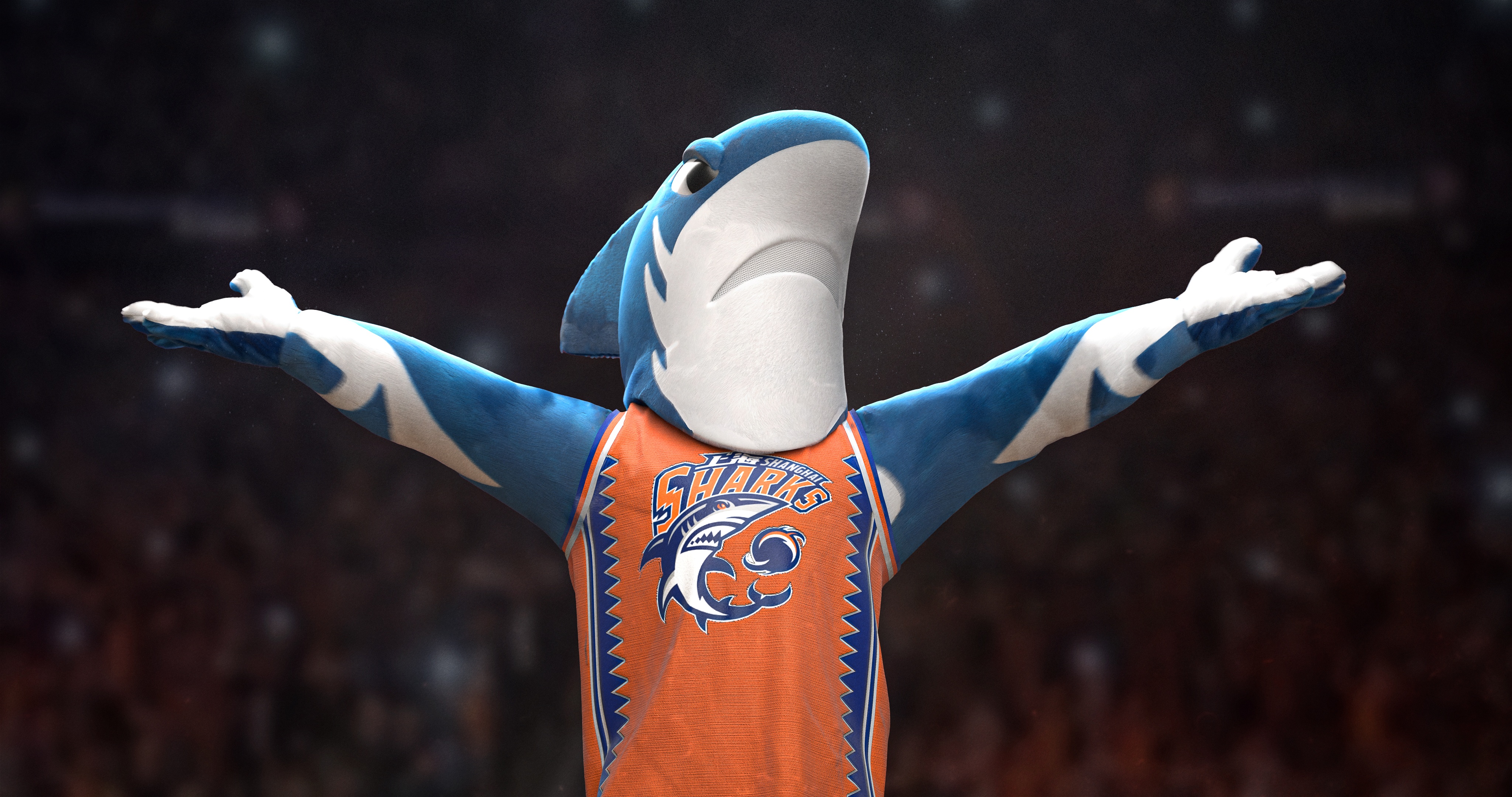
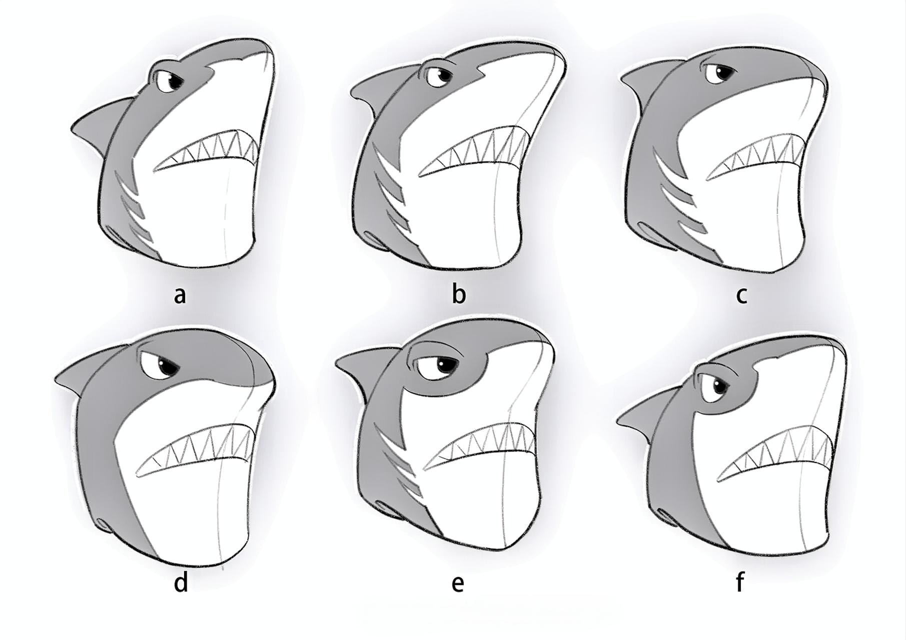
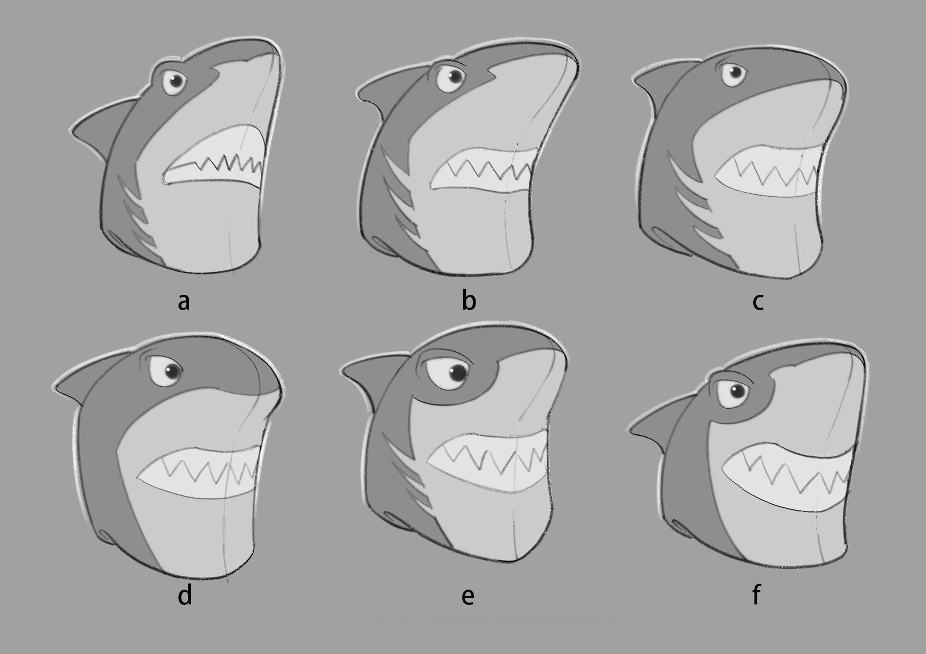
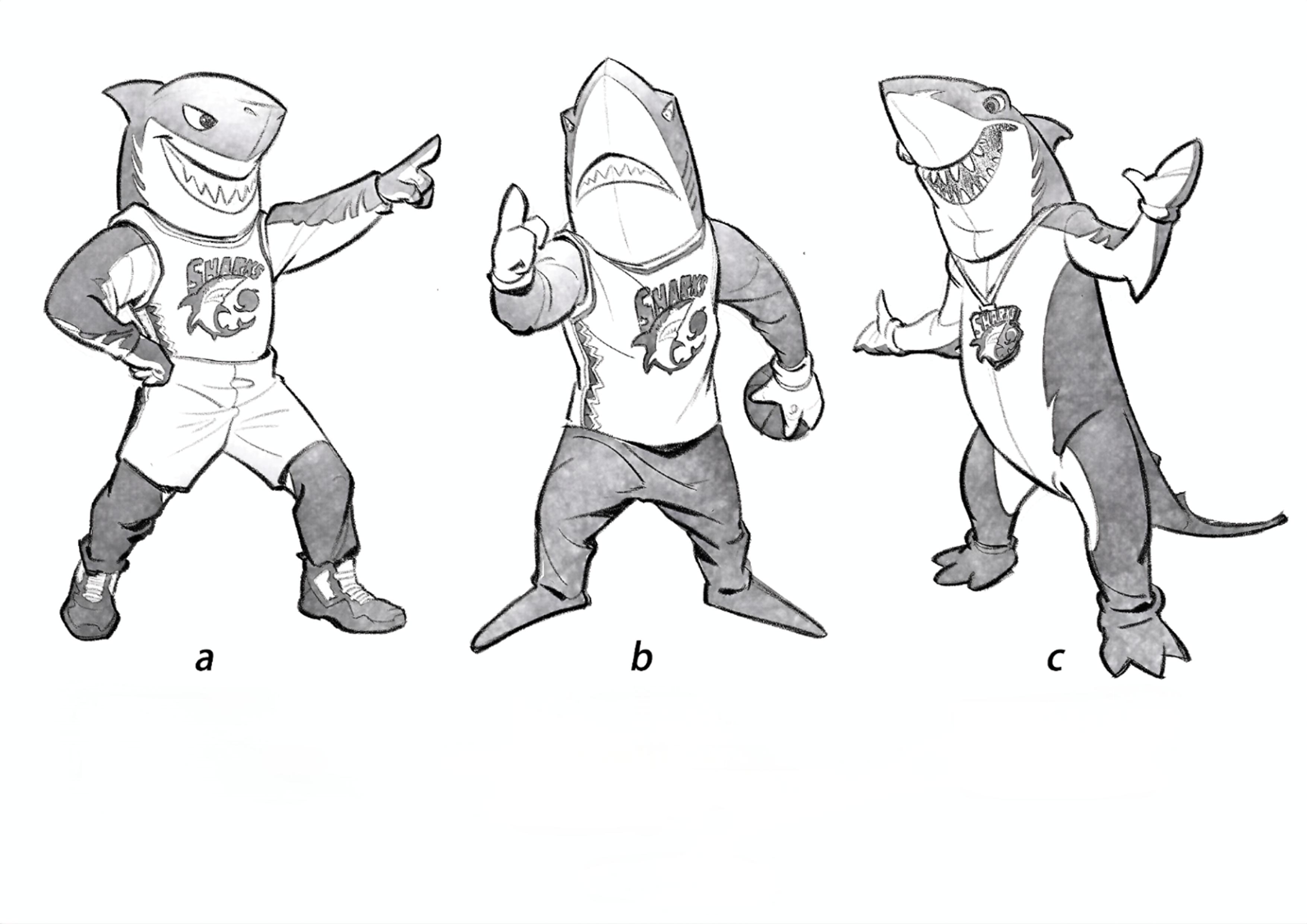
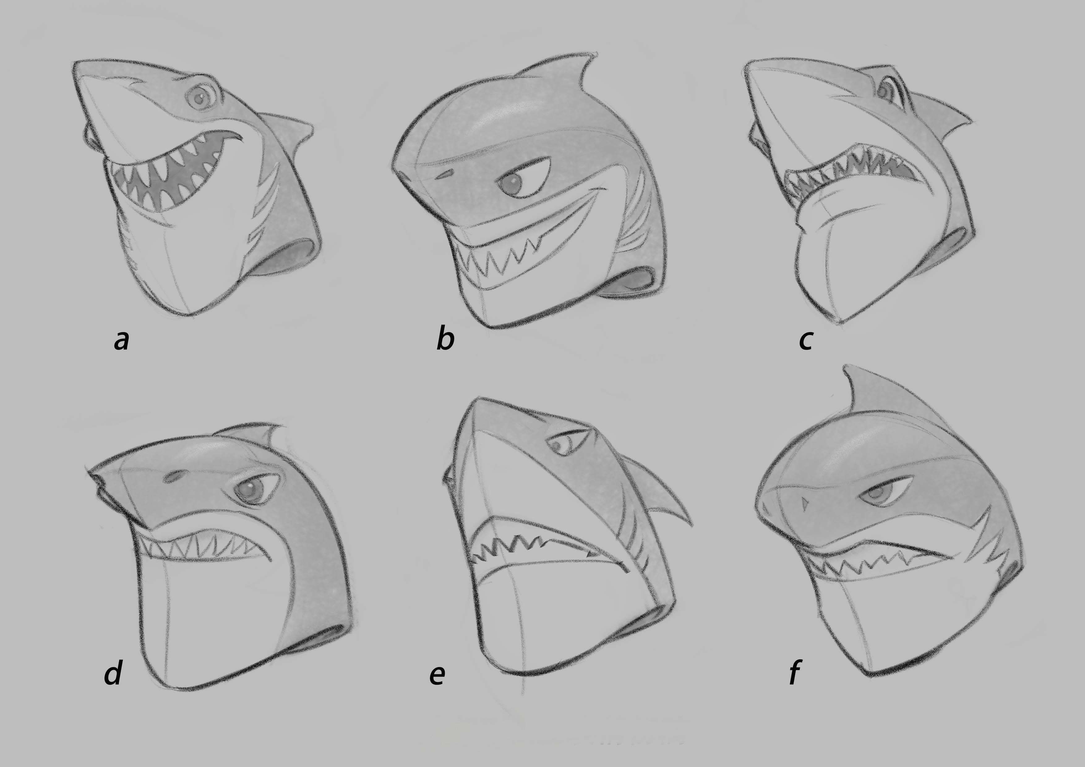
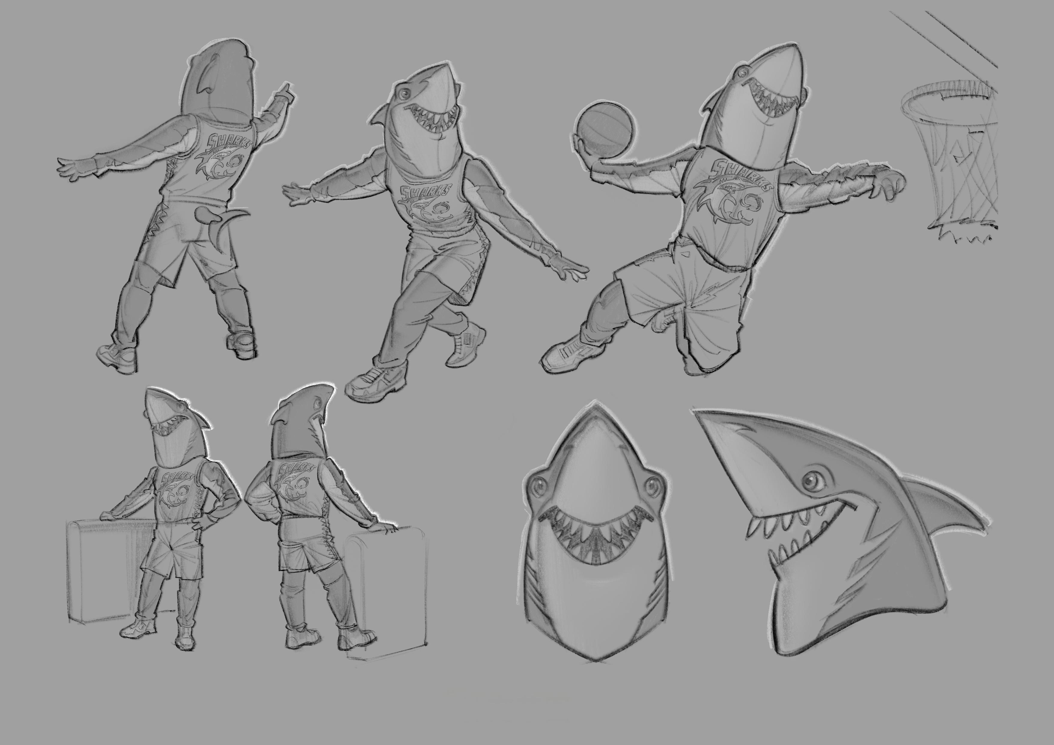
The overall design inspiration for “Steel Shark” comes from the shark’s unique contrast in nature—an endearing, almost playful appearance paired with a swift and fierce demeanor. This duality gives the character a distinctive personality and symbolizes the way athletes combine fun and power on the court. Our goal was to create a mascot that not only ignites fan enthusiasm but also brings a sense of lightheartedness and joy to the game atmosphere. Visually, the color palette inherits the classic orange and royal blue of the Shanghai Sharks’ previous CBA mascot, using the striking contrast to convey passion and vitality, echoing the team’s “Unstoppable Shark” spirit. The jagged pattern along the sides of the jersey is inspired by the shark’s sharp teeth, reinforcing both the theme and the sense of strength. The head design is simple yet bold, retaining the iconic silhouette of the great white shark, while subtle facial expressions strike a balance between charm and ferocity. The colors and forms are fully aligned with the team’s visual identity, making it easy to extend the design into merchandise, animated shorts, and fan engagement activities—boosting brand recognition and communication power. The biggest challenge during the design process was the client’s lack of a clear direction for facial expression. To address this, I prepared a wide range of head shape sketches early on, paired with various facial expressions and action poses for presentation. After multiple rounds of discussions and refinements, we arrived at a final design that satisfied all parties. In production, I employed an efficient workflow that blended traditional drawing with modern 3D technology: sculpting the head and structure in ZBrush, simulating fabrics in Marvelous Designer, creating textures and materials in Substance Painter, and finalizing lighting and rendering in Blender. This approach not only ensured strong expressiveness and accurate fidelity to the concept but also greatly improved efficiency and control at each stage. The key highlight of “Steel Shark” lies in its successful fusion of the shark’s playful and fierce traits, creating a powerful visual contrast that is both approachable and full of strength.

Entrant
NBCUniversal
Category
Branded Content - Social
Country / Region
United States

Entrant
The LOOMIS Agency
Category
Video - TV Ad
Country / Region
United States

Entrant
Jiaodu Design Co.,Ltd
Category
Advertising - Online Ad (Campaign)
Country / Region
China
Entrant
McKinsey Global Publishing
Category
Publication - Digital Publications
Country / Region
United States