2025
Reclaiming a Legacy: Rebranding Mace® for a New Generation
Entrant Company
Priority Designs
Category
Corporate Identity - Brand Identity
Client's Name
Mace
Country / Region
United States
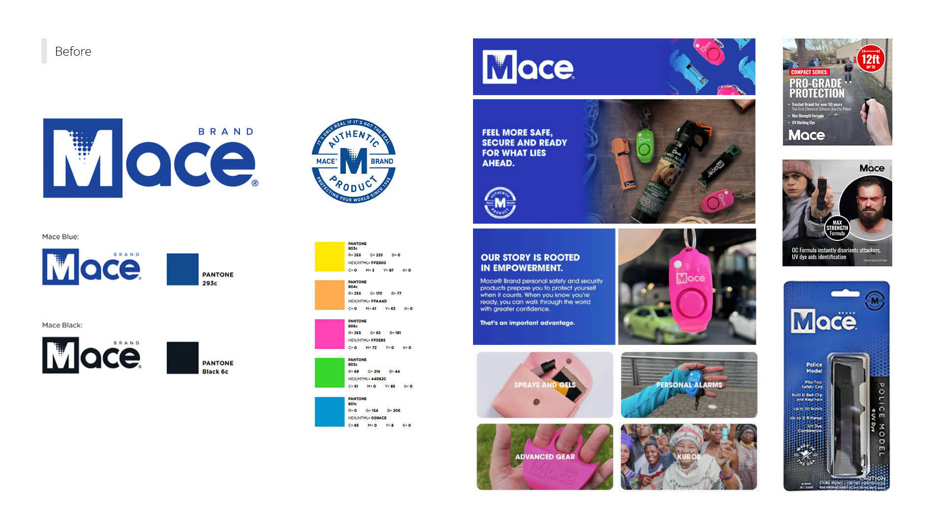
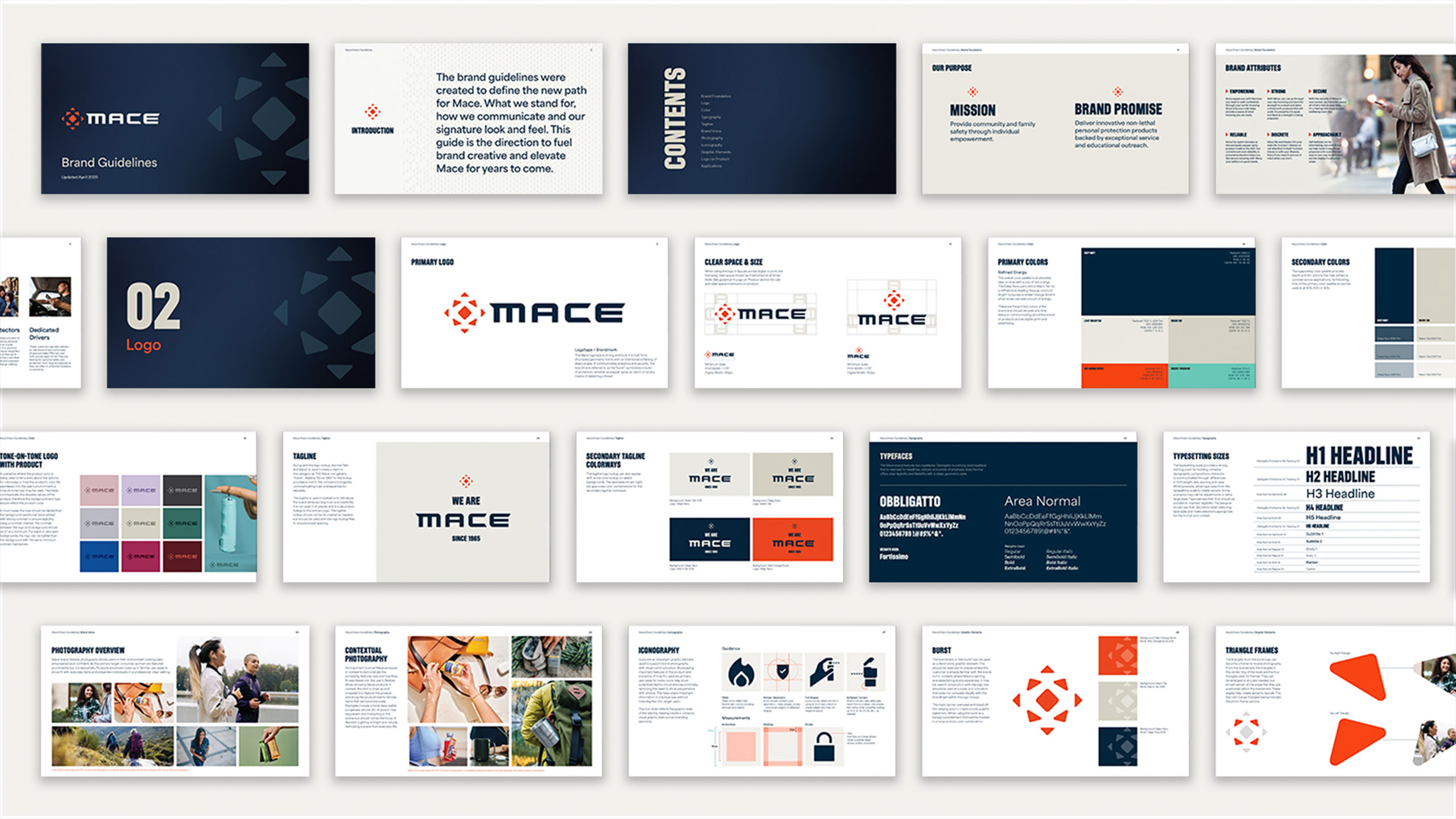
For nearly 60 years, Mace® has been a household name in pepper spray. But heritage alone couldn’t keep the brand relevant in a crowded, modern marketplace. Its visual identity was tired, blending into shelves, and failing to connect with today’s consumers. Mace® needed more than a facelift—it needed to re-claim a category that took it's name right out from under them.
We started by digging deep. Workshops with leadership, competitive audits, and consumer interviews all told the same story: Mace® was falling flat, visually looking as generic as the word Mace had become. It didn't inspire. It fell flat. Safe in the wrong way. To reclaim its authority, Mace® needed a look and voice as bold as the protection it promised.
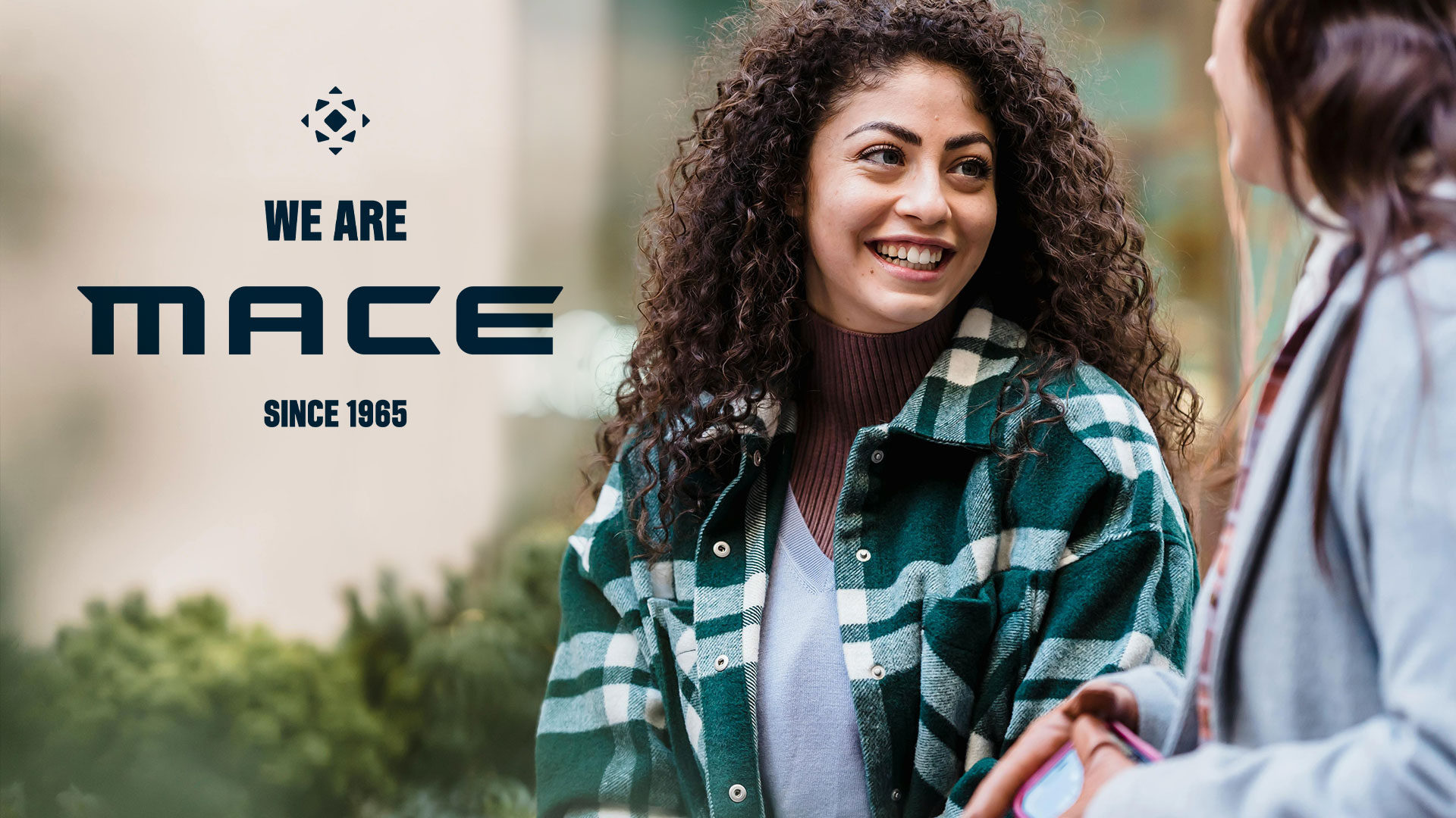
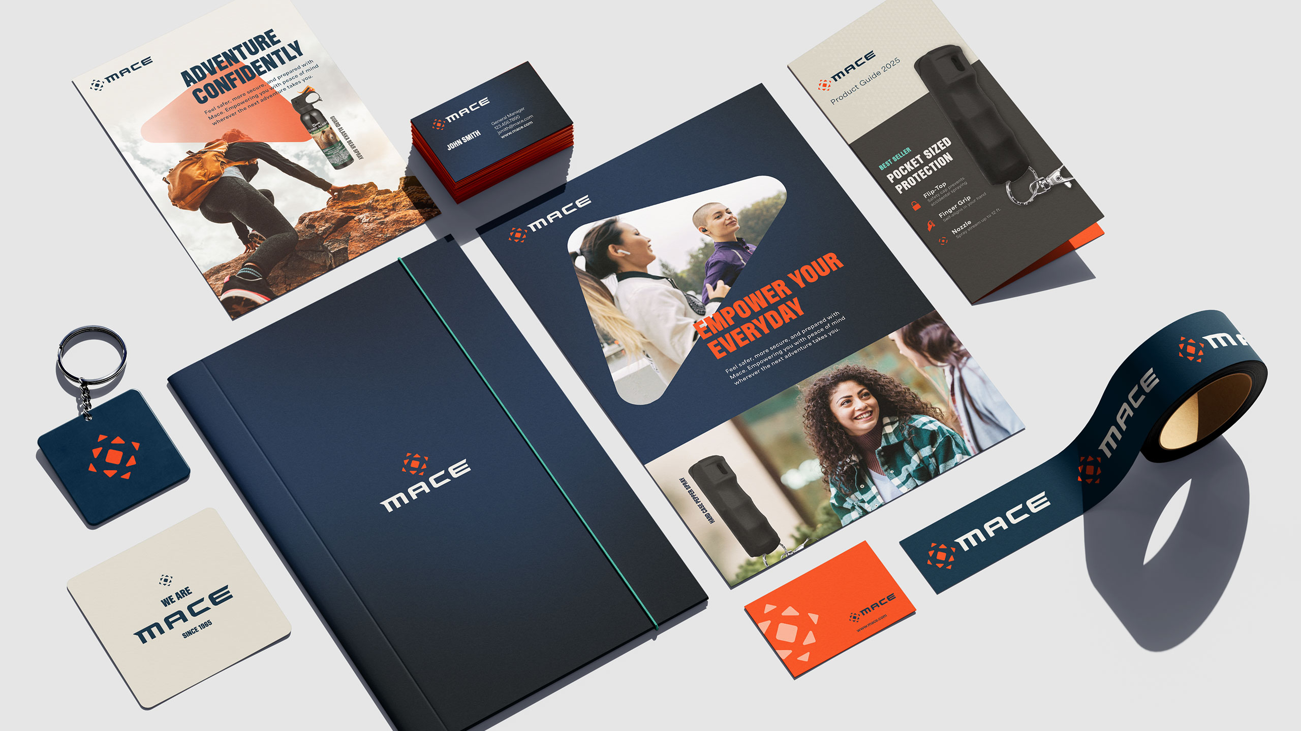
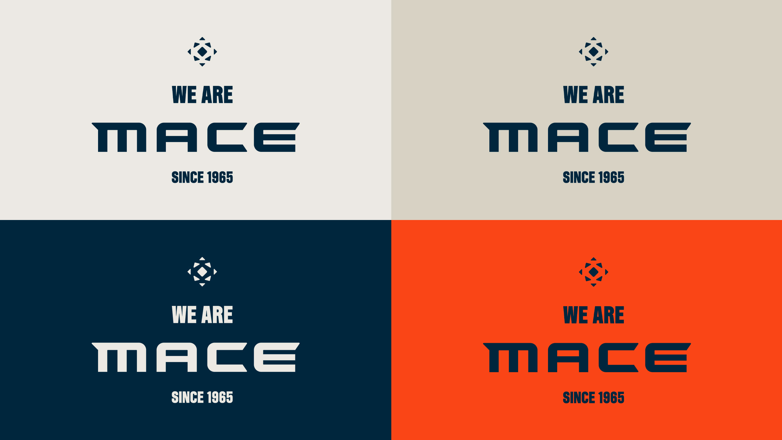
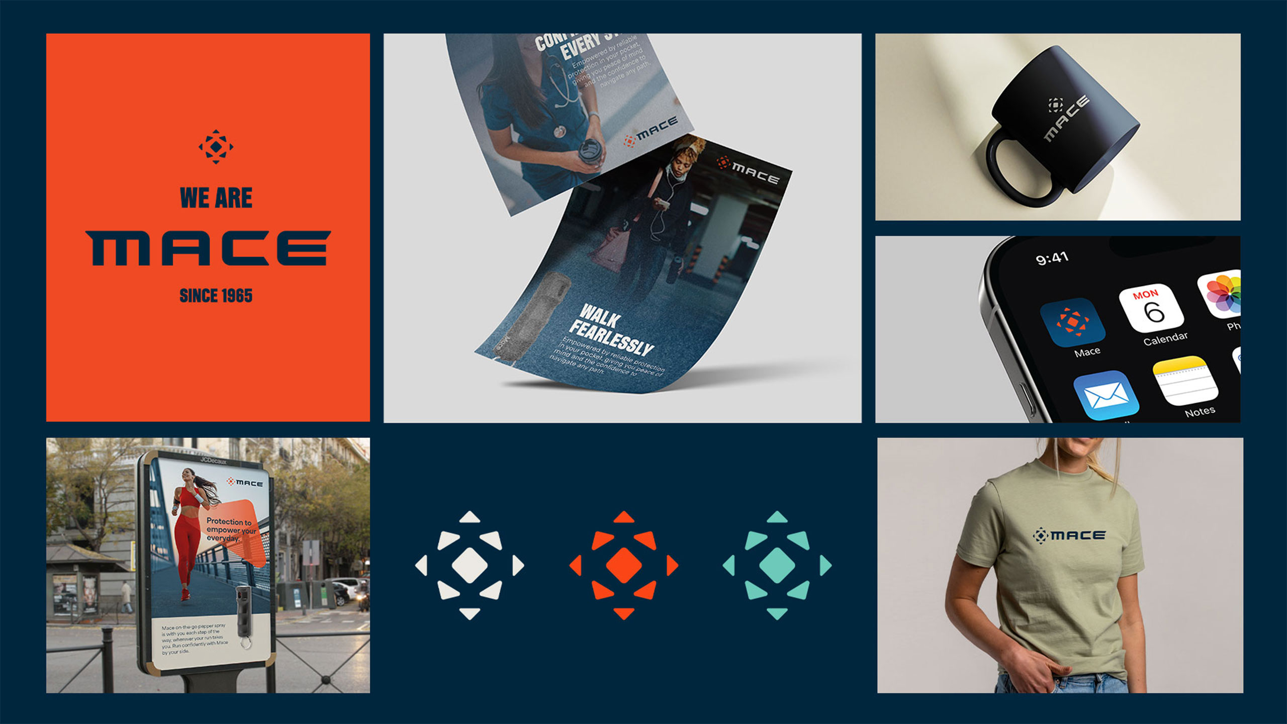
The transformation began with the logo. We embedded a dynamic “burst” into the Mace® wordmark—a visual spark of protection and forward momentum. The tagline, “We Are Mace, Since 1965”, became both a declaration of legacy and a statement of leadership.
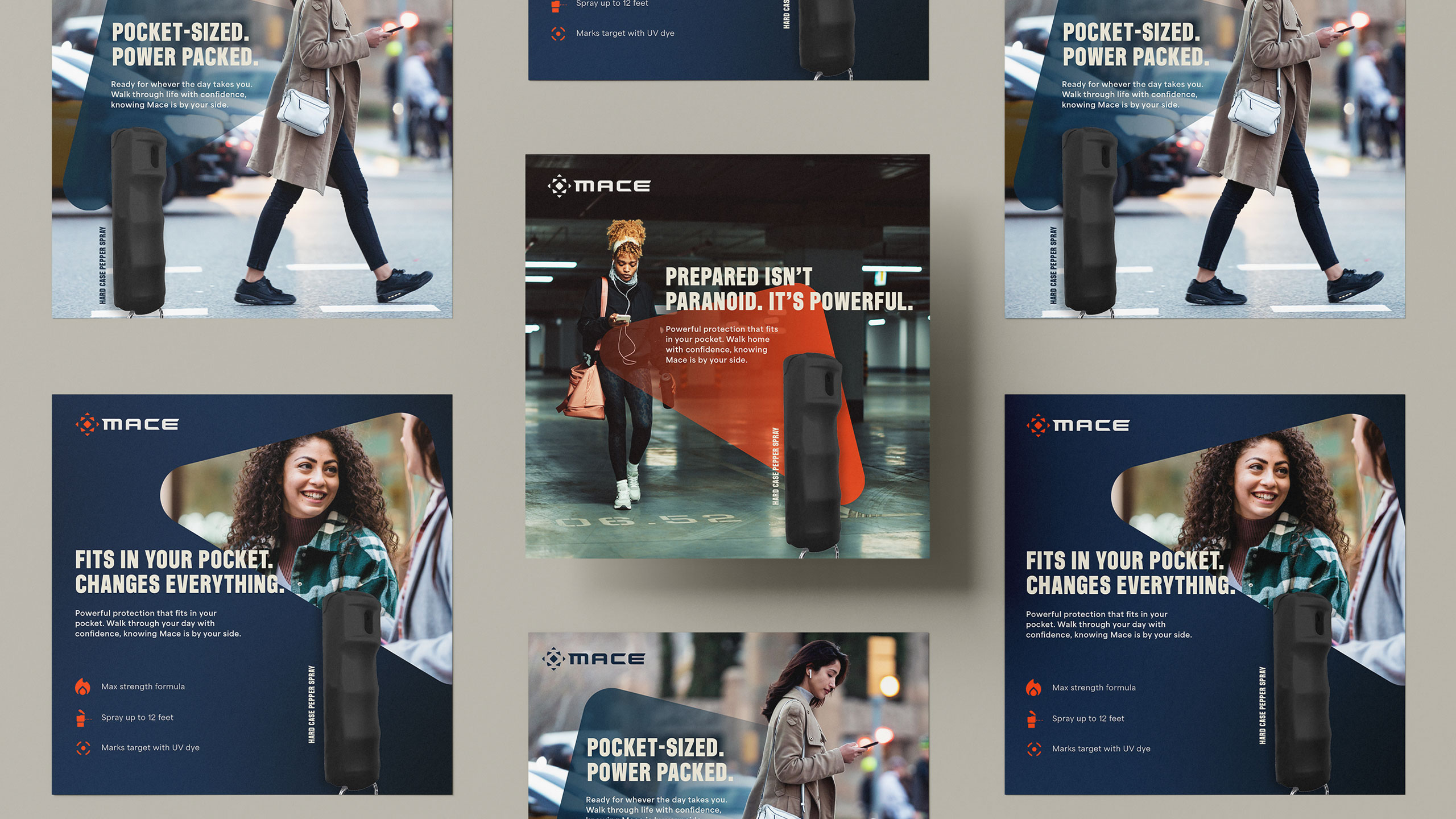
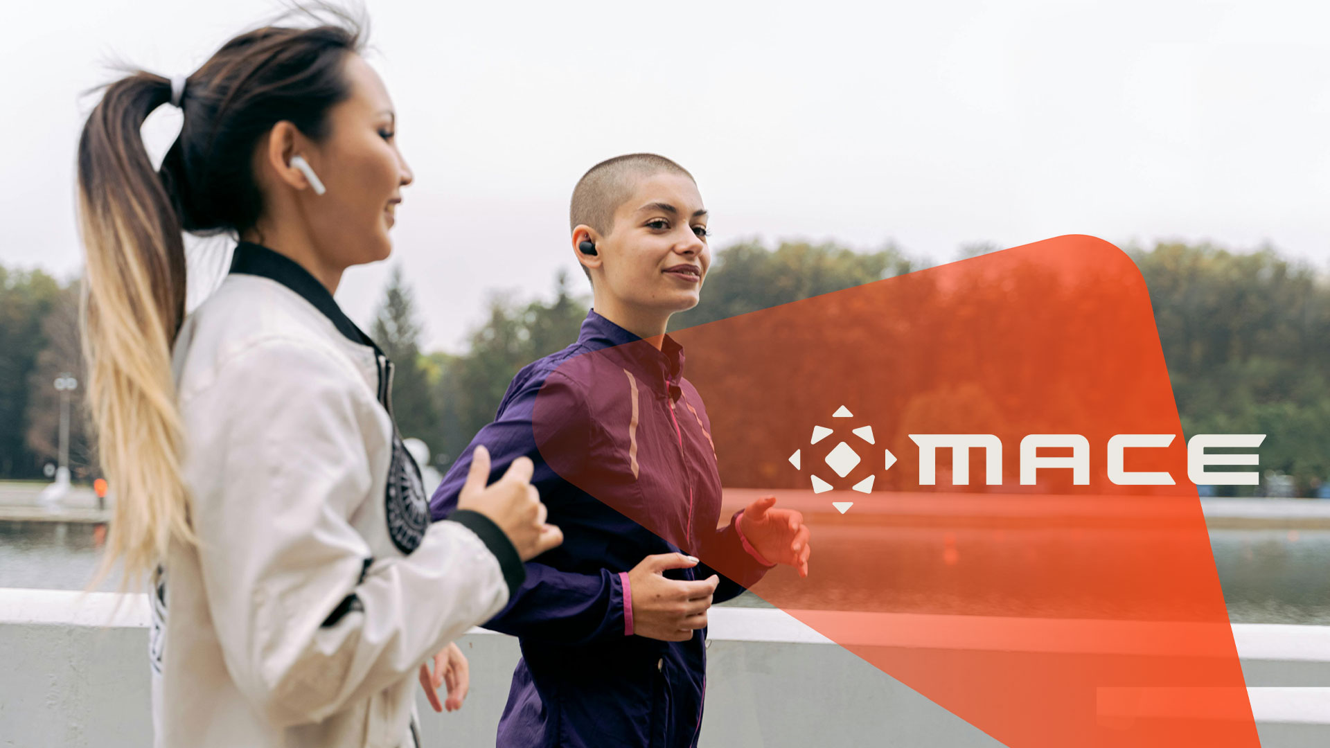
From there, we built a visual language to match the mission: a vibrant, elevated color palette; typography with structure and presence; and photography with calm, confident people. The creative identity features people in their daily lives, at ease yet strong and ready for anything, without relying on tired tropes of masculine aggression or hyper-femininity. We extended the identity beyond marketing into the product experience, creating guidelines for how the identity appears on molded surfaces within the product itself.
The result was a brand reborn. Mace® now demands attention. Online, it feels fresh, authoritative, and unmistakably Mace®. Inside the company, teams have a clear toolkit to tell the brand’s story consistently and powerfully.
This was more than a rebrand. Mace® now connects authentically with a generation of women who are tired of seeing aggressive, masculine brands or "shrink it and pink it" approaches used to inauthentically sell to women. Mace® is once again leading the conversation on personal safety, empowering users with strength and relatability — and this time, it’s impossible to ignore.


Credits
Entrant Company
Eric Tom & Bruce
Category
Video - Fund Raiser
Country / Region
Australia

Entrant Company
Yifan Chen
Category
Student Submission - Student Ad
Country / Region
United Kingdom

Entrant Company
Bearframe
Category
Video - Tourism
Country / Region
Taiwan

Entrant Company
Miami Ad School Madrid
Category
Mobile App - New Category
Country / Region
Spain