2019
Logo Rebrand
Entrant Company
Morris Animal Foundation
Category
Corporate Identity - Logos
Client's Name
Morris Animal Foundation
Country / Region
United States
The Morris Animal Foundation logo must capture the breadth of work the Foundation funds, across many species, but the old logo was dated in design, color and open concept without borders which would get lost in larger collateral applications.<br><br>The new logo took its cue from the old to bring forward the Foundation's 70-year history, but infused with new life, color and pizzazz. Looking to the future, the new logo is a better fit with the forward-thinking research mission of the Foundation.<br><br>1. The shape of each animal was cleaned up and fluidity in lines addressed.<br>2. The updated elephant tail and addition of the bird on the elephant's trunk brought some personality.<br>3. The new font is clean, modern and sophisticated.<br>4. The animal design works well when paired with program names, and enabled us to get rid of sub-brands that detracted from the Foundation's core identity.<br>5. Placing the logo in a color box makes it pop on the page.
Credits
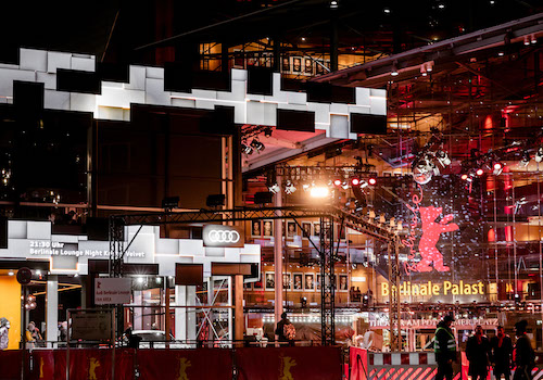
Entrant Company
DNM I DREINULLmotion
Category
Integrated Marketing - Event Marketing
Country / Region
Germany

Entrant Company
Robinson Creative Inc
Category
Integrated Marketing - Company Branding
Country / Region
United States


Entrant Company
Triken Studios
Category
Video - Show Opening Segment (NEW)
Country / Region
Singapore
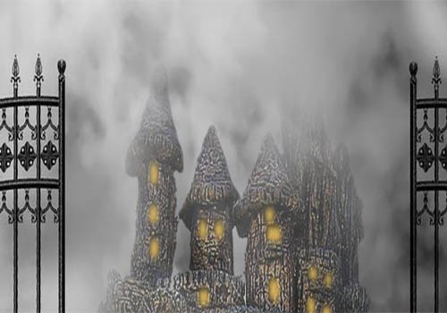

Entrant Company
EVERY NOW AND THEN THEATRE
Category
Audio - Radio AD / Broadcast
Country / Region
United States

