2025
Qingyan Zhangji Shuanghua Vinegar Brand Design
Entrant Company
Youchen Design
Category
Corporate Identity - Brand Identity
Client's Name
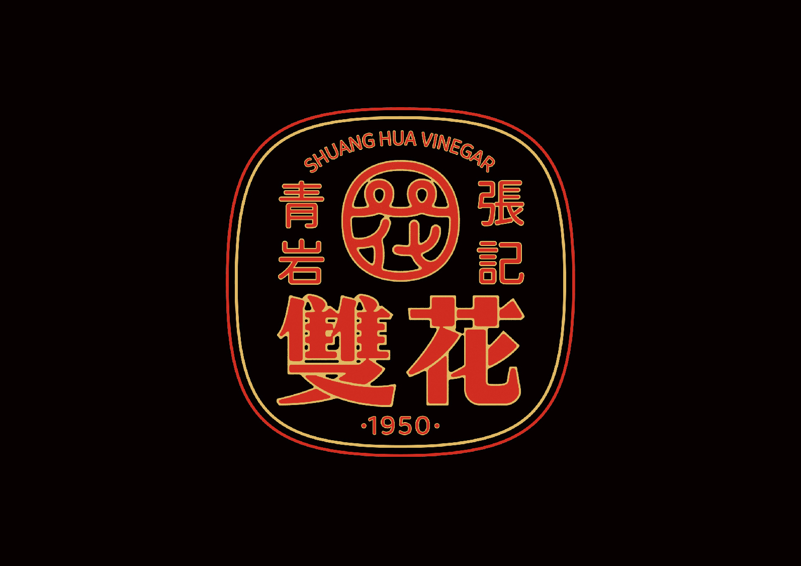
Qingyan Zhangji Shuanghua Vinegar
Country / Region
China
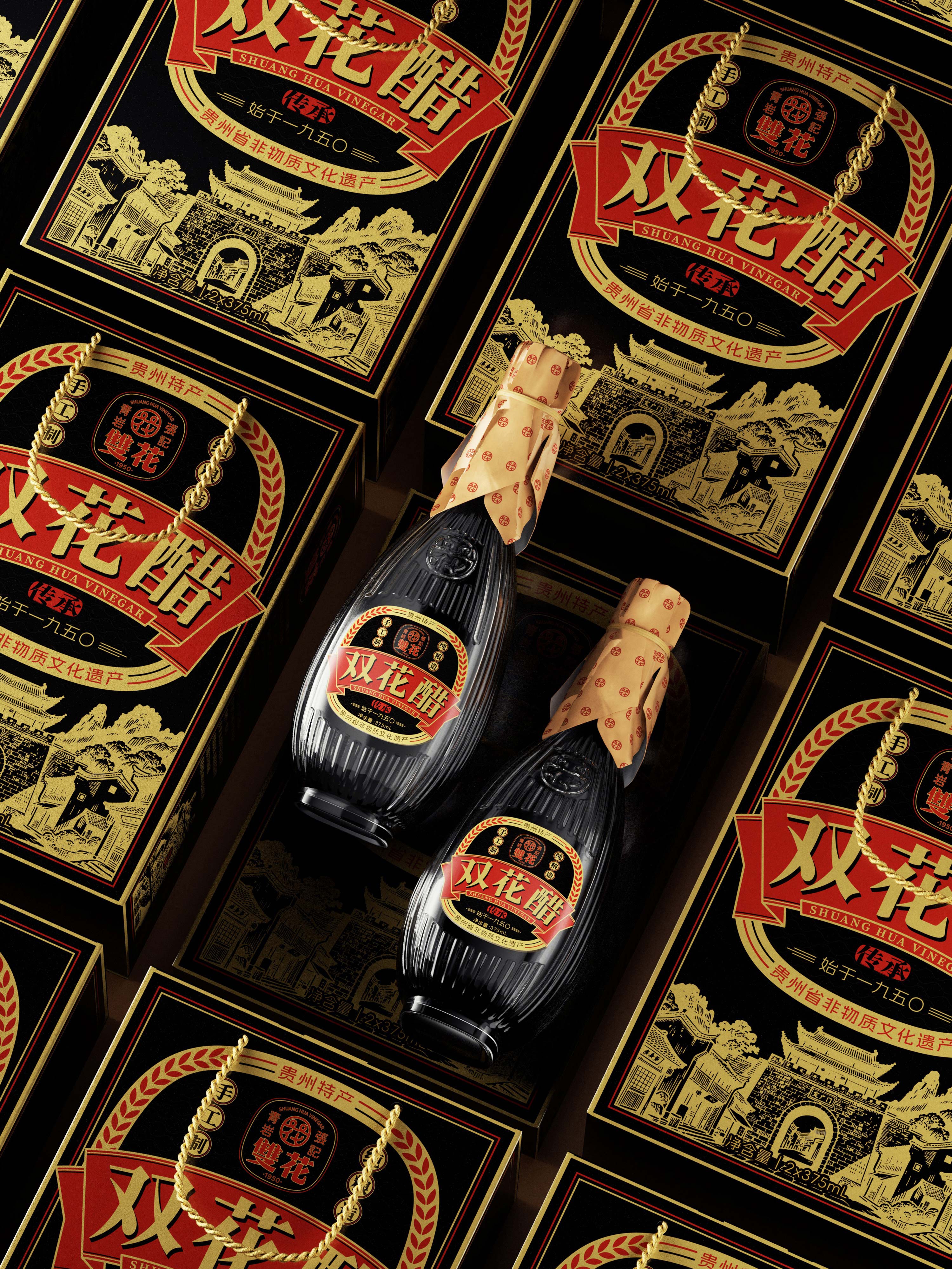
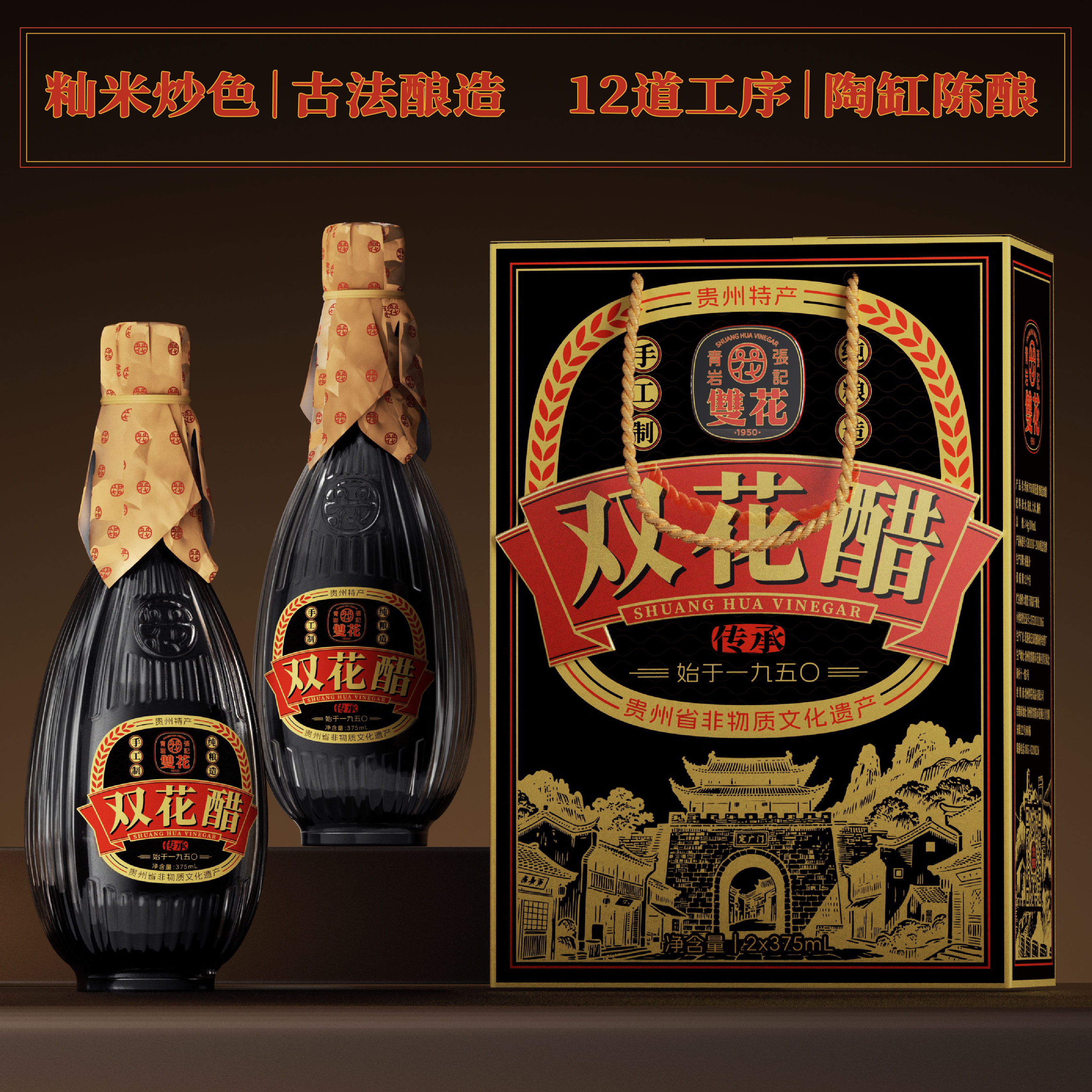
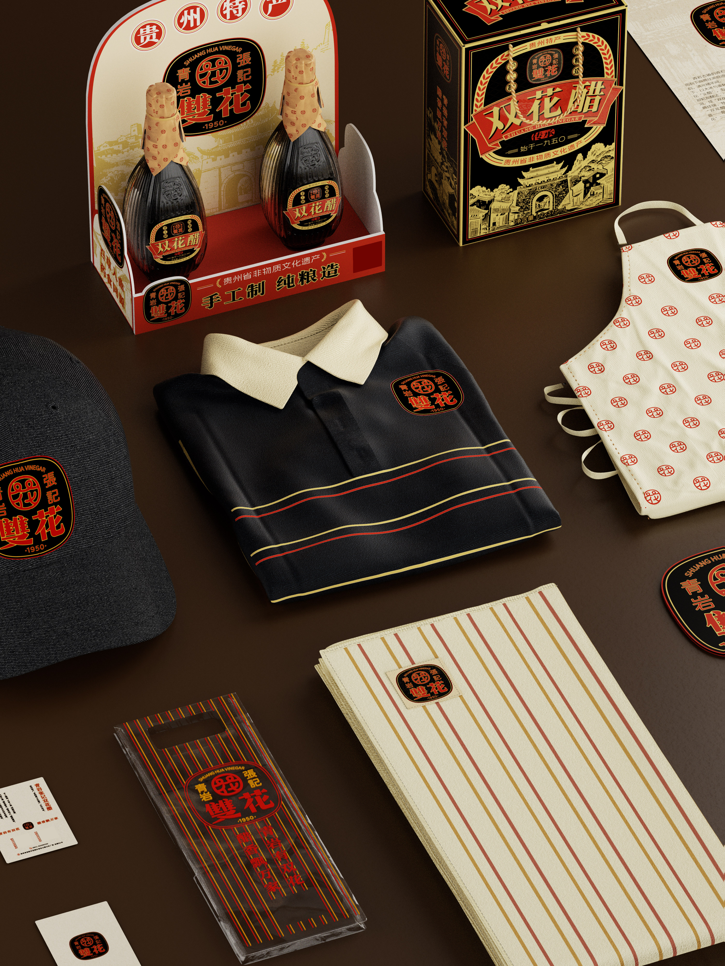
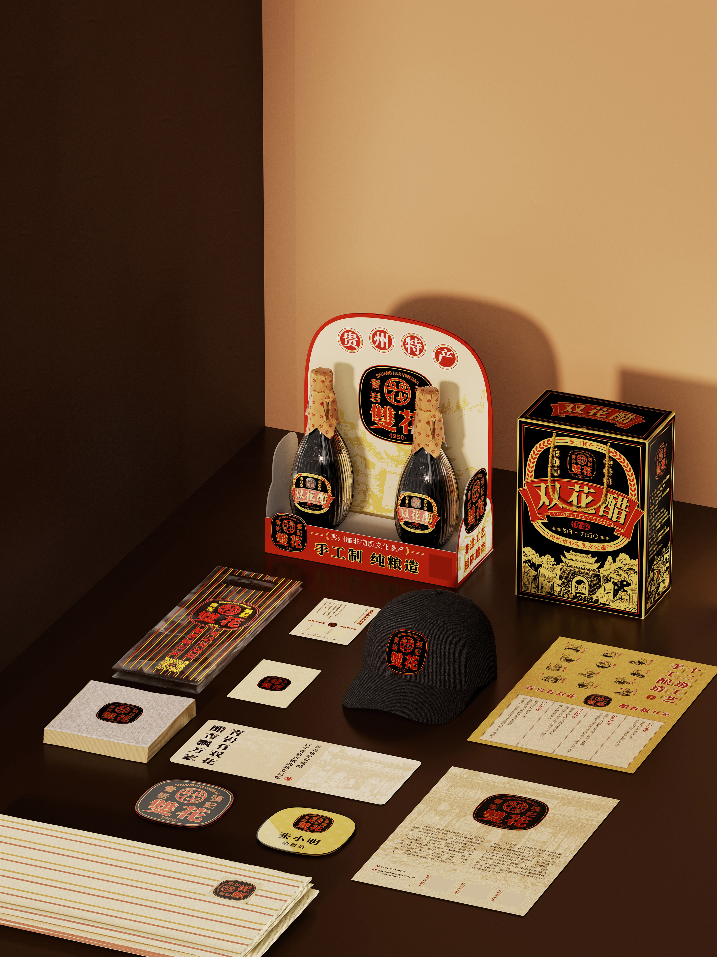
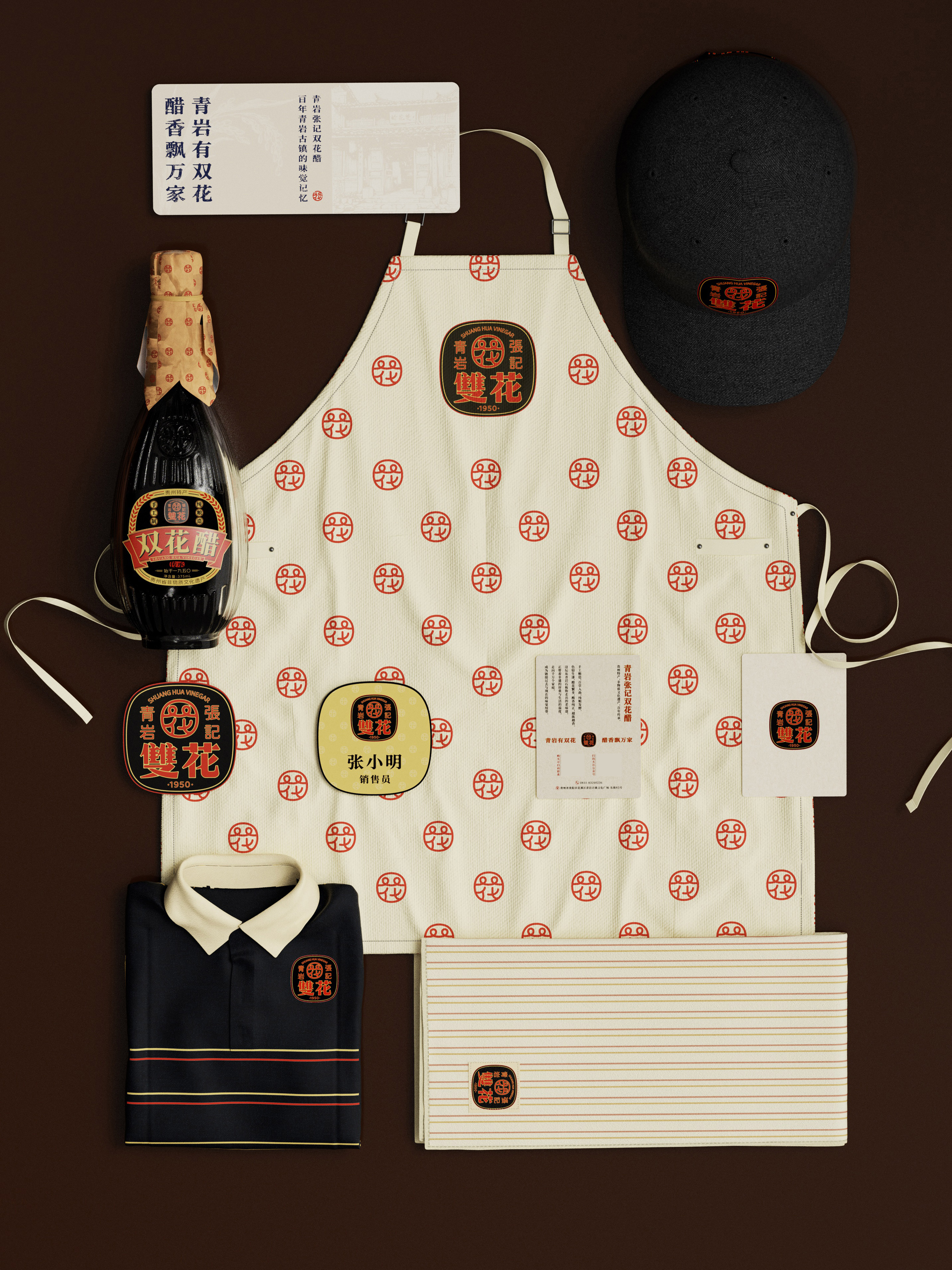
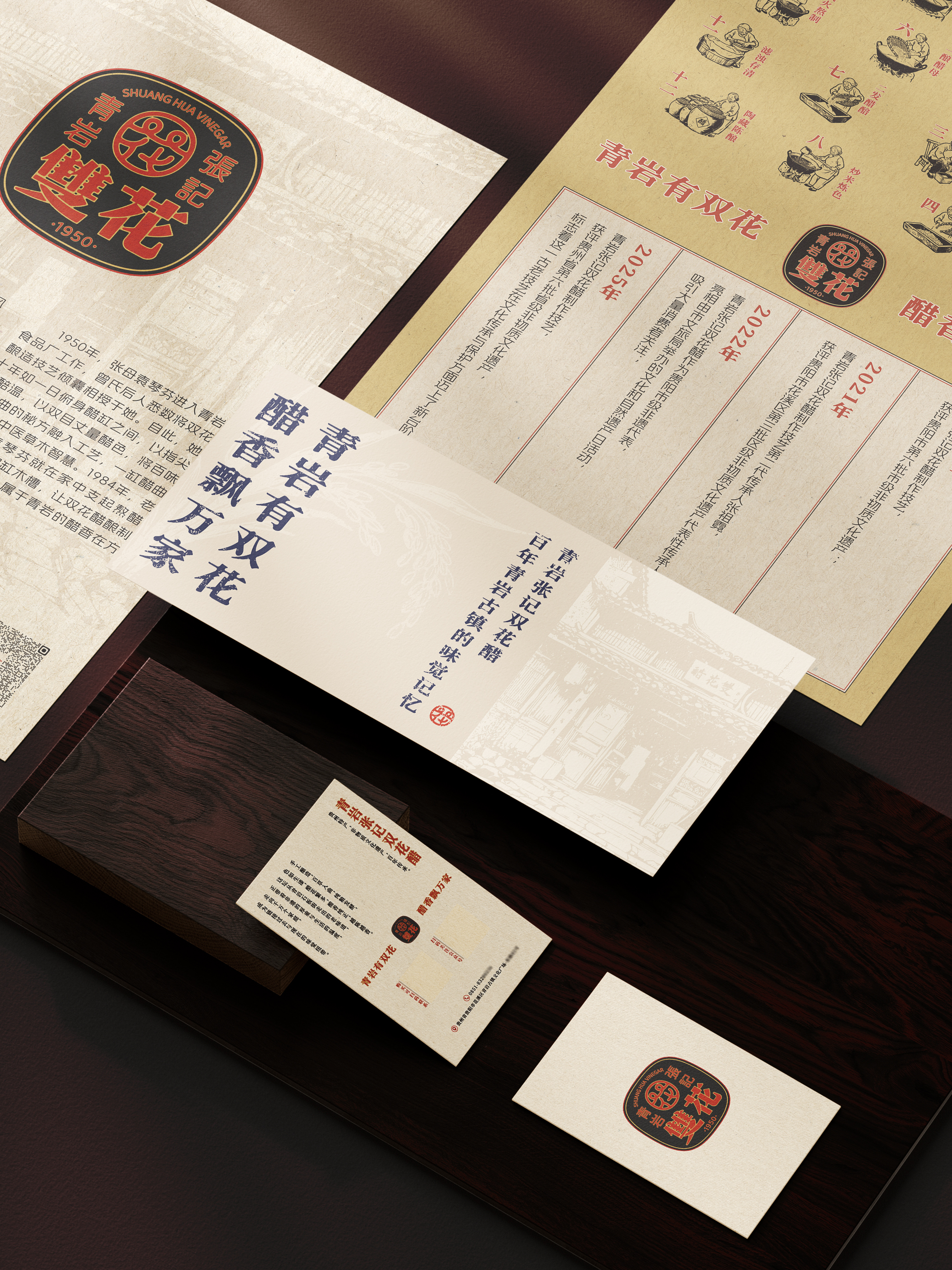
This project establishes a comprehensive brand identity for Qingyan Zhangji Shuanghua Vinegar—a recognized intangible cultural heritage of Guizhou Province. The design translates its profound local culture and unique brand essence into a visual language that resonates with contemporary audiences, creating a rich and compelling brand narrative.
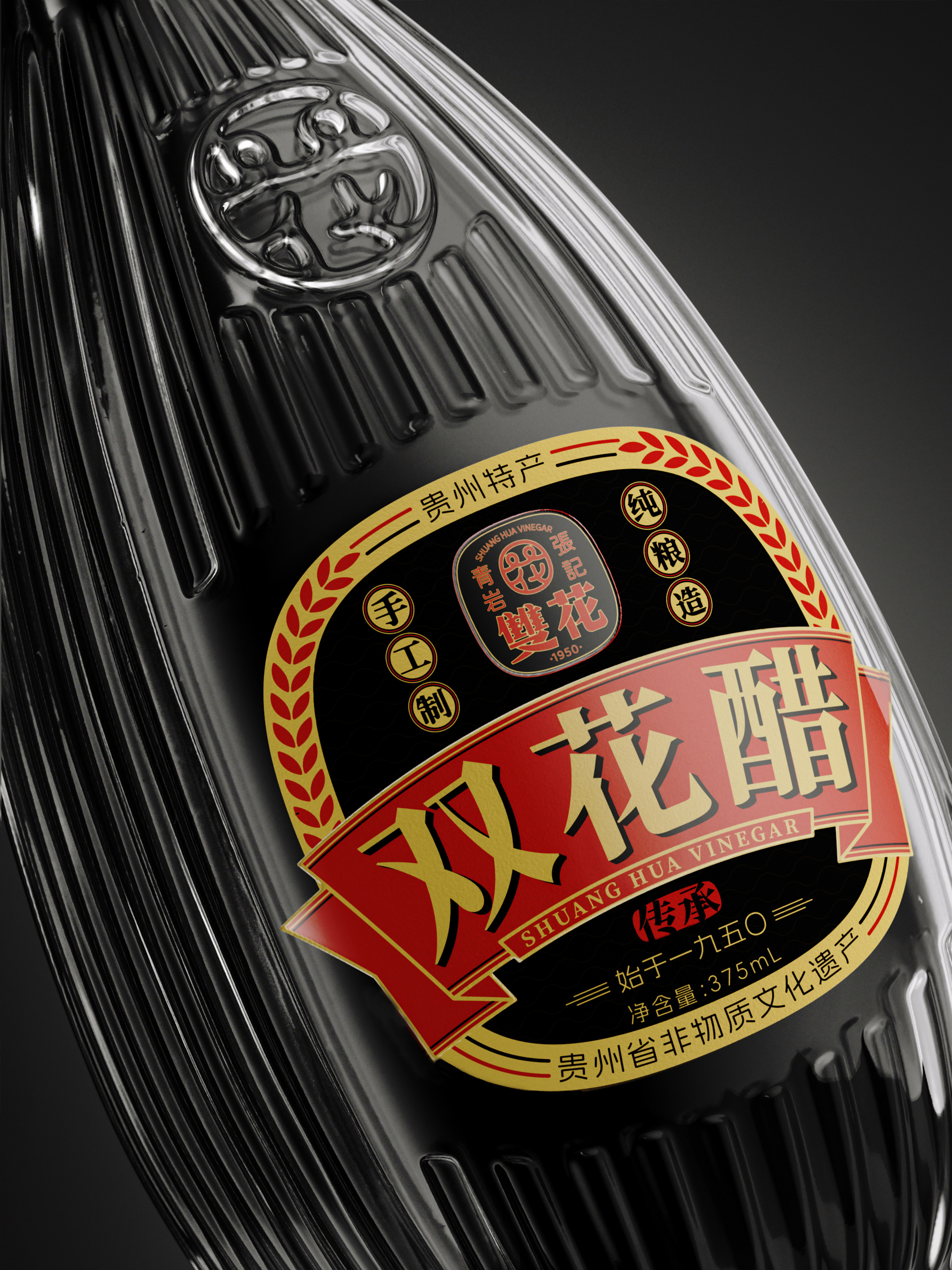
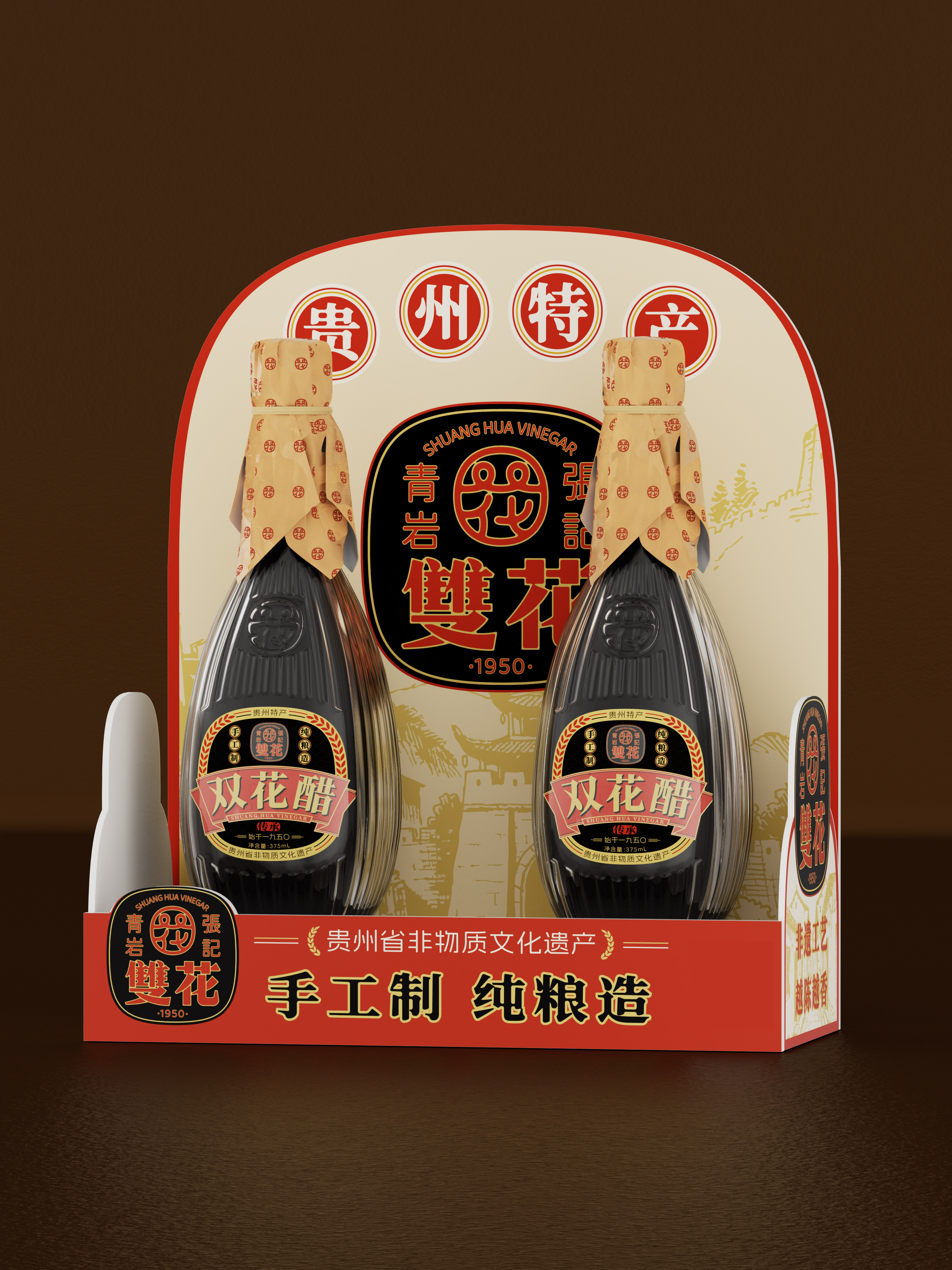
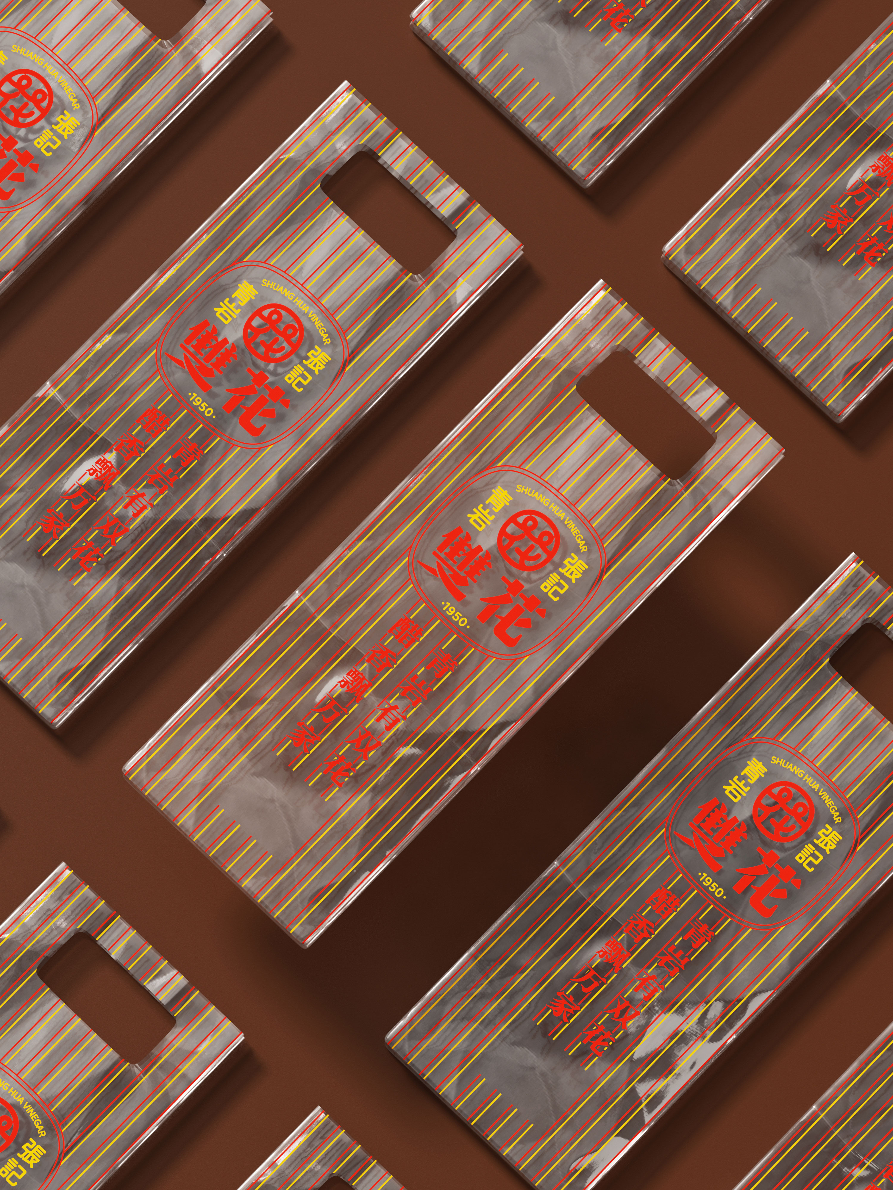
The visual strategy draws directly from the fermentation process, adopting the “vinegar bubble” as a key motif, abstracted into the core logo. The bottle features a round top and a square base—a form echoing the traditional Chinese cosmology of the round heaven and square earth—creating a distinctive brand icon. The vertical ribbing is designed to create a dynamic interplay of light and shadow, serving as a visual metaphor for the dense viscosity of the premium vinegar within.
The label design draws on the refined composition of traditional Chinese seals, creating it a dignified and substantial presence. Subtle nods to engraved plaques and ceremonial ribbons enrich the visual language, deepening its unique cultural resonance. Illustrations capture the distinctive architecture of Qingyan Ancient Town and traditional vinegar-making processes, turning the product into a tangible and portable embodiment of local taste. Golden wheat ears highlight the vinegar’s natural grain origins, symbolizing the brand’s dedication to time-honored craftsmanship. The typography revives the hand-painted advertising style of 1950s China, using expressive retro brushstrokes to highlight the identity as a “provincial intangible cultural heritage” and honor the legacy of “three generations of master artisans.”
A refined palette of black, gold, and red adds deeper meaning to the design. Black, inspired by the vinegar’s rich, dark hue, imparts a sense of heritage and depth. Gold signifies the brand’s 75-year history, underscoring its premium value. Red reflects the passion upheld through three generations of dedicated craftsmanship. Together, these colors create a cohesive visual system that bridges tradition and modernity, transforming the abstract concept of intangible cultural heritage into a tangible character and quality.
Credits

Entrant Company
Yizhou Zhou& Autumn Li
Category
Typography - Motion
Country / Region
United States

Entrant Company
Freelance
Category
Mobile App - Medical
Country / Region
United States

Entrant Company
Spotlight Integrated Marketing Co., Ltd.
Category
Event - Music
Country / Region
Taiwan
Entrant Company
Bold Creatives
Category
Advertising - Advertising Campaign
Country / Region
Saudi Arabia