
2025 Gold Winner

2025
Entrant
Category
Client's Name
Country / Region
About The Entry
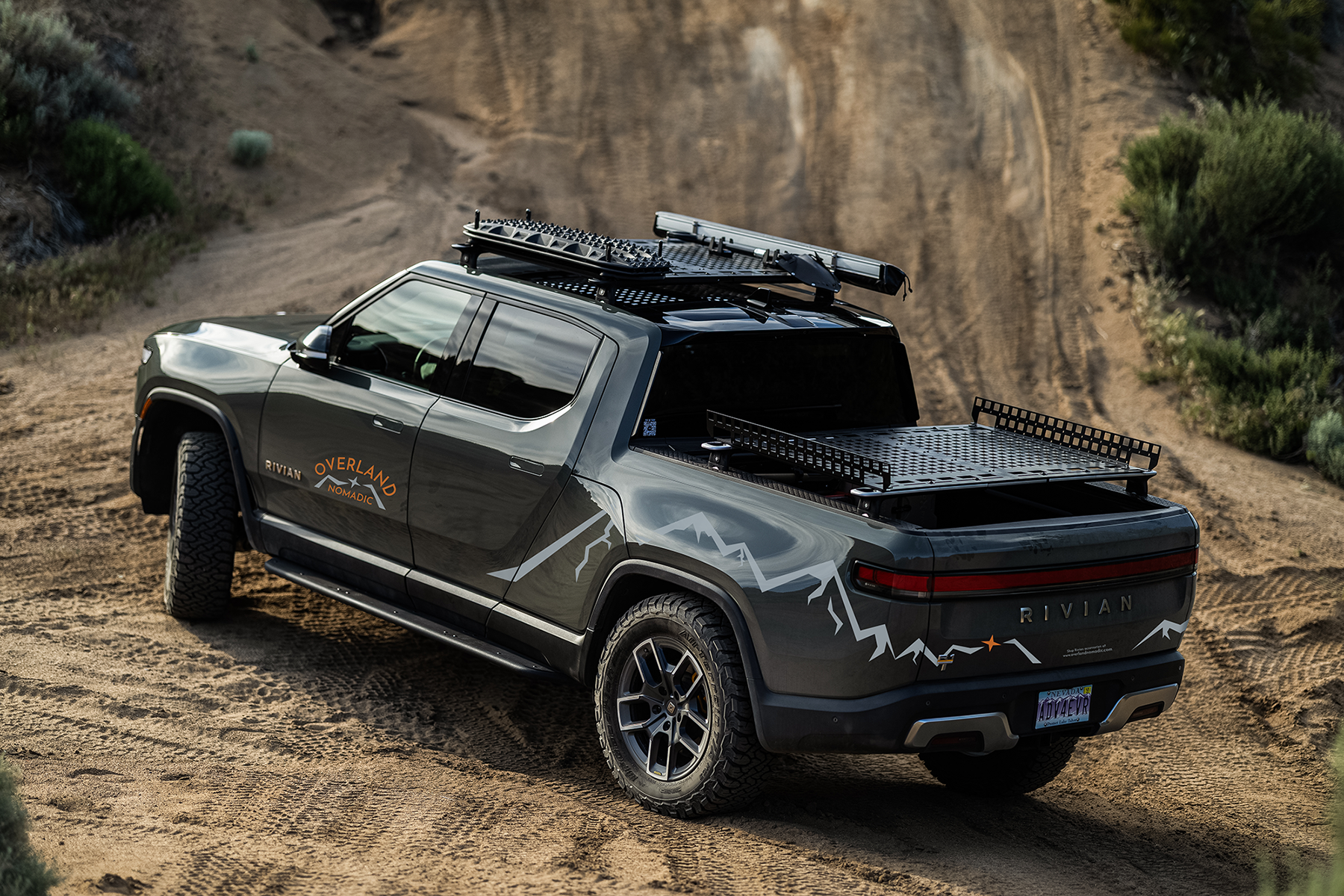
The Overland Nomadic logo shows a rugged mountain landscape with a compass needle at the center — simple, outdoorsy, and built to feel like it belongs on the trail.
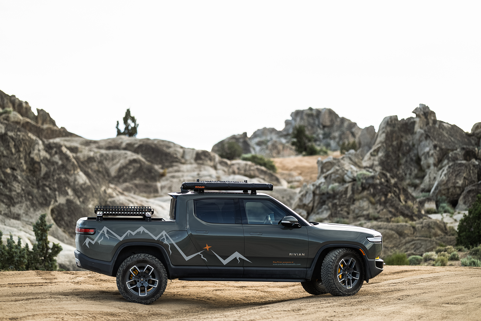
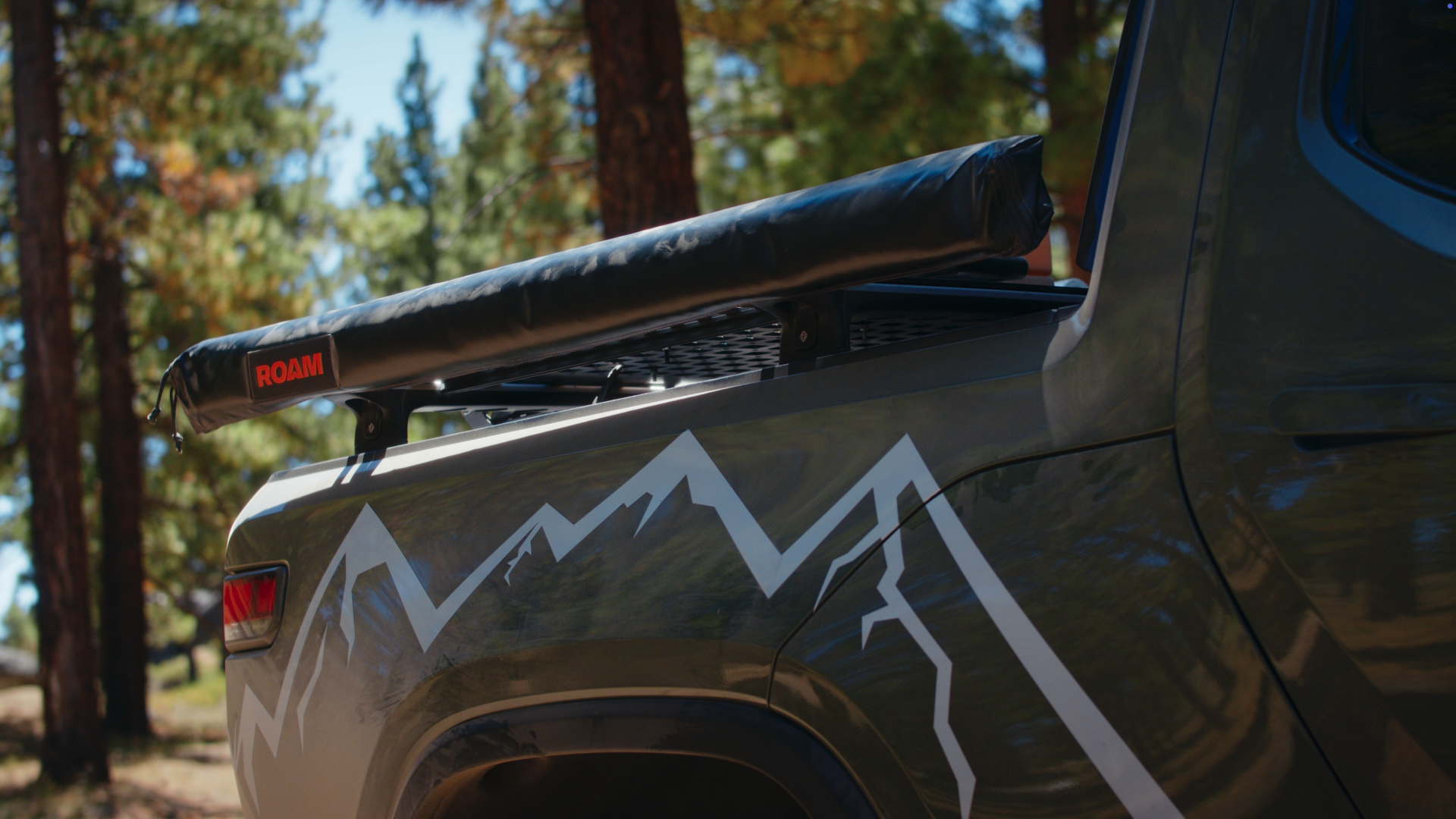
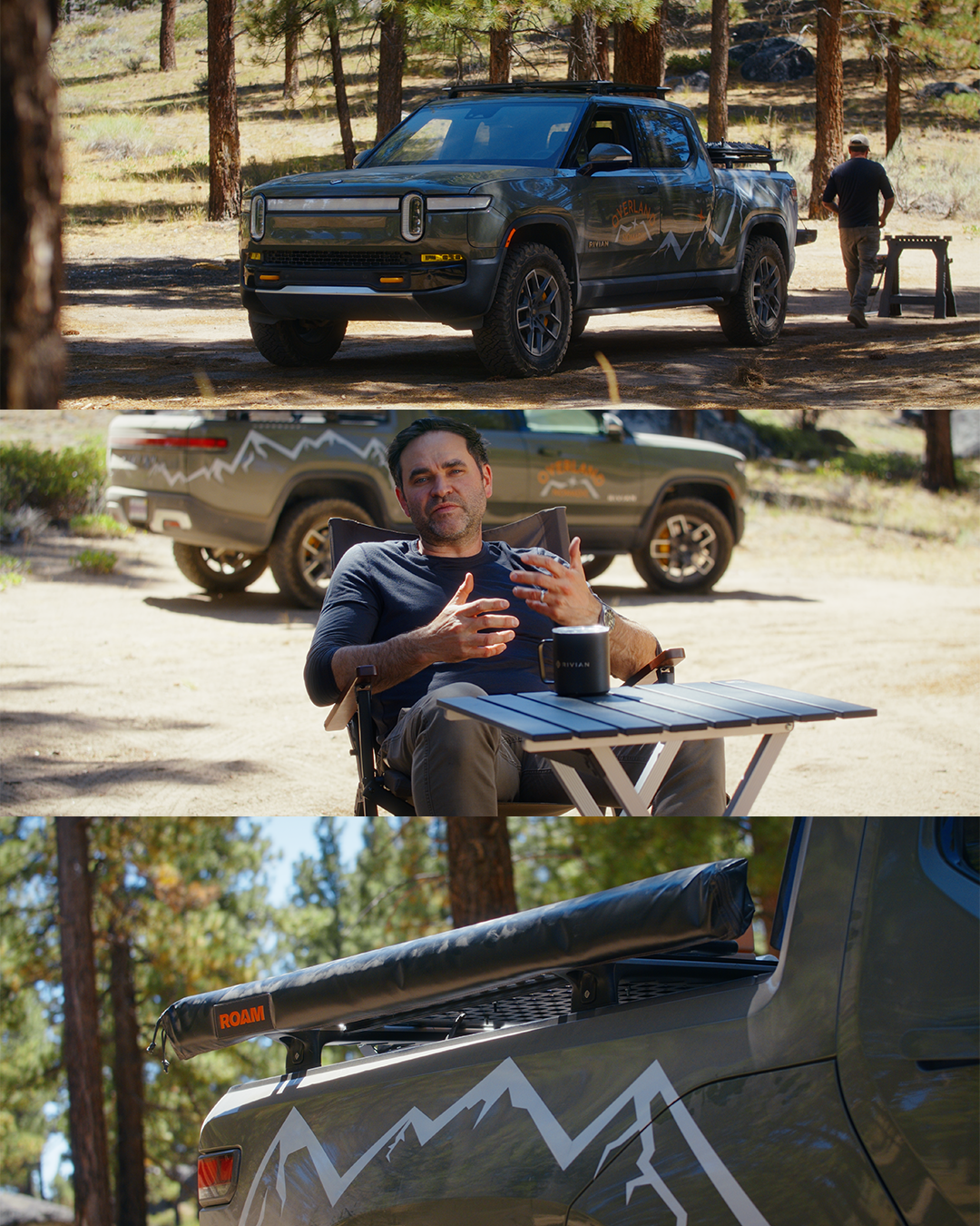
For the truck graphics, I wanted the design to flow naturally from the logo, as if the mountain lines continued right across the vehicle. The lines have a spontaneous, hand-drawn feel — not perfectly geometric, but intentional. It gives the truck movement and energy without feeling forced.
It’s subtle branding: not oversized, not in-your-face. The idea was to make something that still highlights the brand but looks like something you’d want on your vehicle even if you didn’t work for the company.
2025 Gold Winner

2025 Gold Winner

2025 Gold Winner

2025 Gold Winner