
2026
Archer Packaging Redesign
Entrant
AMP Agency
Category
Integrated Marketing - Brand Transformation / Repositioning
Client's Name
Archer
Country / Region
United States
Gallery


About The Entry
Archer sought to redefine its position in a stagnant, visually homogeneous category characterized by dark colors, hyper-masculine visual codes, and faux rustic identities. The objective was to elevate the brand from a traditional meat snack to a premium, modern solution appealing to health-conscious, discerning consumers. Our goal was threefold: to meaningfully differentiate on a crowded shelf, elevate jerky as a premium snack, and transform “real” from a claim to a brand conviction rooted in authenticity and culinary expertise.
The strategy centered on breaking category convention. The name was streamlined from "Country Archer" to simply Archer, conveying a more contemporary, premium sensibility. The redesign employed a dynamic, bright, and energetic color palette—using creamy beige, savory orange, and deep navy—to cut through the visual clutter and align with the modern, better-for-you snacking aisle. Design language incorporated thoughtful layering and a new bull icon to embody authentic brand confidence. This was reinforced by a refined wordmark and declarative messaging (LONG LIVE REAL MEAT) on the back of the package, emphasizing transparency and protein credentials.
The redesigned brand system successfully achieved its core objectives of differentiation and modernization. On the shelf, Archer now stands apart with immediate visual impact, a strong point of view, and unmistakable brand recognition. The repositioning effectively communicates the brand's authenticity, quality, and craveability, establishing Archer as a modern solution built for long-term growth in the competitive savory snack market.
Credits

Entrant
Xiamen Institute of Technology
Category
Typography - Poster
Country / Region
China

Entrant
25TH MOMENT
Category
Event - Wedding
Country / Region
China
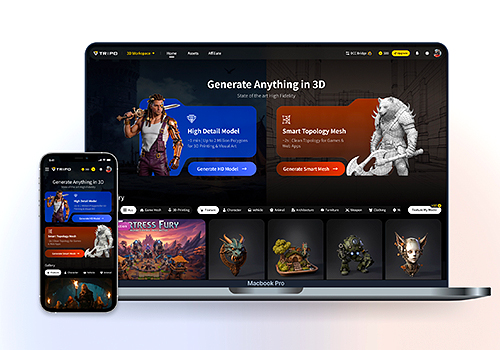
Entrant
Beijing VAST Technology Co., Ltd
Category
Website - AI-Integrated Website (NEW)
Country / Region
China

Entrant
hufax arts / FJCU
Category
Typography - Book
Country / Region
Taiwan