
2026
Chattahoochee Nature Center Rebrand
Entrant
Golden Lasso Agency
Category
Corporate Identity - Logos
Client's Name
Chattahoochee Nature Center
Country / Region
United States
Gallery



About The Entry
Since 1976, Chattahoochee Nature Center has been a quiet force of nature. Across its summer camps, community events, and outdoor trails, this Atlanta-area nonprofit nestled on the banks of the Chattahoochee River has helped people of all ages form lasting ties with the wildlife and plants that keep life flowing throughout the region.
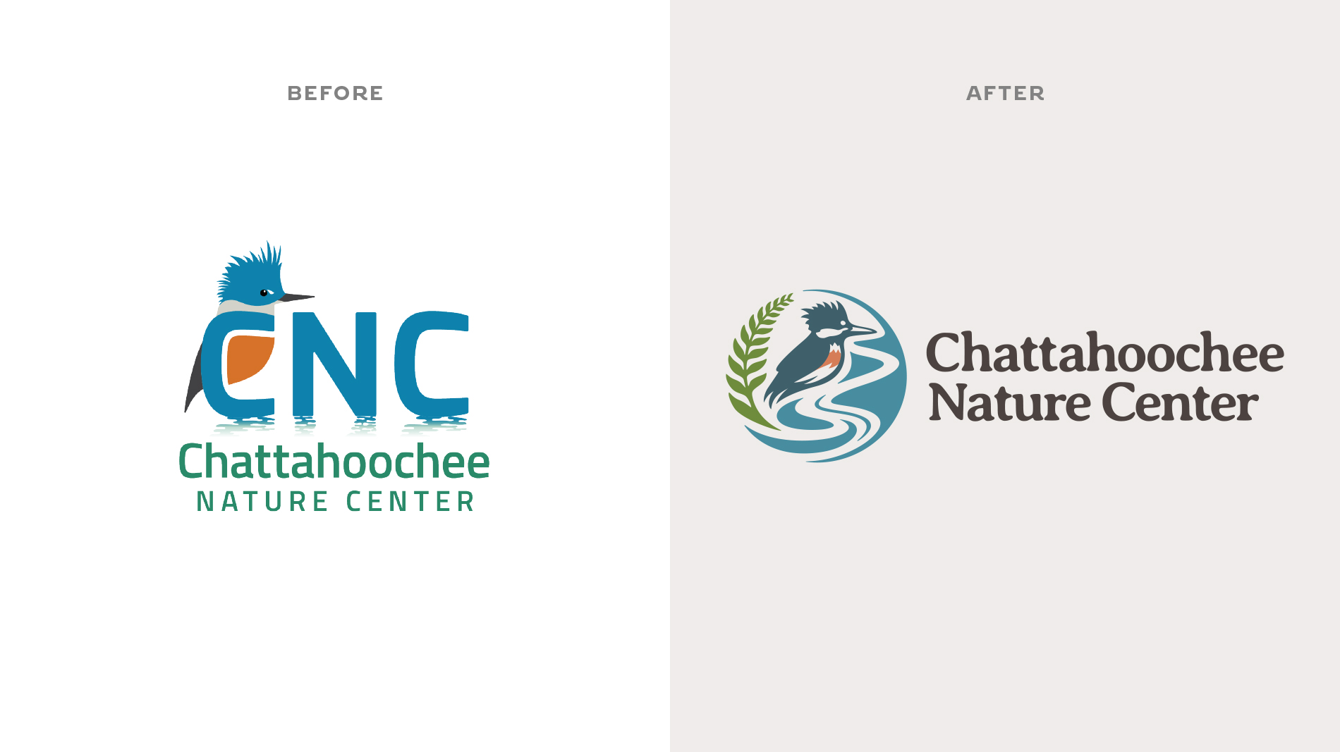
Leading into its 50th anniversary year however, the Center’s quiet call was getting harder to hear — and their dated branding wasn’t helping. It featured the internal shorthand “CNC” (which meant nothing to outsiders) and a clunky logo lockup that wasn’t built for digital applications.
They needed a full strategic, visual, and messaging rebrand.
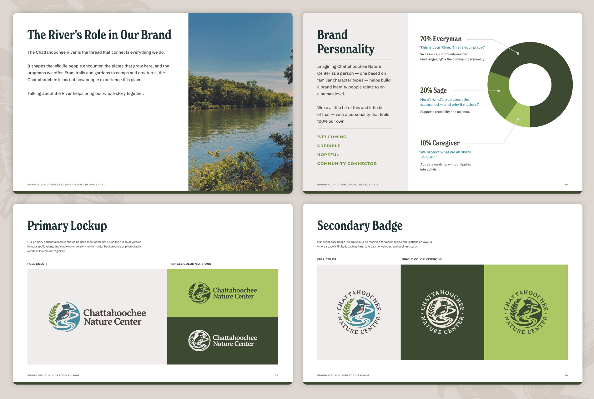
Project Mood: Neo-Nostalgia. Emerging from a workshop with executive leadership, our creative direction for the rebrand was a combined celebration of the Center’s rich history and a modern reinterpretation of naturalist field guides.
Unifying Theme/Main Character Energy: The River. We positioned the Chattahoochee River as the natural thread that runs through everything the Center does, from wildlife rescue to native plant conservation to sparking children’s curiosity along the boardwalk's edge.
The Logo: Revitalized. We “rewilded” their much-loved belted kingfisher (embodying the Center’s own call back to nature), added a fern frond (as a nod to their native plant work), and let the River itself stream down the middle as a literal, physical line — the spine along which the rest of the identity extends.
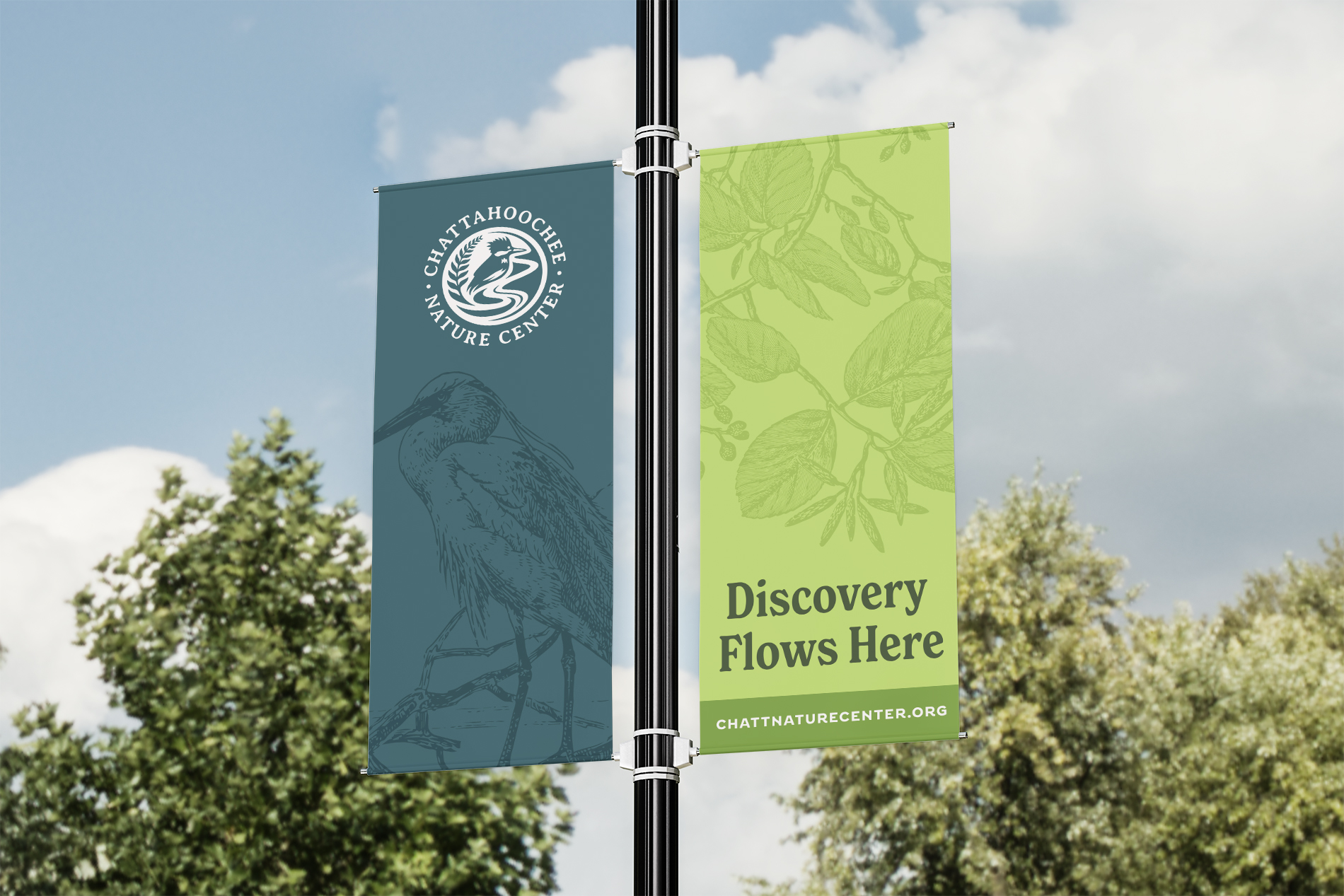
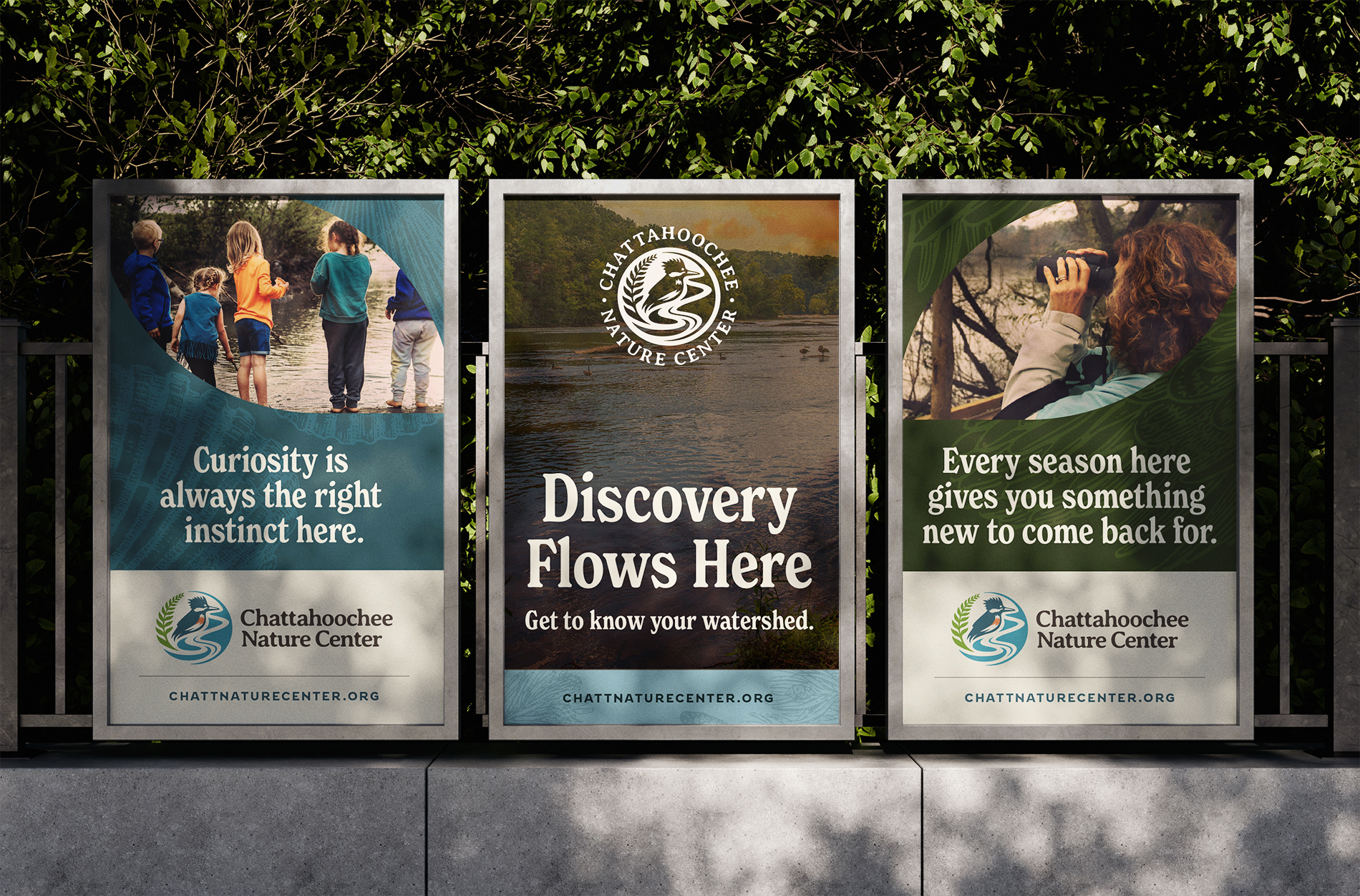
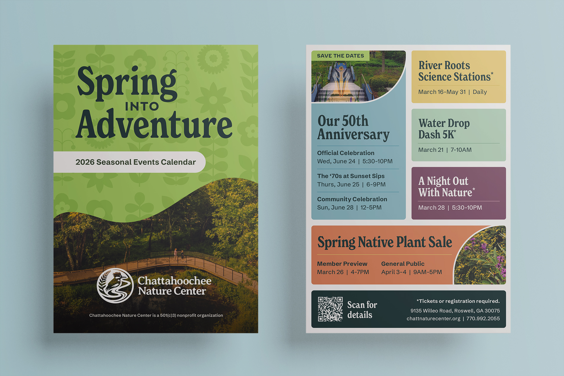
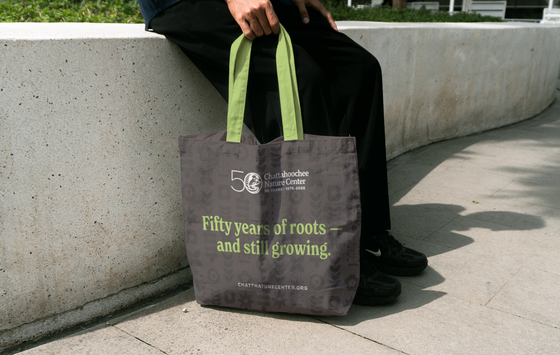
Brand Flow: Watershed Moments. Each visual element feeds into the same current. A color palette drawn from the Chattahoochee’s own features and landscape (Oxbow, Clover, Azalea). Vintage-style engravings of local flora and fauna. And retro-modern typography and botanical accents that reflect the field-guide mood. It all flows into a new tagline, “Discovery Flows Here,” that works as both a headline and a promise on a trailhead sign.
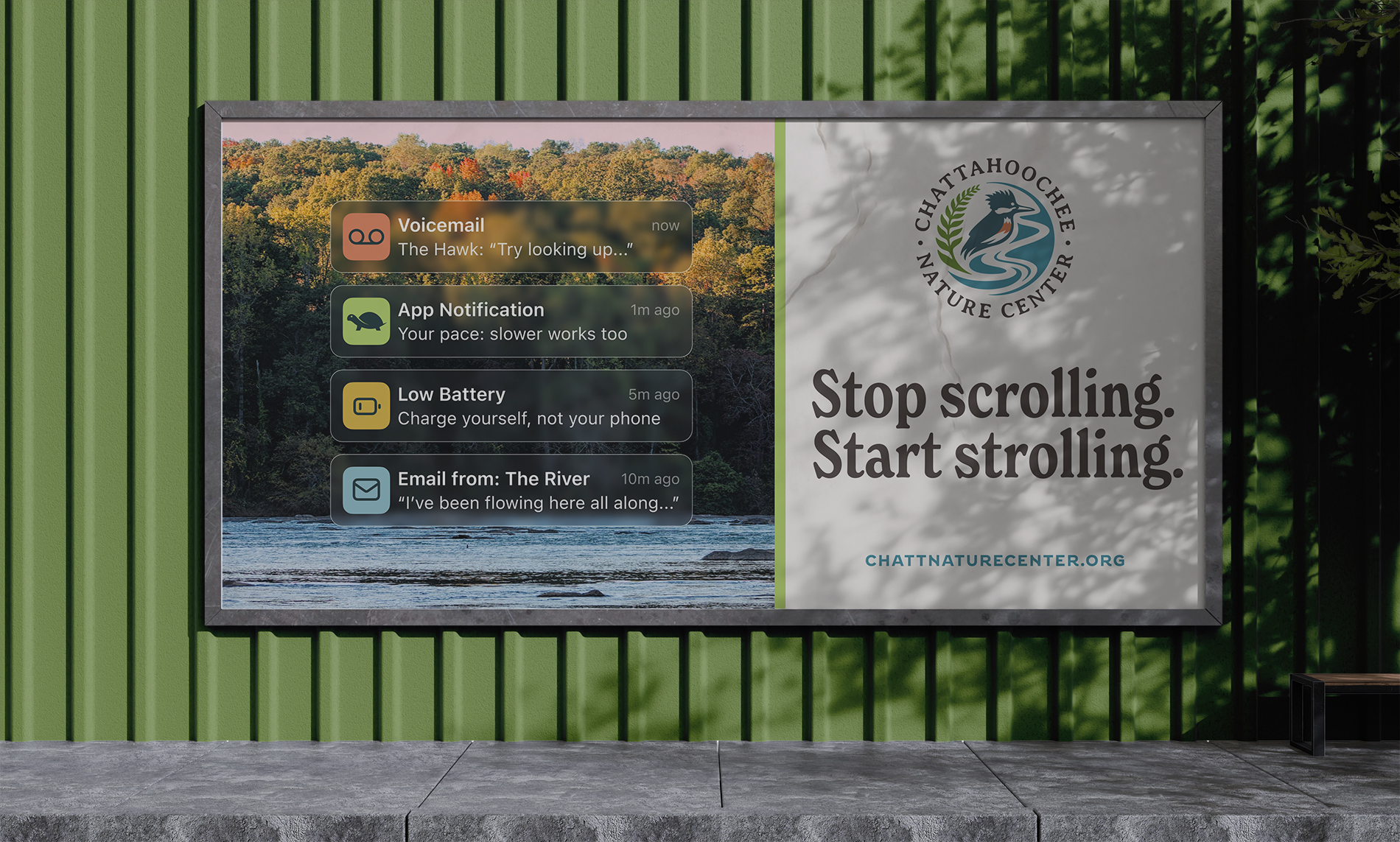
The Brand: Relaunched. To round out the engagement, we created a launch campaign concept called “Find a Better Signal.” A playful challenge in the language of digital life redirected to the great outdoors, the idea raised awareness of Chattahoochee Nature Center
as the natural connection people everywhere have been missing.
Credits

Entrant
drawinginc
Category
Corporate Identity - Brand Identity
Country / Region
Ireland
Entrant
Clearfont Media, LLC
Category
Corporate Identity - Logos
Country / Region
United States

Entrant
Tomato Tomate
Category
Outstanding Agency Awards - Oustanding New Agency (<24 Months Old)
Country / Region
United States

Entrant
McKinsey Global Publishing
Category
Branded Content - New Category
Country / Region
United States