
2020
Rebrand
Entrant
Klick Inc
Category
Corporate Identity - Business Card
Client's Name
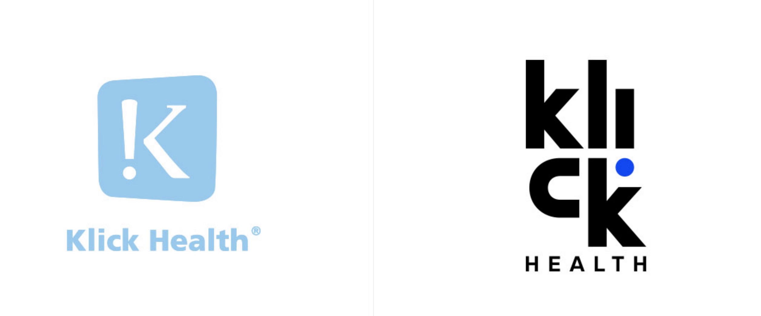
Klick Health
Country / Region
Canada
Klick Health has been growing like crazy. But its corporate identity wasn’t keeping up. It no longer reflected the company’s purpose nor the unique people-centric culture that’s at the heart of the independent healthcare marketing agency. And even though Klick’s logo had high brand awareness, it no longer felt modern, nor in keeping with Klick’s high-energy, fun, and friendly personality.
The Brand Experience team knew they had to honor tradition yet take the company into the future. Every element should boldly pop off every page and screen—but in a friendly, “hello there,” conversational kind of way. And like everything at Klick, people should be at the forefront.
The concept was different, especially given the agency’s work in the healthcare industry. Being independent is different. Having values like kindness and empathy is different. And Klick really likes being different. So, they decided to own it.
It’s been mere months and the rebrand is already having an effect on Klick’s recruiting efforts. It’s reinforcing why clients want to work with them. It’s instilling a lot of Klickster pride. And while Klick is still Klick and not that much has changed, everything feels different.
Logo
The exclamation mark from the old logo is flipped on its head like an inverted “i.” The letters are now stacked playfully, the dot becoming the primary design element.
Font
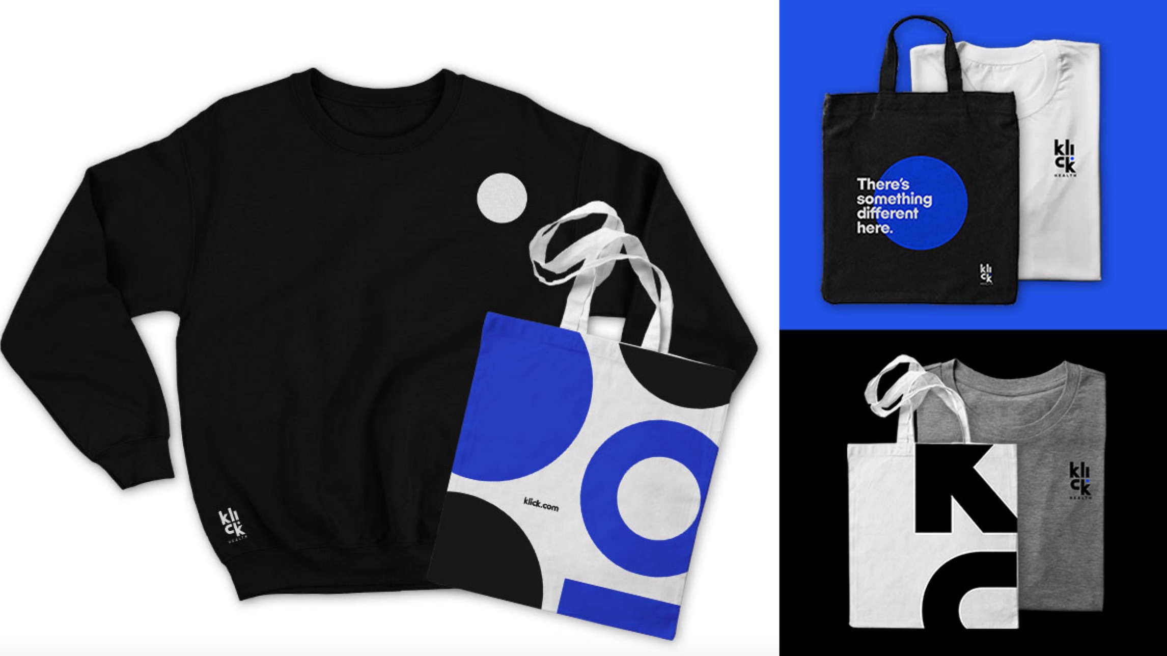
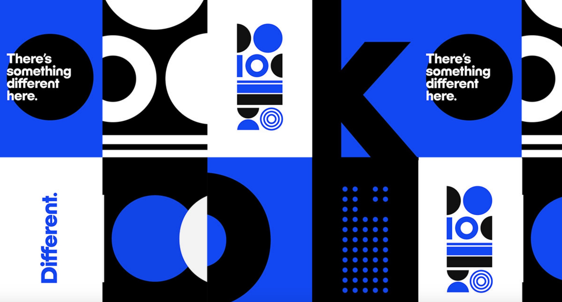
Introducing Klick Bold. Created to demand attention, but in a friendly and engaging way that sparks conversation.
Color
Healthcare brand colors may have a reputation for being understated. But Klick dialed-up the saturation on its signature blue and created a vibrant feel that projects excitement and fun.
People-first
Say goodbye to generic stock photography and healthcare icons. Klick’s people are at the heart of its rebrand, being themselves in bright, bold and fun situations that reinforce what the company’s all about.
Tagline
The rebrand was built around “There’s something different here”—Klick’s brand essence and a new tagline. It speaks to the countless reasons behind the company’s double-digit growth and 11 Best Workplace awards in 2019.


Entrant
Storia Photo Video
Category
Video - Educational
Country / Region
Canada
Entrant
Misty Munoz
Category
Integrated Marketing - Event Marketing
Country / Region
United States

Entrant
Multi Web Marketing
Category
Website - Multi-level Marketing
Country / Region
United Kingdom

Entrant
Arachno
Category
Social Media - Instagram Page
Country / Region
Italy