2017
Cang Inn
Entrant Company
Inno-stone Studio
Category
Marketing Branding & Design - Corporate Identity
Client's Name
Ningbo Zhenhai Yanwuyan Visual Design Co. Ltd.
Country / Region
China
This theme Inn consists of three different parts : These are named respectively as 'Cang Cyan', 'Cang Green' and 'Cang Red'. The word 'Cang', which originates from chinese ancient poetry, has the meaning of 'collection' and 'ensconce' here in the design.In the Logo design, the vertical line represents abstract architectural structure, while the thin line forms a simple shape in a manner of extending from the window. And the image of the water wave is used in design for 'Cang Cyan', so as the bamboo for 'Cang Green' and the plum flower for 'Cang Red', to present a soft and veiled eastern beauty, a visual fashion endowed with the idea of Zen.
Credits


Entrant Company
Wassabi Design Firm
Category
Marketing Branding & Design - Character Design
Country / Region
United States


Entrant Company
Web Shop Manager
Category
Website - Consumer
Country / Region
United States
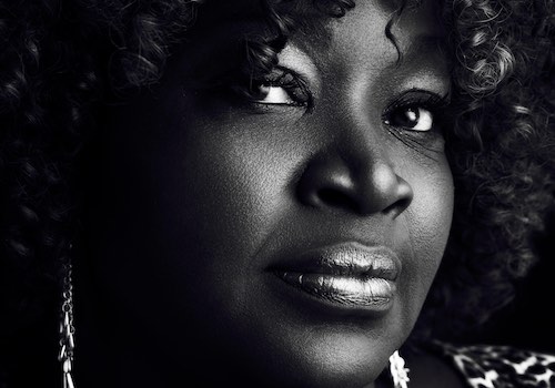

Entrant Company
Claudio Di Lucia
Category
Photography - People / Portrait
Country / Region
Germany


Entrant Company
PINCH / MARTIN TREMBLAY PHOTOGRAPHER
Category
Photography - People / Portrait
Country / Region
Canada


