
2018
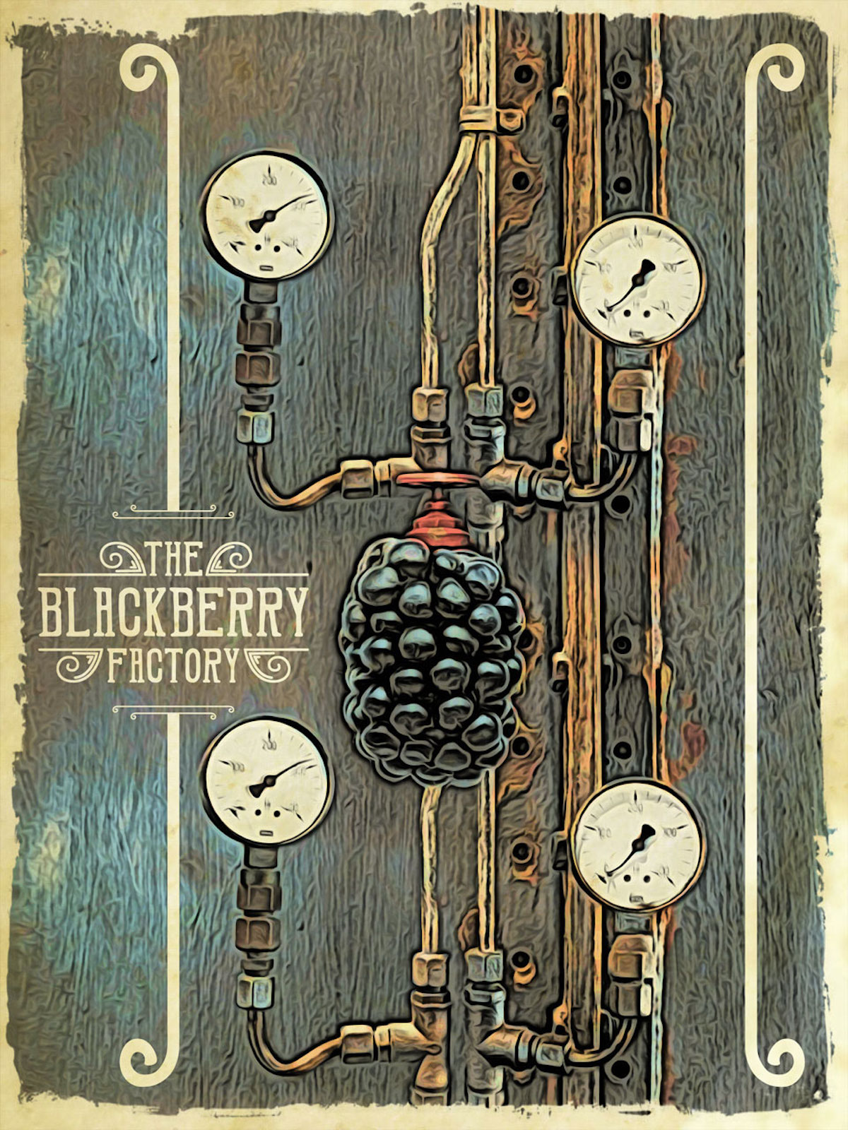
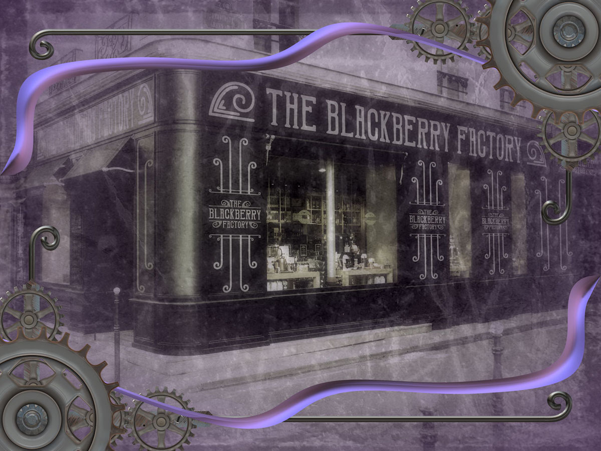
The Blackberry Factory Wall Art Series
Entrant Company
Teresa Cowley
Category
Marketing Branding & Promotional - Poster Series
Client's Name
Curioos wall art shop
Country / Region
Canada
This whole idea came about after using blackberry juice to dye papers for the covers of a journal. I started to imagine this crazy steampunk style factory producing blackberries (the fruit not the phone) for some reason as I thoroughly saturated the paper with the juice from the freshly picked berries.
I began to think of what advertising posters for an old fashioned factory that produces blackberries would look like. Would they have parts of the machines in them or just be typographic? I started working on a design with valves and pipes, then I played around with typography and simple ornaments to create a frame around the machine parts.
It was around this time I began to use the paper I dyed on the covers of a journal and thought to use the piece I designed on the cover. But the more I thought of it, I thought something like a typographic label would work better. The dyed paper took on an intense purple colour hence the colour choice for the typographic label. Out of curiosity, I took parts of the typography layout and put it on the facade of a building next.
I ended up not using them on the journal cover but thought they'd make a great series of pieces for my wall art shop.
Entrant Company
Viscul Creative
Category
Video - TV Ad Campaign
Country / Region
United States

Entrant Company
Kukoon Media Inc.
Category
Corporate Identity - Logo
Country / Region
Canada

Entrant Company
Leroy & Rose
Category
Marketing Branding & Promotional - Poster Single
Country / Region
United States
Entrant Company
The Mint Museum
Category
Corporate Social Responsibility - Pro Bono (Free)
Country / Region
United States