2018
New Avatar for Nepal's own Tokla Green Tea
Entrant
Almond Branding
Category
Corporate Identity - Packaging Single
Client's Name
Nepal Tea Development Corporation
Country / Region
India
The Brand Tokla is as old as the tea industry in Nepal. With this 150 year old heritage, its not surprising that the name Tokla has become synonymous to tea or Chia as its locally known in Nepal.
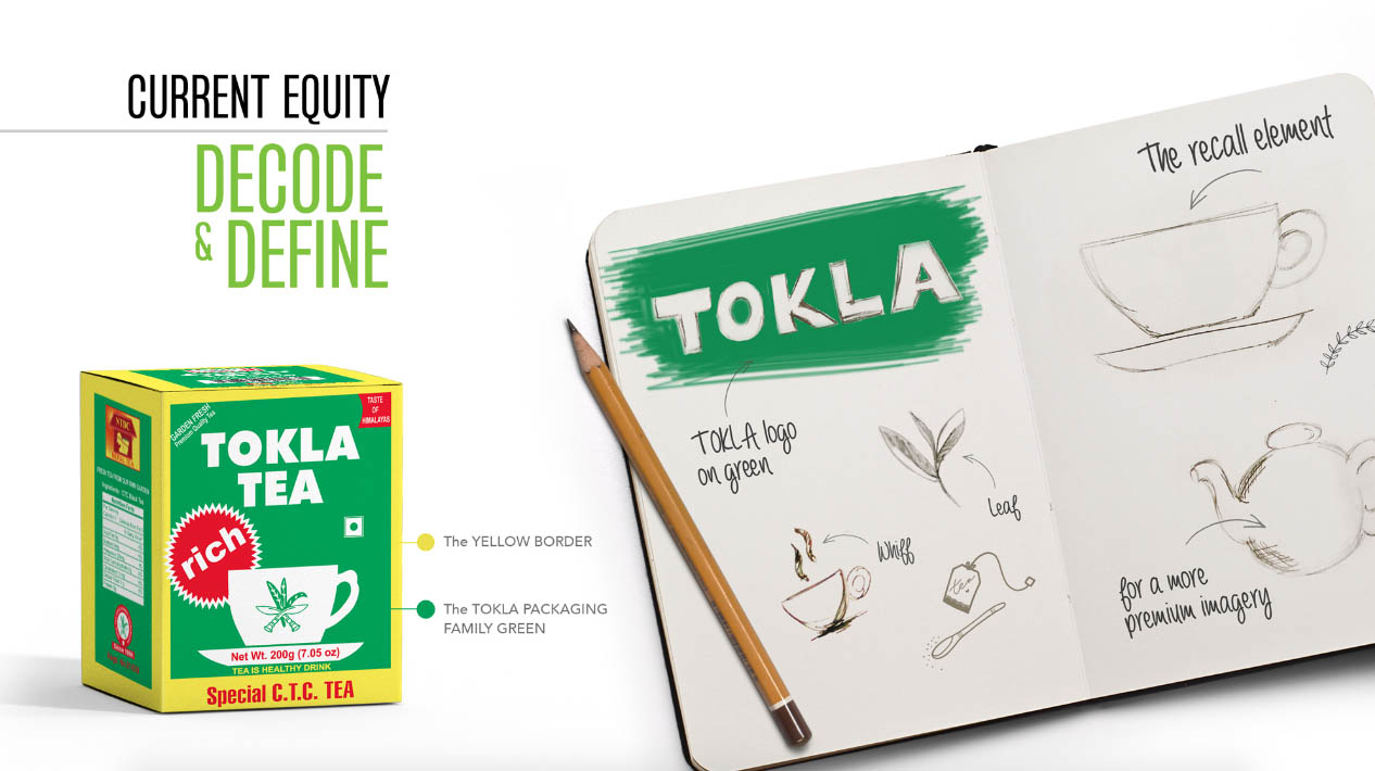
The brand has a variety of offerings from regular CTC tea, premium long leaf, Masala tea and the likes and has recently ventured into Green tea to reach out to the rapidly growing health conscious audience in the Himalayan country. However, the packaging of Green tea badly needed a facelift in order to appeal to this slightly different discerning audience.(Refer Slide 1)
There has been a few attempts made locally to modernize the pack but they had failed miserably, each time resulting into dip in sales as they had swayed away too much from the family of Tokla.
The range from Tokla had a characteristic dark green colour with Tokla branding in white and our research showed that the masses in Nepal identified the brand with this colour codes. We also observed that there is a 'not-tobe-missed' white teacup right at the centre of each pack.
The key challenge was not to deviate far from the parent Tokla Design language and yet connote the modern and premium offering to an evolved audience.
Our proposed approach was three fold(Refer Slide 2)
1. Retain brand Tokla boldly on green at top
" Take advantage of Trust & Heritage as well as familiarity
2. Bring in premiumization with design elements and a strong Visual Hook for recall
" Reach out to the evolved sensibilities of the evolved consumer
3. Convey the Freshness and Organic certifications and claims on Front of Pack(FOP)
" Back it up with health benefits on the Back of Pack (BOP)
While rest of the range had a flat white cup, we chose a white teapot as the central element of the pack that would also serve as the Green tea branding unit.
With this a strong connect with the parent range was established. Now with fonts and styling and everything else, the packaging was made to look premium and upmarket.
A brown earthy looking wooden spoon holding the tea leaves was crafted as the Visual Hook of the pack - the design element that will be recalled by consumers if they are asked to describe the pack. (Refer Slide 3)
The entire thing was laid on a Nepali patterned band at the base, which along with the gold-foiled edge at the top gave the packaging a nice framing. The design developed was such that it seamlessly could adapt to both horizontal as well as vertical panels of the packaging.
Since the Green tea market is still piking up in Nepal, it was quite critical in our opinion, to educate the first timers to the exact process of brewing their perfect cup, lest they end up having a bad experience because of no fault of the product.
Hence an entire section was devoted to the "Art of making Green tea" (Refer Slide 5). Infact each face of the carton was judiciously utilized to communicate the Tokla Brand Story and reasons to pick up the pack. (Refer Slide 6)
The grainy textured effect to the entire pack interspersed with spot UV and embossing effect and the gold-foiling shimmer gave the packaging the much needed premium look that made it stand differentiated on the shelves and yet look belonging to the Tokla family. (Refer Slide 7)


Entrant
Meli Marketing
Category
Corporate Identity - Logo
Country / Region
United States
Entrant
Tarrant County College
Category
Content Marketing - Publication Article / Column
Country / Region
United States

Entrant
ChappellRoberts
Category
Integrated Marketing - Nonprofit
Country / Region
United States


Entrant
Agência Um
Category
Video - Health & Fitness
Country / Region
Brazil


