
2018
Ad Victorem Logo Design
Entrant
Ad Victorem
Category
Corporate Identity - Logo
Client's Name
Ad Victorem
Country / Region
United States
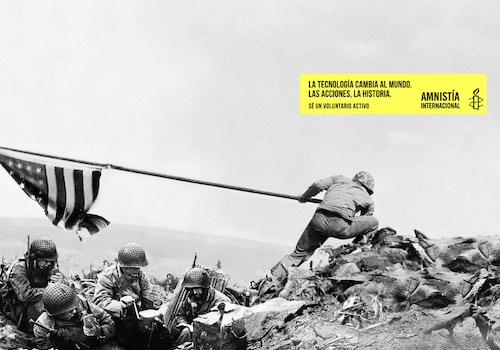
The Ad Victorem agency was inspired by the origin of its founders last name Wiktor, which is derived from the Latin name Victor. Ad Victorem is based on the phrase Latin "Ad Victorem Spolias" ?To The Victor Go The Spoils. The logo was formed out of the "Renaissance theme" using symbolism and imagery of Roman legions carrying banners into battle provided inspiration for the logo.
The logo had to be easily recognizable, simple, memorable and meaningful - not an easy task. The "victory flag" emerged as symbol for the agency, just as it was used during times of battle. Soldiers gave priority to the flags of their regiments and many would sacrifice their lives defending it to protect it from enemy capture. Just as many countries honor their flag during their national anthems, there's great loyal towards the symbol of flag. The end result, fit the narrative crafted from the name of the agency and the foundation of principles from which we created Ad Victorem.


Credits

Entrant
Nokua Design
Category
Photography - Food & Beverage
Country / Region
Malaysia

Entrant
Upp B2B
Category
Integrated Marketing - Company Branding
Country / Region
United Kingdom
Entrant
Castillo de If
Category
Corporate Social Responsibility - Pro Bono (Free)
Country / Region
Guatemala
Entrant
M&A Creative Agency
Category
Advertising - Magazine Cover
Country / Region
Portugal