
2020
CG Tower Sales Brochure
Entrant Company
Impact North Inc.
Category
Marketing & Promotional - Brochure
Client's Name
Cortel Group
Country / Region
Canada
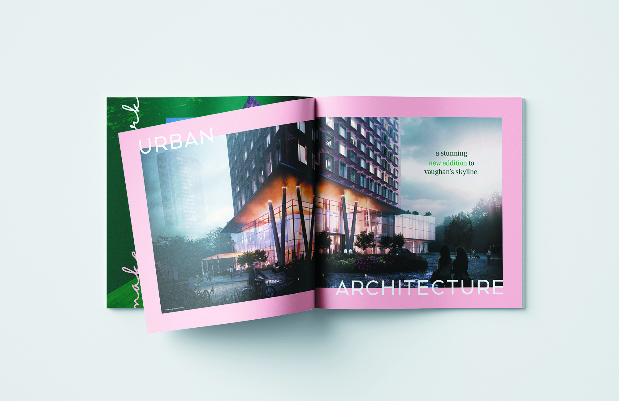
Concept/Creativity – Every aspect of this brochure was designed to make a distinct mark on the people who encountered it – perfectly in line with the campaign. The cover was selected partly because its reflective surface made it stand out within the presentation centre, creating a buyer buzz, and partly because the surface picked up the surrounding colours and produced a colour palette similar to the greens and pinks used throughout the campaign and extensively within the brochure. The cover was debossed with the CG Tower stamp once again literally making its mark. The first page in the brochure was a clear acetate insert onto which we placed the Make your Mark campaign line and a brush stroke that once flipped over, revealed the CG Tower emblem. The colour treatment on this acetate page was extremely rare at the time and only achieved with a specialized machine new to the market.
Layout/Design/Content – The function of the content was to inform and to create a vibe for the building through stunning renderings and powerful call outs highlighting the major selling features of the project – transit, community, park space, and of course, the architecturally unique components such as all brick exterior and amenity spaces at heights unlike any in the city. The handwritten font which formed the CG in the tower emblem was used throughout the brochure to highlight the signature nature of the project. In line with the notion that this building was very much a product of an intense creative process, an entire spread was dedicated to this very process – bringing the reader into the thinking that stood behind the building which they would one day stand within. As every aspect of this campaign was approached, visuals were intended to steal the show and thus the copy was kept to a minimum – only used where it would intensify the image. This brochure specifically aimed at elevating the project by showcasing the contributors to it, and so spreads were created to highlight the designers, architects, and collaborators.



Entrant Company
Paradox Media Pte Ltd
Category
Advertising - Advertising Campaign
Country / Region
Singapore
Entrant Company
Mentalstack
Category
Website - Design / Web Agency
Country / Region
Poland
Entrant Company
Vitamin London
Category
Website - Information Technology (IT)
Country / Region
United Kingdom

Entrant Company
Vidico
Category
Video - Retail
Country / Region
Australia