2020
KuriosEd Logo
Entrant Company
Phoenix Lifestyle Marketing Group
Category
Corporate Identity - Logos
Client's Name
Ed Choice
Country / Region
United States
The Phoenix was selected to provide Brand Development and Strategic Planning services as well as to design and implement the Visual Representation for a new non-profit organization whose vision is to create a world that ensures universal access to quality education and provides the opportunity for living a more fulfilling life.
The Phoenix facilitated a successful Brand Development session and Strategic Planning workshop with key stakeholders of the faith-based organization. The outputs of these sessions included the establishment of the organization’s Vision, Mission and Goals. The Phoenix also developed the Brand Identity, Positioning and Key Messaging mechanisms for the organization. The Phoenix led key stakeholders through a Naming convention to establish the organization’s name: KuriosEd. As a result of the Brand Development and Strategic work, The Phoenix then developed the Brand’s Visual Identity.
The KuriosEd color palette was designed to include colors that serve as the foundation for the Brand Identity and as a point of recognition for the Brand’s target audience. The main colors in the logo represent trust, loyalty, wisdom, confidence and faith.
The Phoenix analyzed the competitive landscape of organizations that focus on educational reform in the US. The logo was designed to differentiate from existing organizations while still demonstrating KuriosEd’s credibility in the field. The Phoenix incorporated design elements that evoke a sense of community and aspiration. To create and ownable design, the logo features the organization’s name and includes both subtle and overt visual cues reflective of educational success.
The KuriosEd Brand Mark is a powerful image representing an open book that conveys the Brand’s tenets of education, knowledge and wisdom. The turning pages of the book represent access to more educational opportunities and the knowledge gained through quality education. As the pages continue to turn, they turn into KuriosEd. The Phoenix considered several distinct contemporary and elegant fonts to establish the Brand typography. The font selected for the logo conveys confidence and distinction.
Credits
Entrant Company
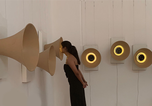
Sniffing out the differences
Category
Experiential & Immersive - Experiential & Immersive / Other
Country / Region
India

Entrant Company
Modmacro, Inc.
Category
Corporate Identity - Logos
Country / Region
United States

Entrant Company
BI WORLDWIDE
Category
Event - Live Show (NEW)
Country / Region
United States

Entrant Company
AARP
Category
Marketing & Promotional - Brochure
Country / Region
United States