
2020
ANGIA
Entrant Company
Bratus Agency
Category
Corporate Identity - Brand Identity
Client's Name
An Gia Investment
Country / Region
Vietnam
The logo became a story-teller narrating the effortfully developing journey of ANGIA. The brand name’s letter A was exceptionally modified with the removed crossbar, higher contrast promoting the depth and upward movement. The balance of two simple “A” letterforms in the beginning and the end constructed the stability and solidity of the logotype. The single letter A was also used as the logomark on different applications to make the visual identity more flexible and powerful. Moreover, we experimented with visual languages including typography, colors, composition, spaces, and materials to deliver a modern minimal identity and focus more on the clarified brand message. All elements of the layouts were built on a flexible grid to diversify visual contents as well as manage the visual system on every touchpoint – online and offline.
Credits
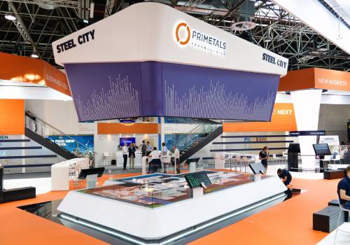

Entrant Company
Responsive Spaces
Category
Strategic Program - Interactive Brand Experience
Country / Region
Austria


Entrant Company
Magnetic Creative
Category
Content Marketing - Case Study
Country / Region
South Africa


Entrant Company
Vision Control Film and Animation
Category
Video - Animation
Country / Region
Germany


Entrant Company
Big Kahuna
Category
Audio - Audio / Other
Country / Region
United Kingdom


