2020
SO
Entrant
Next
Category
Corporate Identity - Brand Identity
Client's Name
Skin Only
Country / Region
Australia
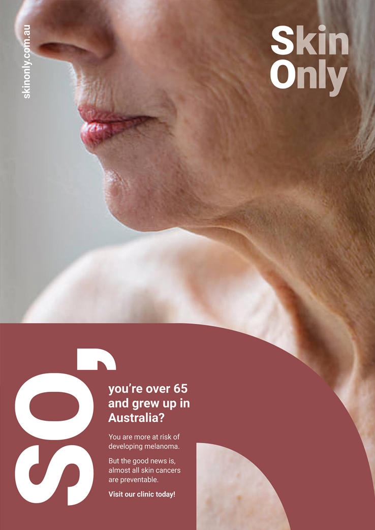
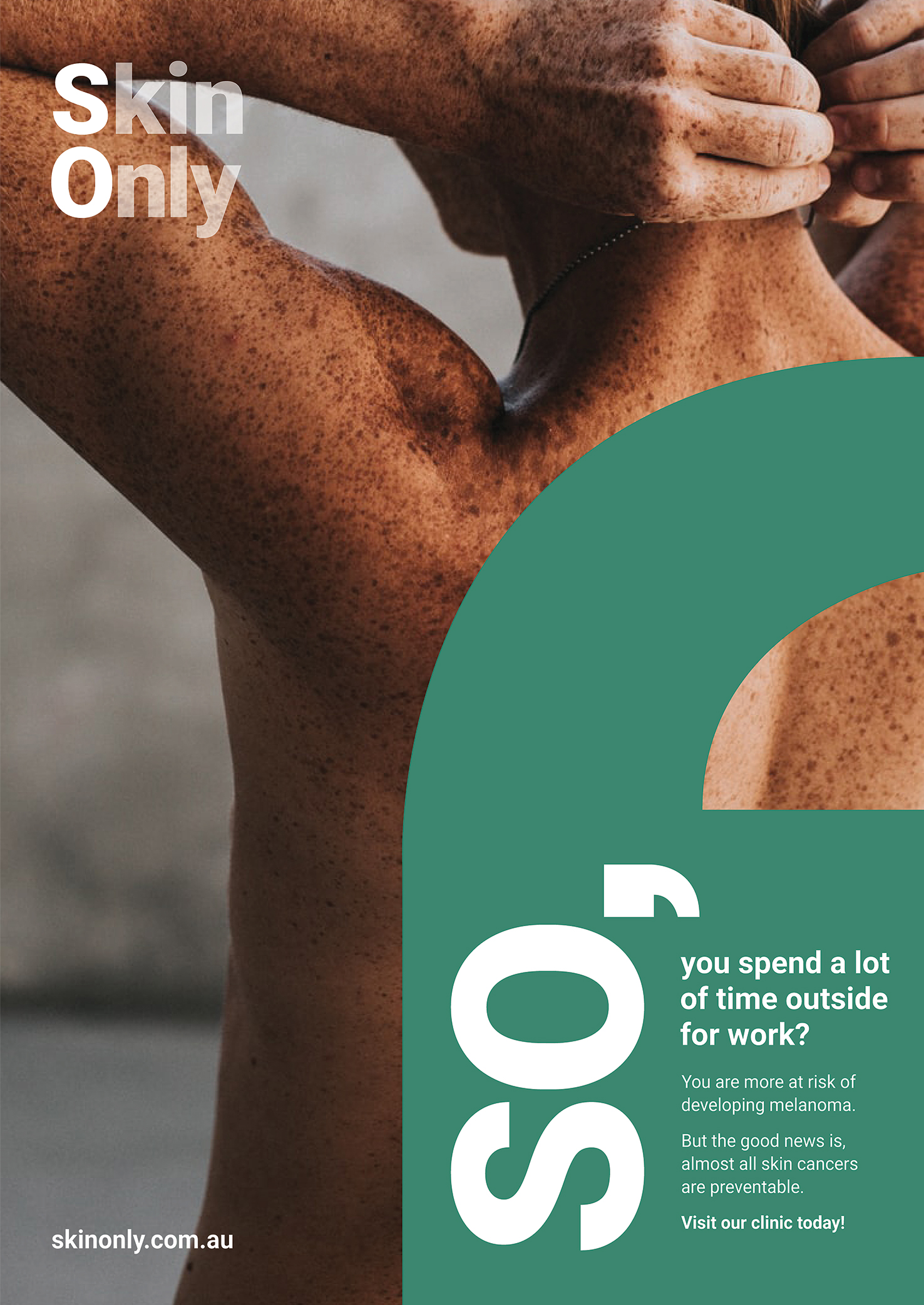
The goal of Skin Only was to reposition our client's practice, a skin checking and cancer clinic, against the myriad of competitors who all look ostensibly the same. Standard practice for these clinics in Australia is to use a bright orange dot or some representation of the sun to highlight the damage the sun's rays can do you. This approach is intimidating and, no doubt, discourages people from visiting these clinics – even though the risks of not doing so are extreme – especially in Australia. By contrast, our approach hinged on the name: Skin Only which we were able to shorten to the acronym 'SO'. This, along with a softer colour palette, allowed us to generate a gentler, more conversational style to the brand. SO, becomes the conversation starter – 'So, you have a family history of skin cancer?' – for example. The typographic elements then also became secondary brand symbols and the brand takes on a life of its own – flexible, powerful and effective.
Credits

Entrant
proof.
Category
Corporate Social Responsibility - Pro Bono (Free)
Country / Region
Bulgaria

Entrant
Vision Control Film and Animation
Category
Video - Medical
Country / Region
Germany


Entrant
José Salvador
Category
Social Media - Social Video
Country / Region
Mexico

Entrant
Studio Simpatico
Category
Website - Financial Services
Country / Region
United States
