
2021
Colorful Childhood
Entrant Company
Absolutely Shock You Studio
Category
Event - Celebration Event
Client's Name
Jiaxing Nanhu International Experimental School
Country / Region
China
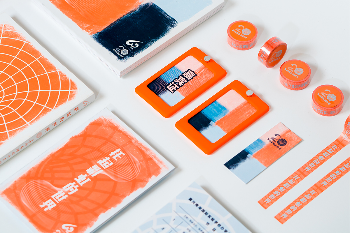
To celebrate the 20th anniversary of international primary school founding, A series of events and publications are launched with a cohesive visual identity. The designer researched the structure of landmark sculptures in school, He realized that the logo design can Inspired by sculptures. The logo is a clean and distinct design with only two figures that denote the number which is 20, It have both the function of information communicating and decorative as a character image. Meanwhile, The designer have designed a whole set of the anniversary event visual identity to create a friendly atmosphere.


Credits
Entrant Company
No Fixed Address
Category
Experiential & Immersive - Augmented Reality
Country / Region
Canada

Entrant Company
McAfee Brand Team
Category
Video - Animation
Country / Region
Australia

Entrant Company
FAR EASTONE TELECOMMUNICATIONS CO., LTD.
Category
Integrated Marketing - Integrated Marketing Campaign
Country / Region
Taiwan
Entrant Company
GoDaddy
Category
Strategic Program - COVID-19-Related (NEW)
Country / Region
United States