2021
Marumero ni me hana no tsuku hanashi
Entrant Company
iD. (Izumiya Design Office)
Category
Publication - Book
Client's Name
Editions Treville Co., Ltd.
Country / Region
Japan
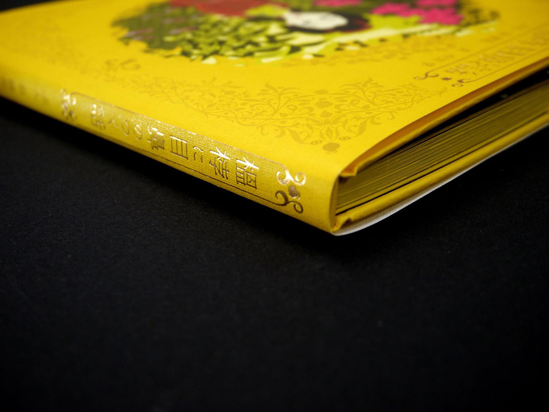
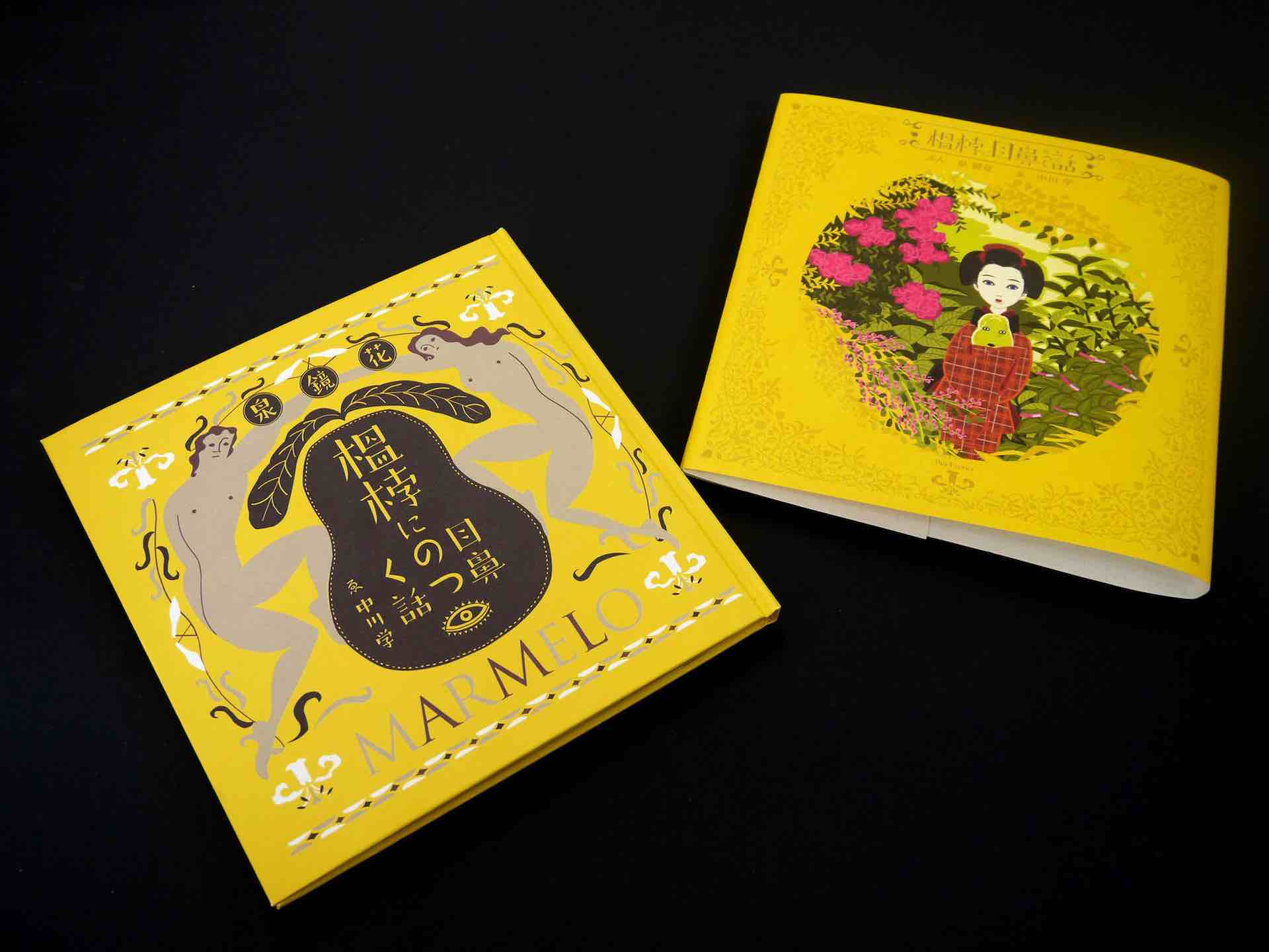
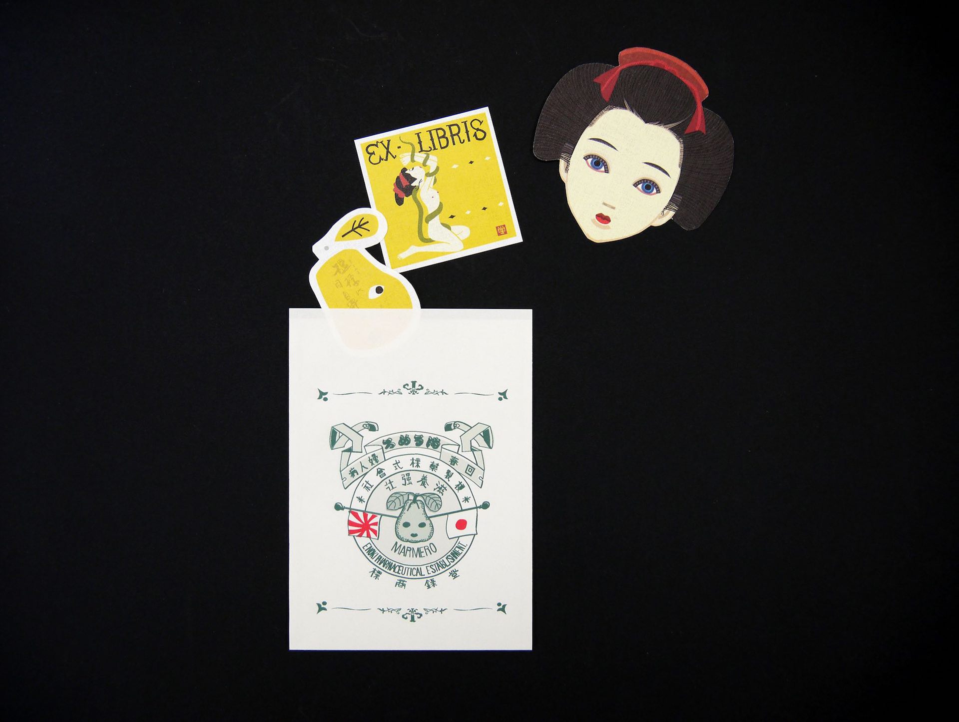
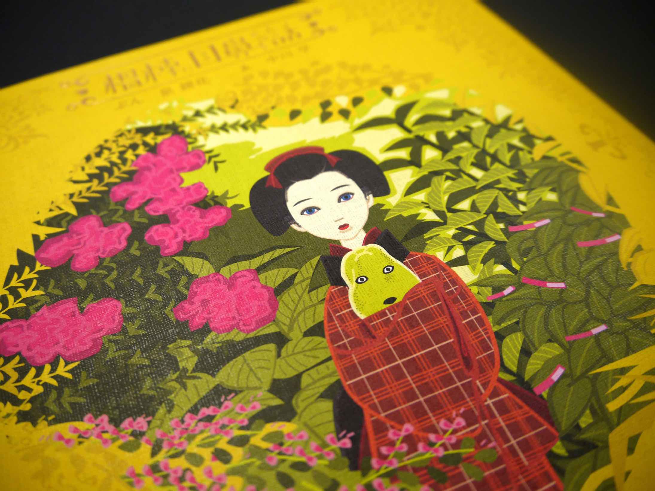
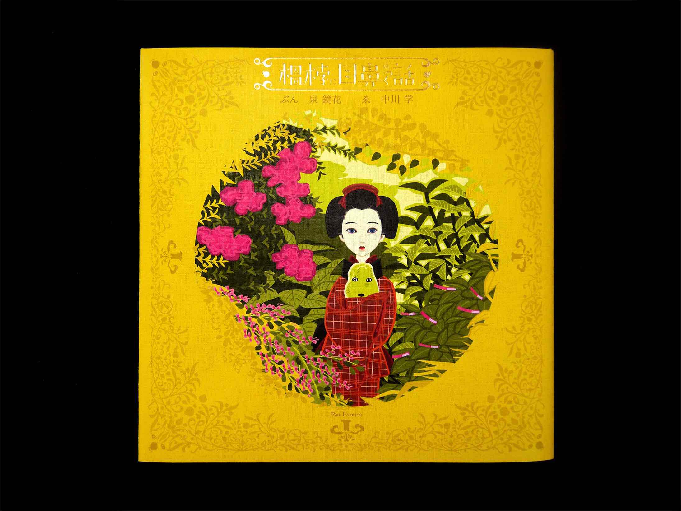
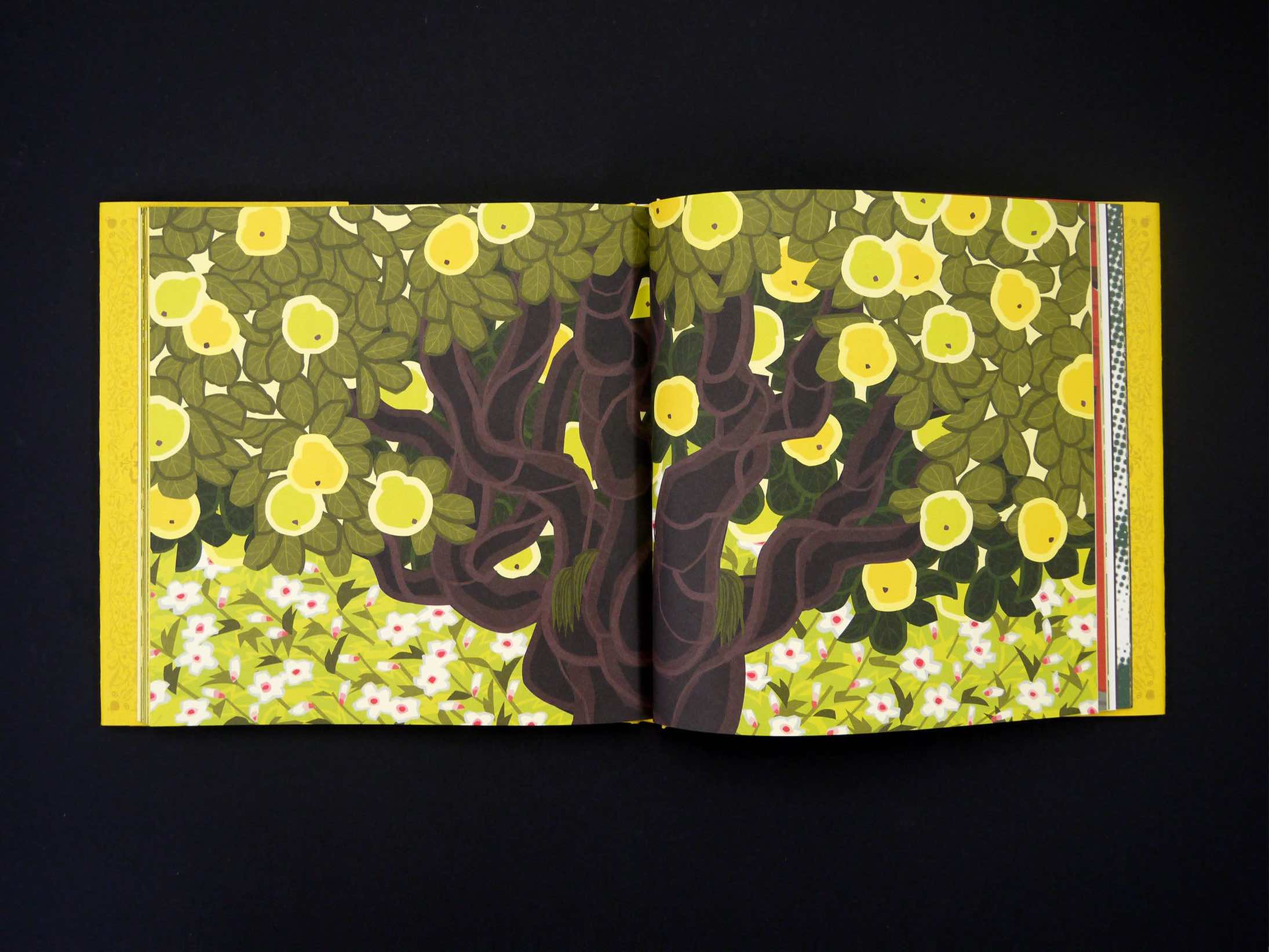
“Features on a Quince” (original Japanese title: “Marumero ni me hana no tsuku hanashi,” 1920) remains something of a hidden gem among short stories by Izumi Kyōka, a writer known for his tales of fantasy and beauty and admired by many of the most famous names in modern Japanese literature, such as Akutagawa Ryūnosuke , and Mishima Yukio. The story is set in the neighborhood of Kanazawa City where Kyōka grew up, and through depictions of real-life sites like a gloomy path down the hill behind the shrine leading into the pleasure quarters along the southwest bank of the Asano River, we sense Kyōka drawing on his own childhood memories as he shows us an adult realm of sexual desire through the eyes of the protagonist, the boy Kenzō. The story’s title refers to the fruit of a quince to which Kenzō has given eyes and a nose in the form of little bite marks; accordingly, the face on the quince takes on a striking resemblance to the features of the local beauty, Otowa, and seems to cast a spell on all the boys around. This quince, and the exquisite fragrance that envelops it, emits a seductive allure—a forbidden fruit threatening to put an end to Kenzō’s age of innocence as a boy yet to experience his sexual awakening.
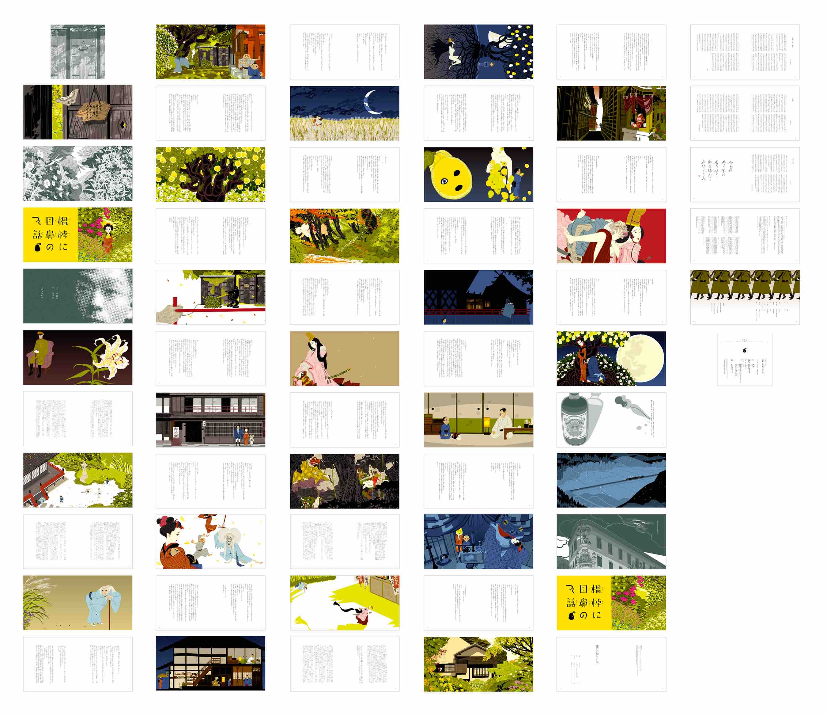
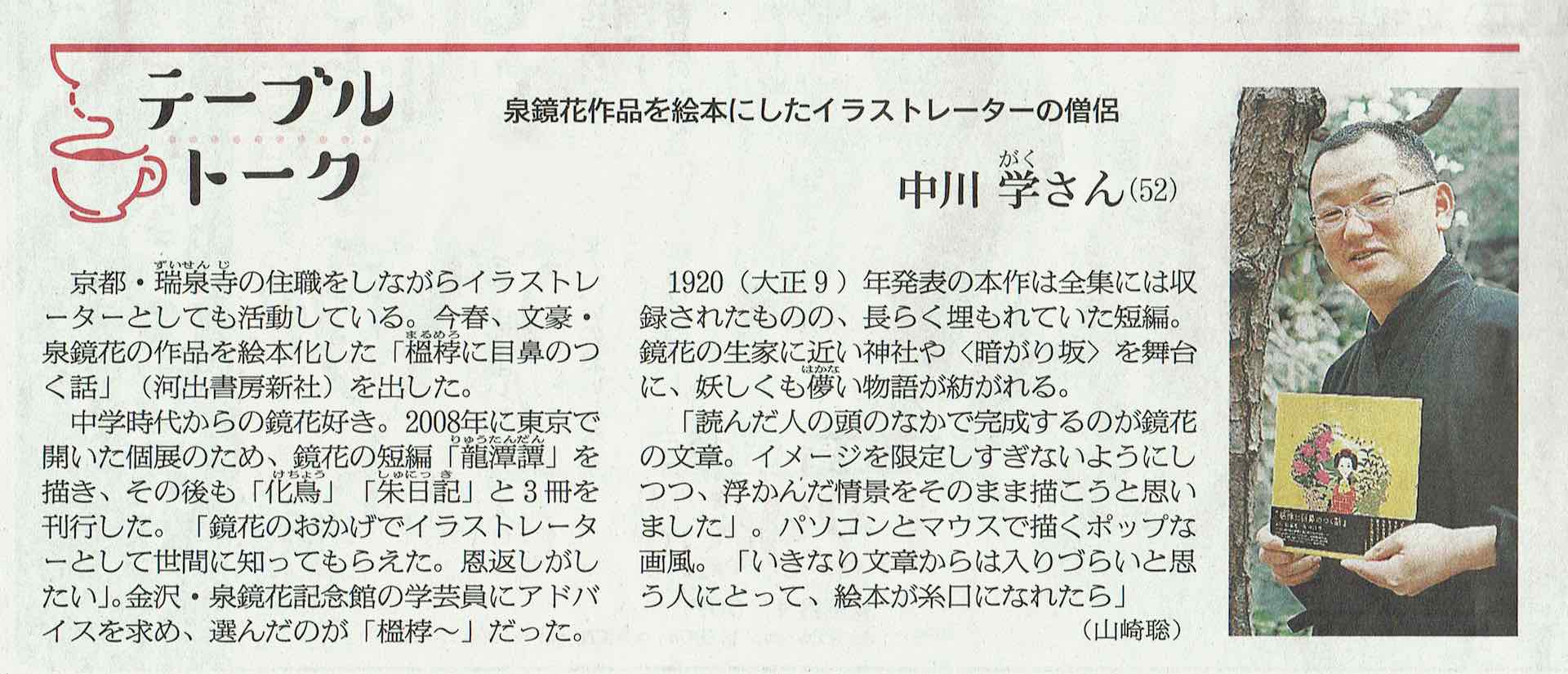
Nakagawa Gaku, illustrator of Features on a Quince, has been known till now for his reimaginings of Kyōka’s more “fantastic” stories in picture-book form: first “Ryūtandan”(1896); then “Kechō”(1897); and then “Shu nikki”(1911). But with Features on a Quince, we see Nakagawa turning his attention to a tale that explores themes of sexual desire, and the experience of awakening to that hitherto uncharted world, head-on. Using a clean, “pop” visual style that suggests a boy’s vantage point, Nakagawa has succeeded in breathing new vitality into a work that has till now received scant critical attention. This is, indeed, a picture book meant for adults—for anyone who can remember what it was like to stand on the borderline of childhood with a presentiment toward what lies beyond.
Credits


Entrant Company
No Fixed Address
Category
Strategic Program - PR Campaign
Country / Region
Canada


Entrant Company
Derek McCoy, Inc.
Category
Video - Public Relations
Country / Region
United States


Entrant Company
Savannah College of Art and Design
Category
Branded Content - Content / Promotion (NEW)
Country / Region
United States


Entrant Company
DNM | Dreinullmotion
Category
Event - Conference / Convention
Country / Region
Germany
