2021
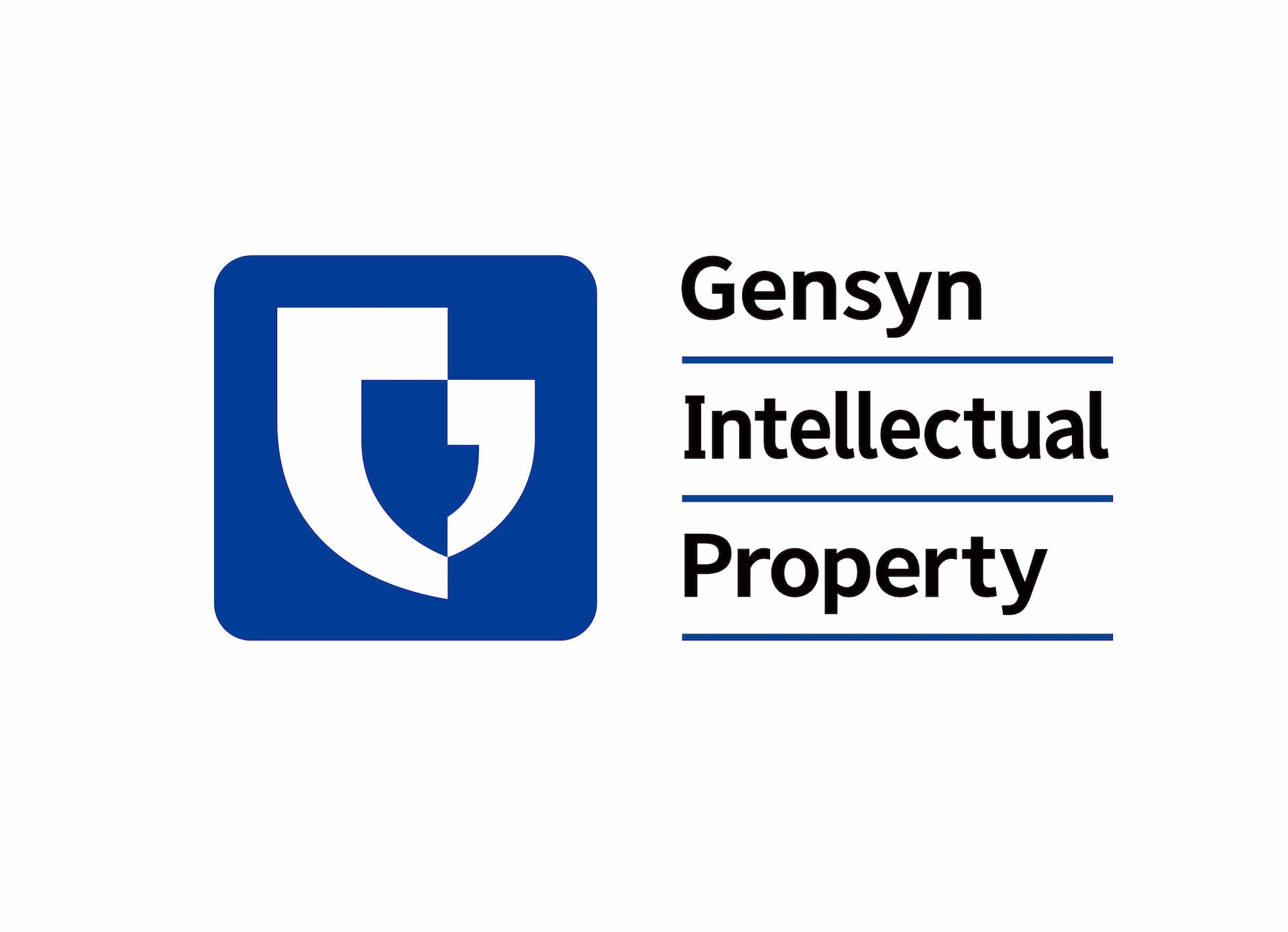
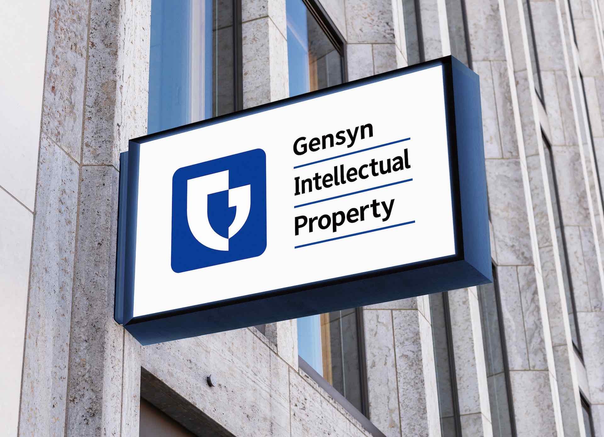
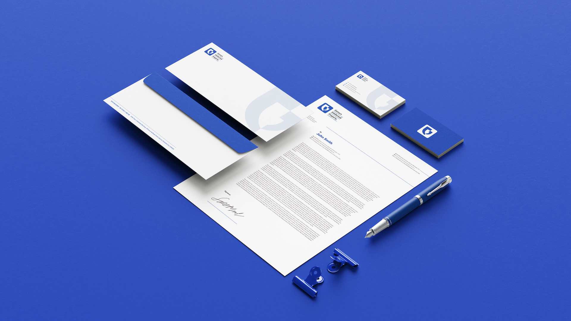
Beijing Gensyn Intellectual Property Agency Logo Design
Entrant Company
Gu Jin, Kairifu Consulting (Beijing) Co., Ltd
Category
Corporate Identity - Logos
Client's Name
Beijing Gensyn Intellectual Property Agency
Country / Region
China
This logo is abstractly evolved from the initial letter "G" from the enterprise's English name, it is consist of left and right abstract single quotation marks , which means smooth communication and consultation between enterprise and customers, We use "positive and negative shape" creative techniques and using hollow blue part and the right of single quotation mark to form a complete 3D shield modeling. The single quotation mark on the left is like a powerful hand gripping the shield, highlighting the industry characteristics of intellectual property protection, at the same time, the shield is like a smiling face, conveying the concept of service first. This logo is shaped by the outline of traditional Chinese seal, and use blue color symbolizes the vision of steady development of the enterprise.

Credits

Entrant Company
Decca
Category
Branded Content - Email Marketing
Country / Region
United States

Entrant Company
Satori Marketing, LLC
Category
Corporate Social Responsibility - Pro Bono (Free)
Country / Region
United States

Entrant Company
The Creative Bar
Category
Marketing & Promotional - Promotional
Country / Region
United States
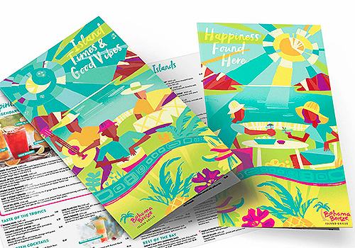
Entrant Company
Ad Cucina
Category
Marketing & Promotional - Menu
Country / Region
United States