
2022
Bonza Hotel
Entrant Company
Leona Design
Category
Corporate Identity - Brand Identity
Client's Name
Bonza Hotel
Country / Region
Australia
Bonza Hotel is a luxurious hotel in Hsinchu, Taiwan, and this hotel is operated by two brothers and opened by their father in 2013. The core purpose of this brand is to let every client feel at home when they come to visit, and it hopes that it is not only luxurious but also full of warmth.
Using two letters B presents the two brothers who work hard together and the symmetrical layout of this logo creates the same design as the remarkable symbol ''Tai Chi''. Tai Chi is a traditional and magnificent symbol in Asia, which also means the beginning, the top, the best, and the perfect. As combined with Tai Chi's allusion, Bonza Hotel hopes that it will become the leader in this industry and bring the best relaxing resort. Also, the basic shape of this logo is related to the architectural feature of the building and the square shape brings an elegant, mature and refined atmosphere. Combing the western and eastern design lets the brand identity more outstanding and unique.
For the brand colours, the main colour is golden yellow and golden colour is like the sun, bring the happiness and warmth. The secondary colours are earth tone, which is low saturation and lets the whole brand identity more luxurious and exquisite.
The typeface is designed to have serifs. The serif typeface the atmosphere more refined and memorable. With this logo, the whole brand identity is more outstanding and striking.
Credits


Entrant Company
George P. Johnson Experience Marketing
Category
Event - Virtual Event
Country / Region
United States
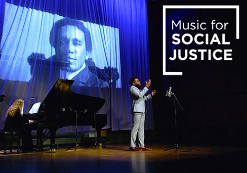
Entrant Company
Michigan State University
Category
Video - TV Series / Episodes
Country / Region
United States
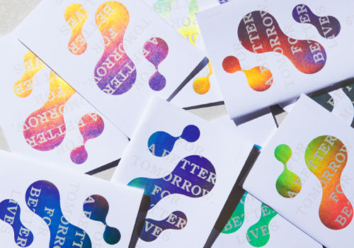

Entrant Company
MUSUBI Inc.
Category
Corporate Identity - Corporate Identity / Other___
Country / Region
Japan
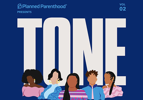
Entrant Company
Planned Parenthood Federation of America
Category
Audio - Podcast
Country / Region
United States


