
2022
ORIENTALBIO
Entrant Company
MUSUBI Inc.
Category
Corporate Identity - Corporate Identity / Other___
Client's Name
ORIENTALBIO
Country / Region
Japan
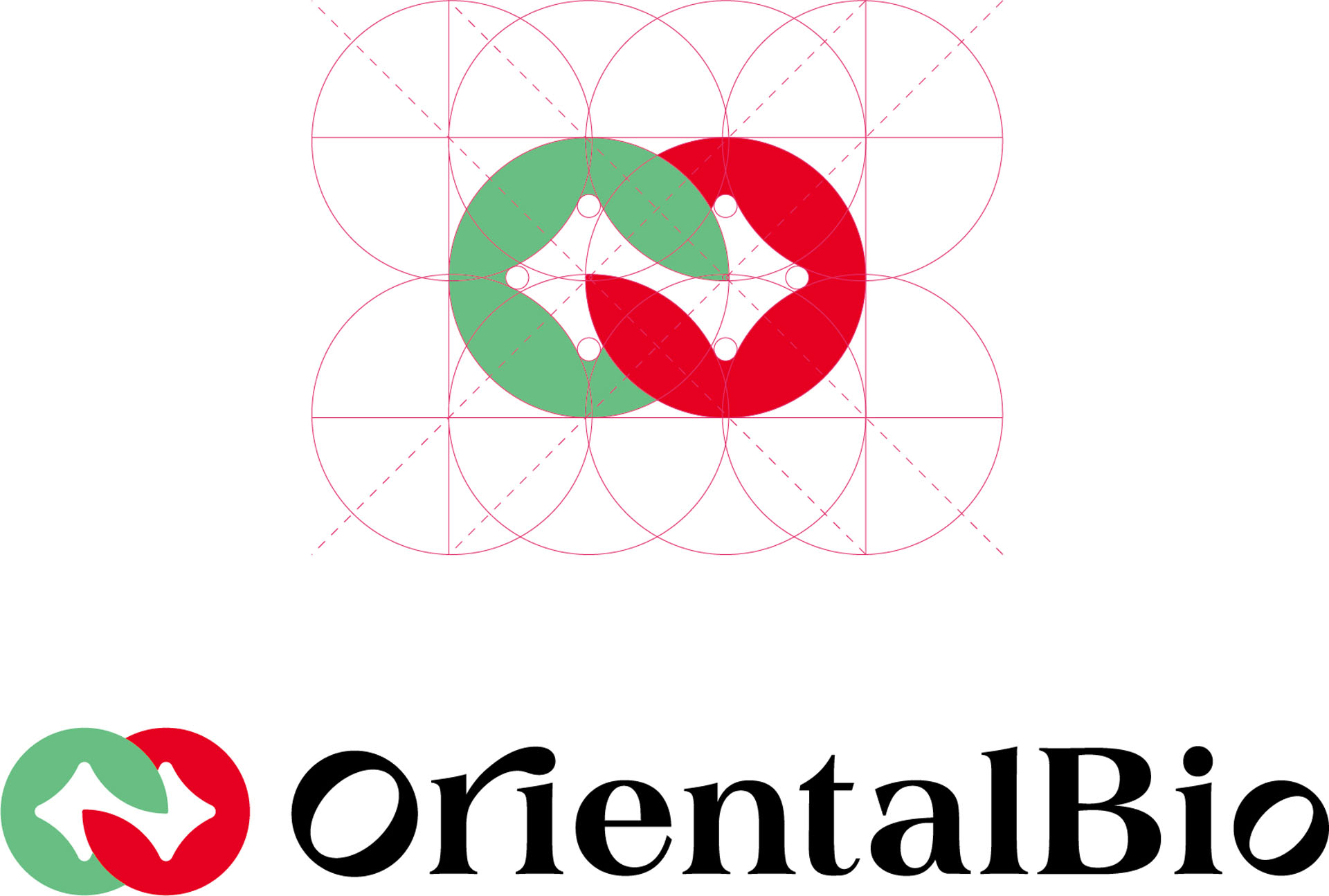
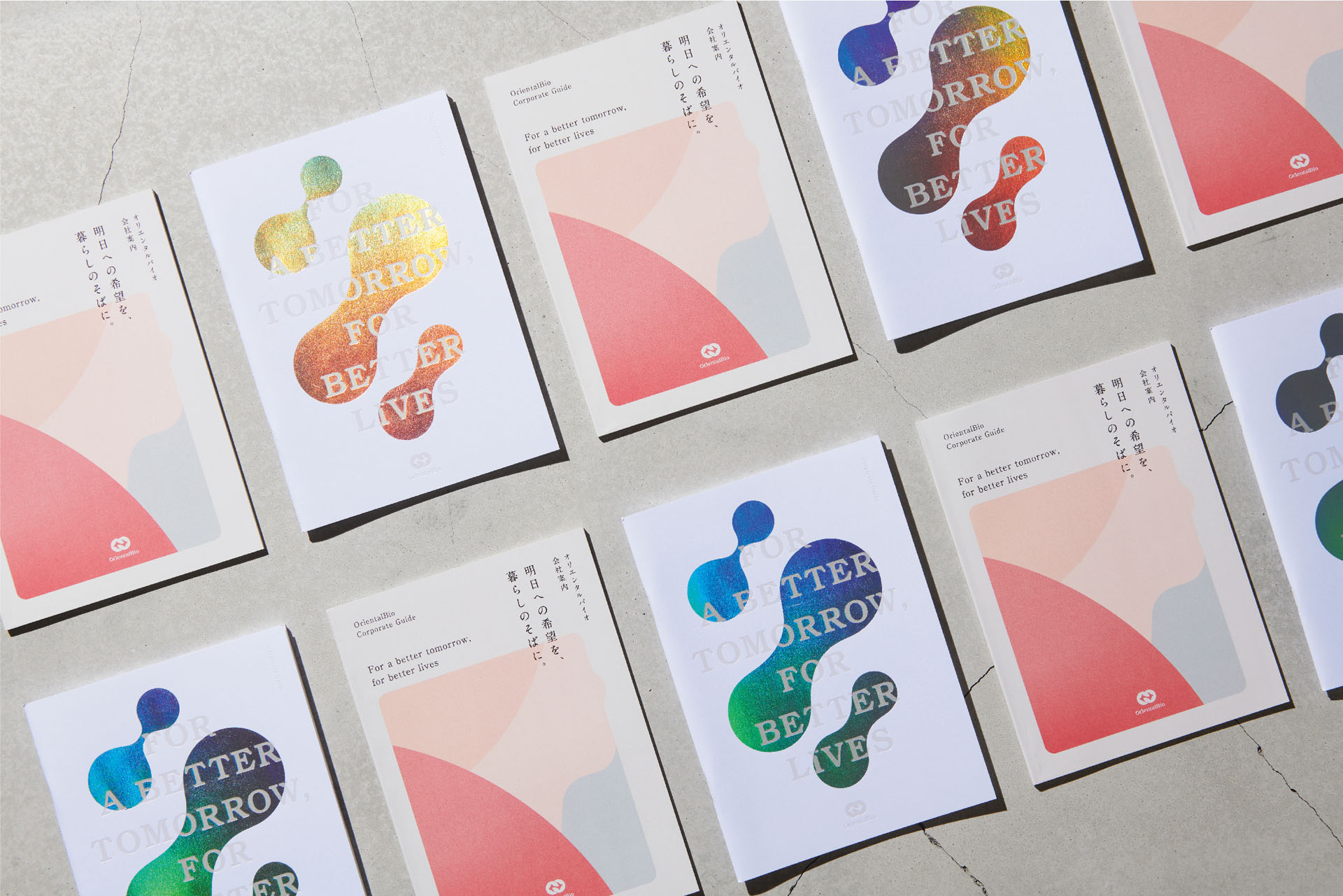
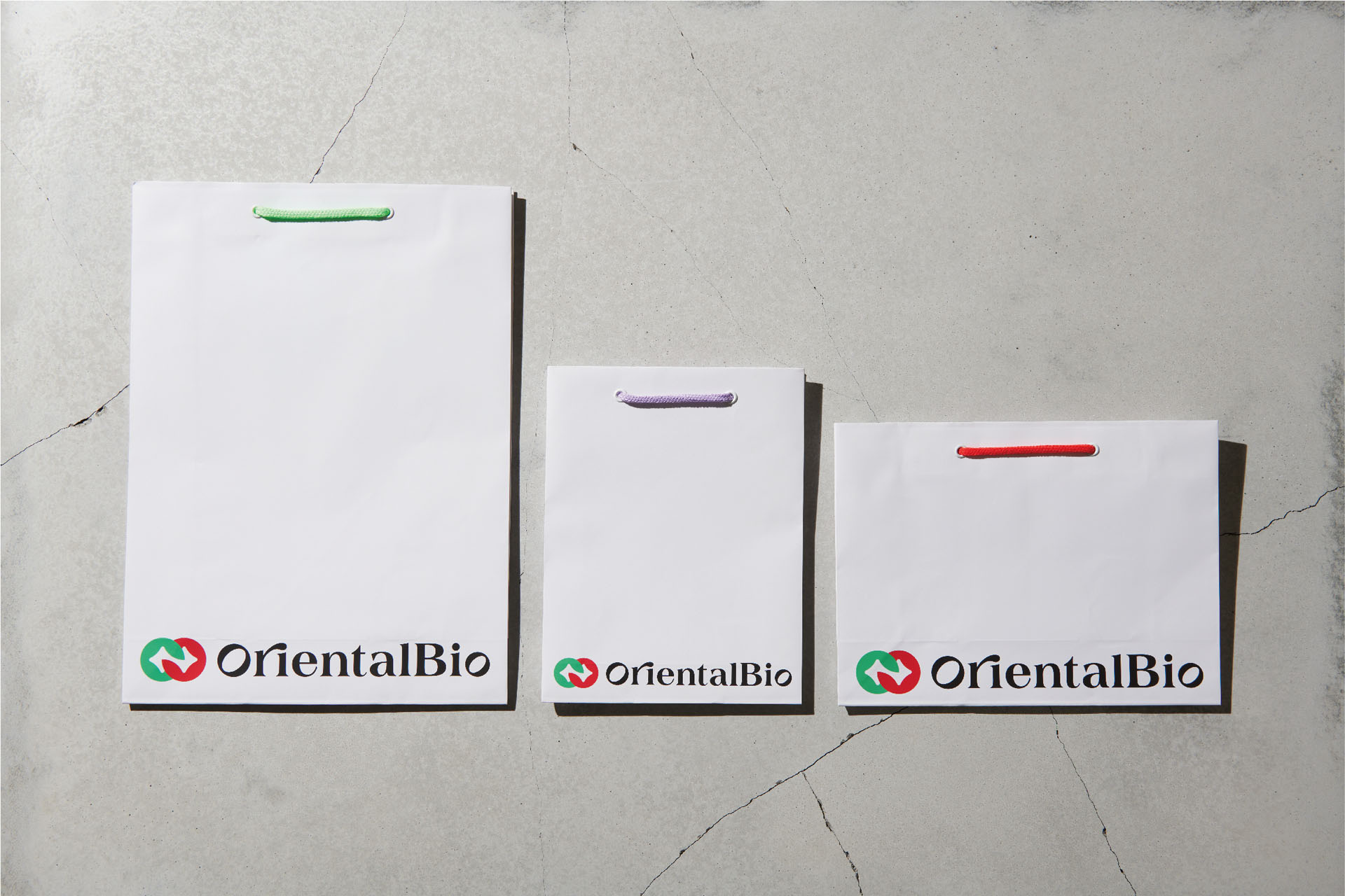
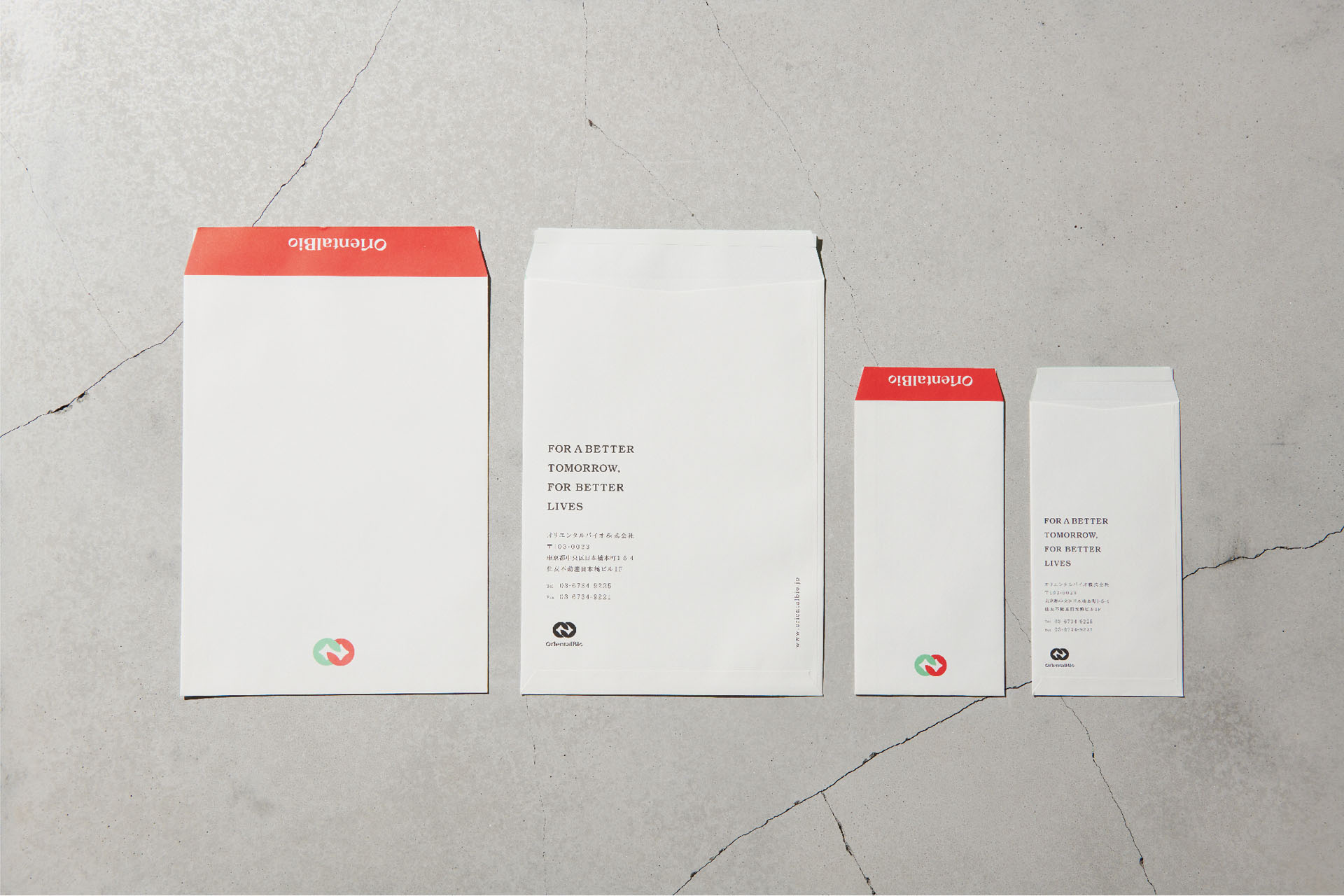
Branding of a health food company celebrating its 30th anniversary. Inheriting the red and green coloring with the initial letter "O" as a motif. The two circles become infinite marks, showing continuity and incorporating the idea of assessing relationships by connecting people by getting closer to the customer's life.
The center of the circle is an image of a brilliant hope for tomorrow and an increase in the plus (+) of daily life. The letter used is "O", which uses the silhouette of the logo mark so far, and the accent "r" always represents the attitude of taking a new step. Japanese has been redesigned to give a sophisticated impression to English.


Credits

Entrant Company
SAPHIRA
Category
Video - Professional Services
Country / Region
Ukraine

Entrant Company
Ansys
Category
Publication - Book
Country / Region
United States

Entrant Company
Leona Design Pty Ltd.
Category
Corporate Identity - Brand Identity
Country / Region
Australia

Entrant Company
The Ritz-Carlton
Category
Social Media - Influencer & Celebrity
Country / Region
United States