
2023
Halliburton Corporate Identity Redesign
Entrant
Coley Porter Bell
Category
Corporate Identity - Corporate Identity Redesign
Client's Name
Halliburton
Country / Region
United States
In 2022, nearly $500B was invested in renewable power alone. Around the world, we’ve seen a transition, disrupting the energy sector. Halliburton has been an integral part of the energy sector since its founding in 1919. But to maintain its appeal, the brand needed to position itself as a service provider in the emerging alternative energy space.
To achieve these aims, Halliburton established Halliburton Labs, an accelerator program for clean energy start-ups, where they can test, refine and scale their ideas, turning them into market-ready innovations. In return, Halliburton would gain insights about the needs of new energy, providing future opportunities for the brand. Despite this initiative, Halliburton was not properly understood and appreciated by its audiences. A new brand was needed to capture and express this exciting new opportunity.
The new brand strategy drew from Halliburton’s equity as the execution company, one that gets the job done. By assisting innovative start-ups, Halliburton Labs was accelerating the transition to new energy solutions, ones that benefitted the start-ups, Halliburton – and the world. Halliburton Lab’s strategy was succinctly expressed in the new tagline, ‘The future of energy. Faster’. Across two sharp phrases, it highlights the brand’s ambitions for the energy transition, and their equally ambitious timetable.
A new logo, color palette, imagery style, typography and design system expresses the energy, inventiveness, and determination crucial to creating ‘The future of energy. Faster’. The design system is a structured, but fluid grid system composed of blocks. These blocks are in constant motion, coalescing into new forms, representing the infinitive possibilities that Halliburton Labs is exploring and helping build.
The logo is the heart of the visual system. Five simple rectangles that represent the powerful framework of Halliburton, while the dynamic, fluid colorways speak of the innovative potential. On closer examination, the elements come together to reveal the hidden H and L – a subtle reminder that Halliburton Labs is fostering ideas, supporting the start-ups, and the future of energy.


Credits
Entrant
Miami Ad School Europe
Category
Student Submission - Student Website
Country / Region
Germany

Entrant
Taiwan Tourism Bureau in New York
Category
Integrated Marketing - Event Marketing
Country / Region
United States
Entrant
Preston Spire
Category
Corporate Identity - Logos
Country / Region
United States
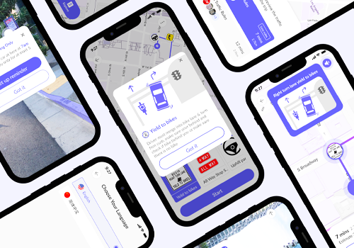
Entrant
Meng Lan
Category
App - GPS / Navigation
Country / Region
United States