2023
EMOSENSE
Entrant
Shanghai Rapidesign Advertising Co., Ltd
Category
Corporate Identity - Brand Identity
Client's Name
Country / Region
China
The audience’s feeling is prioritized by the presentation experience design firm EMOSENSE. EMOSENSE, which mimics the meaning of the English words emotion and sense, is defined as emotion and sense. In keeping with the speech’s topic, it tries to fulfill the event’s main objective by promoting collective action or decision-making with EMOSENSE, an audio-visual design that can evoke the audience’s emotional resonance.
Its creative concept is to design sensibility with rationality. The technique of transferring the spoken scene's lens to the screen is reproduced by merging the English words “emotion” and “sense”, and the purer creative thoughts are presented through visual forms, breaking through the audience’s habitual visual cues and evoking emotional resonance.
A portion of the English letters from the words Emotion and Sense were taken out for the design, and they were artistically placed to reach the ideal golden ratio. Ultimately, they formed the shape of the logo.
In order to evoke the audience’s emotional resonance and convey the emotional value of the brand’s inclusiveness and freedom, the auxiliary graphics employ the lens projection as the design concept and create an ambiance utilising various gradient colours. For example, the billboard in the subway station use blue-orange as the background color, projecting a blue-pink gradient, bringing a blurry but fashionable experience to consumers; the office space uses black as the background color, projecting a bright orange-blue gradient, allowing employees to work in a positive and warm, rigorous and serious working state; the speech scene uses a deep blue-purple gradient, which fully attracts audience’s attention, as if they were in the vast space.
In order to form a unity with the logo’s modeling structure, its English typeface is the is a modern sans-serif font (by using the breaking and positive & negative figure techniques, the typeface in the logo is concise, powerful and highly recognizable, reflecting the humanistic, open, soft, and conscious font temperament, bringing a different visual experience).


Credits
Entrant
Ogilvy
Category
Advertising - Advertising Campaign
Country / Region
United States
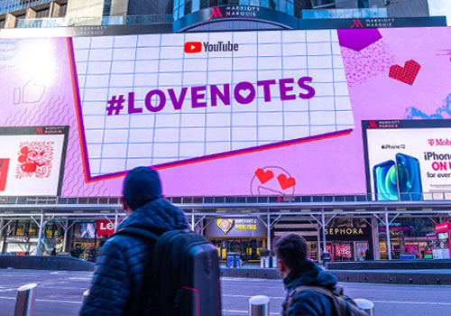
Entrant
Toaster Inc
Category
Outdoor Advertising - Outdoor Advertising / Other___
Country / Region
United States
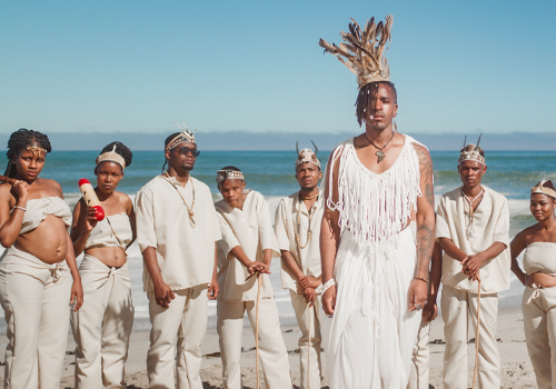
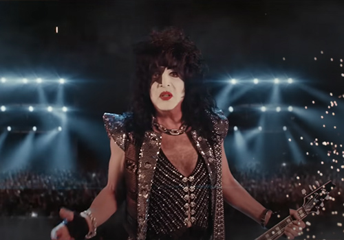
Entrant
Vitae Records
Category
Video - Music Video
Country / Region
United States
Entrant
Reklam5 Digital Agency
Category
Website - Retail
Country / Region
Turkey