
2024
TRADEL.TECH. Making investment easy
Entrant
Aida Pioneer
Category
Corporate Identity - Logos
Client's Name
Tradel.tech
Country / Region
United States
CHALLENGE
Tradel.tech is a brokerage firm that is focused on making investing in bonds and securities accessible and easy for everyone, with a user-friendly app and a range of helpful tools and resources. The app was created to carter to users of all levels of experience. The research and analysis tools provided are also easy to use and understand, helping users to make informed investing decisions.
APPROACH
During a discovery session, we identified the client's insights and expectations for the app. The main obstacle for newcomers was the perceived difficulty and complexity of the investment process. In other words, people were afraid that their lack of knowledge and experience in investing would make it challenging to try it on their own without the help of a traditional offline brokerage firm. We focused on this assumption and developed a brand strategy around it.
IDEA&NAME
At the first stage, we developed a full-fledged brand platform and formed the rules for its communication. The brand essence is “making investment easy”. It's a human, easy going, but at the same time functional brand for those who is ready to experiment with personal investments. The client gets all the necessary information and support to be able to handle the management of his investment portfolio. Crystal clear interface, appalling design, handy tips and human touch support is what makes it really easy and fun.
The word tradel comes from trade. It's easy to pronounce and remember. Together with the domain it combines the cashy app name Tradel.tech.
DESIGN
Investments are always about money. It was money as the essence and form that formed the basis of the logo. Each world currency has an individual symbol that identifies it. We have developed a unique typographic solution in the appropriate style and integrated it into a metaphorical coin. The sign turned out to be concise and relevant to the company's activities. In the brand identity, we conveyed such key brand characteristics as lightness, simplicity and humanity. We used pure colors, dynamic elements and obvious shapes.


Credits
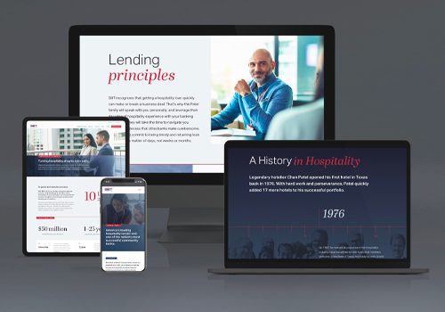
Entrant
Spire Agency
Category
Website - Business to Business
Country / Region
United States
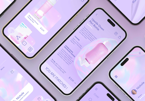
Entrant
Qingyu Huang
Category
Branded Content - Cause / Awareness (NEW)
Country / Region
United States

Entrant
KoçSistem Bilgi ve IletiSim Hizmetleri A.S
Category
Website - Technology / Science
Country / Region
Turkey
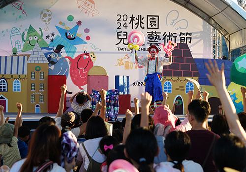
Entrant
Department of Cultural Affairs, Taoyuan
Category
Event - Cultural Event
Country / Region
Taiwan