
2024
magoka brand
Entrant Company
SHU-TE UNIVERSITY
Category
Integrated Marketing - Brand Transformation / Repositioning
Client's Name
Suai-A-Ka Cultural Space
Country / Region
Taiwan
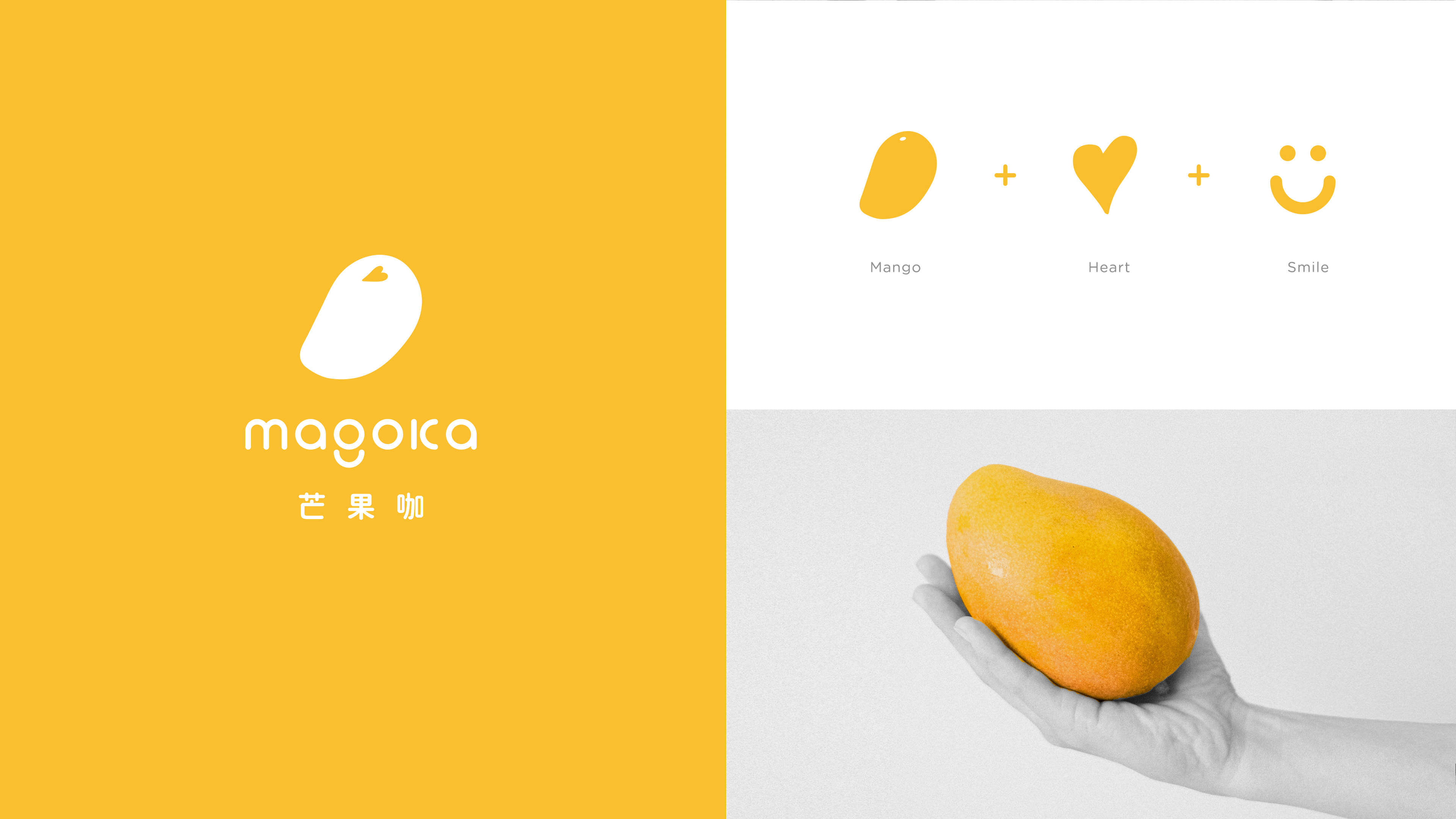
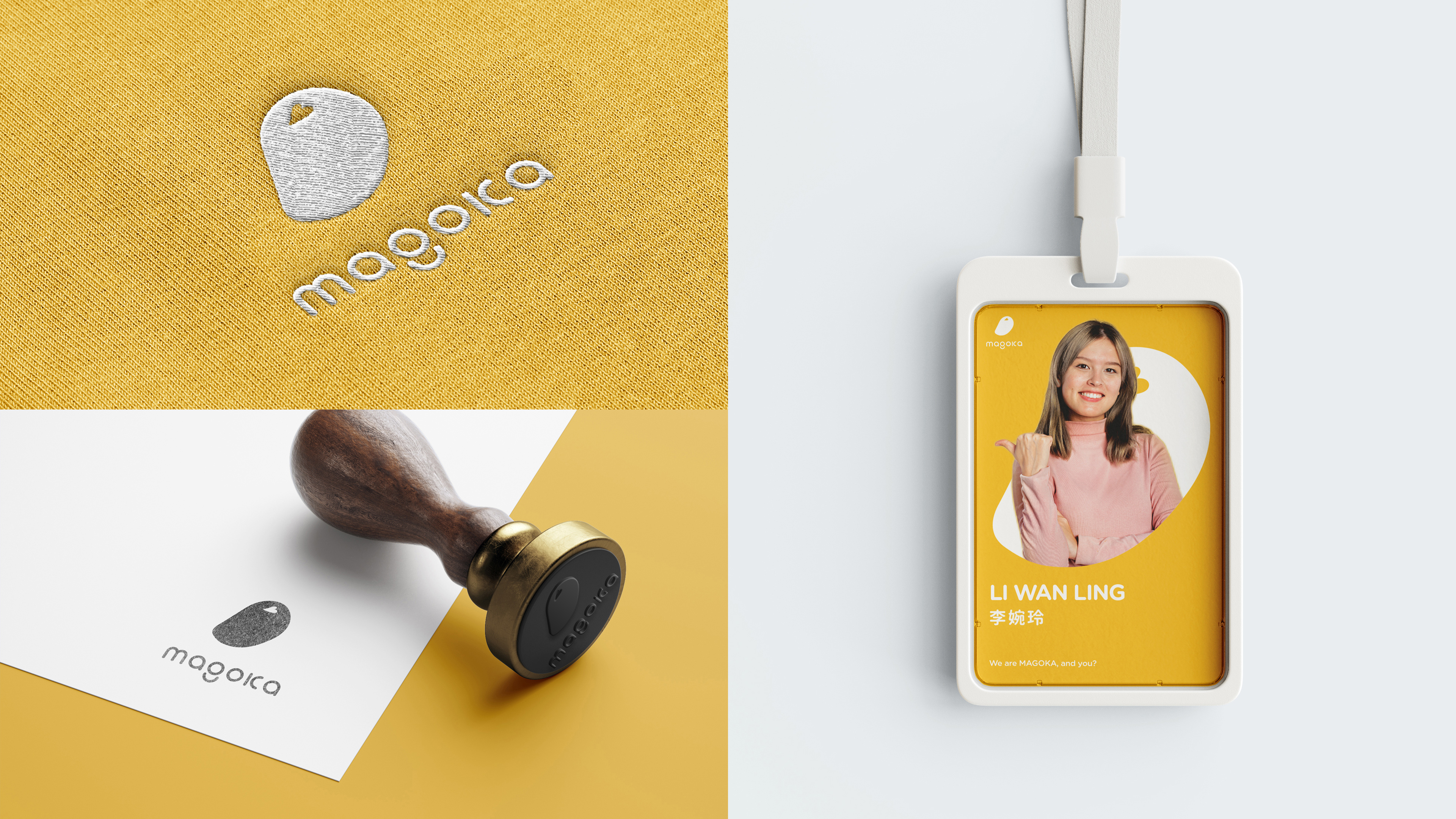
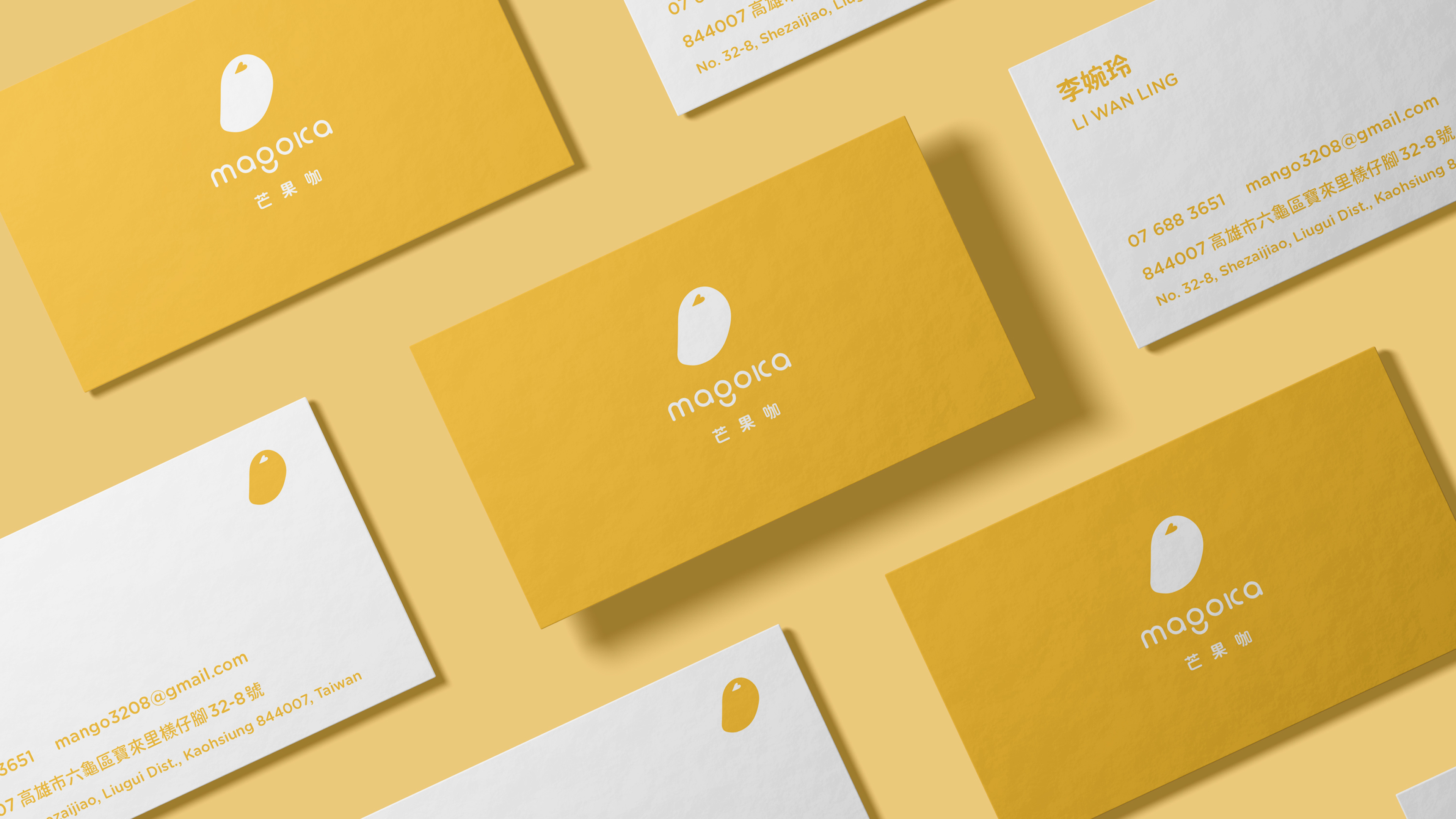
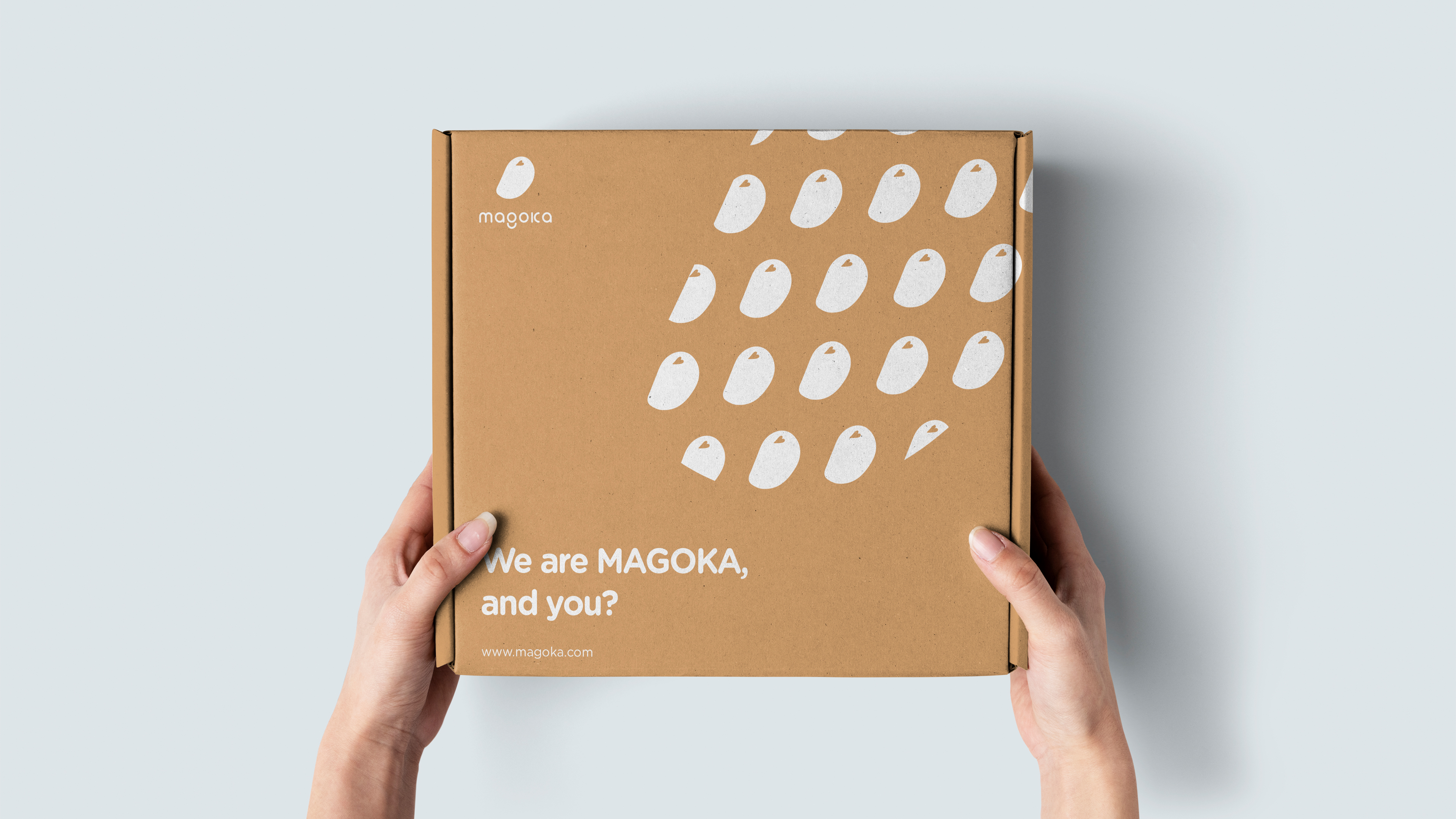
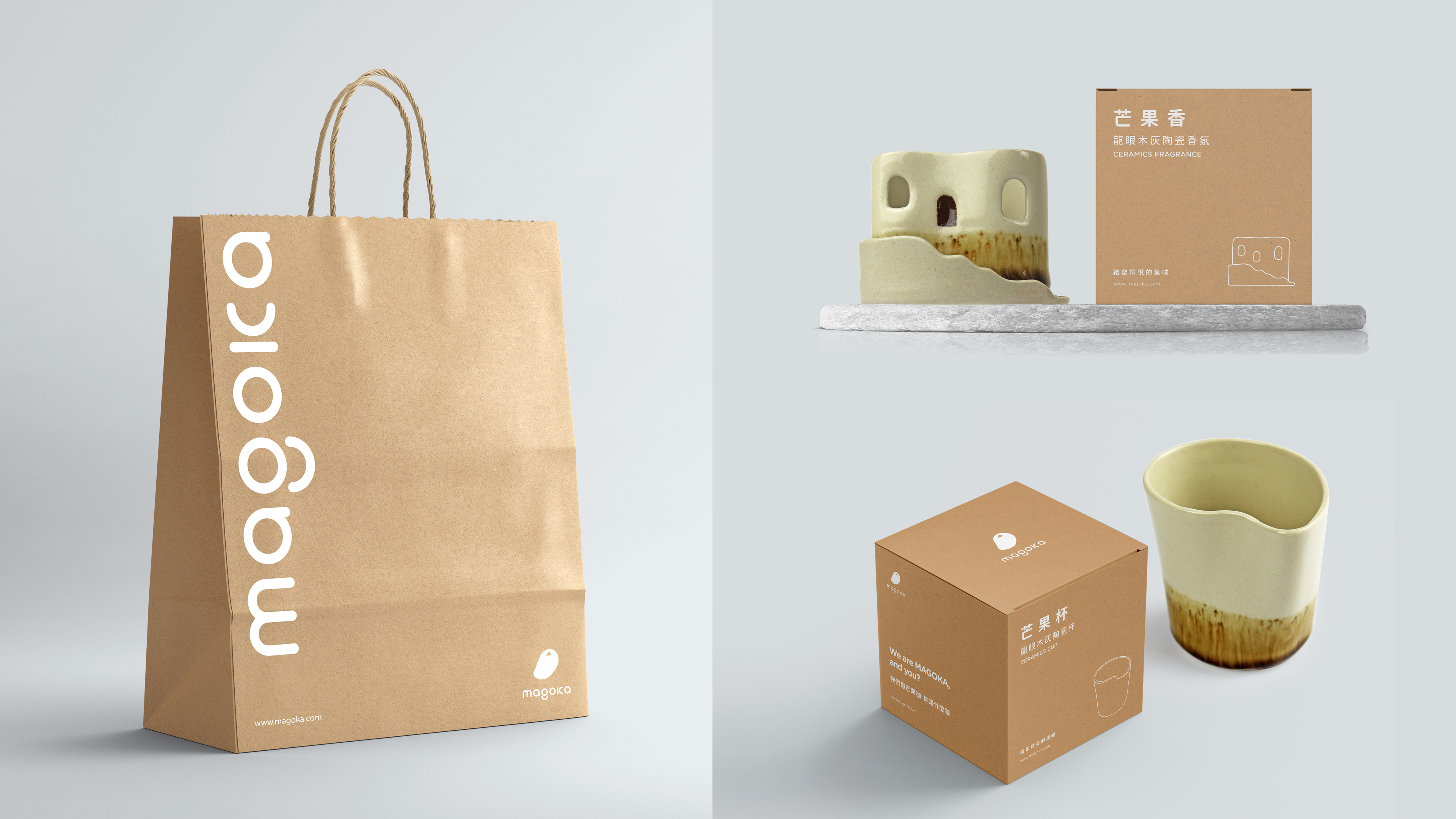
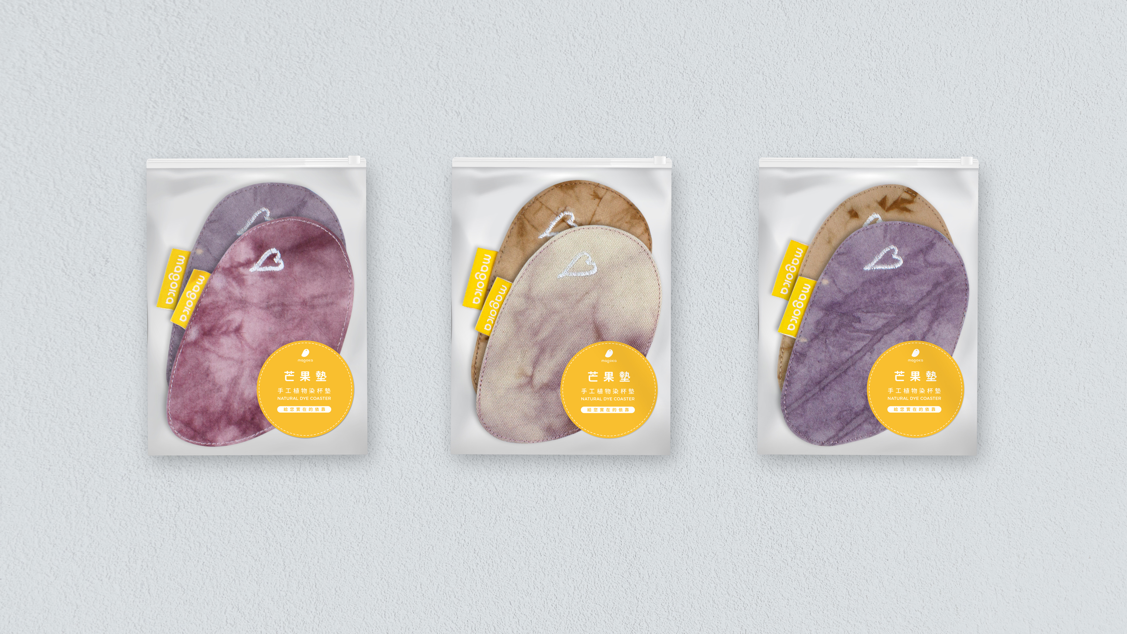
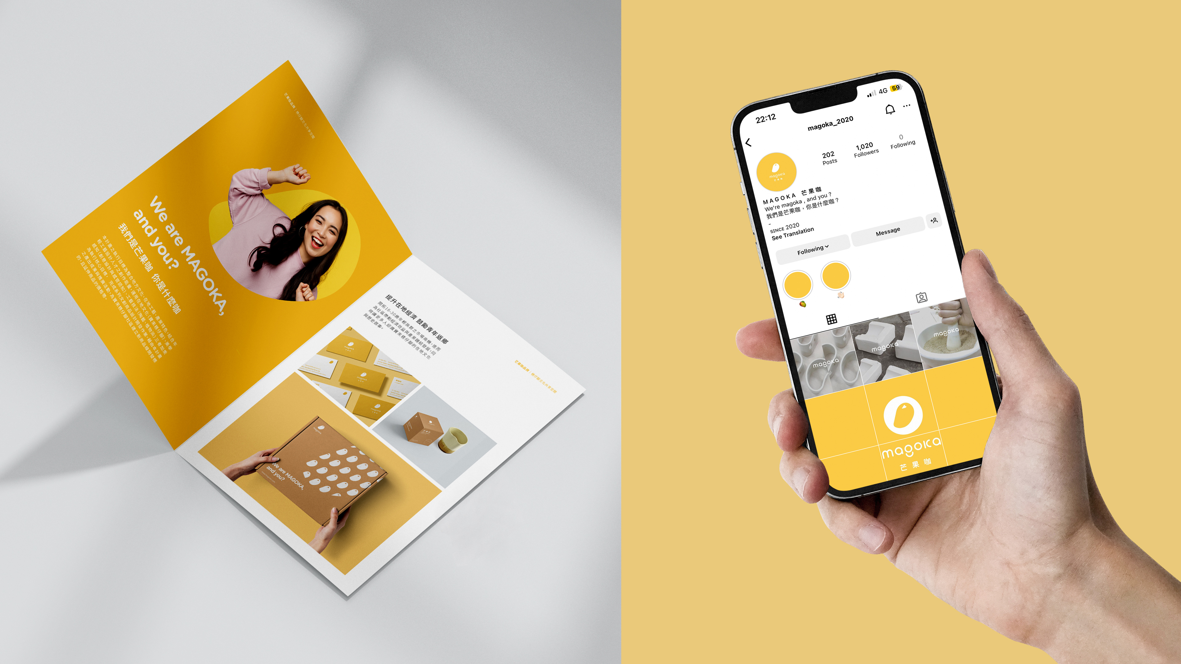
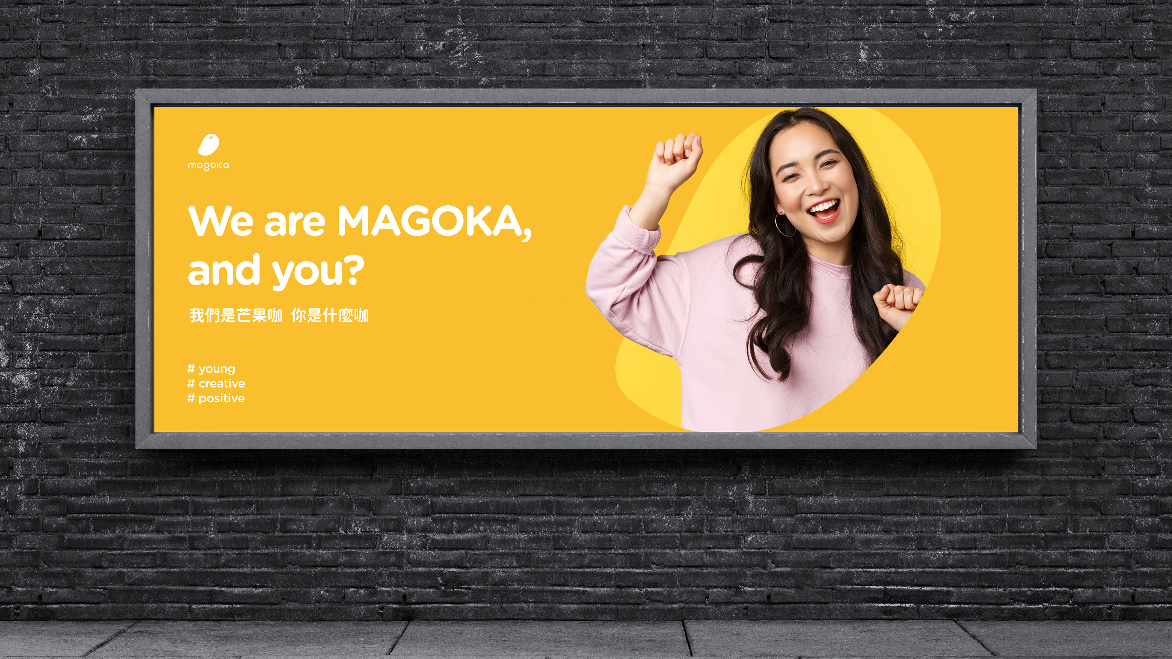
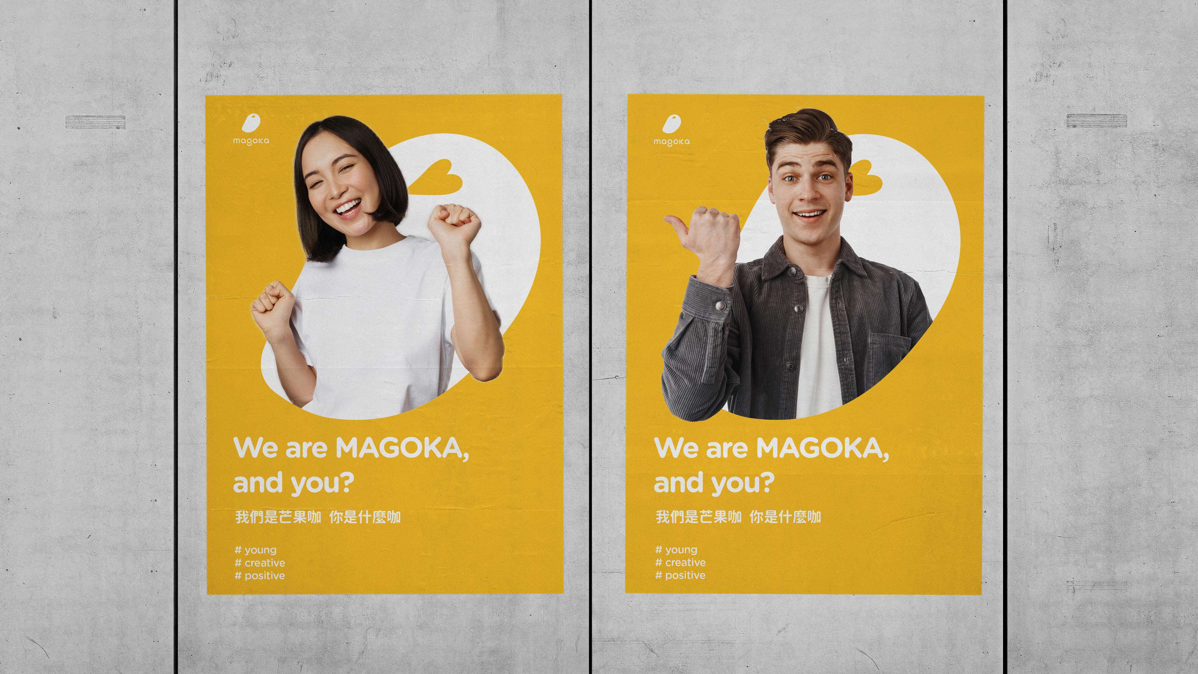
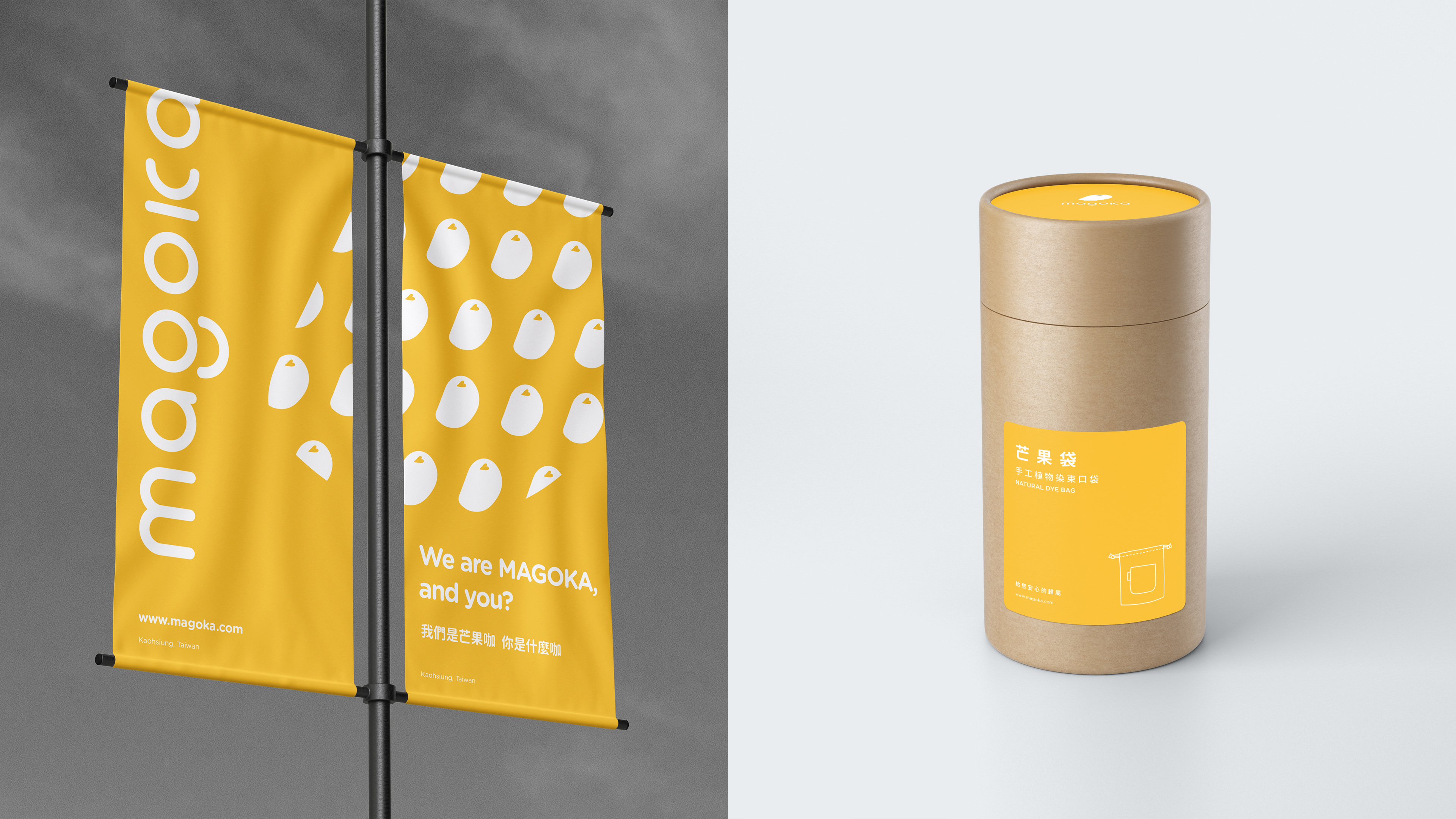
Founded in 2010, the Mango Feet Space in Liugui Baolai District, Taiwan, was reconstructed along with the rural community after the Mokla hurricane. The area is known for its abundance of "golden mangoes". The MAGOKA brand logo is based on the core spirit of mango, heart and smile. The mango is a metaphor for the economic products of the region such as crops and handicrafts, the heart is a metaphor for the hearts of the region to help each other and the smile is a metaphor for a positive attitude towards life. The MAGOKA brand uses bright yellow as the main color palette and establishes a consistent identification system. The brand intends to create a positive image of cheerfulness and innovation for the brand, and to stimulate the new generation's recognition and consumption.
Credits
Entrant Company
Yang Yanjun
Category
Corporate Identity - Logos
Country / Region
China
Entrant Company
Studio Resonate - SiriusXM Media
Category
Audio - Commercial (Campaign) (NEW)
Country / Region
United States
Entrant Company
LightUp Life Co., Ltd.
Category
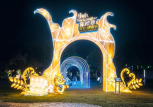
Event - Cultural Event
Country / Region
Taiwan
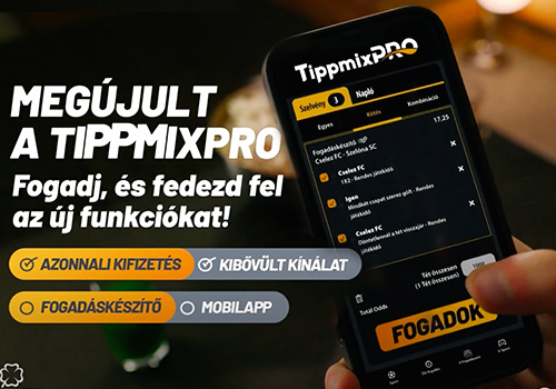
Entrant Company
Lounge Group
Category
Advertising - Advertising Campaign
Country / Region
Hungary