
2024
Tenuta la Vigna labels
Entrant
akòmi
Category
Corporate Identity - Corporate Identity Redesign
Client's Name
Azienda Agricola Tenuta la Vigna
Country / Region
Italy
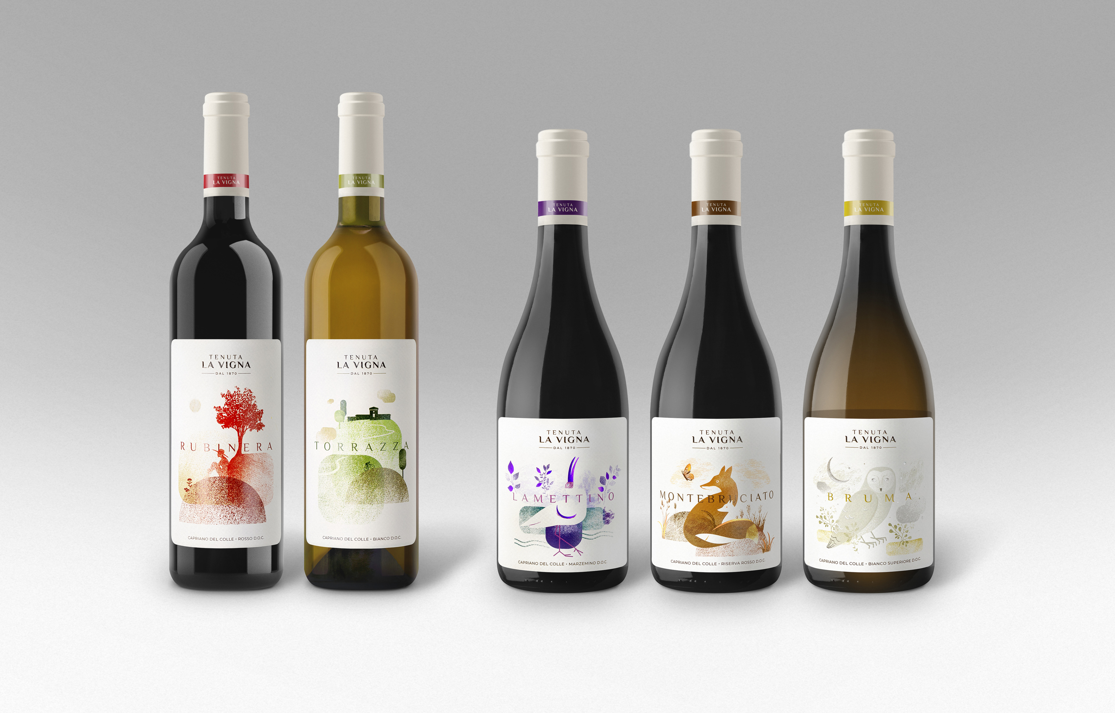
The graphic redesign project for Azienda Agricola Tenuta la Vigna involves the labels of the Company's five main wines, divided among three premium wines and two base wines. The inspiration for this work comes from the deep connection that the company has established with the surrounding territory and its dedication to biodiversity and sustainability.
The labels of the three flagship wines of Tenuta La Vigna - Bruma, Montebruciato and Lamettino - are inspired by local wild animals, selected on the basis of their physical characteristics and linked to the name of the wine. They have been represented in their natural habitat and each label has a predominant color that identifies the type of wine and reflects the meaning of the name and the subject depicted.
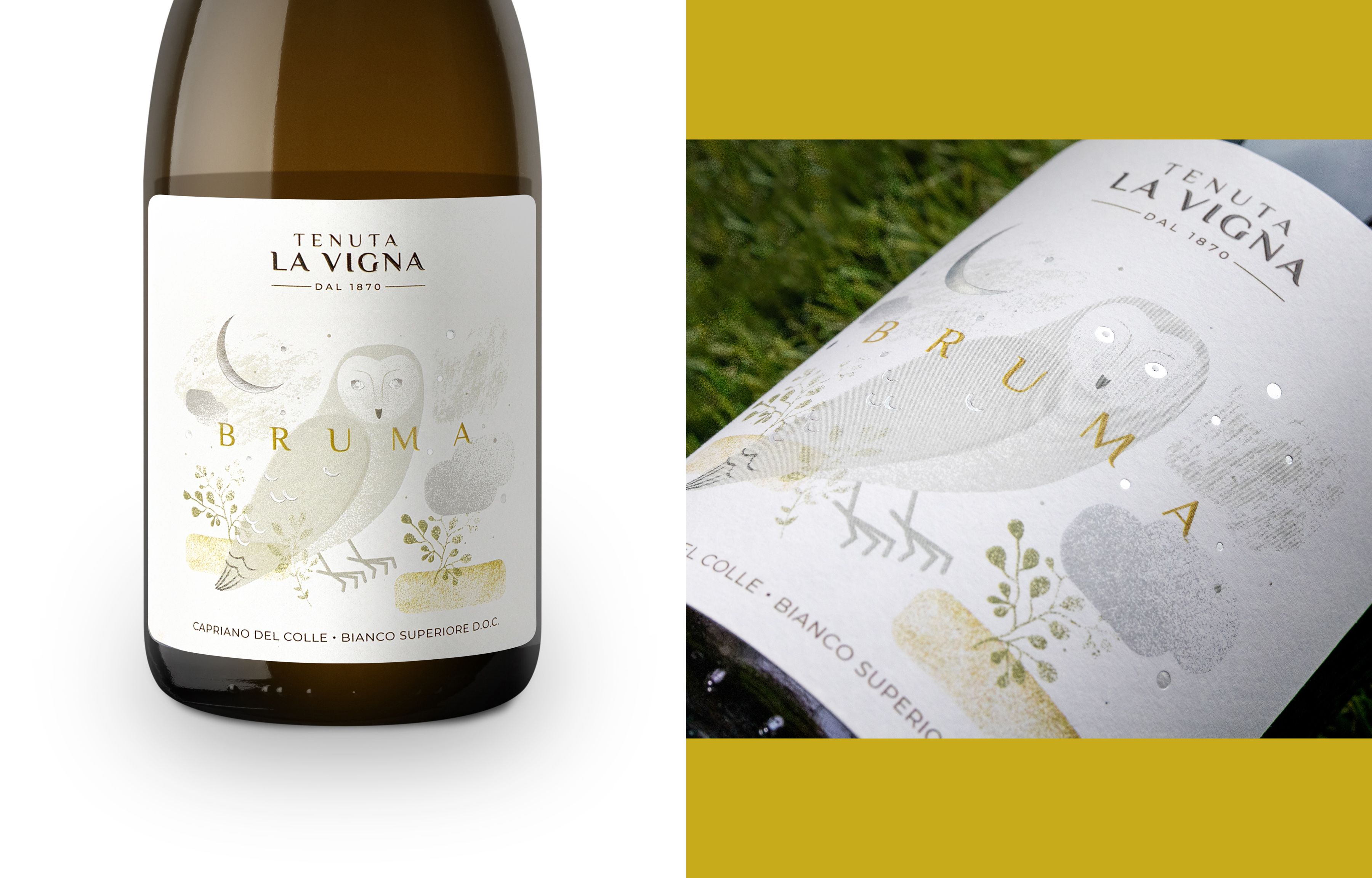
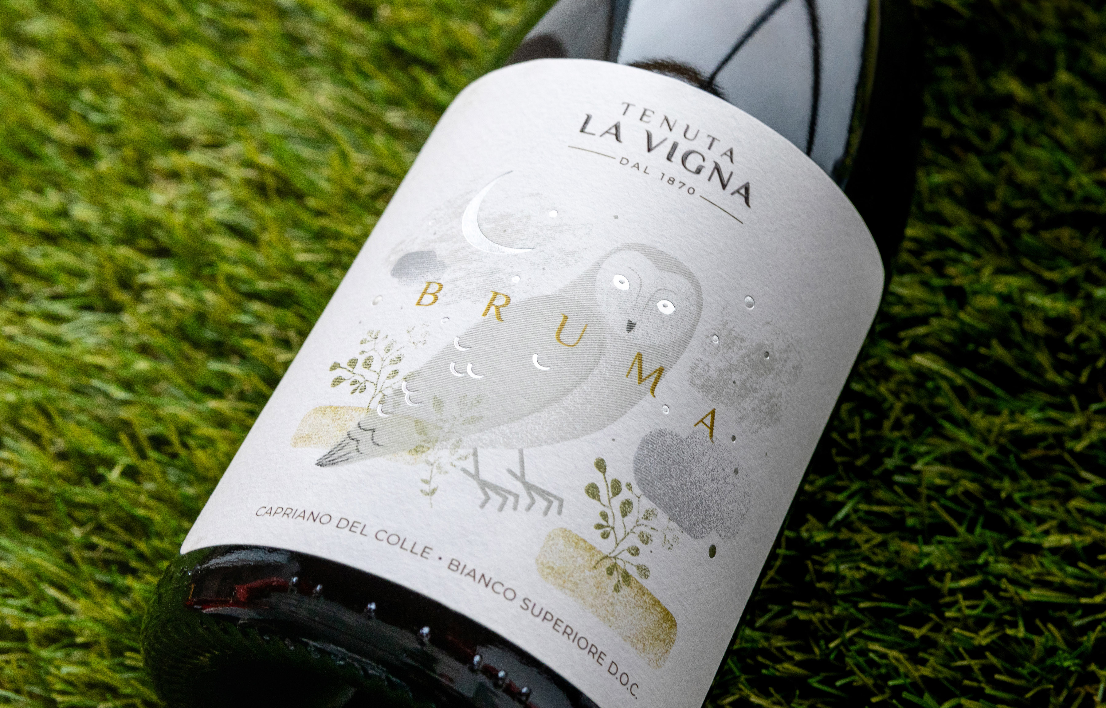
Bruma, the reserve white wine. The label shows a nocturnal bird of prey at dusk among the vineyards enveloped in frost and fog. Hot foil on the moon and stars create a magical effect, while the logo is highlighted by high thickness UV.
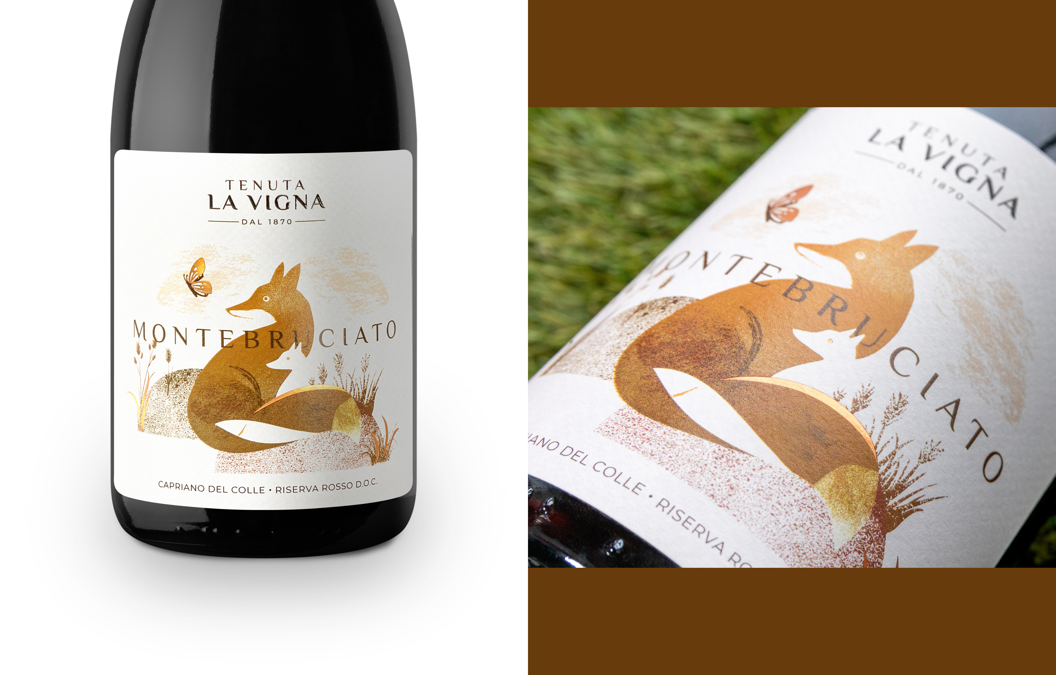
Montebruciato, the reserve red wine. The label shows a fox with her cub on a hill. Orange tones predominate, recalling the reflections of the wine in the glass. The copper hot foil recalls the rays of the autumn sun at sunset in Montenetto, known as "Montebruciato".
Lamettino, marzemino 100%. Purple dominates this label, representing marzemino’s violet reflections. A white ibis cools off among the "Lamot" lakes in the Montenetto reserve. Hot foil emphasizes the purple reflections and lightens the label, while the logo shines with UV.
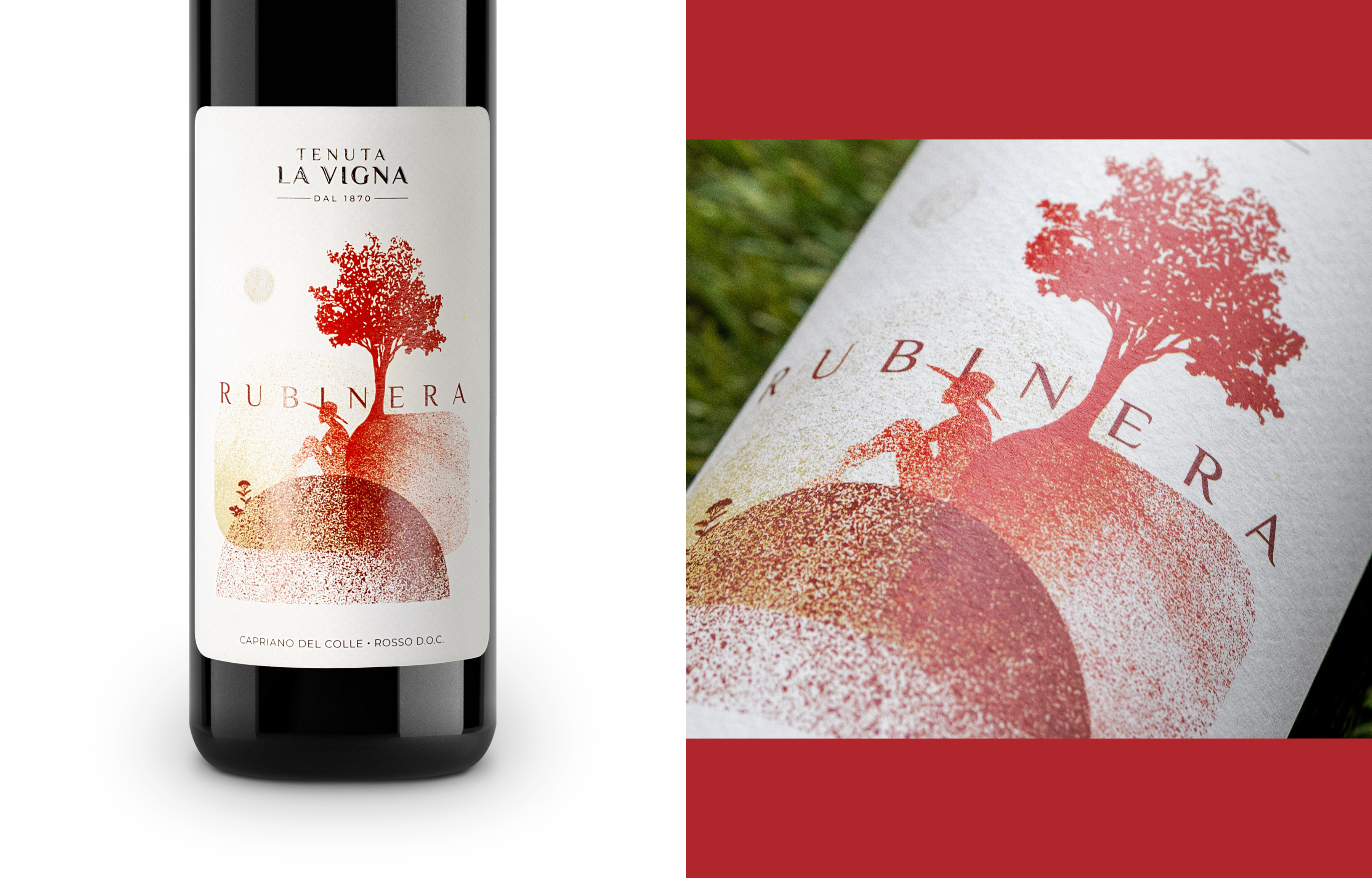
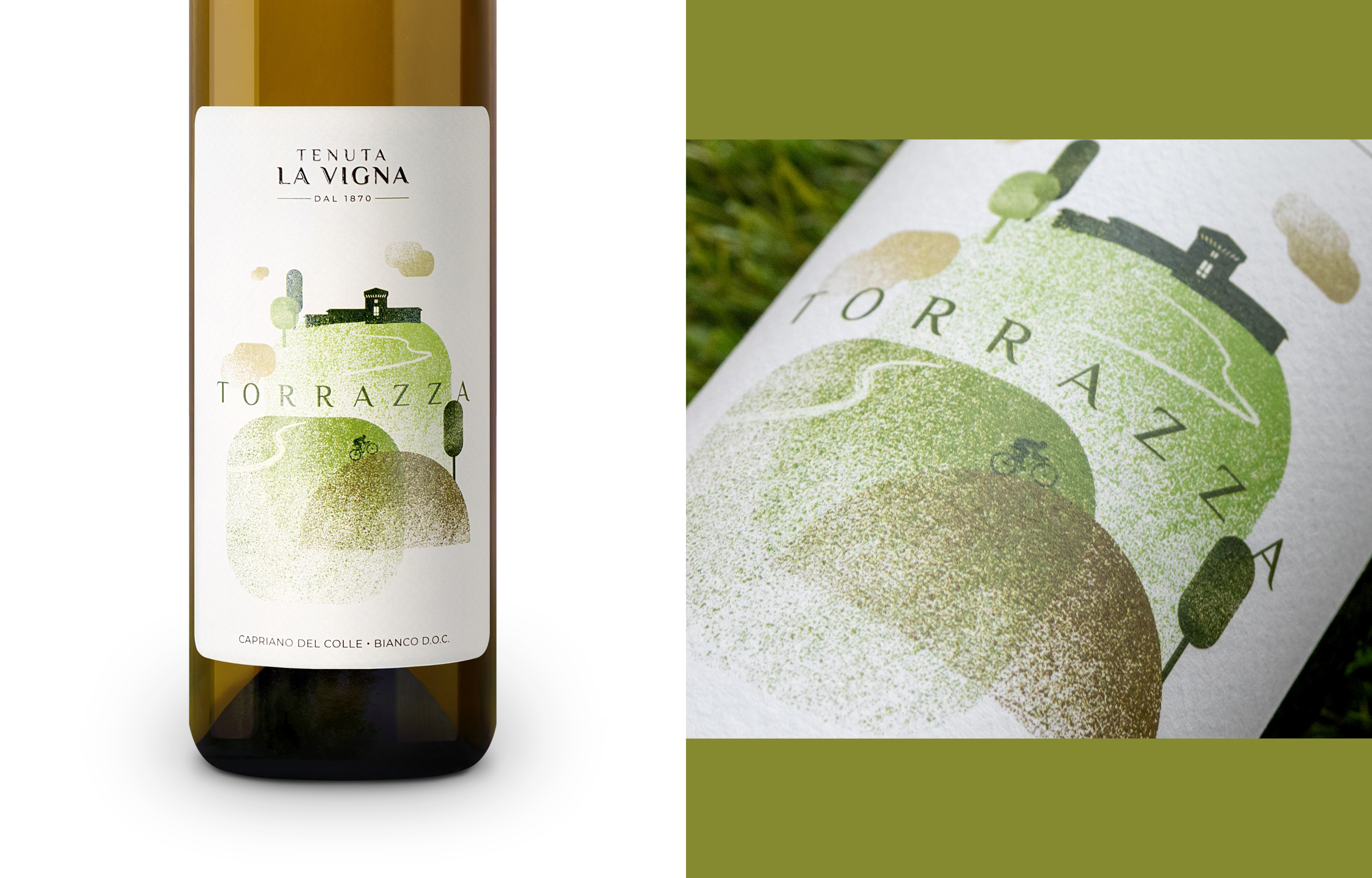
The labels of the table wines, Torrazza and Rubinera, tell the story of the harmonious relationship between man and nature, with cycling and picnics as symbols of hilly experiences. Ecological Fedrigoni Inverness white paper was chosen for the labels, with special finishes such as hot lamination to highlight significant details and UV varnishing to emphasize the colors and the Tenuta La Vigna brand.
The bottle capsules and the graphics on the 6-pack boxes reflect the same philosophy, using simplified illustrations of the subjects shown on the labels to clearly identify the type of wine.


Entrant
By Hart
Category
Corporate Identity - Brand Identity
Country / Region
United States

Entrant
Ian Chen
Category
Typography - Book
Country / Region
United States

Entrant
Dean&Co.
Category
Corporate Identity - Logos
Country / Region
United States

Entrant
Xianghan Wang
Category
Experiential & Immersive - Virtual Reality
Country / Region
United States