2024
Bipor Brand Design Solution
Entrant
Xi'an Bipor Brand Cultural Creative Co., Ltd
Category
Corporate Identity - Brand Identity
Client's Name
Country / Region
China
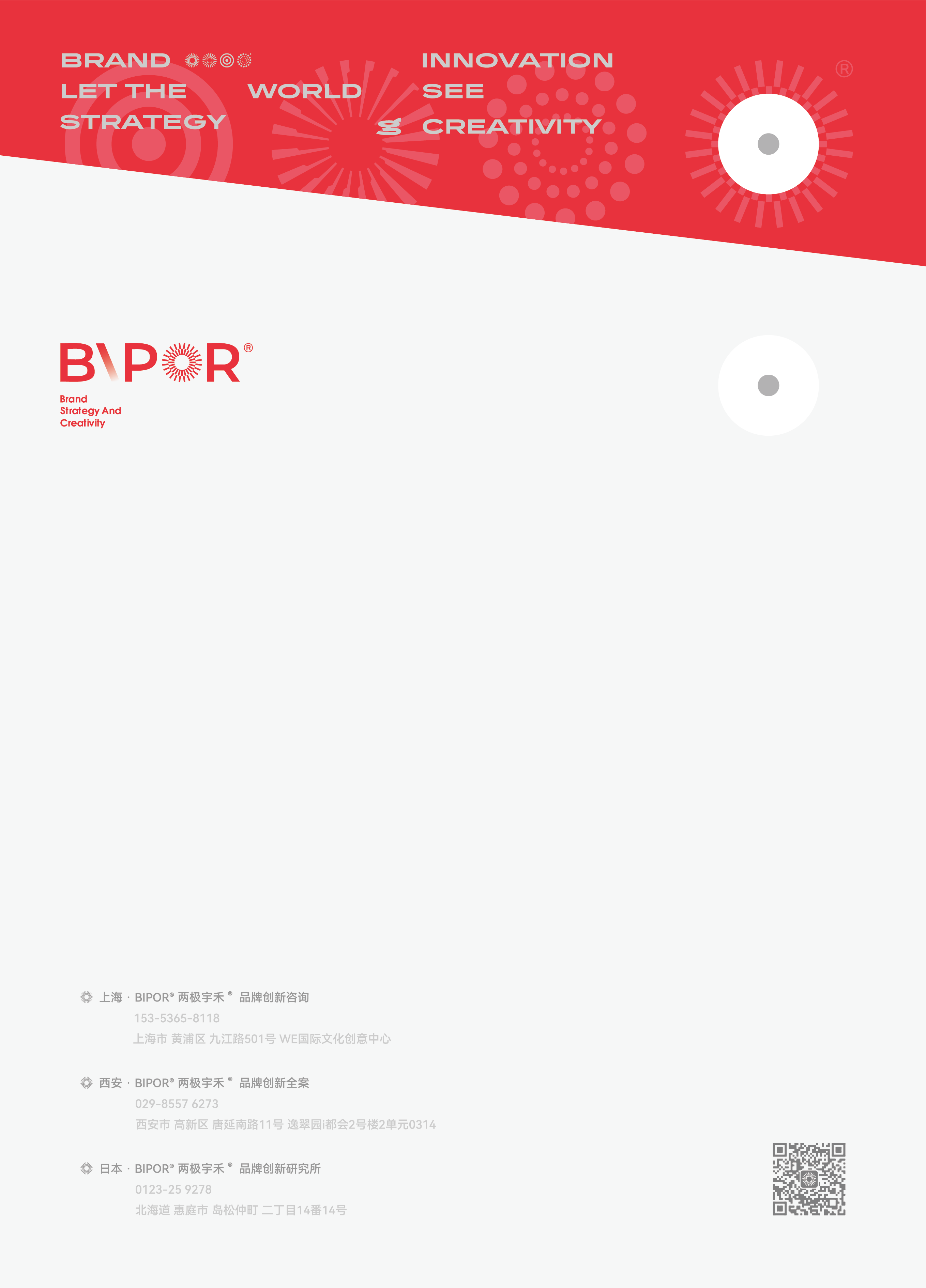
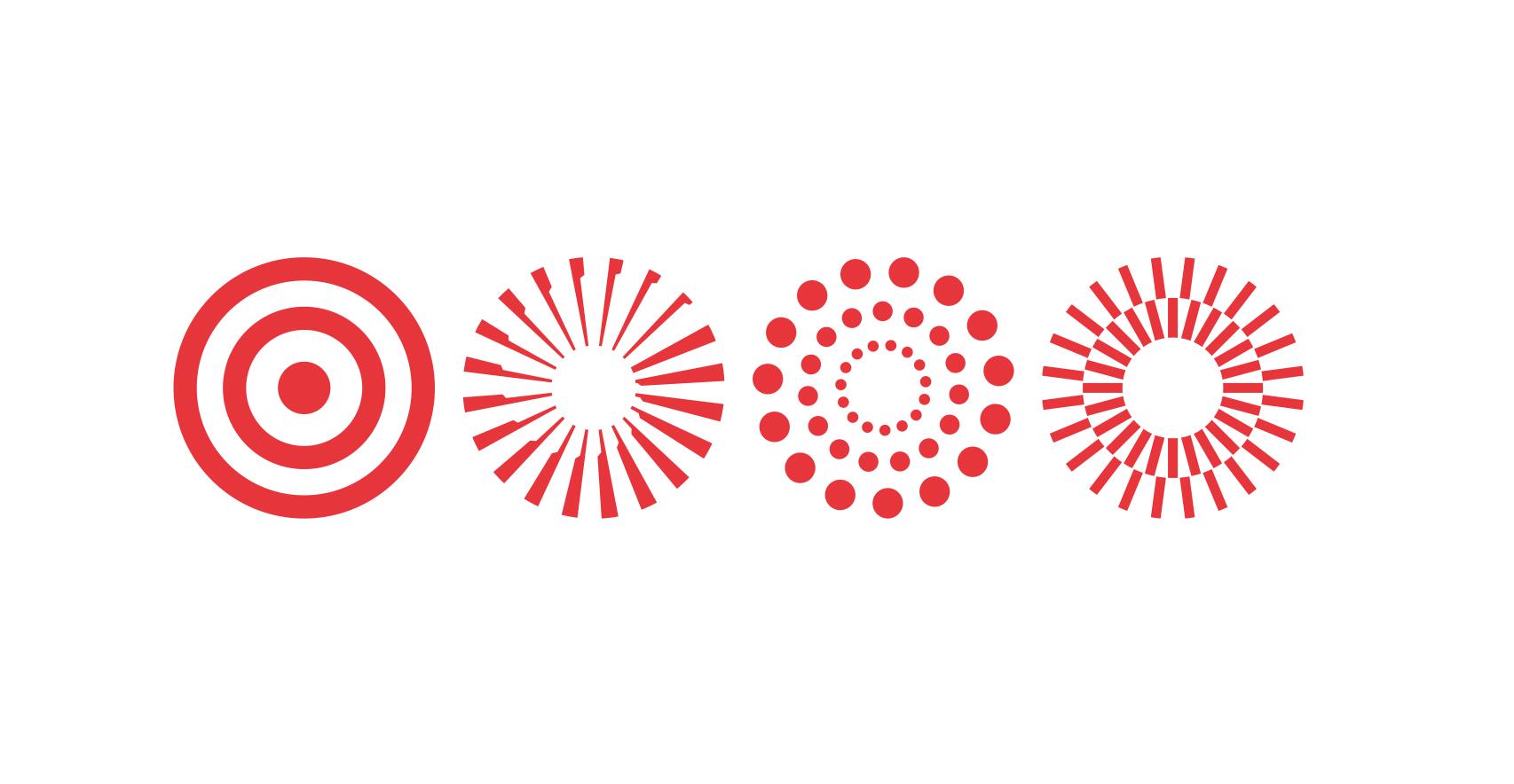
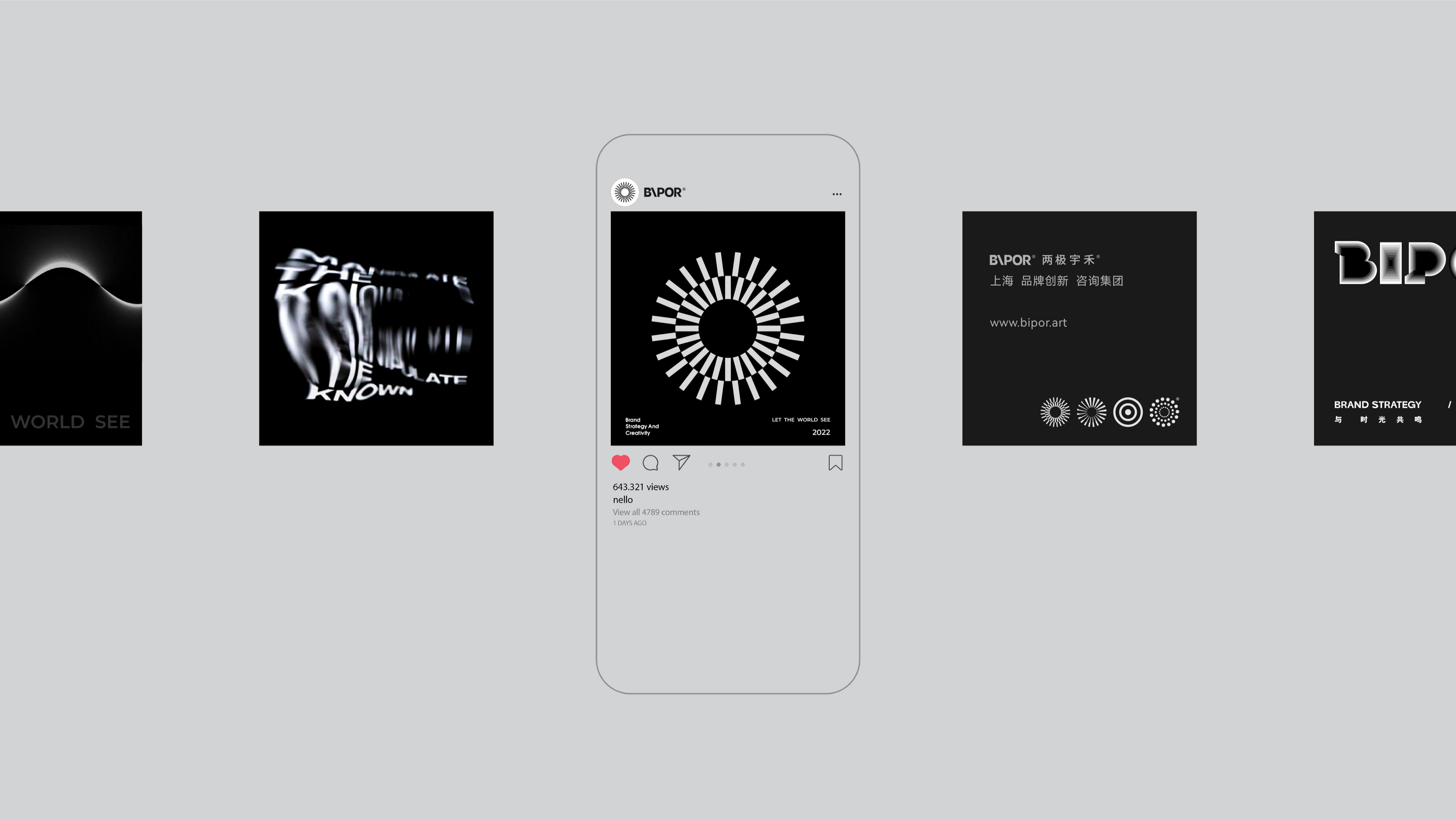
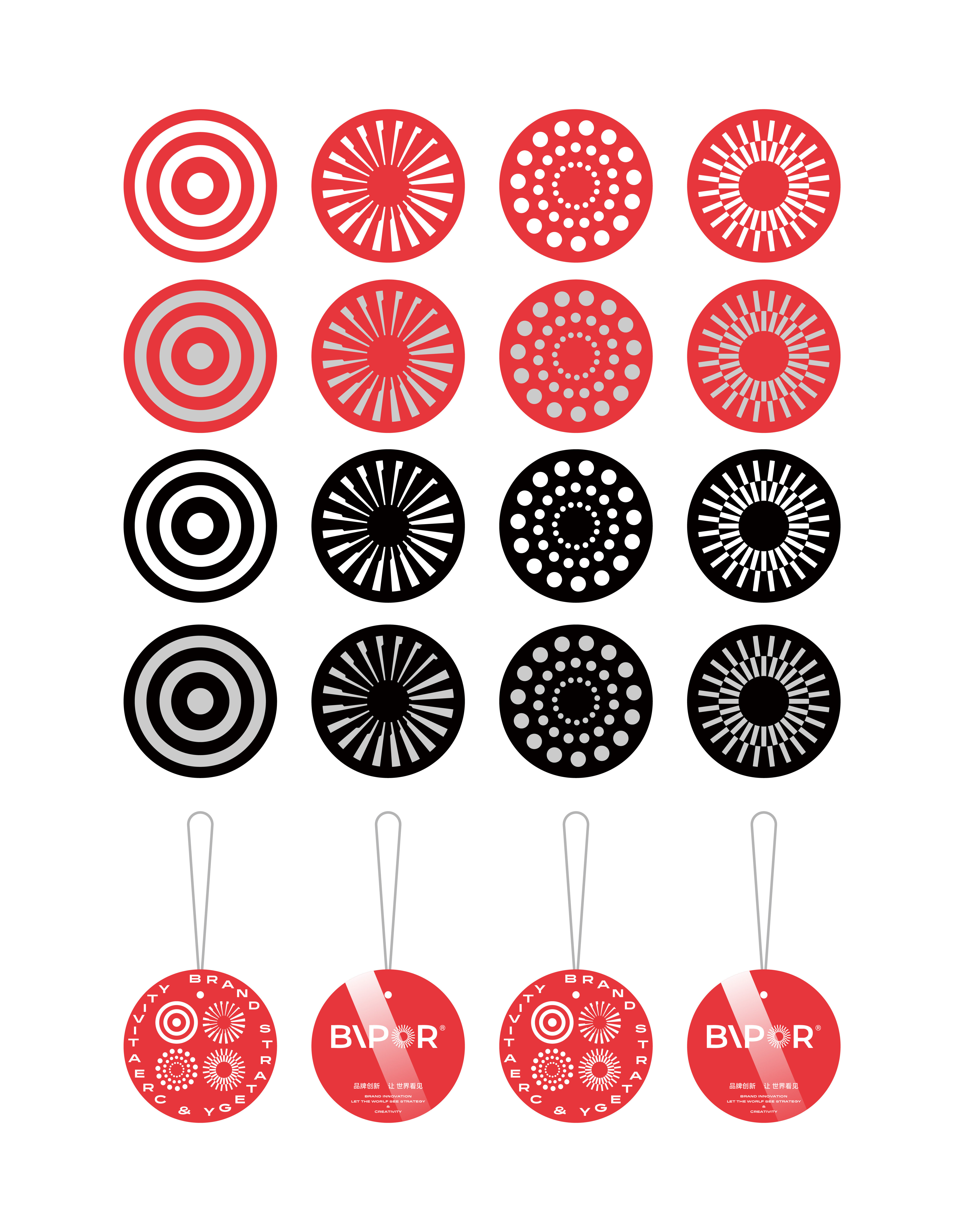
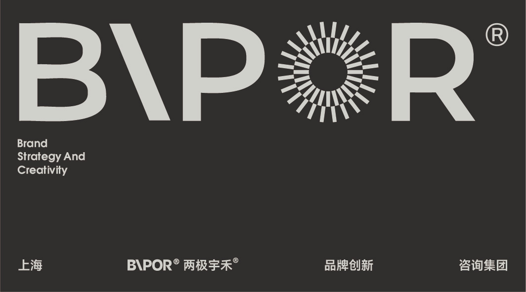
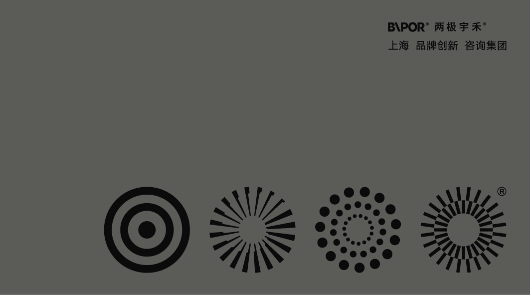
The logo design of the Bipor brand combines innovation with aesthetics, blending font design with visual art. The logo is graphically stylized, with fluid strokes and a slight tilt to the letter "I", giving a sense of lightness and upward movement, emphasizing the brand's vitality and innovation. The core concept of the logo revolves around the circle, evolving into four different styles to represent the brand's four dimensions: brand strategy, design, audiovisual media, and digital marketing modules. Furthermore, in the application of the visual identity (VI), the brand culture is integrated into the design of file folders and envelopes, with a slanted cut to break the conventional design, enhancing visual appeal and stimulating curiosity. The design inspiration for the logo derives from the traditional Chinese philosophical concept of "Dao", reflecting the natural law of the universe's development and endless cycles. Through the use of multiple auxiliary graphics, the brand achieves higher recognition and demonstrates comprehensive service across different business modules, showcasing inclusivity and depth in its multidimensional development. In terms of sustainability, paper materials are used to minimize environmental impact. The design of the Bipor brand logo not only focuses on visual aesthetics and innovation but also effectively communicates and embodies the brand's philosophy, opening up new possibilities for brand development.
Credits


Entrant
AVANGA Filmproduktion GmbH
Category
Video - Recruitment
Country / Region
Germany
Entrant
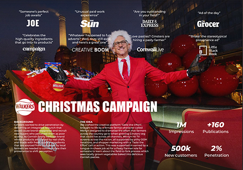
Splendid Communications Ltd
Category
Best Agency Awards - PR Agency of the Year
Country / Region
United Kingdom


Entrant
Vegangster
Category
Website - Design / Web Agency
Country / Region
Latvia
Entrant
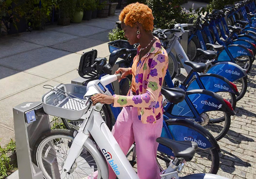
Publicis One Team
Category
Branded Content - Lifestyle
Country / Region
United States
