
2024
ORIVANA
Entrant Company
UnMe Design CO., LTD.
Category
Corporate Identity - Brand Identity
Client's Name
ORIVANA
Country / Region
Taiwan
Brand Introduction: To appeal to young consumers in Taiwan and enter the European and American markets, the renowned Pu'er tea brand "Tianxiang Hall" has launched ORIVANA, meaning "Primordial Forest – Utopia." ORIVANA uses Pu'er tea from non-industrialized, pesticide-free mountain regions of Yunnan, China, home to ancient trees over ten stories tall. The brand adheres to traditional craftsmanship and hand-harvesting techniques to produce tea bags and tea capsules. By adopting modern brewing methods, ORIVANA bridges cultural gaps, making it easier for diverse markets to accept. This pure tea from the Eastern primordial forest is designed to satisfy consumers with a taste for ritualistic living.
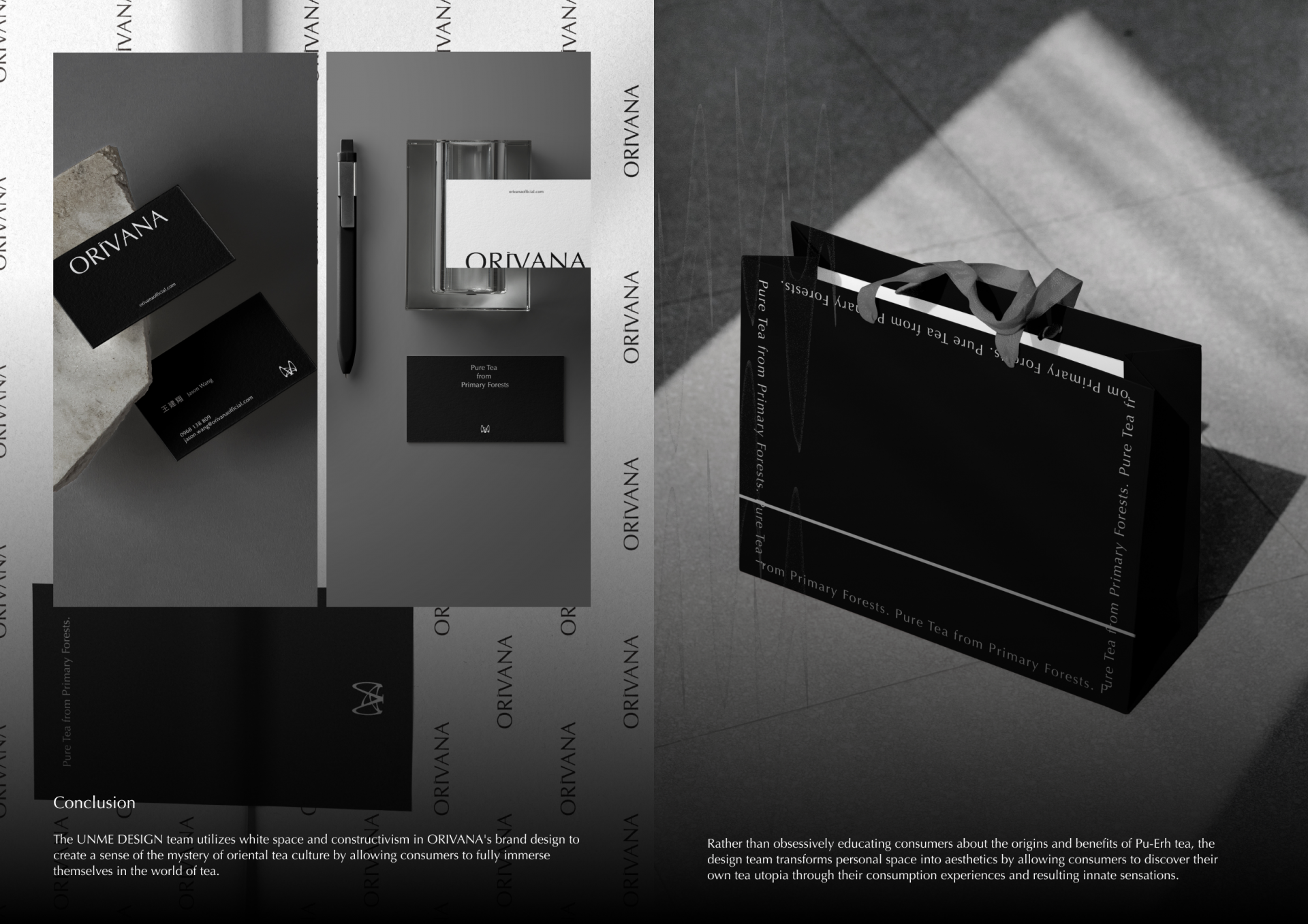
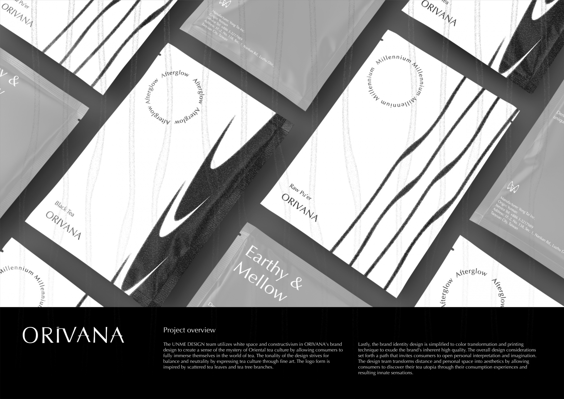
Design Concept: In response to the precious and rare nature of the tea and new market requirements, ORIVANA's packaging design aims to convey the artistic nature of Eastern tea culture and the minimalist concept. The design creates a sense of imagination, tranquility, and self-awareness, providing a unique sensory experience from unboxing to tasting. The overall color scheme uses black, white, and gray, with a sleek and simple logo subtly integrated, reflecting the understated elegance and rich cultural heritage of the East.
Creativity and Features: Opening the bag reveals a sturdy paper box with a silky ribbon handle and the "Orivana" name complementing the box's angles. The sliding box design mimics a drawer for storing precious items, preserving the valuable Pu'er tea. Inside, a black card with white text provides information about the tea, with neatly arranged tea bags or capsules. The inner box's folded edges and compartments are designed to allow the tea bags to stand upright, showcasing meticulous artistry. The tea bags come in different shades of gray to correspond with the varying intensities of the tea flavors. The packaging patterns are inspired by the ripples and reflections on the surface of the tea, showcasing different Pu'er tea flavors and atmospheres. This design can be applied to both tea bags and tea capsules, reducing mold or production line waste, achieving sustainable design. We believe this product will introduce Eastern tea culture to new markets, allowing consumers to create their own tea utopia.


Credits
Entrant Company
UNIVERSITY OF SOUTHERN CALIFORNIA
Category
Student Submission - Student Games
Country / Region
United States

Entrant Company
Sui Pan ,Yikai Wang,Guike Yuan
Category
Student Submission - Student Product Design
Country / Region
China

Entrant Company
Erickson Group Inc
Category
Strategic Program - Branding Refresh
Country / Region
Canada

Entrant Company
At Large PR
Category
Best Agency Awards - Best PR Campaign
Country / Region
United States