
2024
Solar Eclipse
Entrant Company
Hongyou Design
Category
Corporate Identity - Brand Identity
Client's Name
SOLAR ECLIPSE
Country / Region
Taiwan
This compelling graphic design project is custom-tailored for the brand "Eclipse", a purveyor of a diverse and exquisite range of tea beverages. With a primary focus on promoting Taiwan's distinguished Sun Moon Lake black tea series, renowned for its rich and complex flavors, and its charcoal-roasted tea series, celebrated for its unique and captivating taste profile, the brand showcases a commitment to quality and variety. At the heart of the brand's visual identity lies a captivating portrayal of the sun and moon, symbolizing the seamless fusion of tradition and innovation. Through the strategic use of sleek, minimalist lines and a sophisticated palette of neutral colors, the brand masterfully reimagines traditional elements with a contemporary edge. This thoughtful and artistic approach not only aims to elevate the consumer's enjoyment of exceptional tea beverages, but also seeks to immerse them in the profound historical and cultural significance of tea, fostering a deep and meaningful connection to this revered tradition.
The creator of “Eclipse” is a devoted tea enthusiast who ingeniously applied coffee roasting technology to tea, resulting in the distinctive charcoal tea series. This innovative East-meets-West approach beautifully mirrors the brand's identity of harmonizing the elements of the sun and the moon.
The visual design draws inspiration from the minimalist aesthetics prevalent in modern cafes, showcasing sleek lines and geometric patterns. These elements are complemented by a sophisticated color palette of black, grey, and white, interwoven with a gradient design. The overall effect is a refined and evocative visual experience, evoking the ambiance of a misty tea plantation nestled in the mountains.
The brand icon is designed to intricately symbolize the awe-inspiring journey of a solar eclipse, capturing the mesmerizing progression through its five distinct stages. The icon's artful representation vividly portrays the celestial spectacle, beginning with the partial eclipse and leading into the captivating "First contact" as the eclipse unfolds. It further encapsulates the enchanting "Second contact" and the subsequent moment of totality, followed by the gradual brightening denoted by the "Third contact," culminating in the spectacular conclusion of the eclipse, known as the "Fourth contact."


Credits
Entrant Company
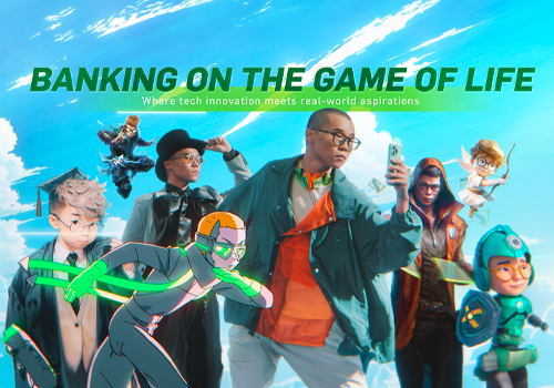
Sunny Idea (HK) Limited, Zenith HK
Category
Video - Insurance
Country / Region
Hong Kong SAR

Entrant Company
Lounge Group
Category
Video - TV Ad Campaign
Country / Region
Hungary

Entrant Company
Wieden+Kennedy New York
Category
Marketing & Promotional - T-Shirt
Country / Region
United States
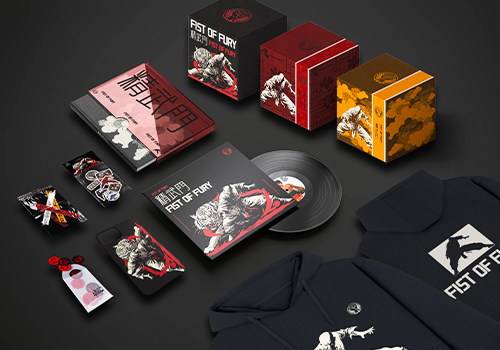
Entrant Company
Swan college, Central South University of Forestry and Technology
Category
Branded Content - Branded Content / Other___
Country / Region
China