2025
‘I am Candle’ Coffee
Entrant Company
LI MENGDI
Category
Typography - New Category: VI Design - ‘I am Candle’ Coffee
Client's Name
LI MENGDI
Country / Region
China
The "I Am Candle" Coffee brand identity is a creative fusion of environmental awareness and resource conservation. In response to the growing concern over environmental protection and resource scarcity, this design transforms leftover candles into a unique "Candle Crayon" font, reducing waste and promoting material reuse. The process involves melting and reshaping the wax from used candles, with color pigments added to form distinctive lettering molds. The result is a logo that conveys sustainability in both form and function.
The design employs actual materials—wax, color powder, and ultra-light clay molds—created through hands-on experimentation. Unlike typical digital designs, the entire visual identity is rooted in the physical process of candle melting and mold-making, reflecting the brand’s commitment to sustainability. The capital "C" in the logo represents both "Candle Crayon" and "Coffee," symbolizing the core concept of the brand: recycling and reimagining everyday resources.
This visual identity not only serves as a powerful tool for spreading the message of resource conservation but also creates a sensory impact through the interplay of color, texture, and material. The unique, malleable nature of the "Candle Crayon" font allows for flexible applications across various brand assets, including product packaging, promotional posters, and merchandise. By combining eco-consciousness with the coffee culture, the design fosters a sense of responsibility in consumers, subtly educating them on sustainability while adding artistic flair to the brand’s messaging.
The "I Am Candle" Coffee identity is more than just a logo; it's a symbol of innovation, creativity, and environmental stewardship. It provides inspiration for upcycling and encourages people to reconsider how they interact with everyday materials, making it a truly sustainable, forward-thinking design.


Credits
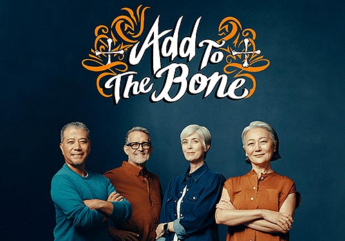
Entrant Company
AbelsonTaylor
Category
Branded Content - Healthcare & Pharma
Country / Region
United States
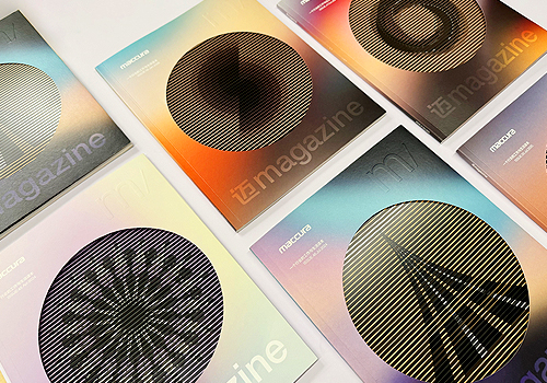
Entrant Company
Chengdu Mifang Culture
Category
Publication - Magazine
Country / Region
China
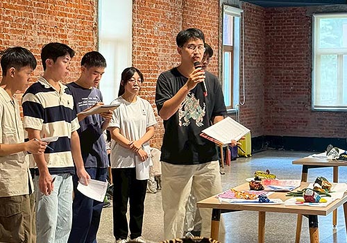
Entrant Company
National Cheng Kung University
Category
Strategic Program - CSR Program
Country / Region
Taiwan
Entrant Company
DonghuaUniversity
Category
Student Submission - Student Conceptual Design
Country / Region
China