
2025
LANDSEA CO-WORKING BRAND IDENTITY DESIGN
Entrant Company
Shanghai Sinostar Art Design Co, Ltd.
Category
Corporate Identity - Brand Identity
Client's Name
Landsea Co-Working of Landsea Apartments
Country / Region
China
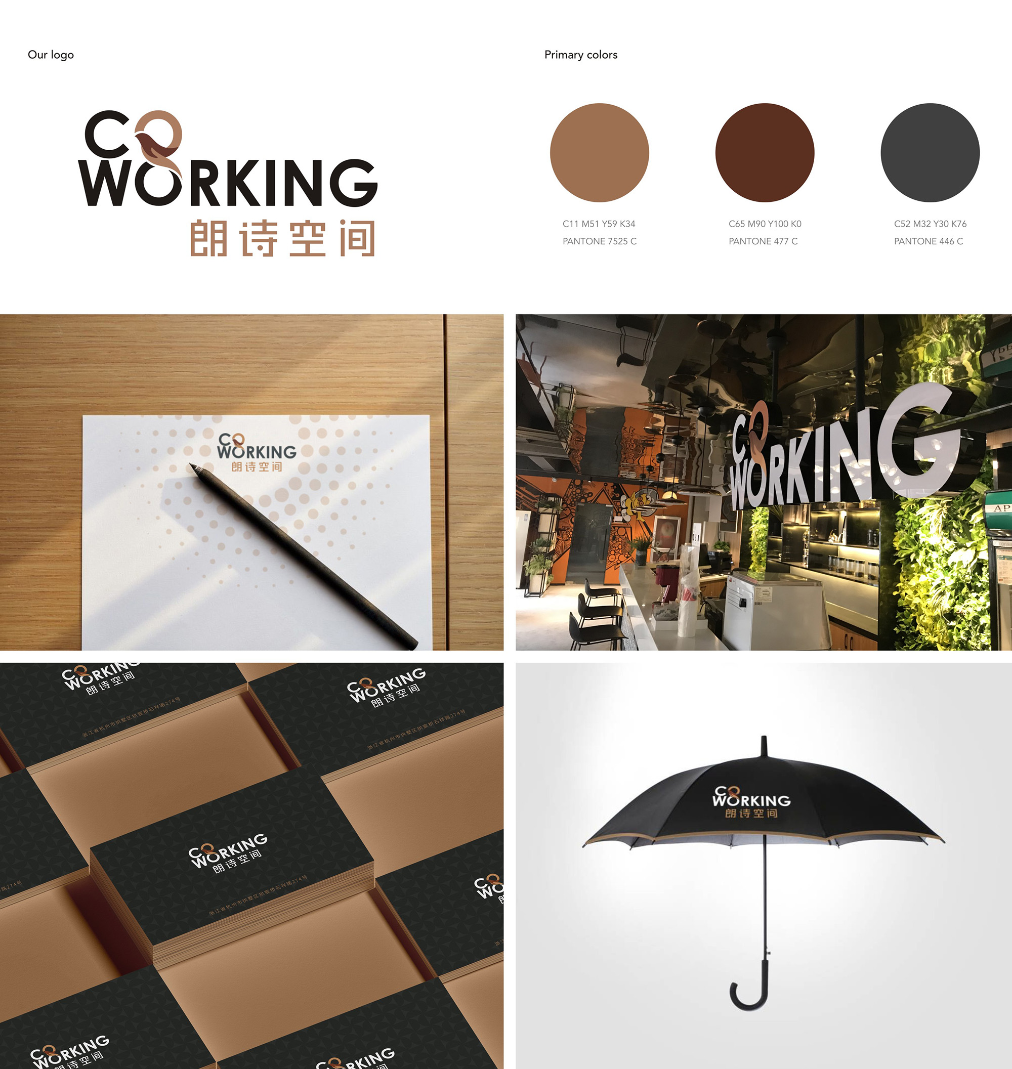
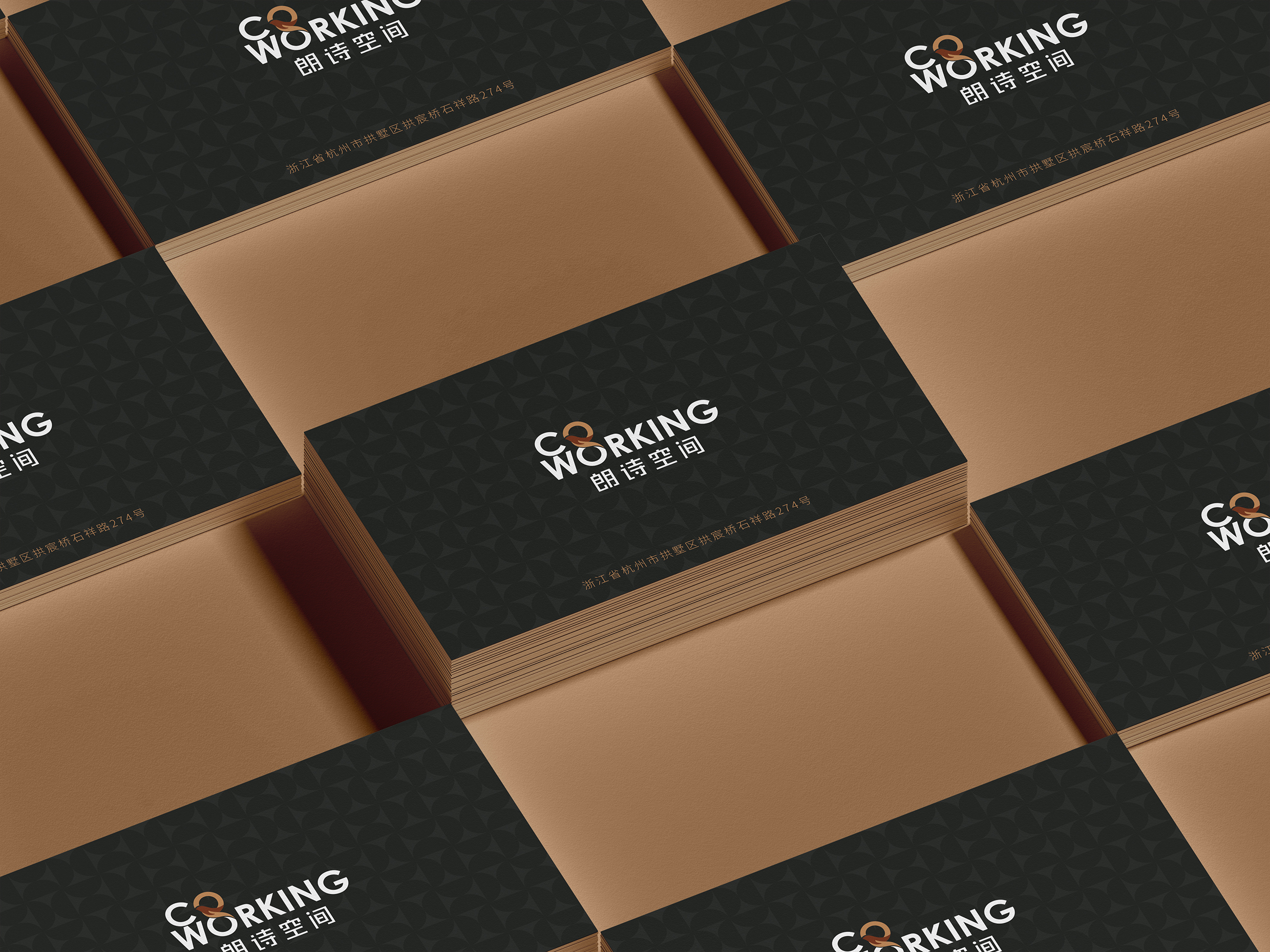
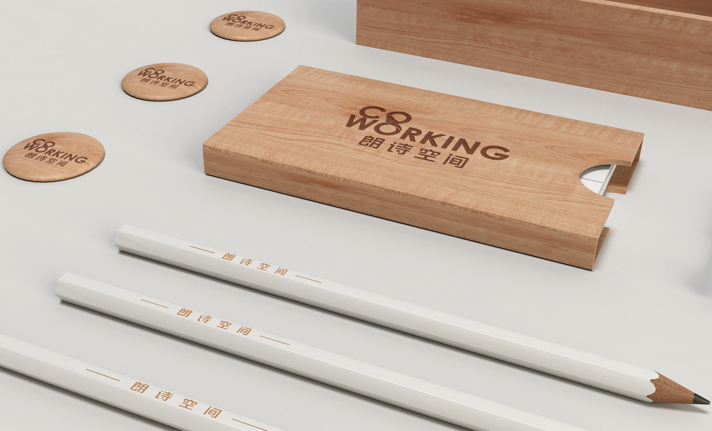
Landsea Co-Working, the co-working brand of Landsea Apartments, is committed to providing green integrated office solutions for enterprises and individuals. Relying on the service concept of “Co-working+Co-living”, Landsea Place creates a green shared space with a highly flexible leasing mode for workstations. Continuing the concept of Landsea Place as a healthy and humanistic community, Landsea Place will provide entrepreneurial counselling and corporate services to help entrepreneurial teams set sail!
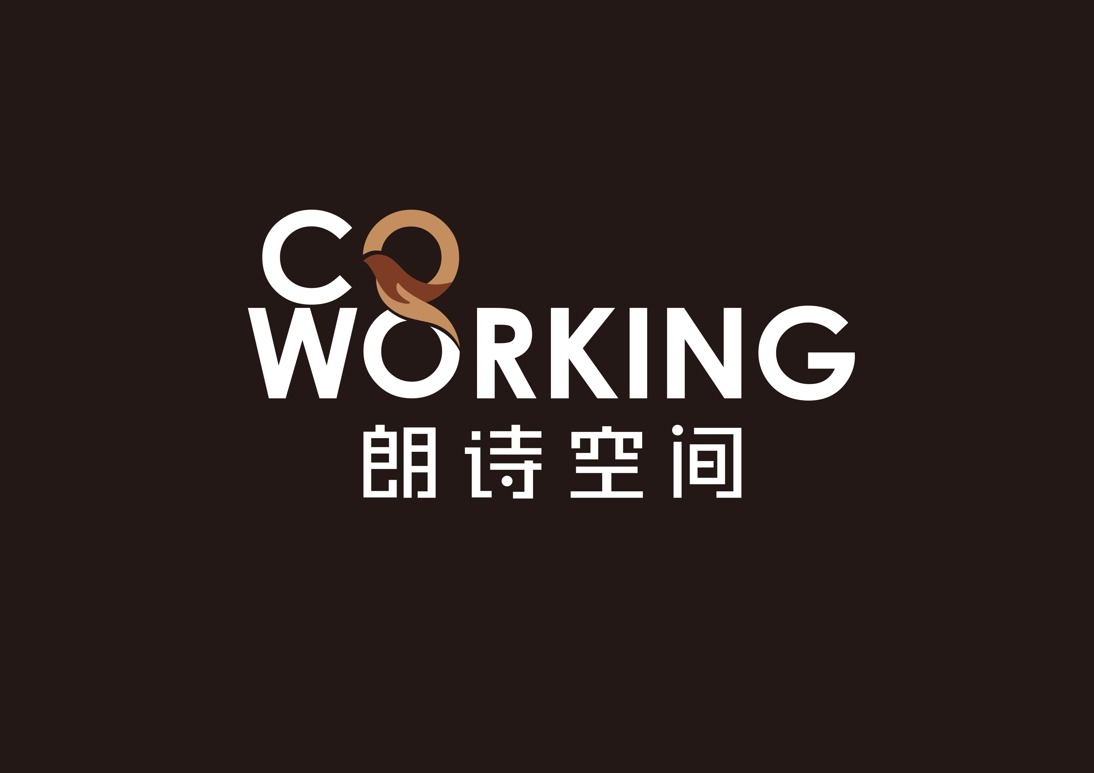
Landsea Co-Working allows interesting souls to meet each other eventually, so that the office also has a poetic life, just like the logo shows: two “O” letters connected with the shape of a bird, the bird’s graphic can be interpreted as two meanings: the lower part of the bird seems to be supported by the hand, and the upper part of the bird seems to be ready to spread its wings and soar, and the letter O has two other meanings: the lower part seems to be an egg breaking its shell, and the upper part seems to be a rising sun. The letter O also has two other meanings: the lower part looks like an egg breaking out of its shell, and the upper part looks like a rising sun. The “bird” element is a continuation of Landsea Apartments’ brand as well as a reflection of the incubation function of co-working enterprises.


Credits
Entrant Company
Axiom of Purpose
Category
Website - Government
Country / Region
United States

Entrant Company
HEYAN
Category
Corporate Identity - Brand Identity
Country / Region
China

Entrant Company
Yuan Ze University
Category
Student Submission - Student Conceptual Design
Country / Region
Taiwan
Entrant Company
Public Television Service Foundation (Hakka TV)
Category
Website - Movie / Film
Country / Region
Taiwan