2025
BALOE
Entrant Company
Bank of Jilin Co., Ltd.
Category
Corporate Identity - Brand Identity
Client's Name
Beijing Yixiang Information Technology Co., Ltd.
Country / Region
China
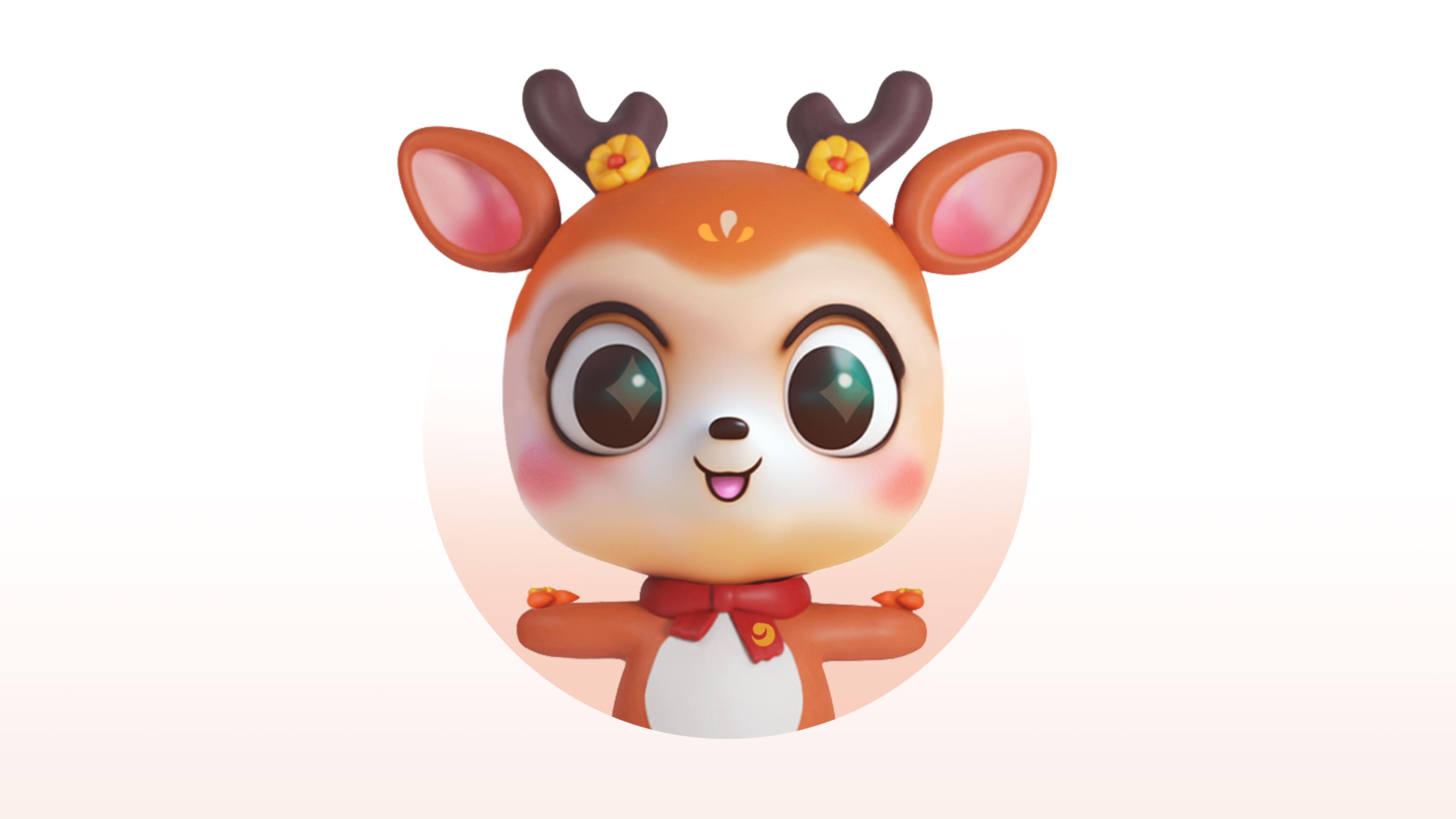
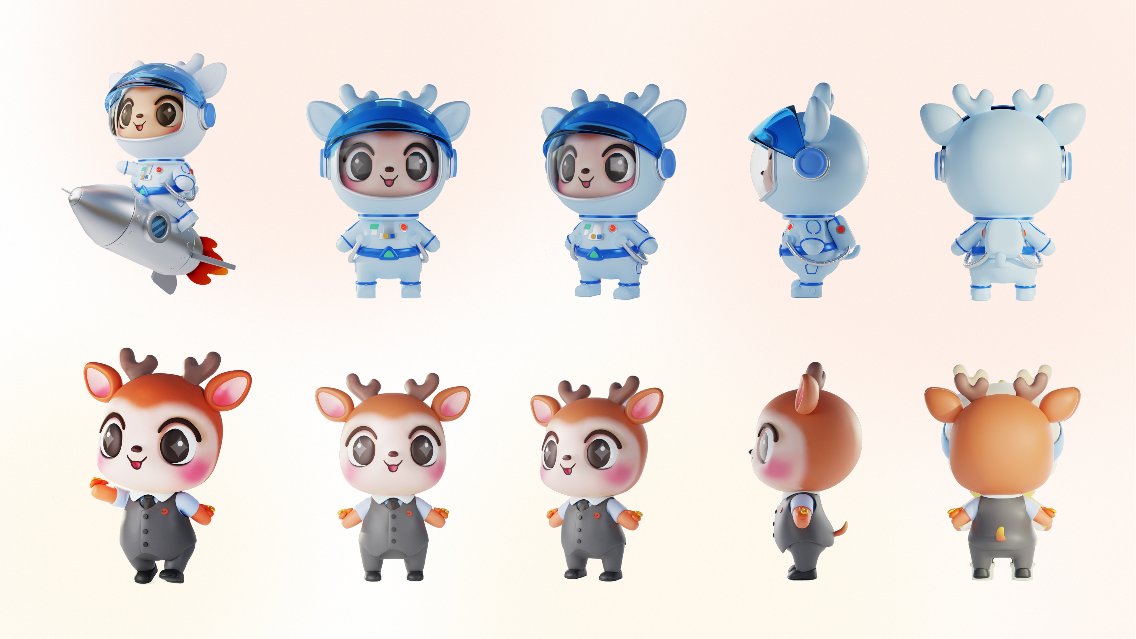
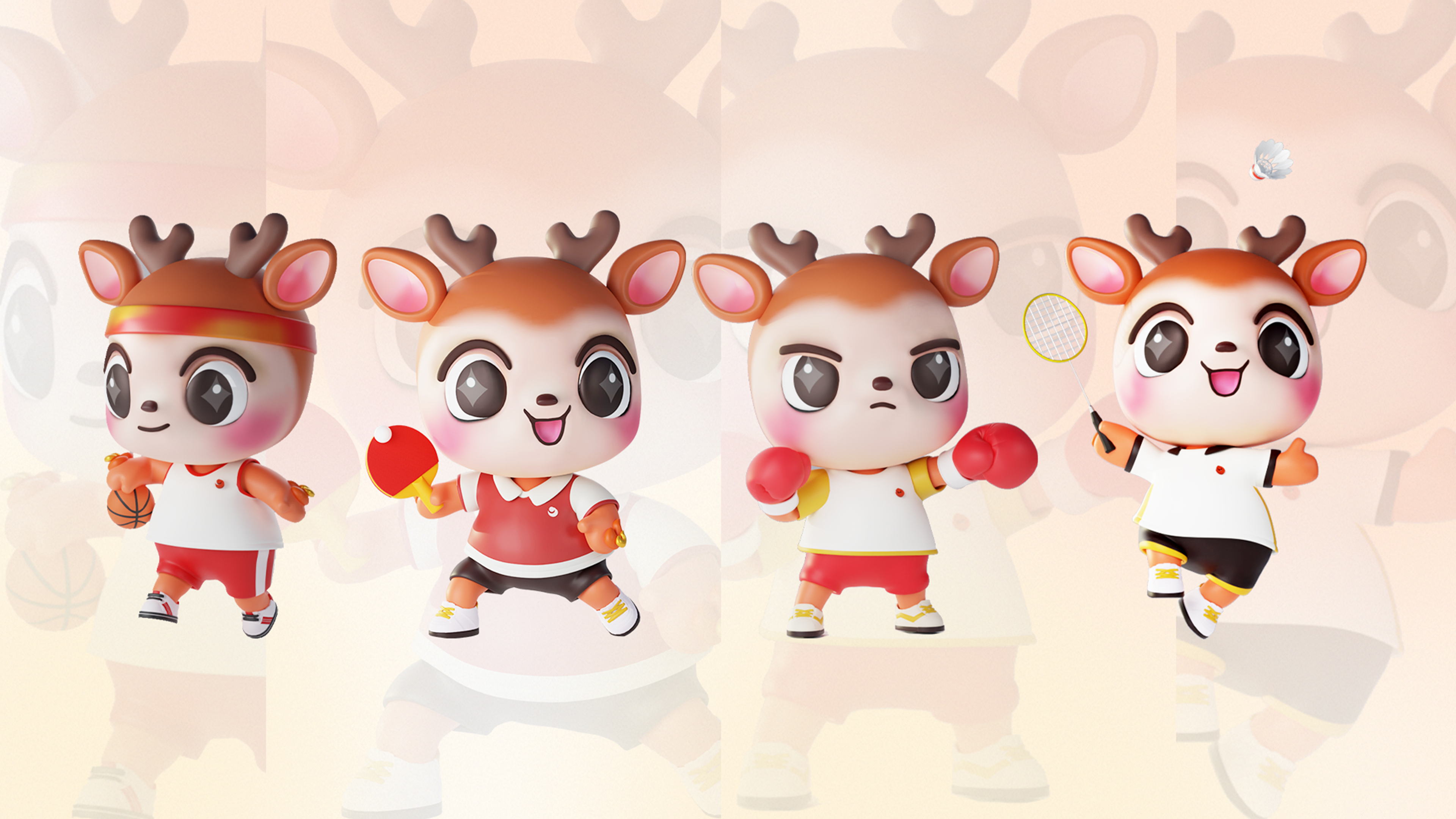
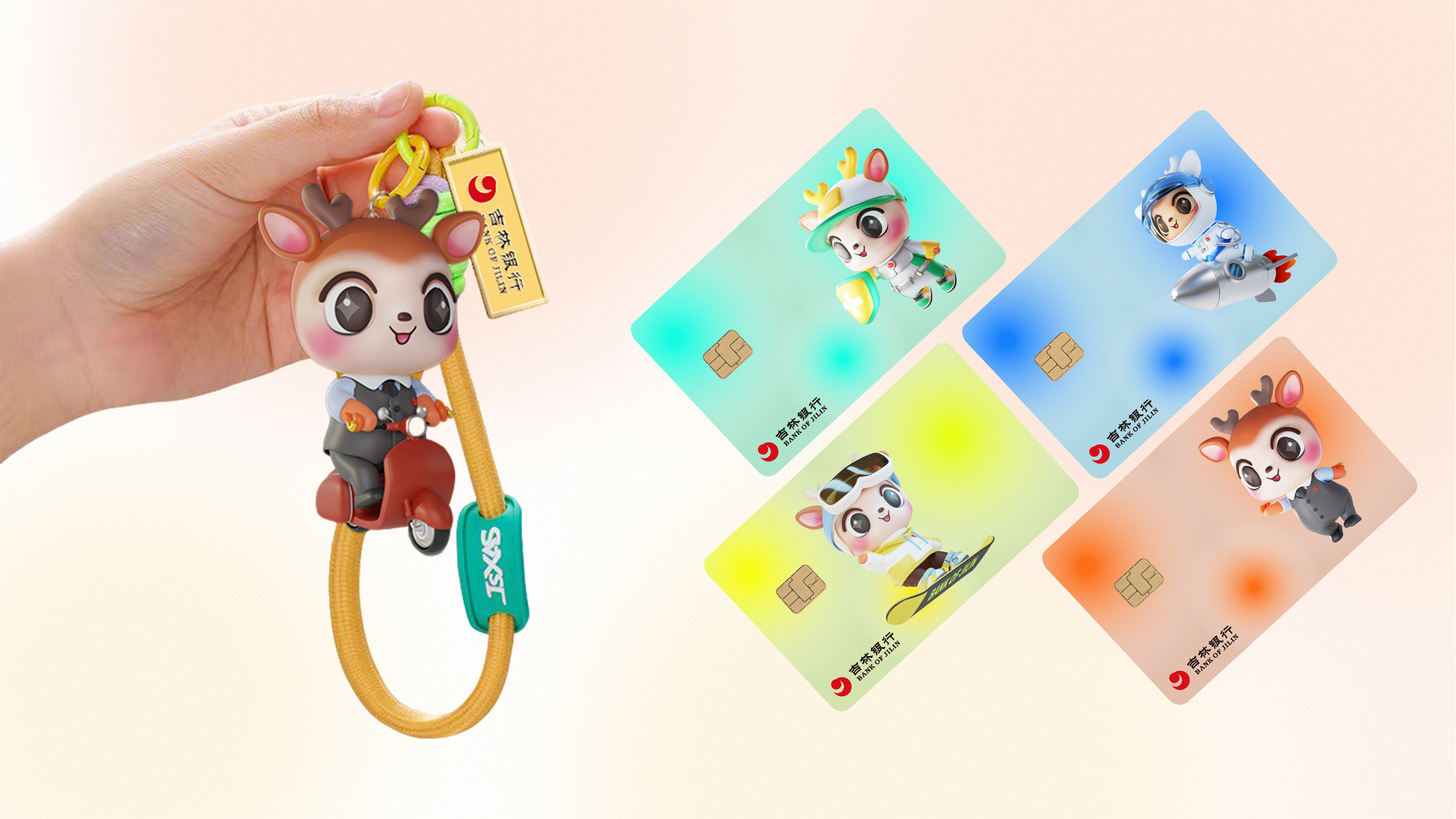
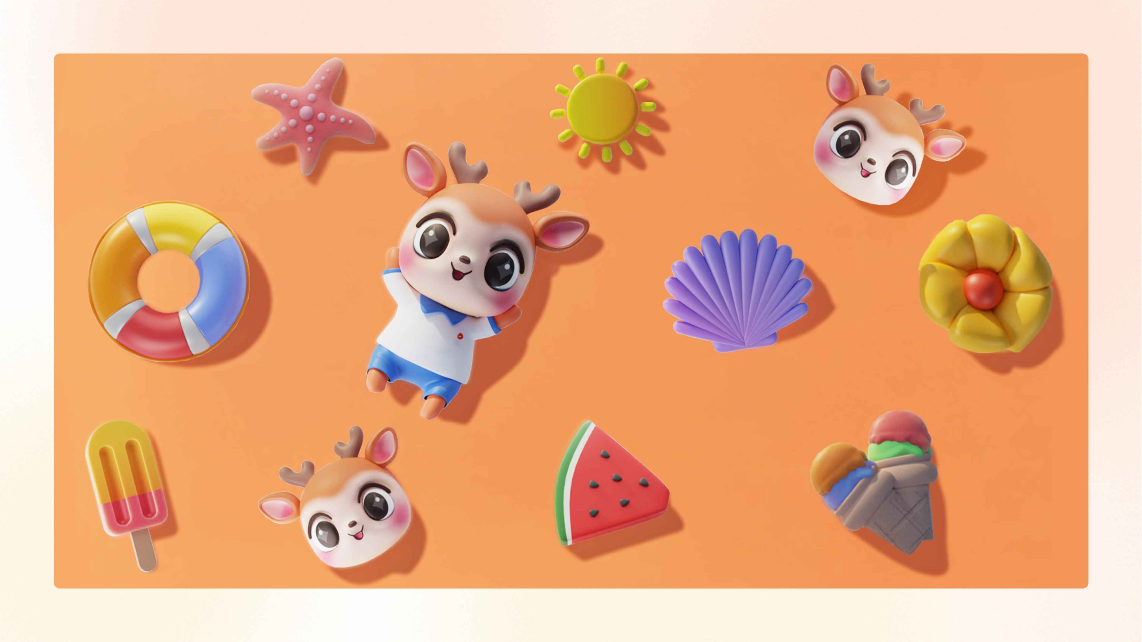
Inspired by the sika deer of Changbai Mountain and the mythical deer from the ancient Chinese classic Shan Hai Jing (The Classic of Mountains and Seas), the image draws deeply from local natural heritage and traditional symbolism. In Chinese, the words for “deer” (lù) and “prosperity” (lù) are homophones, making the deer a widely recognized symbol of good fortune, wealth, and auspiciousness.BALOE reimagines this cultural symbol as a digital spirit with emotional warmth and a companion-like personality. Through a comprehensive visual system encompassing 3D modeling, dynamic animation, digital interaction, and spatial scenarios, BALOE transforms the way financial services are conveyed—making culture and service not only visible and tangible, but also participatory.By awakening emotional resonance among local users and leveraging digital tools to engage younger audiences such as Gen Z, BALOE drives a dual-powered approach of “Culture + Technology.” This strategy enables the brand to become younger, the service more emotionally engaging, and the regional market more deeply cultivated—setting a new benchmark for blending traditional finance with modern user experience. The overall design direction of the BALOE IP centers on being clever, lively, and playfully endearing, aligning with Gen Z aesthetics to create a highly recognizable and emotionally engaging brand character for the financial sector. Its form integrates six culturally symbolic elements to build a coherent and distinctive visual identity system: Forehead: Auspicious Blossom — Symbolizing peace, happiness, and a bright future, serving as a focal visual point. Ears: Plum Blossom Earrings — Representing wealth and guardianship, reflecting the brand's attentive and listening attitude. Antlers: Blooming Plum Branches — Conveying resilience and vitality, enhancing memorability through silhouette design. Body: Nine-Colored Deer Patterns — Inspired by Dunhuang murals, expressing cultural heritage and public-minded values. Limbs: Flame Motifs — Symbolizing prosperity and upward momentum, adding dynamic visual energy. Overall Form: Regional–Cultural Fusion — Blending Jilin’s local characteristics with traditional auspicious motifs, this approach embodies the dual mission of regional finance and inclusive service, reinforcing Jilin Bank’s identity as a warm, trustworthy presence—“Our Family’s Bank” in the hearts of local communities.


Credits

Entrant Company
Zbra Studios
Category
Website - Consulting
Country / Region
United States

Entrant Company
Total Trial Solutions
Category
Video - Animation
Country / Region
United States

Entrant Company
Nanjing University of the Arts
Category
Student Submission - Student Games
Country / Region
China
Entrant Company
Active AI
Category
Website - E-Learning
Country / Region
United States