
2026
The RYDER
Entrant
Avenue5 Residential | Studio5
Category
Branded Content - Property / Developer
Client's Name
Country / Region
United States
Gallery





About The Entry
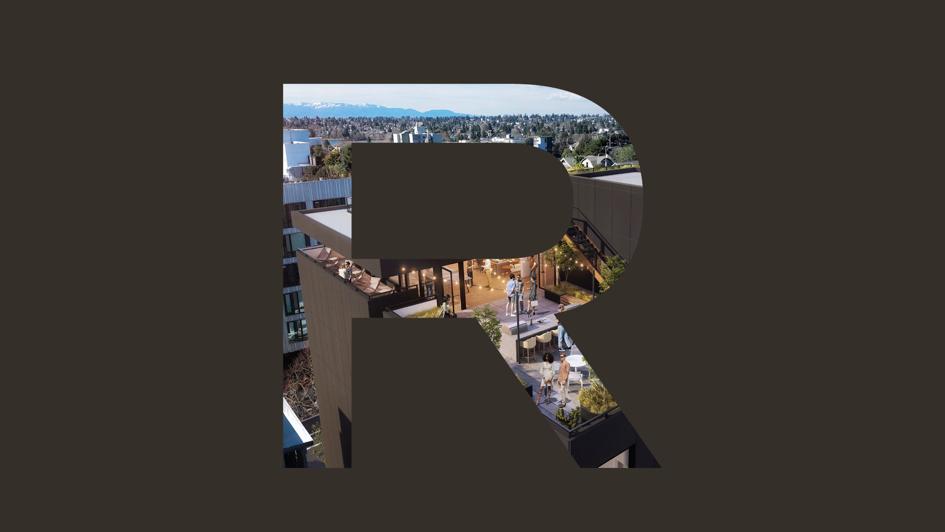
The Ryder identity was designed to reflect modern urban living, pairing a bold, straightforward wordmark with a strong “R” monogram that emphasizes confidence and approachability. A refined palette of charcoal, warm neutrals, slate blue, and subtle bronze accents supports the brand’s promise of balance capturing the energy of city life while encouraging residents to slow down, linger, and feel at home.
Featured Media
Credits

Entrant
TAN YINGNI
Category
Typography - Use of Typography
Country / Region
China

Entrant
Tomato Tomate
Category
Corporate Identity - Logos
Country / Region
United States

Entrant
Copper Giants
Category
Marketing & Promotional - Poster (Series)
Country / Region
United States

Entrant
Random42 Scientific Communication
Category
Experiential & Immersive - Virtual Reality
Country / Region
United Kingdom