
2026
Bitter + Sweet Logo Design
Entrant
Liying Wang
Category
Corporate Identity - Logos
Client's Name
Country / Region
United States
Gallery


About The Entry
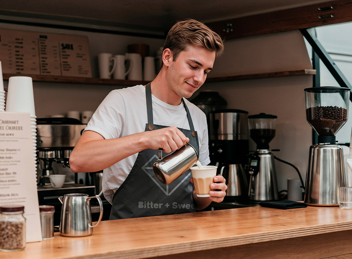
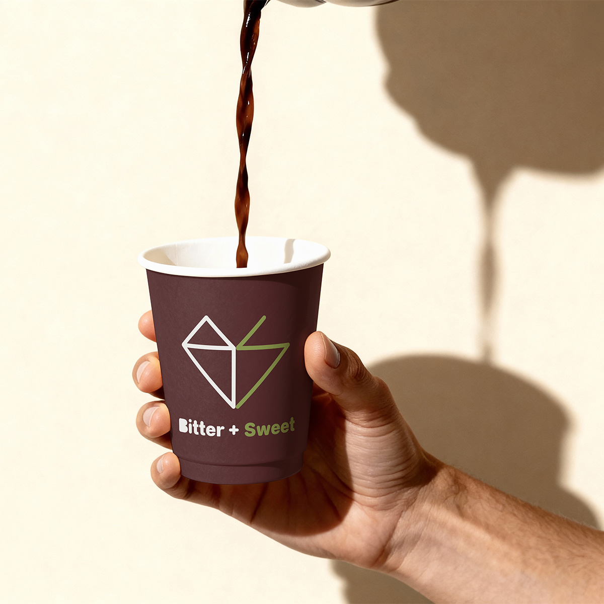
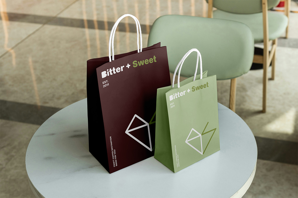
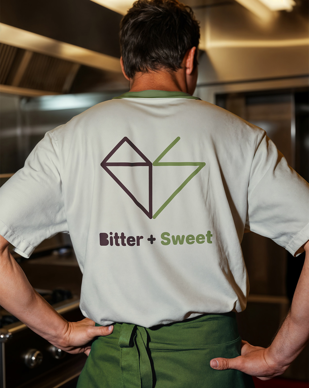
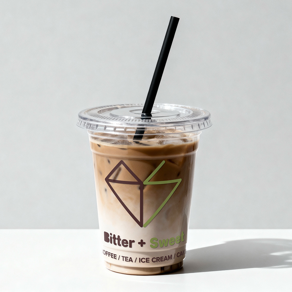
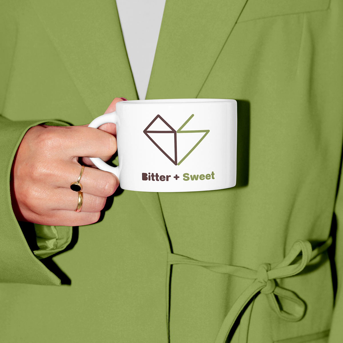
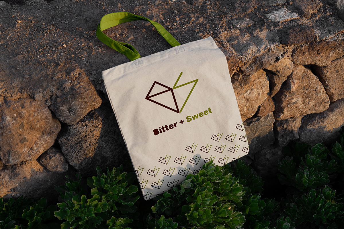
The visual identity for Bitter + Sweet is built on the "double-read" principle and the duality of the coffee experience. Coffee is a balance of opposites: the deep, intense "bitter" of a dark roast and the bright, "sweet" notes of high-quality beans and treats. At first glance, the mark is a geometric heart—a symbol of hospitality and passion. Upon closer look, the brand’s initials will reveal within the structure: the left side forms a rigid, structural 'B' (Bitter), while the right side creates a fluid, open 'S' (Sweet). It is constructed on a strict mathematical grid to ensure it remains clean and timeless.
The color palette avoids the "industrial" look common in many modern cafes, opting instead for organic, earthy tones. The Espresso Brown anchors the brand in tradition, while the Sage Green adds a contemporary, fresh feel from tea, appealing to health-conscious and craft-focused customers. I crafted a rounded, friendly typeface to balance the logo's sharp geometry, making the brand feel welcoming and approachable.

Entrant
BENGAL HERITAGE FOUNDATION
Category
Publication - Magazine
Country / Region
United Kingdom

Entrant
Firmseek
Category
Website - Law & Legal Services
Country / Region
United States
Entrant
NAVIGATOR WORKSHOP NO.1
Category
Corporate Identity - Brand Identity
Country / Region
China

Entrant
National Cheng Kung University
Category
Corporate Social Responsibility - Pro Bono (Free)
Country / Region
Taiwan