
2026
Global Logistics Center Brand Identity
Entrant
CBRE Calibre Creative Group
Category
Corporate Identity - Style Guide
Client's Name
Wadsworth Development Group
Country / Region
United States
Gallery



About The Entry
Nearly 3,000 acres with up to 40 million square feet of potential build-out, Salt Lake City Global Logistics Center (SLC GLC) is one of the largest industrial developments in the United States. But scale alone couldn’t carry its story.
Despite years of leasing progress, the market didn’t grasp the true offering of SLC GLC. It’s a category-defining campus with a bespoke design process for every tenant, not a one-size-fits-all warehouse park. CBRE Calibre Creative Group was engaged to communicate the development’s full potential with a comprehensive identity system capable of projecting continental-scale ambition into the market.
Our diagnosis showed that SLC GLC’s brand must be able to scale across multiple phases of development, each with its own identity, balance local recognition with a future-forward aesthetic and communicate both infrastructure capabilities and value. Accordingly, we triangulated a branding position among a set of nationally and internationally relevant peers that was distinct, and able to serve for the long term.
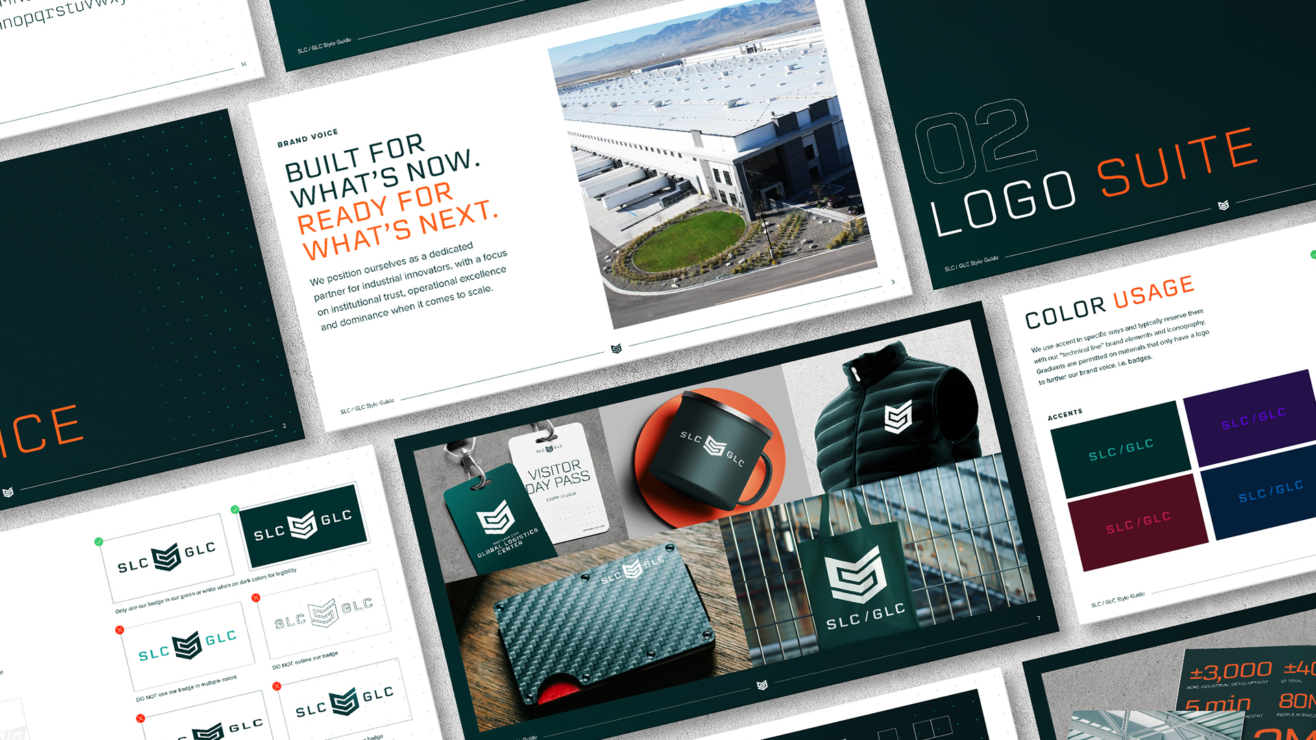
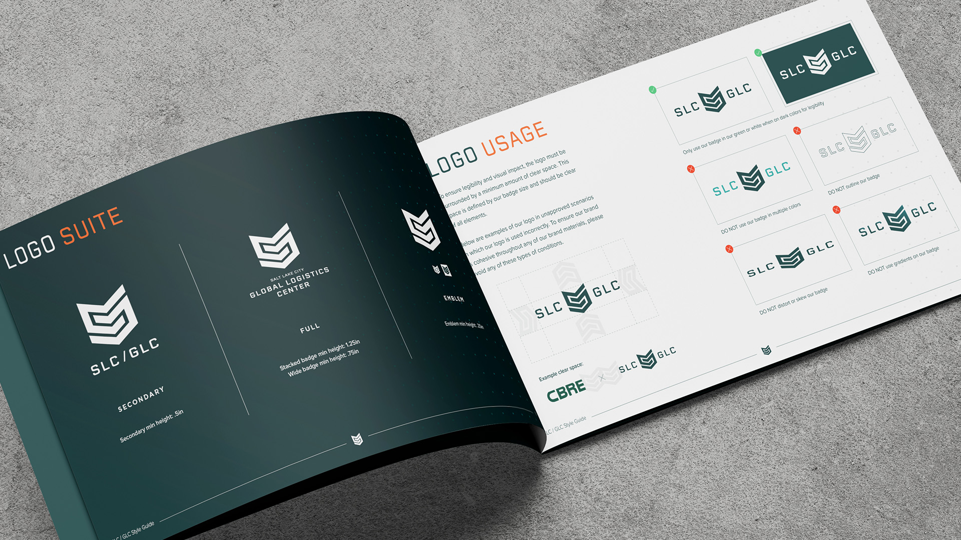
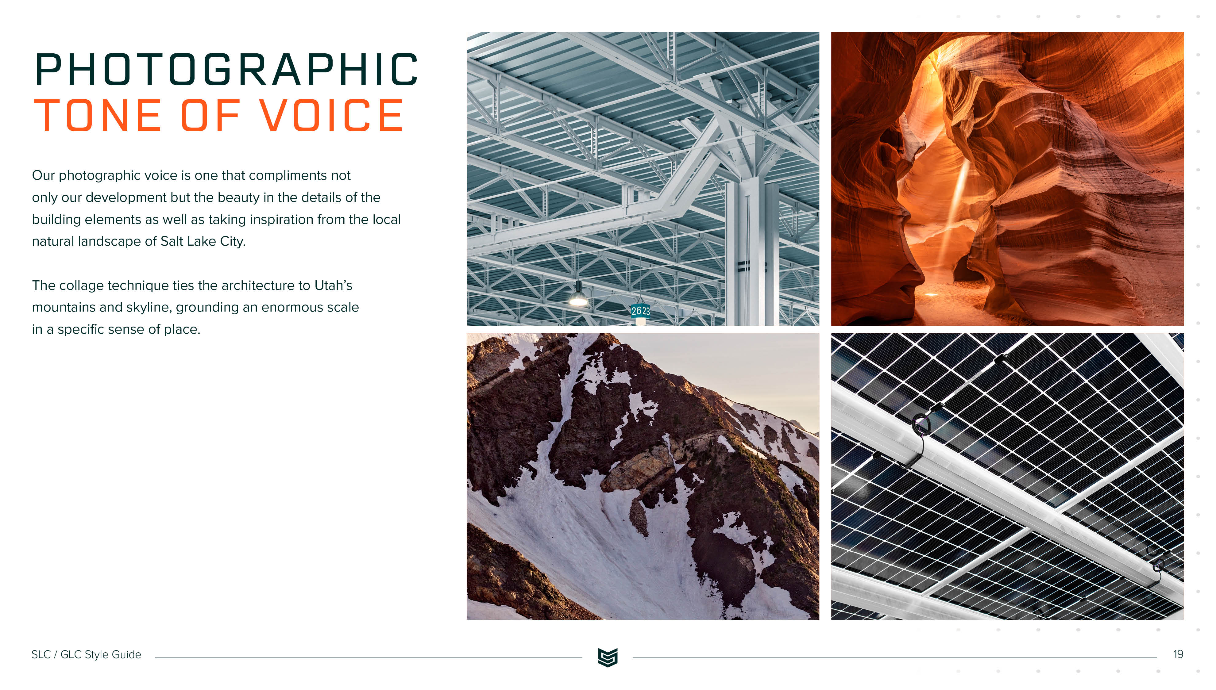
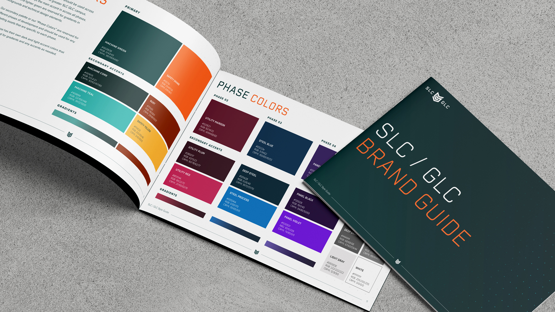
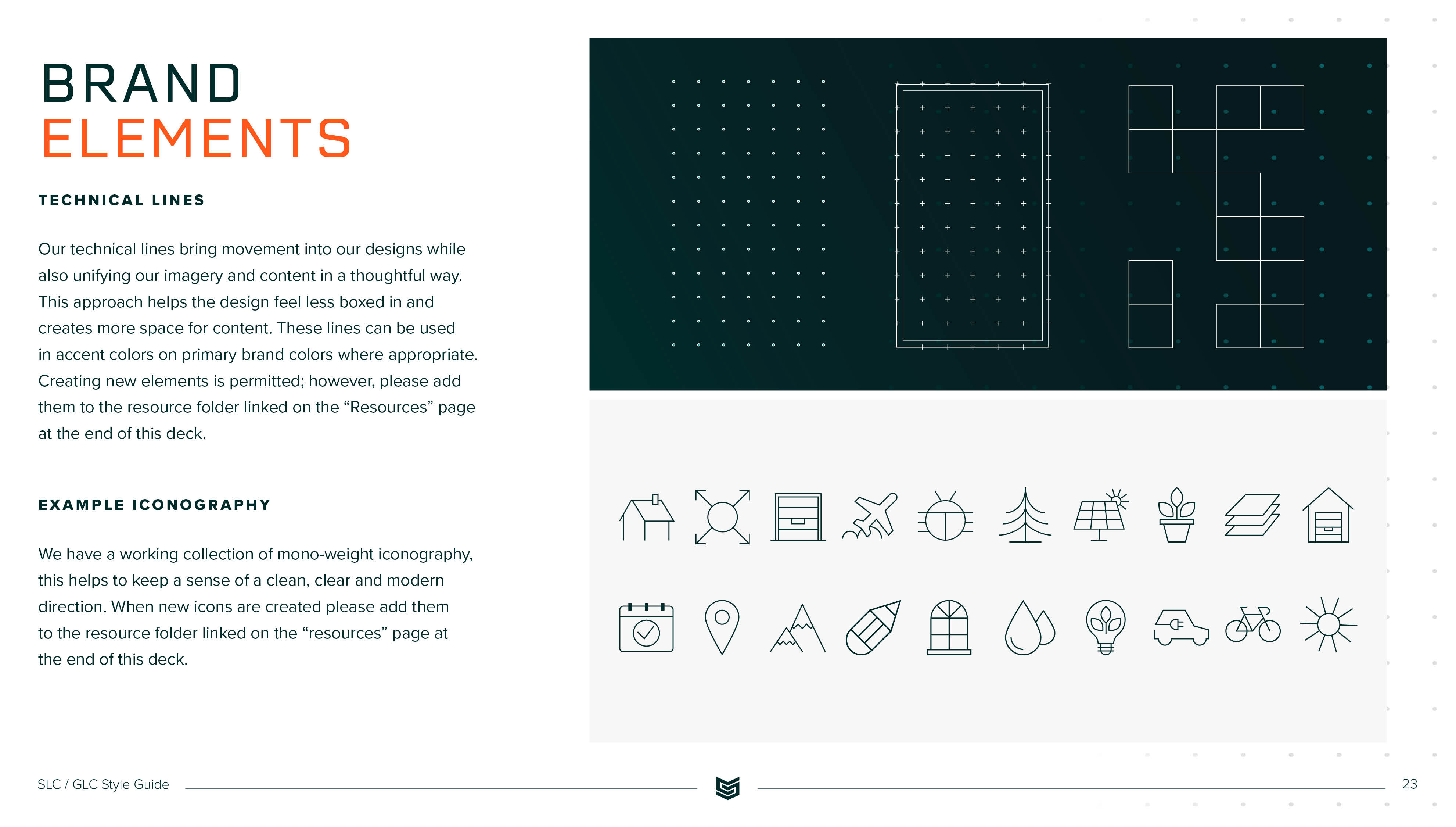
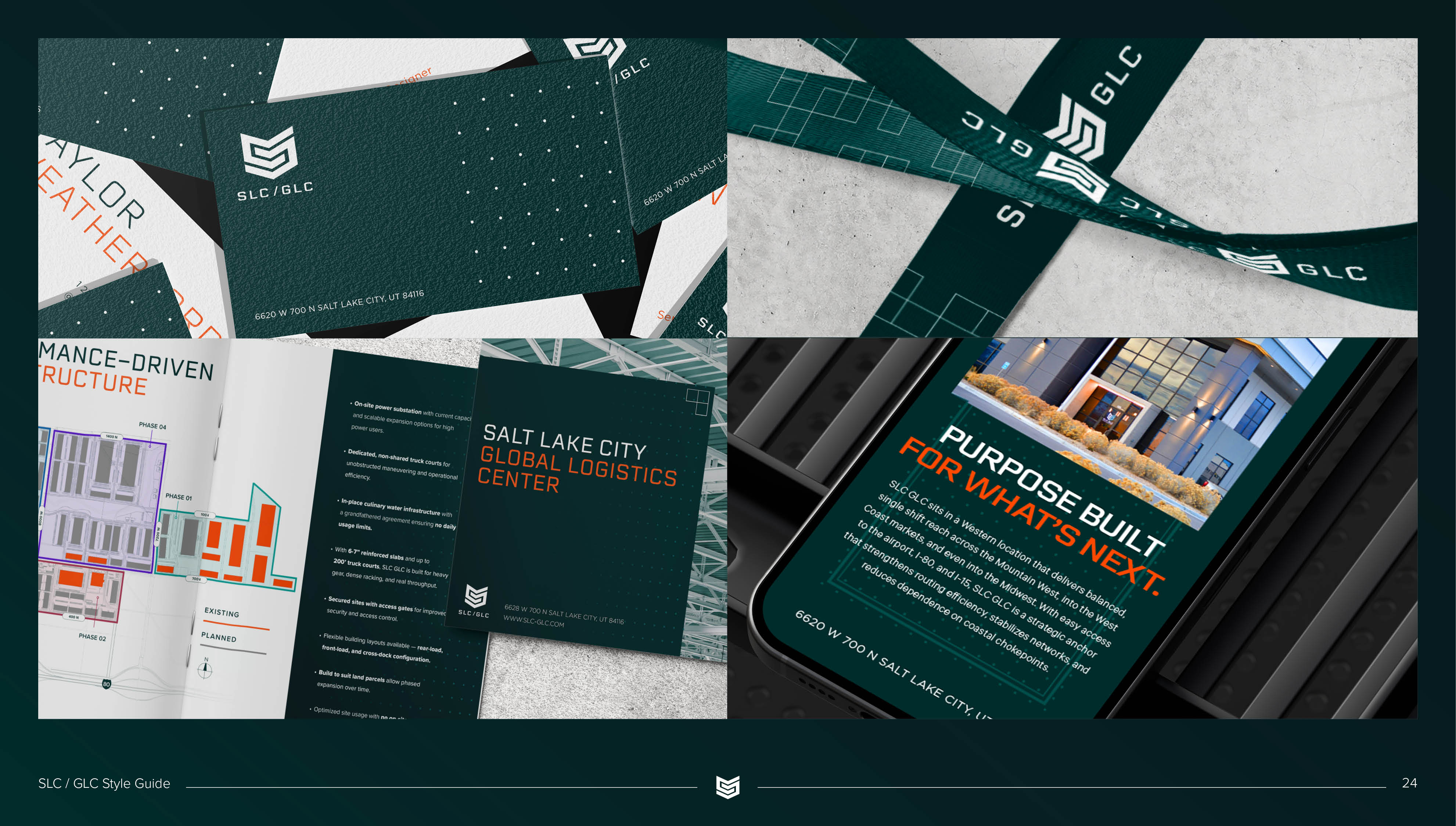
The faceted, chevron-built mark of the refreshed SLC GLC logo evolved from the previous brand to retain recognition while signaling a new level of quality and precision engineering. A bold palette pairing deep green and a muted orange is complemented with phase-specific accent colors that let each stage of development read as its own chapter within one larger system. SLC GLC’s signature "color burn" photographic treatment highlights the detail images and serves as a counterbalance to wide-scale photography with more muted colors. A collage technique ties the development's architecture to Utah's mountains and skyline, grounding an enormous scale in a specific sense of place.
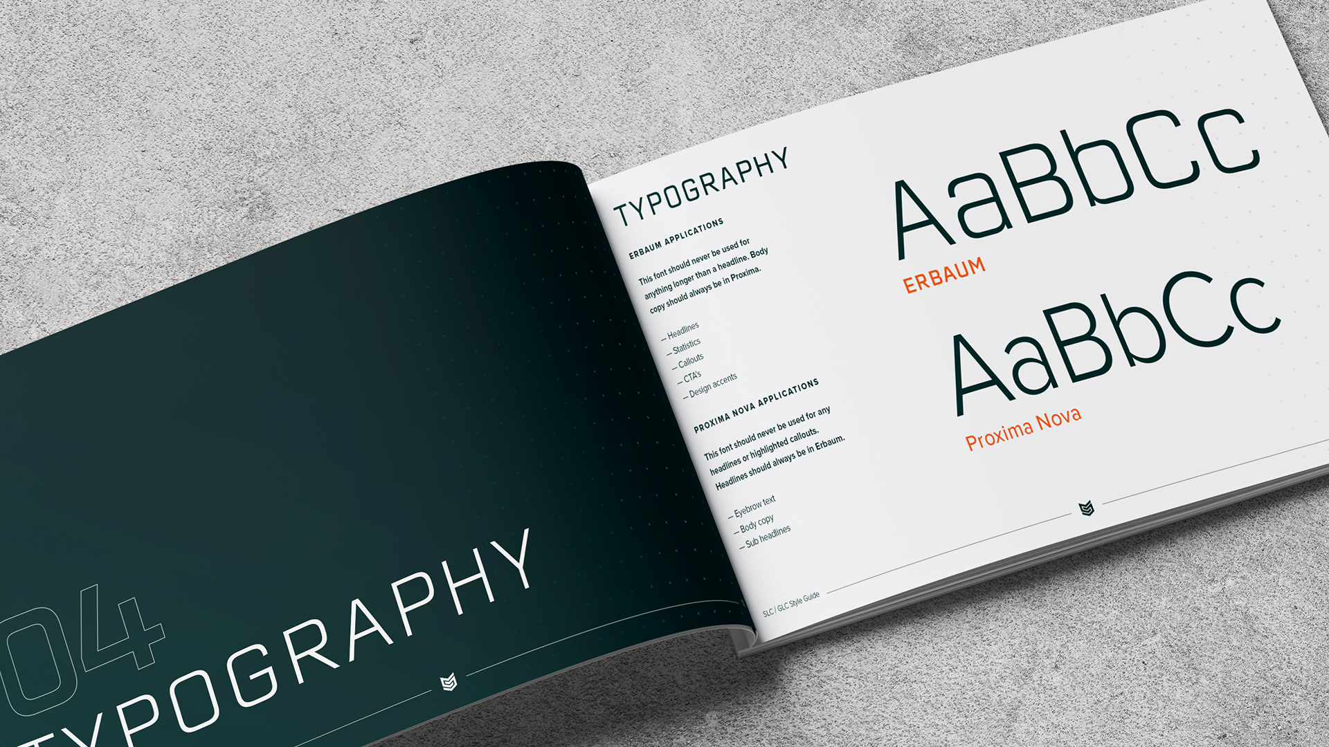
The brand voice balances confidence with a more casual delivery of the project’s offerings. Typography pairs the geometric, technical Erbaum for headlines with Gotham for body copy, reinforcing a tone that is benefit-driven rather than spec-heavy.
The result is a modular, scalable identity that gives SLC GLC's brokerage team, ownership group, and tenants a unified design language, one built to grow phase by phase with the campus without losing coherence.
Credits

Entrant
Gulf Health Council
Category
Social Media - Public Health
Country / Region
Saudi Arabia

Entrant
Niki Jones Agency
Category
Advertising - Online Ad (Campaign)
Country / Region
United States
Entrant
C.L.A.P. US LLC
Category
Experiential & Immersive - Pop-Up Experience
Country / Region
United States
Entrant
Gravity Global
Category
Strategic Program - Digital Marketing Campaign
Country / Region
United States