
2026
Sernova | Never Stop Moving Forward
Entrant
LifeSci Communications
Category
Corporate Identity - Corporate Identity Redesign
Client's Name
Sernova
Country / Region
United States
Gallery
About The Entry
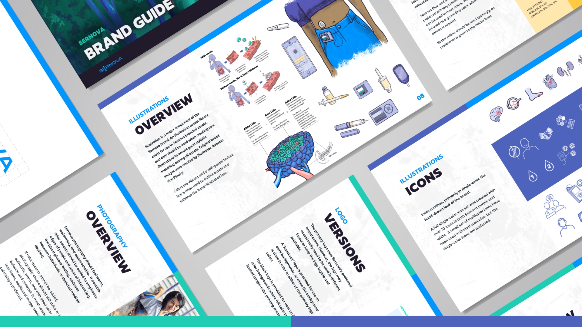
Services: Brand Identity, Logo, Brand Guide, Social Templates, Illustrations, Website, PowerPoint Deck, Collateral Suite.
Overview: Sernova is developing a Cell PouchTM bio-hybrid organ that works to restore the body’s normal function so that patients with type 1 diabetes (T1D) can focus on what matters most: living their lives. From this the LifeSci team drew inspiration for branding that centered around the themes: ‘life uninterrupted’ and ‘forward motion.’ Given the Sernova CEO is living with T1D, providing educational resources to a broader audience while early in clinical stage was authentic to not only the CEO but the company.
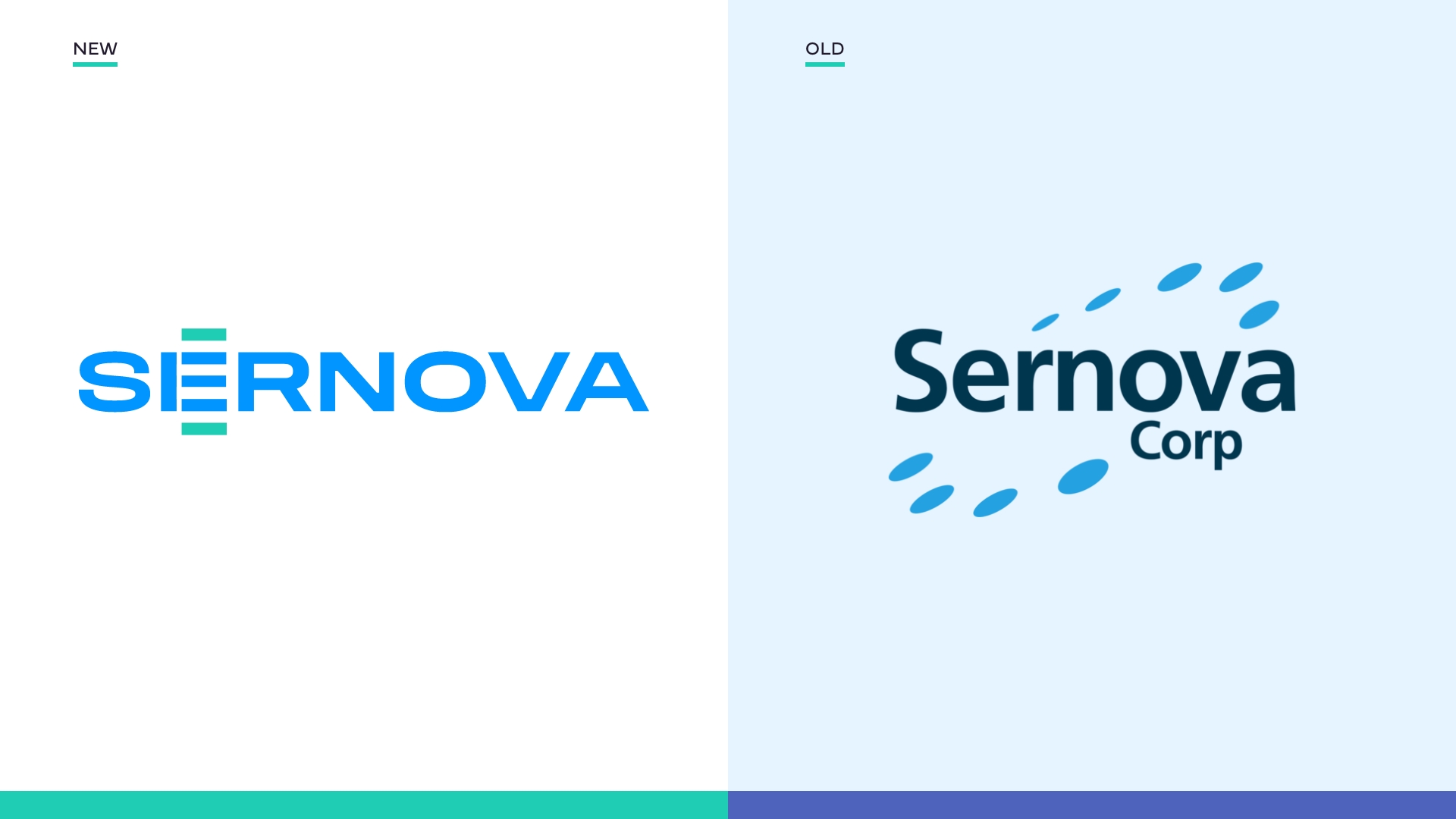
Strategy: Sernova’s new management team tasked LifeSci with a rebrand that:
• Clearly reflects the company’s mission
• Balances science and humanity
• Engages a broader audience
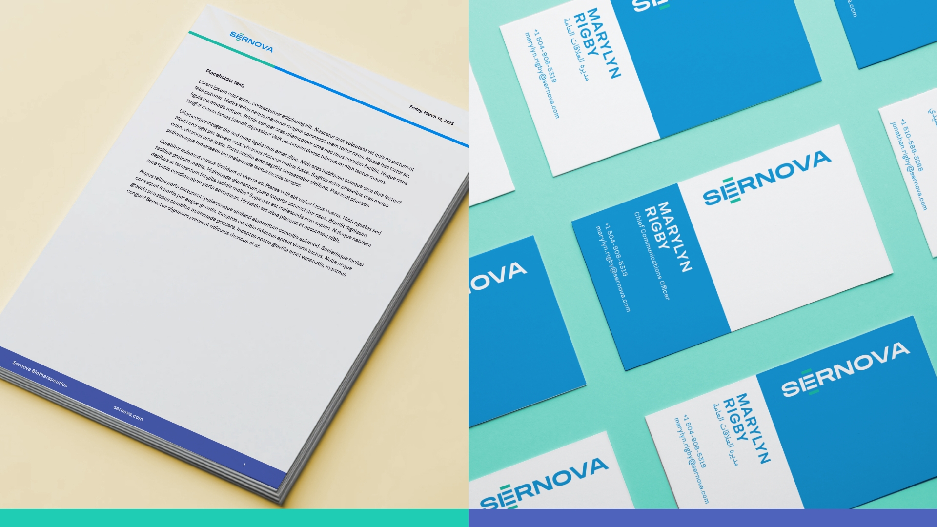
Logo & Identity: The Sernova logo takes inspiration from the structure of their core technology, the bio-hybrid organ. The bars of the letter E reference the channels of the organ, and their visual repetition evokes a feeling of progress, expansion, and growth.
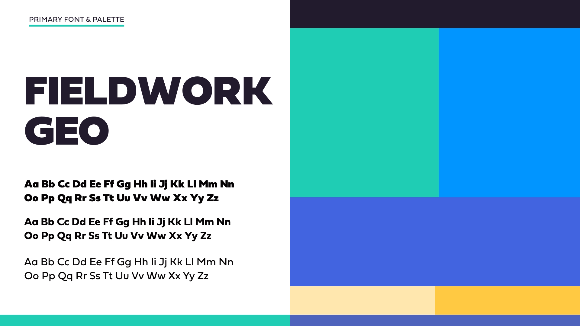
The logo is bold without being forceful, clean while still being distinctive. The primary color palette uses a light blue commonly associated with T1D awareness. The combination of teal and blue is hopeful, calming, and evocative of life, balance, and renewal.
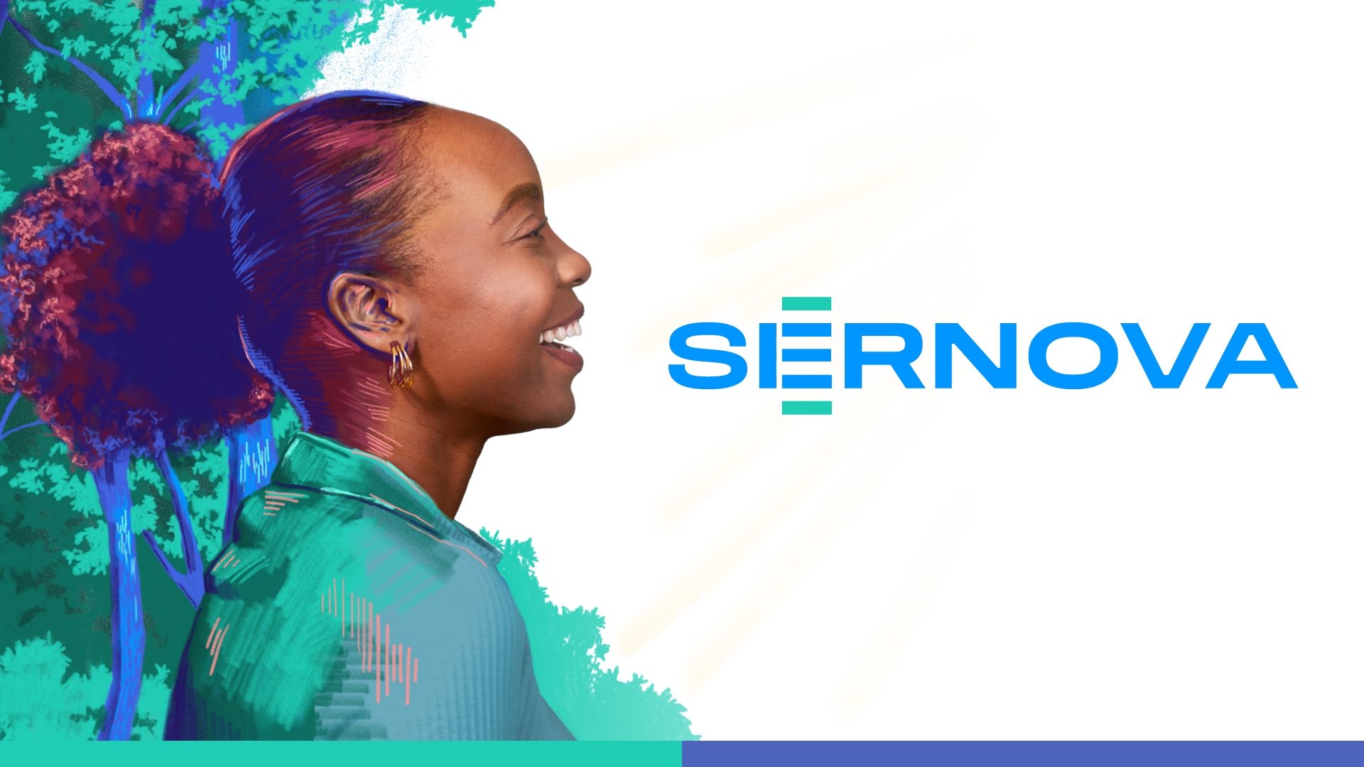
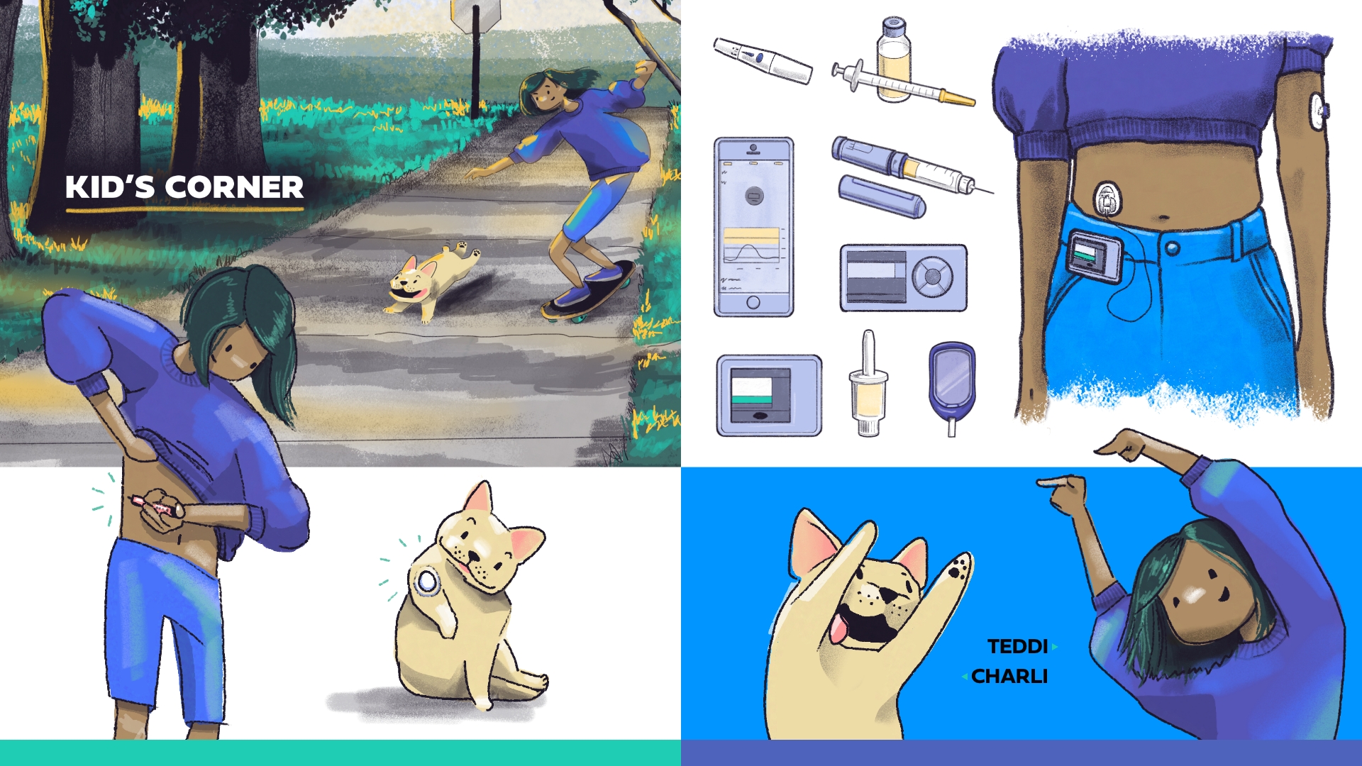
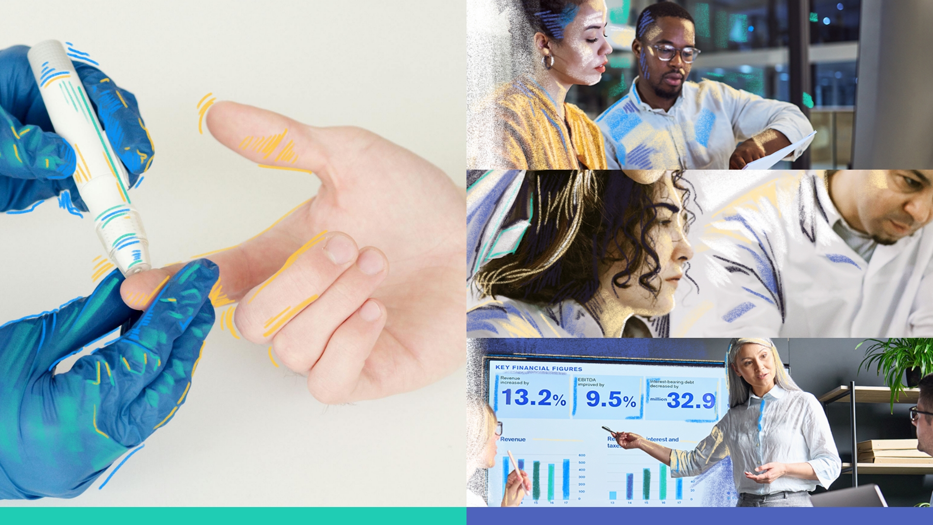
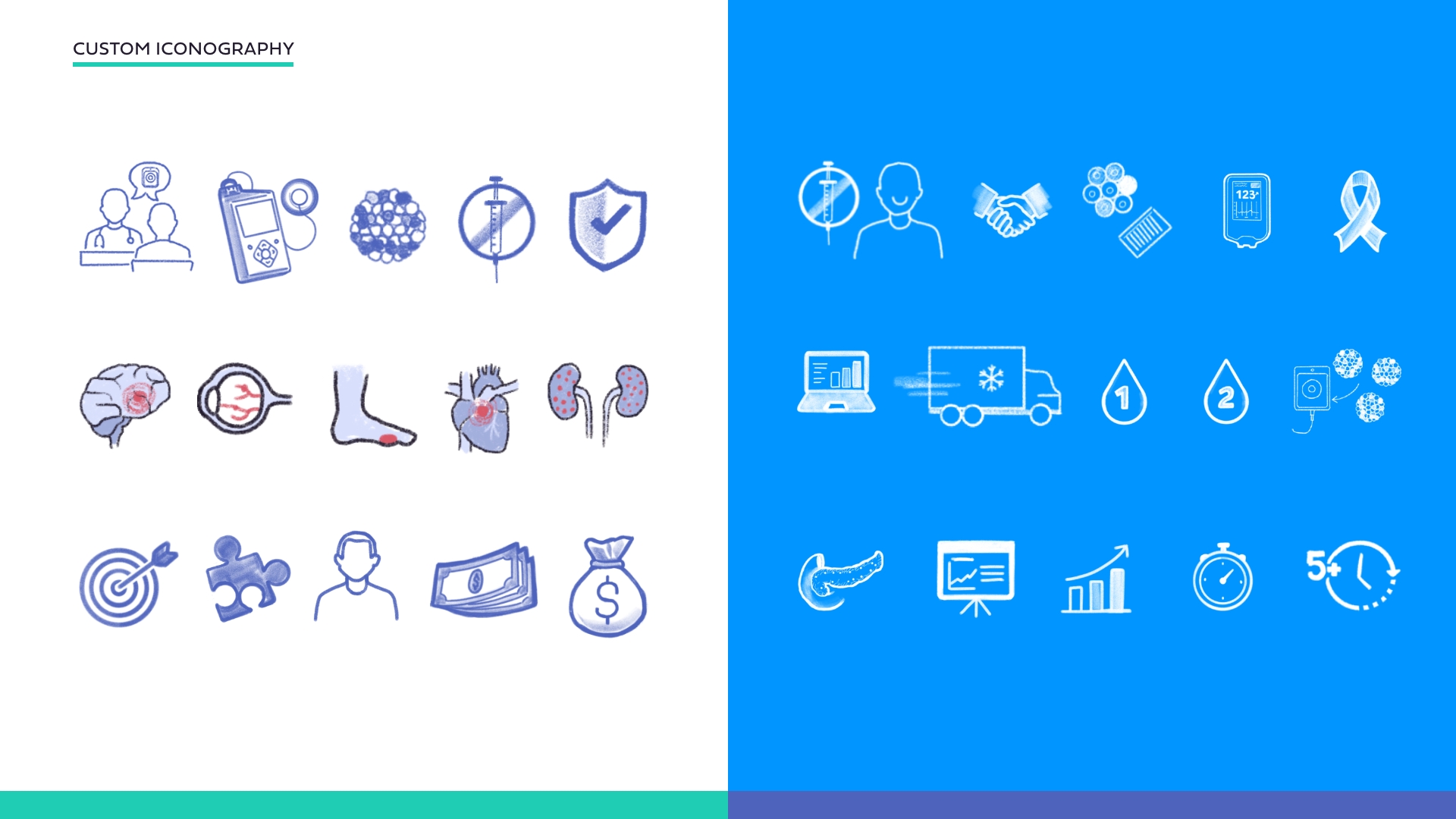
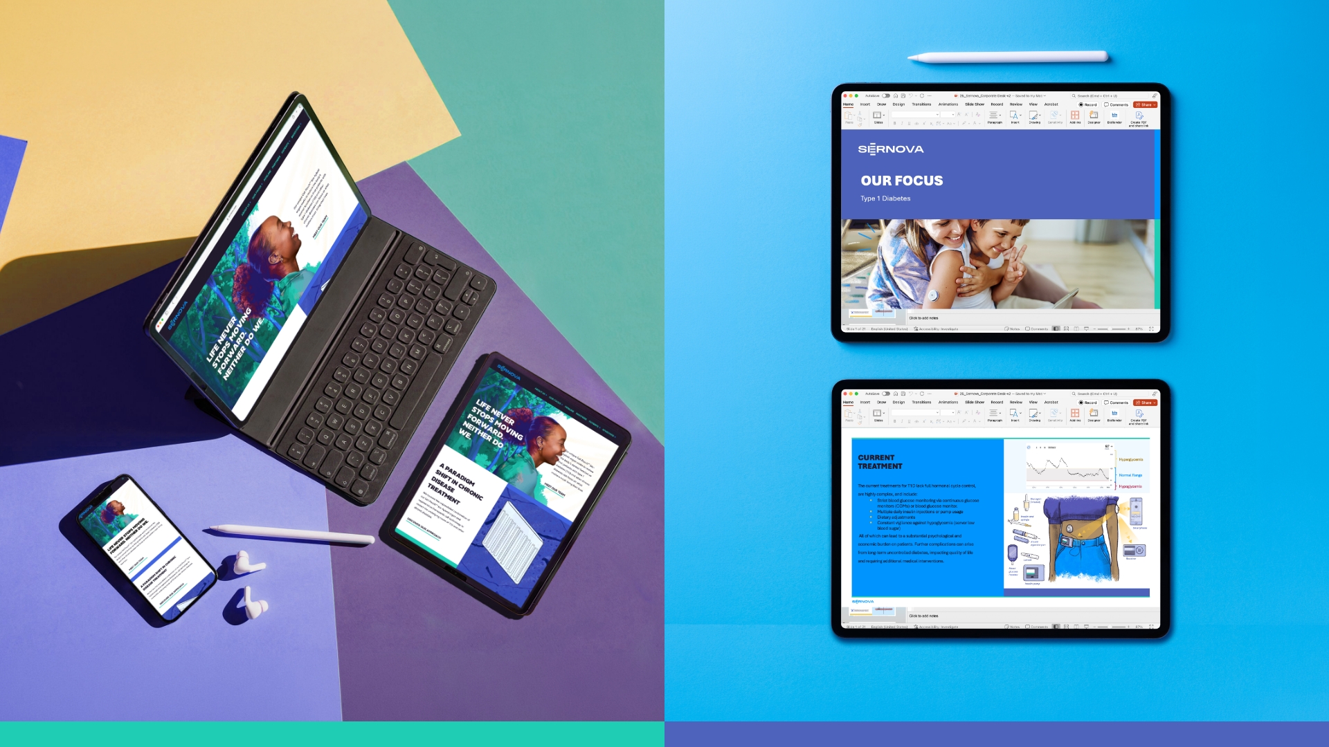
Website & Illustration: Illustration is a major component interwoven into the Sernova brand. The custom illustrations set a tone that is approachable, vibrant, and a with soft-pastel texture line often used over photography, undoubtedly human.
As part of Sernova’s website overhaul, LifeSci developed the Kid’s Corner page and brought it to life with custom illustrated characters of a child named Teddi and dog named Charli to help young patients understand T1D. The page’s objective is to provide an educational resource that is easily understood by children who have either been diagnosed with T1D or who have friends with T1D and want to learn more.
Outcome: By redefining its story, visual identity, and market presence, Sernova gained greater visibility with investors, partners, and patients. The impact has been seen with increased investor engagement, company credibility, market visibility, media coverage, analyst interest, and partner recognition.
Featured Media
Entrant
Heilongjiang Qifan Brand Creative Co., Ltd. /Zhang Runran
Category
Integrated Marketing - Integrated Marketing Campaign
Country / Region
China

Entrant
Cultural Affairs Bureau of Nantou County Government
Category
Event - Cultural
Country / Region
Taiwan
Entrant
Ziwei Deng, Junyue Hua, Shixiao Wang
Category
App / Mobile App - Lifestyle
Country / Region
United States
Entrant
Med Learning Group
Category
Website - Education
Country / Region
United States